pandas.Panelの軸の向きをちょくちょく忘れてしまうので、備忘録として。
DataReaderにtickerのリストを渡すと、Panelが返ってきます。
import pandas_datareader.data as web
from datetime import datetime

tickers = ['AAPL', 'MSFT', 'ORCL']
sd = datetime(2016, 1, 1)
ed = datetime(2016, 1,10)

p = web.DataReader(tickers, "yahoo", sd, ed)
print(p)
<class 'pandas.core.panel.Panel'>
Dimensions: 6 (items) x 5 (major_axis) x 3 (minor_axis)
Items axis: Open to Adj Close
Major_axis axis: 2016-01-04 00:00:00 to 2016-01-08 00:00:00
Minor_axis axis: AAPL to ORCL
Panelにこんな感じでアクセスすると、
d = p['Open']
print(d)
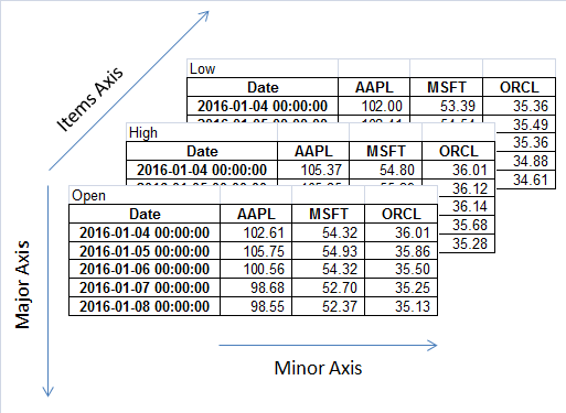
こういうデータが返ってきます。
                  AAPL       MSFT       ORCL
Date
2016-01-04  102.610001  54.320000  36.009998
2016-01-05  105.750000  54.930000  35.860001
2016-01-06  100.559998  54.320000  35.500000
2016-01-07   98.680000  52.700001  35.250000
2016-01-08   98.550003  52.369999  35.130001
つまり図で表すと、こう。
こうするとPanelから特定セルの値をSeriesで取り出してくることも可能。
s = p['Open'][:1]['AAPL']
print(s)
Date
2016-01-04    102.610001
Freq: D, Name: AAPL, dtype: float64