1.初めに
Pythonでデータを可視化する際、matplotlibとseabornが定番だが、表示範囲やスケールを変える際の手間がかかる。
インタラクティブに表示範囲・スケールを変更できる可視化ツールとして、今回Plotlyの使い方を簡単にまとめた。
2.プログラム
visualize.py
import pandas as pd
import numpy as np

df_passanger = pd.read_csv("AirportPassengers.csv", sep=";",  index_col=0)
print(df_passanger.head())

# Using plotly.express
import plotly.express as px

# fig = px.line(df_passanger, x="Month", y="Passengers", title='Life expectancy in Canada')
fig = px.line(df_passanger, y="Passengers", title='Air Passengers')
fig.show()
read_csvでファイルを読み込む。その後、plotly.expressを使い、折れ線グラフでデータを表示。
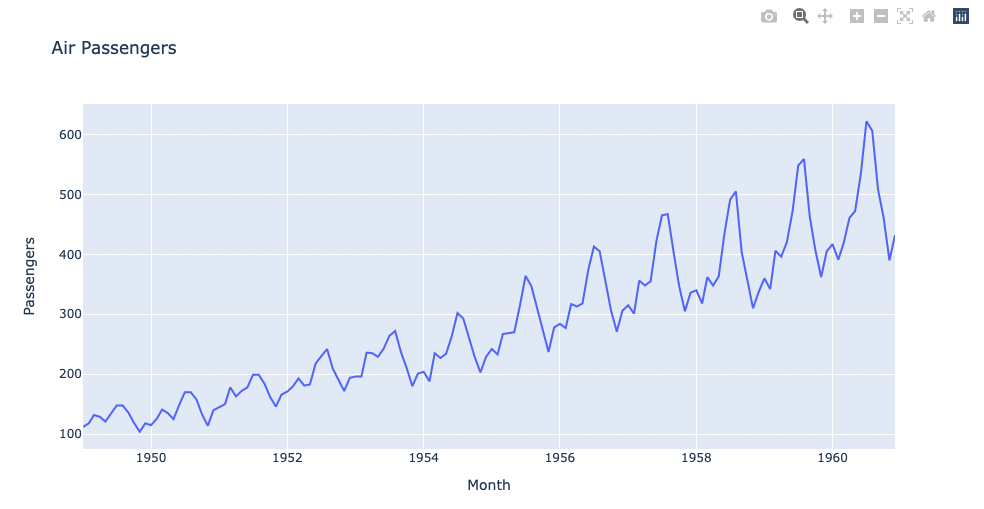
グラフ部分の表示例を以下に示す。
output.py
fig.write_html("test.html")
グラフ画像は、グラフエリア右上のボタンから画像ファイルとして手動で保存できるが、上記のようにhtml方式で保存もできる。html方式の場合、スケールなども変更できる。
3.参考資料
公式ドキュメント
Line Plots with plotly.express
Plotly.express.line
Qiita記事
[Python] Plotlyでぐりぐり動かせるグラフを作る