はじめに
画像と文字の横並びをいい感じに作りたかったので、順を追って試してみたときのイメージ図を備忘録として残していく。
目標としてはこんな感じ。
環境
※以下を使用する。
flexbox
bootstrap 4系
まずはflexboxを使ってみる

style.css
.img-container{
  display:flex;/* flexbox */
}
index.html
<div class="img-container">
  <img src="img.png">
  文言
</div>
デフォルトは横並びみたいです。imgと文言がくっついちゃいます。
水平方向に真ん中にしてみる。

style.css
.img-container{
  display:flex;/* flexbox */
  justify-content:center; /* 水平方向 */
}
index.html
<div class="img-container">
  <img src="img.png">
  文言
</div>
文言が真ん中にならないので何とかしなきゃ
垂直方向を真ん中にしてみる

style.css
.img-container{
  display:flex;/* flexbox */
  justify-content:center; /* 水平方向 */
  align-items: center; /* 垂直方向 */
}
index.html
<div class="img-container">
  <img src="img.png">
  文言
</div>
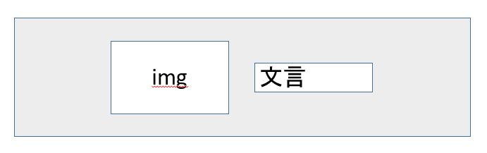
画像と文字がくっついちゃってる。ぴったしくっついてる。余白明けたい。
余白を開けてみる。(ゴール)

style.css
.img-container{
  display:flex;/* flexbox */
  justify-content:center; /* 水平方向 */
  align-items: center; /* 垂直方向 */
}
index.html
<div class="img-container">
  <img class="mr-3" src="img.png">
  文言
</div>
bootstrapでmr-3を使ってイメージの右側に余白を開けてみた。