要旨
matplotlib 円グラフを綺麗に書くための自分なりの方法です。
色々調整が必要な以下のようなデータを円グラフで書くと都度調整するようなことになって面倒ですよね。
- ラベルが長かったり、短かったり。
- データが10個以上あったり、1個だったり。
code
※細かい解説は時間のあるときに追記します・・・
# coding:utf-8
import matplotlib.pyplot as plt
import matplotlib.cm as cm
import numpy as np
### データ###
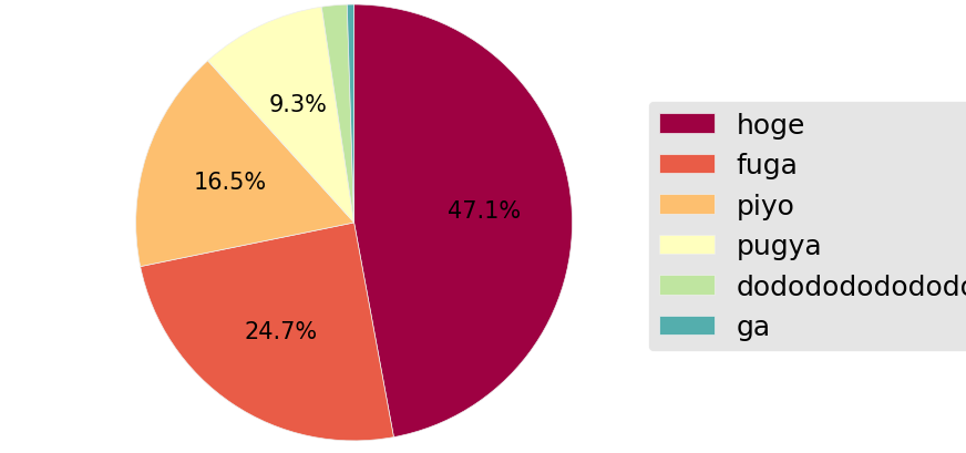
data=[1011,530,355,200,40,11]
label=['hoge','fuga','piyo','pugya','dododododododo','ga']
### 綺麗に書くためのおまじない###
plt.style.use('ggplot')
plt.rcParams.update({'font.size':15})
### 各種パラメータ###
size=(9,5) #凡例を配置する関係でsizeは横長にしておきます。
col=cm.Spectral(np.arange(len(data))/float(len(data))) #color指定はcolormapから好みのものを。
### pie###
plt.figure(figsize=size,dpi=100)
plt.pie(data,colors=col,counterclock=False,startangle=90,autopct=lambda p:'{:.1f}%'.format(p) if p>=5 else '')
plt.subplots_adjust(left=0,right=0.7)
plt.legend(label,fancybox=True,loc='center left',bbox_to_anchor=(0.9,0.5))
plt.axis('equal')
plt.savefig('figure.png',bbox_inches='tight',pad_inches=0.05)
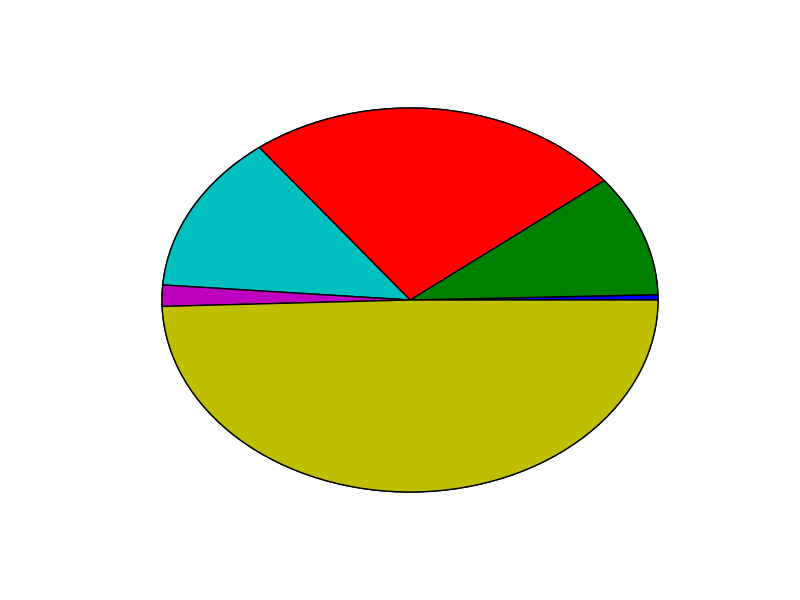
plt.pie(data)だけだとこんな感じなんですが、
こんな感じになります。
参考サイト
colormapは以下サイトから好きなものを。
http://matplotlib.org/examples/color/colormaps_reference.html
各種オプション
http://matplotlib.org/api/axes_api.html#matplotlib.axes.Axes.pie