例題(3):軸の設定
Axes関連の設定について学ぶ.
基準となるサンプルコードは以下の通り.
例(1):サンプルコード
import numpy as np                  # numpy
import matplotlib.pyplot as plt     # matplotlib plt
import matplotlib.ticker as ticker  # matplotlib ticker


def main():
    '''main program'''

    # setting
    f_out = 'graph03_example1.png'   # output file (figure)

    # data
    x = np.arange(0, 10.1, 0.1)
    y1 = np.cos(x)
    y2 = np.sin(x)
    data = {'p1': [x, y1],      # data packing
            'p2': [x, y2]}

    # plot graph
    run_plot(f_out, data)


def run_plot(f_out, data):
    '''plot graph
    [input]
    f_out: output file name
    data: data for plotting
    '''

    # (0) setting of matplotlib
    # graph
    gx = 14                     # graph size of x [cm]
    gy = 6                      # graph size of y [cm]
    dpi = 200                   # graph DPI (100~600程度)

    # font
    f_family = 'IPApGothic'     # font (sans-serif, serif, IPApGothic)
    font_ax = {'size': 10, 'color': 'k'}  # 軸ラベルのフォント
    fs_le = 9                             # 凡例のフォントサイズ
    fs_ma = 9                             # 主目盛りのフォントサイズ
    font_tx = {'size': 10}                # テキストのフォント

    # 軸ラベル
    x_label = 'x'               # x軸ラベル
    y_label = 'y'               # y軸ラベル

    # 軸範囲
    x_s = 0                     # x軸の最小値
    x_e = 10                    # x軸の最大値
    y_s = -1.1                  # y軸の最小値
    y_e = 1.1                   # y軸の最大値

    # 目盛り
    x_ma = 2                    # x軸の主目盛り間隔
    x_mi = 0.5                  # x軸の副目盛り間隔
    y_ma = 0.5                  # y軸の主目盛り間隔
    y_mi = 0.1                  # y軸の副目盛り間隔

    # (A) Figure
    # (A.1) Font or default parameter
    # https://matplotlib.org/stable/api/matplotlib_configuration_api.html
    plt.rcParams['font.family'] = f_family

    # (A.2) Figureの作成
    # https://matplotlib.org/stable/api/_as_gen/matplotlib.pyplot.figure.html
    # [Returns]
    #   Figureオブジェクトが返される。
    # [Parameter]
    # figsize=(6.4,4.8): グラフサイズ(x,y), 1[cm]=1/2.54[in]
    # dpi=100: 出力DPI
    tl = False                  # Figureのスペース自動調整
    fc = 'w'                    # Figureの背景色
    ec = None                   # 枠線の色
    lw = None                   # 枠線の幅
    fig = plt.figure(figsize=(gx/2.54, gy/2.54), dpi=dpi,
                     tight_layout=tl, facecolor=fc, edgecolor=ec,
                     linewidth=lw)

    # (A.3) グラフ間隔の調整(pltまたはfig)
    # bottom等はfigure()でtigit_layout=Trueにすれば不要
    # https://matplotlib.org/stable/api/_as_gen/matplotlib.pyplot.subplots_adjust.html
    bottom = 0.18                # グラフ下側の位置(0~1)
    top = 0.95                  # グラフ上側の位置(0~1)
    left = 0.12                 # グラフ左側の位置(0~1)
    right = 0.73                # グラフ右側の位置(0~1)
    hspace = 0.2                # グラフ(Axes)間の上下余白
    wspace = 0.2                # グラフ(Axes)間の左右余白
    fig.subplots_adjust(bottom=bottom, top=top, left=left, right=right,
                        hspace=hspace, wspace=wspace)

    # (B) Axes
    # (B.1) Axesの追加
    # 複数のグラフをタイル状に作成することができる。
    # 複数グラフの配置を細かく設定する場合はadd_axes()やadd_gridspec()。
    # https://matplotlib.org/stable/api/figure_api.html
    # [Returns]
    #   Axesオブジェクトが返される。
    # [Parameter]
    # *args=(1,1,1): 行番号,列番号,インデックス
    #   1つのFigureに複数のAxesを作る場合に指定する。
    #   add_subplot(2,1,1): 2行のAxesを作り、その1番目(上側)
    #   add_subplot(211): 2,1,1と同じだが、簡略記法
    # projection='rectilinear': グラフの投影法(polarなど)
    # sharex: x軸を共有する際に、共有元のAxisを指定する。
    # sharey: sharexのy軸版
    # label: Axesに対する凡例名(通常は使わない)
    n_row = 1                   # 全グラフの行数
    n_col = 1                   # 全グラフの列数
    n_ind = 1                   # グラフ番号
    fc = 'w'                    # Axesの背景色(通常は白)
    ax = fig.add_subplot(n_row, n_col, n_ind, fc=fc)

    # (B.2) 軸ラベル(axis label)の設定
    # https://matplotlib.org/stable/api/_as_gen/matplotlib.axes.Axes.set_xlabel.html
    # [Parameter]
    # xlabel: 軸ラベル
    # loc='center': 軸ラベル位置(x: left,center,right; y:bottom,center,top)
    # labelpad: 軸ラベルと軸間の余白
    # fonddict: 軸ラベルのText設定
    ax.set_xlabel(x_label, fontdict=font_ax)  # x軸ラベルの設定
    ax.set_ylabel(y_label, fontdict=font_ax)  # y軸ラベルの設定

    # (B.3) 軸の種類の設定
    # https://matplotlib.org/stable/api/_as_gen/matplotlib.axes.Axes.set_xscale.html
    xscale = 'linear'          # x軸の種類(linear, log, symlog, logit)
    yscale = 'linear'          # y軸の種類(linear, log, symlog, logit)
    ax.set_xscale(xscale)      # x軸の種類
    ax.set_yscale(yscale)      # y軸の種類

    # (B.4) 軸の範囲の設定
    # 自動で設定する場合は、auto=Trueのみにする
    # https://matplotlib.org/stable/api/_as_gen/matplotlib.axes.Axes.set_xlim.html
    ax.set_xlim(x_s, x_e, auto=False)  # x軸の範囲
    ax.set_ylim(y_s, y_e, auto=False)  # y軸の範囲

    # (B.5) 軸のアスペクト比
    # x軸とy軸の比率を強制的に設定する場合に行う。
    # https://matplotlib.org/stable/api/_as_gen/matplotlib.axes.Axes.set_aspect.html
    # https://matplotlib.org/stable/api/_as_gen/matplotlib.axes.Axes.set_box_aspect.html
    asp_a = 'auto'          # auto:自動, [数値]:x,yの比率
    asp_b = None            # None:自動, [数値]:x,yのグラフ長さの比率
    ax.set_aspect(asp_a)    # X軸とY軸の比率を設定する
    ax.set_box_aspect(asp_b)   # X軸とY軸のグラフ長さの比率を設定する

    # (B.6) 目盛り関係の設定
    # (B.6.1)主目盛りの位置(Locator)
    # https://matplotlib.org/stable/api/ticker_api.html
    mal_x = ticker.MultipleLocator(x_ma)  # 等間隔目盛り
    # mal_x = ticker.IndexLocator(x_ma, x_off) # 等間隔目盛り(+offset)
    # mal_x = ticker.LogLocator(base=10) # 対数目盛り
    # mal_x = ticker.AutoLocator()         # 自動目盛り
    # mal_x = ticker.NullLocator()         # 目盛りなし
    # mal_x = ticker.LinearLocator(nx_ma)  # 個数指定目盛り
    # mal_x = ticker.FixedLocator([0, 1, 3]) # 位置指定目盛り
    mal_y = ticker.MultipleLocator(y_ma)  # 等間隔目盛り
    # mal_y = ticker.IndexLocator(y_ma, y_off)  # 等間隔目盛り(+offset)
    # mal_y = ticker.LogLocator(base=10) # 対数目盛り
    # mal_y = ticker.AutoLocator()         # 自動目盛り
    # mal_y = ticker.NullLocator()         # 目盛りなし
    # mal_y = ticker.LinearLocator(ny_ma)  # 個数指定目盛り
    # mal_y = ticker.FixedLocator([-1, 0, 1]) # 位置指定目盛り
    ax.xaxis.set_major_locator(mal_x)    # x軸の主目盛り間隔の設定
    ax.yaxis.set_major_locator(mal_y)    # y軸の主目盛り間隔の設定

    # (B.6.2)主目盛りの表記(Formatter)
    # https://matplotlib.org/stable/api/ticker_api.html
    maf_x = ticker.ScalarFormatter()  # 数値
    # maf_x = ticker.NullFormatter() # 目盛り表記なし
    # maf_x = ticker.FixedFormatter(['A','B','C','D','E','F']) # 指定表記
    # maf_x = ticker.StrMethodFormatter('{x:.1f}m') # format記法
    # maf_x = ticker.LogFormatterMathtext(base=10)  # log記法(10^x)
    maf_y = ticker.ScalarFormatter()  # 数値
    # maf_y = ticker.NullFormatter() # 目盛り表記なし
    # maf_y = ticker.FixedFormatter(['A','B','C','D','E','F']) # 指定表記
    # maf_y = ticker.StrMethodFormatter('{x:.2f}m') # format記法
    # maf_y = ticker.LogFormatterMathtext(base=10)  # log記法(10^x)
    ax.xaxis.set_major_formatter(maf_x)  # x軸の主目盛り表記の設定
    ax.yaxis.set_major_formatter(maf_y)  # y軸の主目盛り表記の設定

    # (B.6.3) 副目盛りの位置(Locator)
    # https://matplotlib.org/stable/api/ticker_api.html
    mil_x = ticker.MultipleLocator(x_mi)  # 等間隔目盛り
    # mil_x = ticker.IndexLocator(x_mi, x_off)  # 等間隔目盛り(+offset)
    # mil_x = ticker.LogLocator(base=10, subs=np.arange(2, 10)*0.1) # 対数目盛り
    # mil_x = ticker.AutoLocator()         # 自動目盛り
    # mil_x = ticker.NullLocator()         # 目盛りなし
    # mil_x = ticker.LinearLocator(nx_mi)  # 個数指定目盛り
    mil_y = ticker.MultipleLocator(y_mi)  # 等間隔目盛り
    # mil_y = ticker.IndexLocator(y_mi, y_off)  # 等間隔目盛り(+offset)
    # mil_y = ticker.LogLocator(base=10, subs=np.arange(2, 10)*0.1) # 対数目盛り
    # mil_y = ticker.AutoLocator()         # 自動目盛り
    # mil_y = ticker.NullLocator()         # 目盛りなし
    # mil_y = ticker.LinearLocator(ny_mi)  # 個数指定目盛り
    ax.xaxis.set_minor_locator(mil_x)  # x軸の副目盛り間隔の設定
    ax.yaxis.set_minor_locator(mil_y)  # y軸の副目盛り間隔の設定

    # (B.6.4) 副目盛りの表記(Formatter)
    # https://matplotlib.org/stable/api/ticker_api.html
    mif_x = ticker.NullFormatter()       # 目盛り表記なし
    mif_y = ticker.NullFormatter()       # 目盛り表記なし
    ax.xaxis.set_minor_formatter(mif_x)  # x軸の副目盛り表記の設定
    ax.yaxis.set_minor_formatter(mif_y)  # y軸の副目盛り表記の設定

    # (B.6.5) 目盛り関連の細部の設定
    # https://matplotlib.org/stable/api/_as_gen/matplotlib.axes.Axes.tick_params.html
    # [Parameter]
    # axis: 対象軸(x, y, both)
    # which: major, minor, both
    # labelsize: フォントサイズ
    # top, right, bottom, left: Tickを表記する場所(Trueで表記)
    # labeltop: Trueで上側にも目盛りを付ける(labelrightも同様)
    # labelrotation: 目盛りの表記角度
    # labelcolor: 目盛り表記の色
    # pad: 軸と目盛りの間隔
    # color: 目盛り線の色
    ax.tick_params(axis='both', which='major', labelsize=fs_ma,
                   top=True, right=True)
    ax.tick_params(axis='both', which='minor', top=True, right=True)

    # (B.7) グリッドの設定
    # https://matplotlib.org/stable/api/_as_gen/matplotlib.axes.Axes.grid.html
    gb = False   # 出力の有無(Falseかつ、lsなどの指定なしで、出力なし)
    which = 'major'  # 目盛りの指定(major, minor, both)
    axis = 'both'    # X,Y軸の指定(x, y, both)
    color = 'gray'   # 線色
    ls = '-'         # 線種('-', '--', '-.', ':')
    lw = 0.5         # 線幅
    ax.grid(b=gb, which=which, axis=axis)  # Falseの場合
    # ax.grid(b=gb, which=which, axis=axis, c=color, ls=ls, lw=lw)

    # (B.8) 直線
    # axhline(), axvline(): 横線, 縦線(端から端まで)
    # axhspan(), asvspan(): 横線, 縦線(始点と終点指定)
    # axline(): 直線
    # https://matplotlib.org/stable/api/_as_gen/matplotlib.axes.Axes.axhline.html
    # [Parameter]
    py = 0                      # 横線の位置(y座標)
    color = 'k'                 # 線色
    ls = '-'                    # 線種('-', '--', '-.', ':')
    lw = 0.5                    # 線幅
    #ax.axhline(y=py, c=color, ls=ls, lw=lw)

    # (C) Plot
    # (C.1) plot(): 折れ線グラフ
    # 散布図はscatter()
    # https://matplotlib.org/stable/api/_as_gen/matplotlib.pyplot.plot.html
    # [Returns]
    #   Line2Dオブジェクトが返される。
    # [Parameter]
    # *args: xデータ, yデータ, [fmt]
    #   x,yデータはx軸とy軸のデータ(リストなど)
    #   fmtは線や点の簡易的記法による指定
    # *kwargs: Line2Dの設定値(多数あり)
    d_x = data['p1'][0]                           # x data(適宜変更)
    d_y = data['p1'][1]                           # y data(適宜変更)
    label = '$y=\cos(x)$'  # 凡例(なしはNone)
    ls = '-'                       # 線種('-', '--', '-.', ':')
    lw = 0.5                       # 線幅
    color = 'k'                    # 線色(k, r, g, b, etc.)
    marker = None        # marker(o, s, v, ^, D, +, x, etc.; None=なし)
    mec = 'k'           # markerの線色(k, r, g, b, etc.)
    mew = 0.5           # markerの線幅
    mfc = 'w'           # markerの色(none, k, r, g, b, w, etc.)
    ms = 2              # markerサイズ
    markevery = None    # markerの出力間隔(None=全部, 2は2個毎)
    ax.plot(d_x, d_y, label=label,
            ls=ls, lw=lw, c=color, marker=marker,
            mec=mec, mew=mew, mfc=mfc, ms=ms,
            markevery=markevery)


    # (C.1) plot(): 折れ線グラフ
    # 散布図はscatter()
    # https://matplotlib.org/stable/api/_as_gen/matplotlib.pyplot.plot.html
    # [Returns]
    #   Line2Dオブジェクトが返される。
    # [Parameter]
    # *args: xデータ, yデータ, [fmt]
    #   x,yデータはx軸とy軸のデータ(リストなど)
    #   fmtは線や点の簡易的記法による指定
    # *kwargs: Line2Dの設定値(多数あり)
    d_x = data['p2'][0]                           # x data(適宜変更)
    d_y = data['p2'][1]                           # y data(適宜変更)
    label = '$y=\sin(x)$'  # 凡例(なしはNone)
    ls = '--'                       # 線種('-', '--', '-.', ':')
    lw = 0.5                       # 線幅
    color = 'b'                    # 線色(k, r, g, b, etc.)
    marker = None        # marker(o, s, v, ^, D, +, x, etc.; None=なし)
    mec = 'k'           # markerの線色(k, r, g, b, etc.)
    mew = 0.5           # markerの線幅
    mfc = 'w'           # markerの色(none, k, r, g, b, w, etc.)
    ms = 2              # markerサイズ
    markevery = None    # markerの出力間隔(None=全部, 2は2個毎)
    ax.plot(d_x, d_y, label=label,
            ls=ls, lw=lw, c=color, marker=marker,
            mec=mec, mew=mew, mfc=mfc, ms=ms,
            markevery=markevery)

    # (D) Others: 凡例、テキストなど
    # (D.1) 凡例
    # (D.1.1) 凡例データの一覧を得る
    handles, labels = ax.get_legend_handles_labels()

    # (D.1.2) 凡例の作成
    # https://matplotlib.org/stable/api/_as_gen/matplotlib.axes.Axes.legend.html
    anc = (1.04, 1)             # 凡例の配置場所(0~1の相対位置)
    loc = 'upper left'  # 配置箇所:upper,center,lower; left,center,right; best
    ti = '凡例'         # 凡例のタイトル(なし=None or '')
    ti_fs = 9           # 凡例のタイトルのフォントサイズ
    ncol = 1            # 凡例の列数
    fc = 'w'            # 凡例の背景色(なし=none)
    ec = 'k'            # 枠線の色(なし=none)
    fa = 1.0            # 透明度(0で透明, 1で透明なし)
    bp = 0.5            # 凡例の枠の余白(default=0.4)
    ms = 1.0            # マーカーの倍率(default=1.0)
    sha = True          # True:影付き、False:影なし
    fb = True           # 凡例の角:True:丸、False:四角
    bap = 0.8           # 凡例の外側の余白(default=0.5)
    ls = 0.5            # 凡例間の上下余白
    cs = 2.0            # 凡例間の左右余白
    legend = ax.legend(handles, labels, title=ti,
                       title_fontsize=ti_fs, loc=loc,
                       bbox_to_anchor=anc, ncol=ncol, facecolor=fc,
                       edgecolor=ec, framealpha=fa, fontsize=fs_le,
                       borderpad=bp, shadow=sha, markerscale=ms,
                       fancybox=fb, labelspacing=ls, columnspacing=cs,
                       borderaxespad=bap)

    # (D.1.3) 凡例の細かい設定
    legend.get_frame().set_linestyle('-')  # 枠線の種類
    legend.get_frame().set_linewidth(0.5)  # 枠線の太さ

    # (D.2) テキスト
    # https://matplotlib.org/stable/api/_as_gen/matplotlib.pyplot.text.html
    txt = '(a) Test'         # テキスト文字列
    px = 0.03                # x位置(transformで基準座標の変更)
    py = 0.05                # y位置(transformで基準座標の変更)
    tf = ax.transAxes        # 基準座標(ax.transAxes, fig.transFigure)
    ha = 'left'              # 左右位置(left, center, right)
    va = 'bottom'            # 上下位置(bottom, center, top, baseline)
    rot = 0                  # 回転角度(左回転)
    color = 'k'              # テキストの色
    ax.text(x=px, y=py, s=txt, font=font_tx, ha=ha, va=va, color=color,
            rotation=rot, transform=tf)

    # (E) save figure
    # https://matplotlib.org/stable/api/_as_gen/matplotlib.pyplot.savefig.html
    # [Parameters]
    # fname: 出力ファイル名
    # dpi: 出力DPI(Figure設定時のdpiが優先)
    print(f'write: {f_out}')
    plt.savefig(fname=f_out)    # save figure

    # (F) close
    plt.close()


if __name__ == '__main__':
    main()
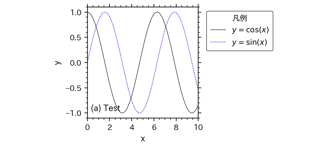
出力結果は以下の通り.

解説
サンプルコードを基に,Axesの変更例を示していくので,それを見て動作を理解してほしい.
例(2):グラフのアスペクト比の変更
サンプルコードから,(B.5)の部分を以下のように変更する(不要なコメント行は削除している).
具体的には,ax.set_box_aspect()の部分.
    # (B.5) 軸のアスペクト比
    asp_a = 'auto'          # auto:自動, [数値]:x,yの比率
    asp_b = 1            # None:自動, [数値]:x,yのグラフ長さの比率
    ax.set_aspect(asp_a)    # X軸とY軸の比率を設定する
    ax.set_box_aspect(asp_b)   # X軸とY軸のグラフ長さの比率を設定する
図は以下のようになり,X軸とY軸の「見た目の長さ」のアスペクト比が1:1(正方形)になっている.グラフ(Axes)の横幅が短くなるので,その分,左右の余白は広くなる.
なお,ax.set_aspect()の方は,X軸とY軸の「数値」のアスペクト比を設定する.
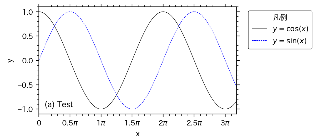
例(3):目盛り間隔と表記を指定位置に変更
目盛りは位置(Locator)と表記(Formatter)を,それぞれ指定して変更する.
例として,サンプルコードから,(B.6.1)~(B.6.2)のx軸部分を変更し,目盛りと表記を自由に指定できるようにする.
表記を指定の文字列に変更するには,FixedFormatter()を使用する.
FixedFormatter()を使用する場合,位置の指定にはFixedLocator()を使用しなければならない.
    x_ma = 0.5*np.pi            # x軸の主目盛り間隔
    x_mi = 0.1*np.pi            # x軸の副目盛り間隔

(中略)

    # (B.6.1)主目盛りの位置(Locator)
    x_ticks = np.arange(0, 4, 0.5) * np.pi
    mal_x = ticker.FixedLocator(x_ticks) # 位置指定目盛り
    mal_y = ticker.MultipleLocator(y_ma)  # 等間隔目盛り
    ax.xaxis.set_major_locator(mal_x)    # x軸の主目盛り間隔の設定
    ax.yaxis.set_major_locator(mal_y)    # y軸の主目盛り間隔の設定

    # (B.6.2)主目盛りの表記(Formatter)
    x_fmt = ['0', '0.5$\pi$','1$\pi$', '1.5$\pi$',
              '2$\pi$', '2.5$\pi$','3$\pi$']
    maf_x = ticker.FixedFormatter(x_fmt) # 指定表記
    maf_y = ticker.ScalarFormatter()  # 数値
    ax.xaxis.set_major_formatter(maf_x)  # x軸の主目盛り表記の設定
    ax.yaxis.set_major_formatter(maf_y)  # y軸の主目盛り表記の設定
図は以下のようになり,x軸が円周率基準の目盛りになっている.
なお,副目盛りは0.1πの等間隔目盛り(表記なし)とするので,FixedLocator()を使わなくても,MultipleLocator()で対応できる.もちろん,FixedLocator()使うことも可能.
目盛り表記については,下記URLで様々な例が示されている.
https://matplotlib.org/stable/gallery/ticks_and_spines/tick-formatters.html
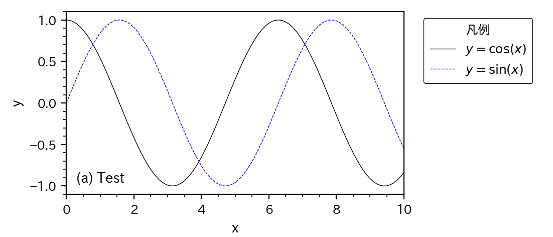
例(4):目盛り線(Tick)の削除
サンプルコードでは,上下左右に目盛り線(Tick)を付けているが,左側と下側だけ付けるようにするには,(B.6.5)を変更すれば良い(topとrightをFalseにしている).
    # (B.6.5) 目盛り関連の細部の設定
    ax.tick_params(axis='both', which='major', labelsize=fs_ma,
                   top=False, right=False)
    ax.tick_params(axis='both', which='minor', top=False, right=False)
図は以下の通り.
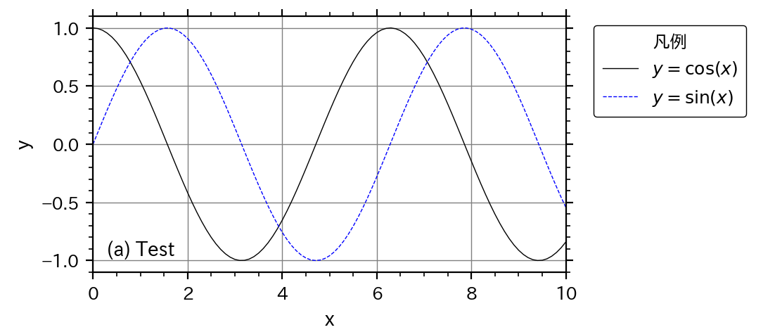
例(5):グリッド線
x軸とy軸にグリッド線を付ける.
(B.7)の部分を変更する(gb, colorを変更).
    # (B.7) グリッドの設定
    # https://matplotlib.org/stable/api/_as_gen/matplotlib.axes.Axes.grid.html
    gb = True   # 出力の有無(Falseかつ、lsなどの指定なしで、出力なし)
    which = 'major'  # 目盛りの指定(major, minor, both)
    axis = 'both'    # X,Y軸の指定(x, y, both)
    color = 'gray'   # 線色
    ls = '-'         # 線種('-', '--', '-.', ':')
    lw = 0.5         # 線幅
    # ax.grid(b=gb, which=which, axis=axis)  # Falseの場合
    ax.grid(b=gb, which=which, axis=axis, c=color, ls=ls, lw=lw)
図は以下の通り.
演習
サンプルコードを基に,下記の演習問題を解答せよ.
解答はコメント欄を参照.
演習(1):LinearLocator()を用いた目盛りの設定
x軸の目盛り位置にLinearLocator()を用いて,サンプルコードと同じ図を作成せよ.
※簡単にできそうで難しい.

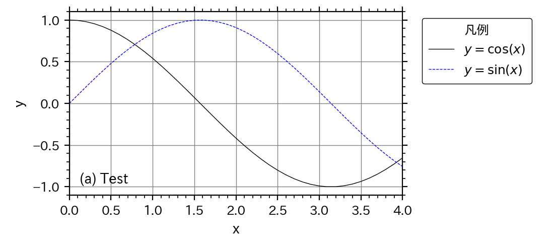
演習(2):数値のアスペクト比の設定
下図のように,x軸の範囲(0~4),x軸の目盛り間隔(0.5と0.1),グリッド線を変更した上で,x軸とy軸の数値のアスペクト比を1:1に変更せよ.
※グリッド線が正方形となっており,x軸とy軸の比率が1:1であることが分かる.
演習(3):目盛り間隔と表記を指定位置に変更
下図のように,y軸の目盛りを変更せよ(-1=A, -0,5=B, 1=C).

次の記事
例題演習matplotlib(4):Legend(凡例)の設定
https://qiita.com/s4s/items/2b5ef8a1dc96db790070