Introduction
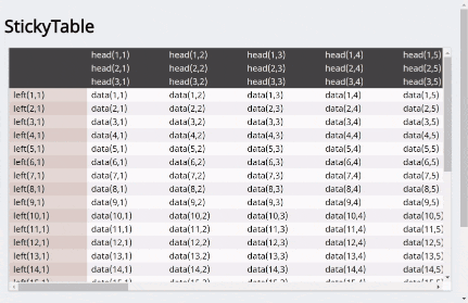
モダンブラウザにおいてposition: stickyとwidth: max-contentの対応が進んだことで、CSSのみで行・列ヘッダ固定テーブルを容易に実装できるようになりました。
なお、各ブラウザの対応状況が異なるため、現状ではセルの横幅(場合によっては高さも)を明示する課題を残してはいますが、保守性は大幅に向上されました。
Goal
Support
本実装での各ブラウザの対応状況です。
| ブラウザ | バージョン | 対応状況 |
|---|---|---|
| Chrome | v.60 | 〇 |
| Firefox | v.55 | 〇 |
| Safari | v.10.1 | 〇 |
| Edge | v.15 | × |
How to
HTML
<table class="sticky_table">
<thead>
<tr>
<th class="blank"> </th>
<th>head</th>
<th>head</th>
<!-- ... -->
</tr>
<!-- ... -->
</thead>
<tbody>
<tr>
<th>left</th>
<td>data</td>
<td>data</td>
<!-- ... -->
</tr>
<!-- ... -->
</tbody>
</table>
HTMLはシンプルなテーブルの記述です。
ヘッダ固定テーブルを実装するために以下を行います。
- tableタグに
sticky_tableクラスを付与する。 - theadのtrの1列目(固定列と固定行の交差部分)に
blankクラスを付与する。
CSS
tableタグ
.sticky_table {
  display: block;
  position: relative;
  overflow: scroll;
  width: calc(100vw - 3.0rem);
  height: calc(75vh);
  border-collapse: collapse;
  font-size: 0;
}
tableタグは幅と高さを決め、子要素がはみ出した際にスクロールするようにします。
position: relativeは、子要素の位置が相対指定となった際の基準として明記します。
font-size: 0は後述のinline-block要素を横並びにした際に生じる隙間を回避するために指定します。
thead, tbodyタグ
.sticky_table thead,
.sticky_table tbody {
  display: block;
  width: -webkit-max-content;
  width: -moz-max-content;
  width: max-content;
}
theadとtbodyタグは幅を子要素のとりうる最大の横幅となるようwidth: max-contentを指定します。
なお、max-contentはブラウザによって対応状況が異なります。
Intrinsic & Extrinsic Sizing | Can I use...
th, tdタグ
.sticky_table th,
.sticky_table td {
  display: inline-block;
  width: 8.0rem;
  background: #fff;
  font-size: 1.0rem;
}
thとtdタグはdisplay: inline-blockとし、横並びに整列させ、widthで横幅を固定します。
backgroundはスクロールした際、固定要素と文字が重なるのを回避するため指定します。
列ヘッダの固定
.sticky_table tbody th {
  position: -webkit-sticky;
  position: sticky;
  left: 0;
  z-index: 1;
}
列はtbodyの子要素thに対しposition: stickyを指定します。スクロールの際に左側に吸着するようleft: 0を指定します。
行ヘッダの固定
.sticky_table thead {
  position: -webkit-sticky;
  position: sticky;
  top: 0;
  z-index: 2;
}
行はtheadに対しposition: stickyを指定します。スクロールの際に上側に吸着するようtop: 0を指定します。
行・列ヘッダの交差部分の固定
.sticky_table thead th.blank {
  position: -webkit-sticky;
  position: sticky;
  top: 0;
  left: 0;
  z-index: 3;
}
行・列ヘッダの交差部分はtheadのblankクラスを指定したthに対しposition: stickyを指定します。スクロールの際に左上に吸着するようtop: 0; left: 0を指定します。
ヘッダ固定テーブルの実装は以上です。
あとはCSSでデザインを行えば完成ですが、ここではヘッダ固定テーブルの実装について記すことが主旨のため、デザイン関連のコードは割愛させていただきます。Codepenをご参照ください。
Conclusion
CSSのみでヘッダ固定テーブルが実装できましたがこれで完成ではありません。
当初目的としていたものは、position: stickyの指定のみでtheadとtbody>thを固定する事でした。しかしながら各ブラウザの対応状況が異なるため、display属性をブロック要素にして対処しています。
ブロック要素を横並びにするためwidth: max-contentが必要になります。ブラウザの対応状況が進み、table部品にもposition: stickyが適用できるようになれば不要となり、より容易にヘッダ固定テーブルを実装することができるようになるでしょう。
Reference
CSS position: sticky | Can I use...
Intrinsic & Extrinsic Sizing | Can I use...