気になっていたGrid Layoutを触る機会があったのでメモ
Grid Layoutとは
CSS グリッドレイアウトは、二次元グリッドシステムを CSS にもたらします。グリッドは、主要なページ領域や小さなユーザーインターフェース要素のレイアウトに利用できます。
MDNより
Grid Layout
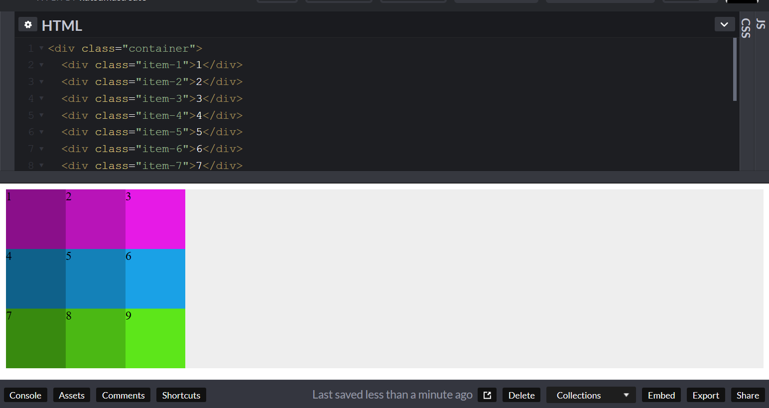
下記のようなhtml
<div class="container">
  <div class="item-1">1</div>
  <div class="item-2">2</div>
  <div class="item-3">3</div>
  <div class="item-4">4</div>
  <div class="item-5">5</div>
  <div class="item-6">6</div>
  <div class="item-7">7</div>
  <div class="item-8">8</div>
  <div class="item-9">9</div>
</div>
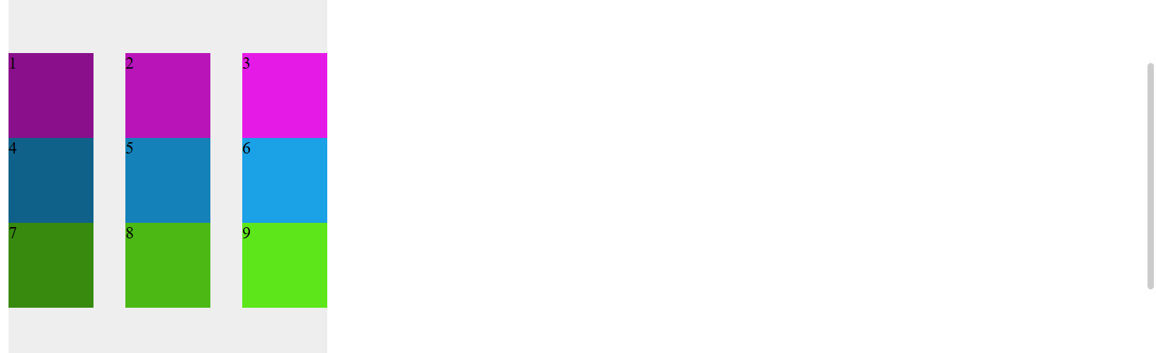
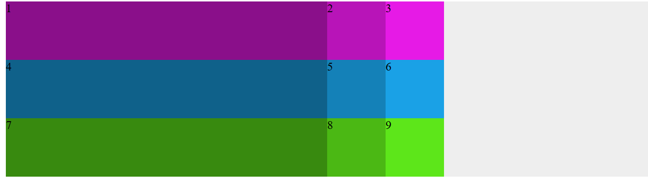
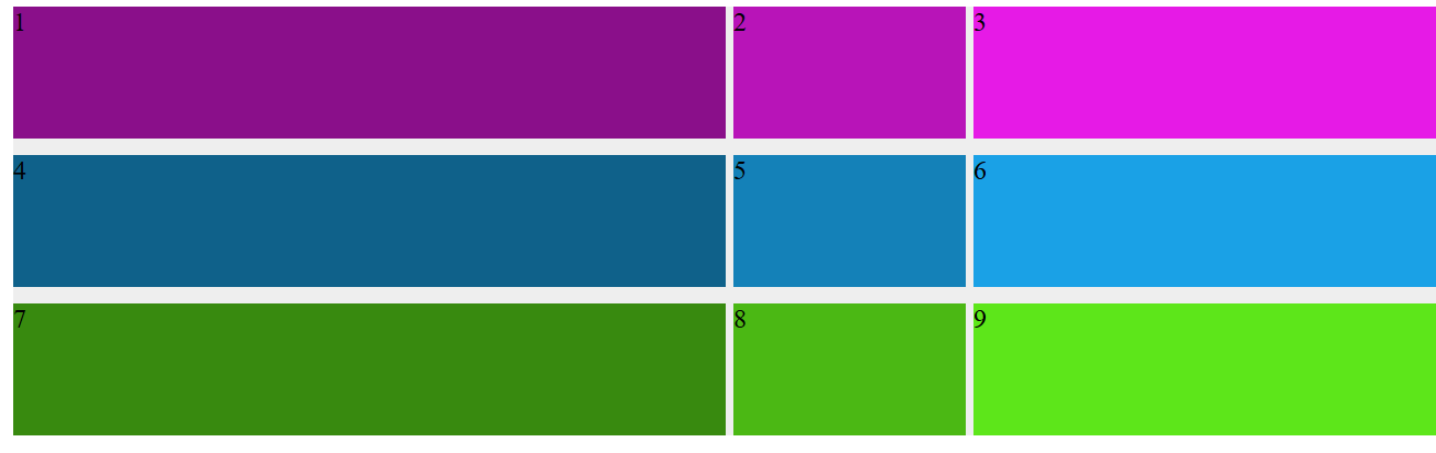
3*3マスのGrid Layout
)
.container {
  display: grid;
  grid-template-rows: 80px 80px 80px;
  grid-template-columns: 80px 80px 80px;
}

.container {
  display: grid;
  grid-template: 80px 80px 80px / 80px 80px 80px;
}

.container {
  display: grid;
  grid-template: repeat(3, 80px) / repeat(3, 80px);
}
どれも同じになる
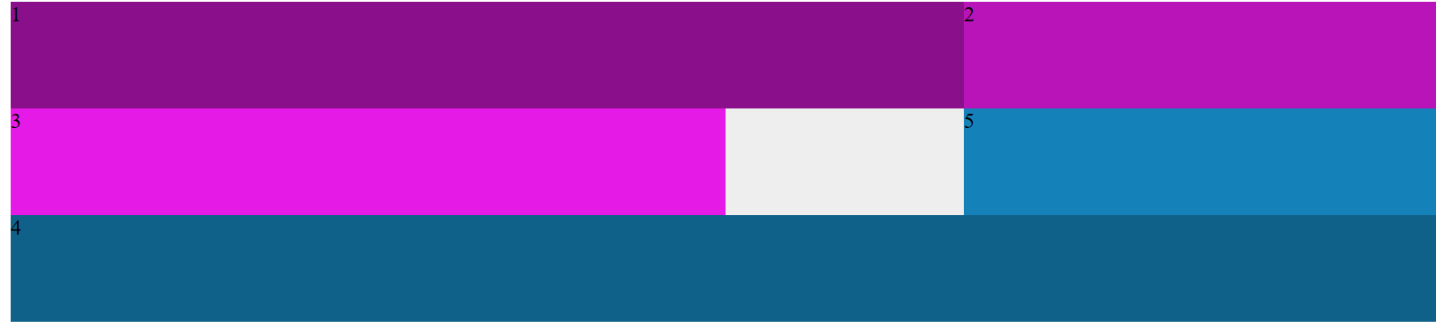
3*3だが画面幅まで揃えたい
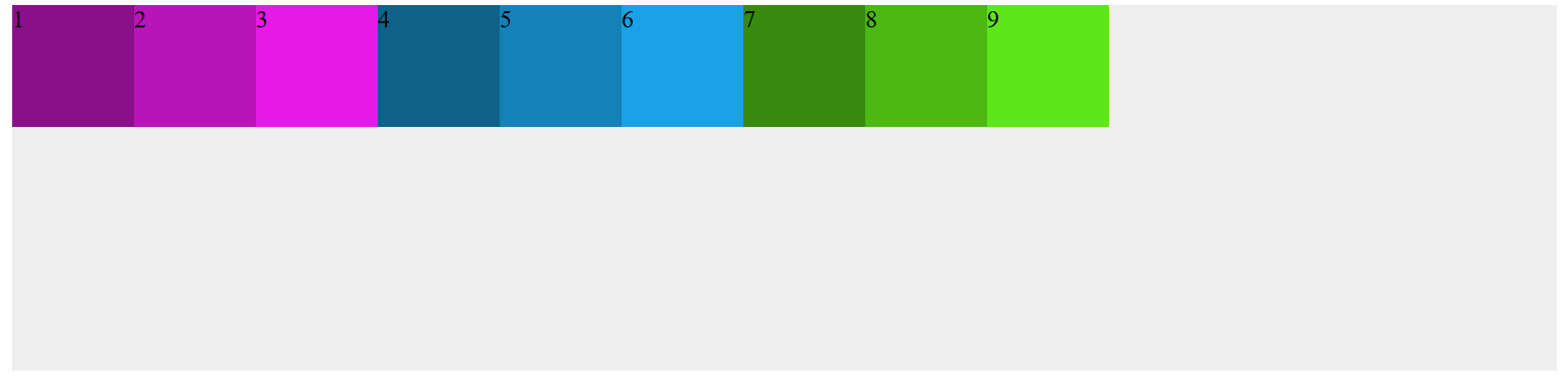
.container {
  background: #eee;
  display: grid;
  grid-template: repeat(3, 80px) / repeat(auto-fill, 80px);
}
ただレスポンシブで幅を縮めて、ピクセル幅によっては余白が生まれたりすることがある
幅をピクセルではなくパーセントで設定
.container {
  background: #eee;
  display: grid;
  grid-template: 80px 80px 80px / 50% 80px 80px;
}
パーセントにすると我慢幅の%(この場合左側が常に50%)を維持する
※ただ%の加算値が100以上になると突き抜けてしまう(画面幅を超えるため)
比率で表示
.container {
  background: #eee;
  display: grid;
  grid-template: 80px 80px 80px / 50% 1fr 2fr;
}
frはfraction(分数)この場合、columnsの残り50%を3等分してそれを1/3、2/3で分けている
そのため画面幅が変わっても比率は維持される
余白を設定したい
.container {
  background: #eee;
  display: grid;
  grid-template: 80px 80px 80px / 50% 1fr 2fr;
  grid-gap: 10px 5px;
}
gridはpaddingやmarginと違い、rowsとcolumnsで考える
※ブラウザによっては 接頭辞にgrid- をつける必要がある
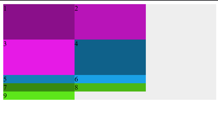
位置を調整したい
.container {
  background: #eee;
  display: grid;
  grid-template: 80px 80px 80px / 50% 1fr 2fr;
}
.item-1 {
  background: hsl(300, 80%, 30%);
  grid-row: 3;
  grid-column: 3;
}
これで.item-1が右下rowで3行目、columnで3列目になる。
spanやareaのプロパティがあるがここでは割愛
右下からの番号でも配置が可能
.container {
  background: #eee;
  display: grid;
  grid-template: 80px 80px 80px / 50% 1fr 2fr;
}
.item-1 {
  background: hsl(300, 80%, 30%);
  grid-row: -2;
  grid-column: -2;
}
数値ではなく変数で表す
.container {
  background: #eee;
  display: grid;
  grid-template: 80px 80px 80px / 50% 1fr [item-1] 2fr;
}
.item-1 {
  background: hsl(300, 80%, 30%);
  grid-row: -2;
  grid-column: item-1;
}
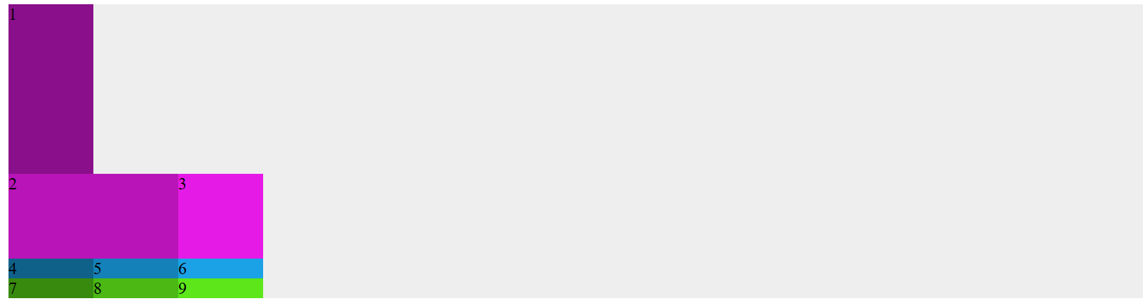
重なった場合z-index
.container {
  background: #eee;
  display: grid;
  grid-template: 80px 80px 80px / 50% 1fr 2fr;
}
.item-1 {
  background: hsl(300, 80%, 30%);
  grid-row: 3;
  grid-column: 3;
}
.item-4 {
  background: hsl(200, 80%, 30%);
  grid-row: 2 / 4;
  grid-column: 3 / 4;
}
こうすると4が1に重なってしまい、1の上に表示させたい場合
.container {
  background: #eee;
  display: grid;
  grid-template: 80px 80px 80px / 50% 1fr 2fr;
}
.item-1 {
  background: hsl(300, 80%, 30%);
  grid-row: 3;
  grid-column: 3;
  z-index: 0;
}
.item-4 {
  background: hsl(200, 80%, 30%);
  grid-row: 2 / 4;
  grid-column: 3 / 4;
}
z-index: 0;で一番上に表示される
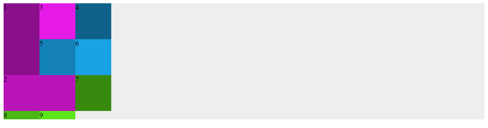
areasを使って配置する
gridは名前を使用することで自由に配置ができる
.container {
  background: #eee;
  display: grid;
  grid-template: 80px 80px 80px / 50% 1fr 2fr;
  grid-template-areas:
    "header header header1"
    "right-middle . left-middle"
    "footer footer footer";
  }
/*親要素にgrid-template-areasで名前を設定し、子要素にgrid-areaで名前を適用する*/
/*配置したくない箇所には.を設定する*/
.item-1 {
  background: hsl(300, 80%, 30%);
  grid-area: header;
}
.item-2 {
  background: hsl(300, 80%, 40%);
  grid-area: header1;
}
.item-3 {
  background: hsl(300, 80%, 50%);
  grid-area: right-middle;
}
.item-4 {
  background: hsl(200, 80%, 30%);
  grid-area: footer;
}
.item-5 {
  background: hsl(200, 80%, 40%);
  grid-area: left-middle;
}
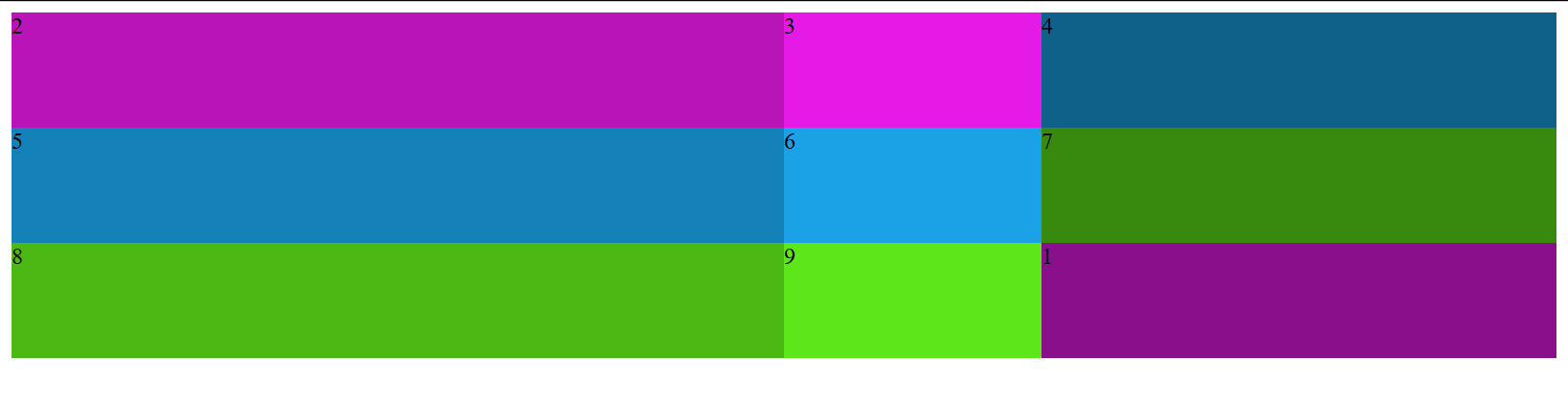
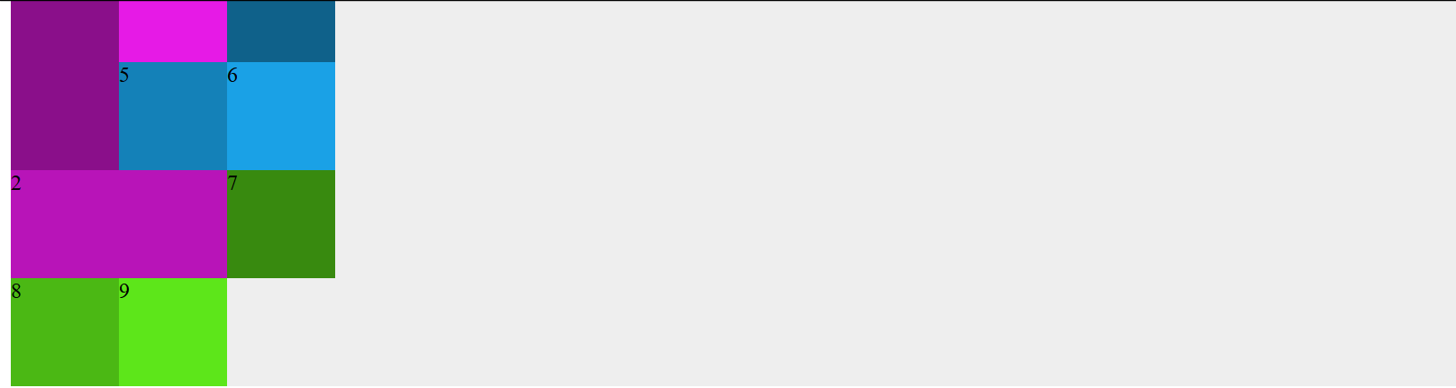
gridの幅からセルが飛び出してしまった
3*3だが画面幅まで揃えたいのときみたいにセルが飛び出してしまった
.container {
  background: #eee;
  display: grid;
  grid-template: 80px 80px 80px / 80px 80px 80px;
  }
.item-1 {
  background: hsl(300, 80%, 30%);
  grid-row: 3 / 1;
}
.item-2 {
  background: hsl(300, 80%, 40%);
  grid-column: 3 / 1;
}
- 1の横に空白が生まれた
- 4~9が3×3グリッドから飛び出してしまった
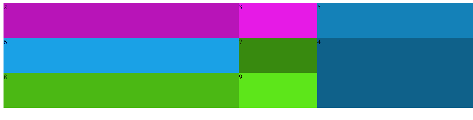
.container {
  background: #eee;
  display: grid;
  grid-template: 80px 80px 80px / 80px 80px 80px;
  grid-auto-flow: dense;/*grid-auto-flowプロパティで空いた隙間を自動で埋める*/
  }
.item-1 {
  background: hsl(300, 80%, 30%);
  grid-row: 3 / 1;
}
.item-2 {
  background: hsl(300, 80%, 40%);
  grid-column: 3 / 1;
}
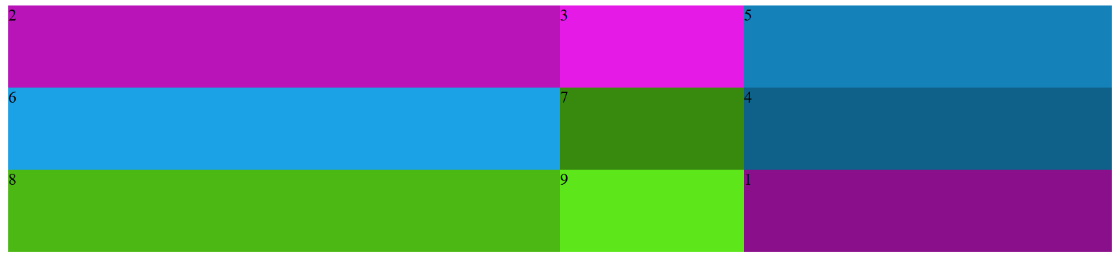
.container {
  background: #eee;
  display: grid;
  grid-template: 80px 80px 80px / 80px 80px 80px;
  grid-auto-flow: dense;
  grid-auto-rows: 80px;/*grid-auto-rowsもしくはgrid-auto-columnsプロパティではみ出したセルを設定する*/
*/
  }
.item-1 {
  background: hsl(300, 80%, 30%);
  grid-row: 3 / 1;
}
.item-2 {
  background: hsl(300, 80%, 40%);
  grid-column: 3 / 1;
}
レイアウトの配置
.container {
  background: #eee;
  width: 300px;
  height: 500px;
  display: grid;
  grid-template: 80px 80px 80px / 80px 80px 80px;
  justify-content: space-between;
  align-content: center;
  }
justify-contentで横の配置、align-contentで縦の配置。text-alignと似ています。