Material ComponentsにはTabLayoutというものがあり、ViewPagerなどと組み合わせてタブ切り替えのUIを提供します。
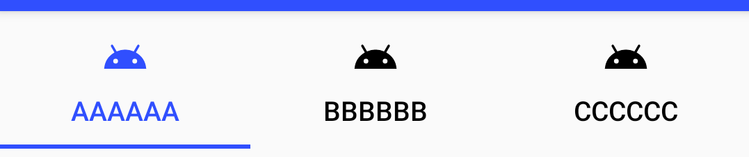
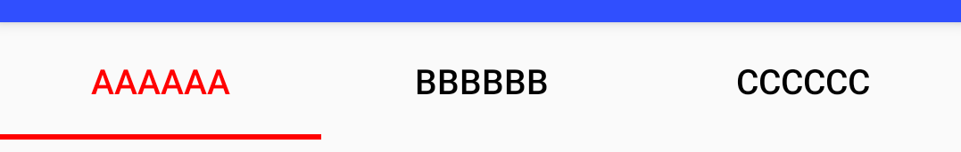
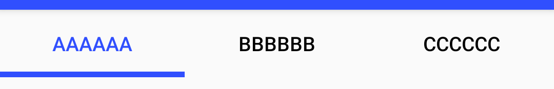
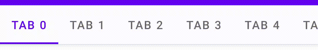
標準的な見た目は以下のようになっています。
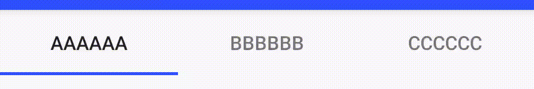
このように、標準では選択されているタブを示すインジケーターがアンダーラインで表示され、選択した場所へアニメーションを伴って移動します。
一方、iOS版のGoogleMapではタブがこんな動作をしています。(Android版はアニメーションしない)
これの実装がどうなっているのか、iOSに詳しくないこともあって分かりませんが、Segmented Controlが似た動きをしていますね。
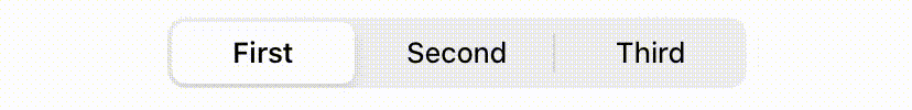
複数の選択肢があって、それを選択するとそこにボタン状の背景がアニメーションで移動する。というUIですね。
これをAndroidで実装するのは難しいと思うのですが、TabLayoutでどこまで頑張れるのか調べたのでまとめます。
タブの中身の工夫
いきなりインジケーターから外れますが、タブの中身をカスタマイズすることで選択されているタブを示す表示ができます。
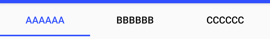
テキストの色
XMLからならapp:tabTextColorで選択されていないタブのテキストの色を、app:tabSelectedTextColorで選択されたタブのテキストの色を指定することができます。コードからならvoid setTabTextColors(int normalColor, int selectedColor)か、void setTabTextColors(@Nullable ColorStateList textColor)で2色を指定します。
<com.google.android.material.tabs.TabLayout
    android:id="@+id/tabs"
    android:layout_width="match_parent"
    android:layout_height="wrap_content"
    app:tabSelectedTextColor="@color/colorPrimary"
    app:tabTextColor="@color/black"
    />
アイコンの色
アイコンを設定している場合は、XMLからapp:tabIconTint、コードからはvoid setTabIconTint(@Nullable ColorStateList iconTint)かvoid setTabIconTintResource(@ColorRes int iconTintResourceId)で指定できます。
<selector xmlns:android="http://schemas.android.com/apk/res/android">
    <item android:color="@color/colorPrimary" android:state_selected="true"/>
    <item android:color="@color/black" android:state_selected="false"/>
</selector>
<com.google.android.material.tabs.TabLayout
    android:id="@+id/tabs"
    android:layout_width="match_parent"
    android:layout_height="wrap_content"
    app:tabSelectedTextColor="@color/colorPrimary"
    app:tabTextColor="@color/black"
    app:tabIconTint="@color/fg_tab"
    />
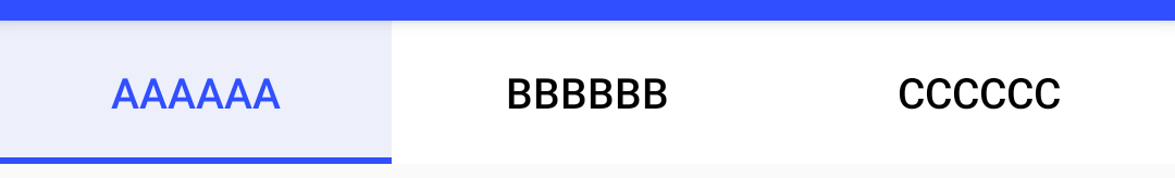
背景の指定
XMLからapp:tabBackgroundでタブの背景色を指定することができます。コードから設定する手段はなさそう?
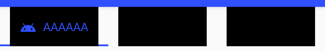
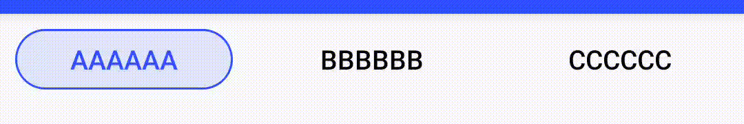
CustomViewの場合
CustomViewを表示させている場合、当然ながら前述のsetTabTextColorsやsetITabIconTintは使えませんが、選択されているタブはselected状態なのでStateListを使って選択状態に応じて表示を変えることができます。
っとその前に、CustomViewを使う場合、あらかじめ設定されているパディングに注意する必要があります。CustomViewに背景を設定してみると以下のようにタブの間に結構広めのパディングがあります。
このパディングを除去するためには、app:tabPaddingStart``app:tabPaddingEndを指定します。app:tabPaddingではパディングが残るので注意
<com.google.android.material.tabs.TabLayout
    android:id="@+id/tabs"
    android:layout_width="match_parent"
    android:layout_height="wrap_content"
    app:tabPaddingStart="0dp"
    app:tabPaddingEnd="0dp"
    />
その上で、カスタムViewの背景を指定するとそれっぽい表示ができたりします。
<selector xmlns:android="http://schemas.android.com/apk/res/android">
    <item android:state_selected="true">
        <shape android:shape="rectangle">
            <corners android:radius="20dp"/>
            <solid android:color="#20304FFE"/>
            <stroke android:color="#304FFE" android:width="1dp"/>
        </shape>
    </item>
    <item>
        <shape android:shape="rectangle"/>
    </item>
</selector>
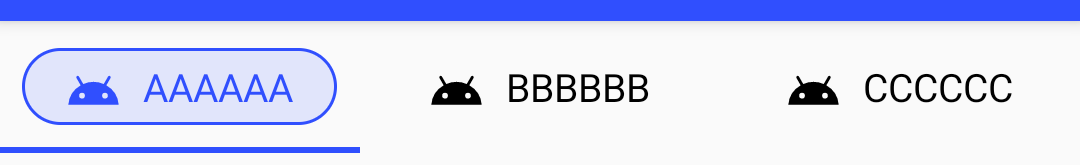
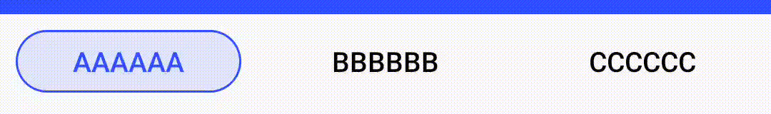
ただし、背景はアニメーションしてくれません。
またこの場合、アンダーラインのインジケーターが邪魔ですね。後述するようにインジケーターはDrawableとして指定できるので、nullを渡すなどすれば消すことができます。
<com.google.android.material.tabs.TabLayout
    android:id="@+id/tabs"
    android:layout_width="match_parent"
    android:layout_height="wrap_content"
    app:tabPaddingStart="0dp"
    app:tabPaddingEnd="0dp"
    app:tabIndicator="@null"
    />
インジケーターのカスタイマイズ
色
インジケーターの色は特に指定しなければcolorAccentの色になります。
変更したい場合は、XMLでapp:tabIndicatorColor、コードからはvoid setSelectedTabIndicatorColor(@ColorInt int color)で変更することができます。
表示位置
XMLからapp:tabIndicatorGravity、コードからvoid setSelectedTabIndicatorGravity(@TabIndicatorGravity int indicatorGravity)でインジケーターの表示位置を変更することができます。
取り得る値は、xmlの場合、bottom / center / top / stretch、コードからはTabLayoutの定数INDICATOR_GRAVITY_BOTTOM / INDICATOR_GRAVITY_CENTER / INDICATOR_GRAVITY_TOP / INDICATOR_GRAVITY_STRETCH を指定することができます。
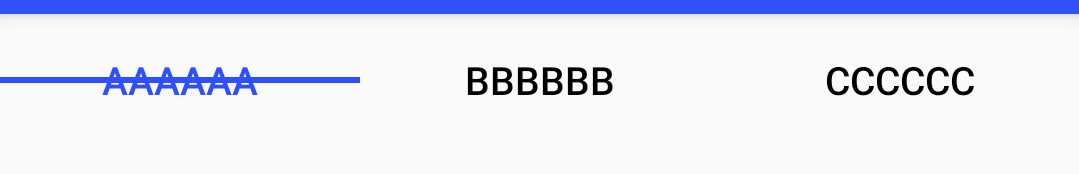
通常はbottomですね。
center:打ち消し線みたいになっちゃってます
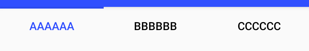
top:上付き
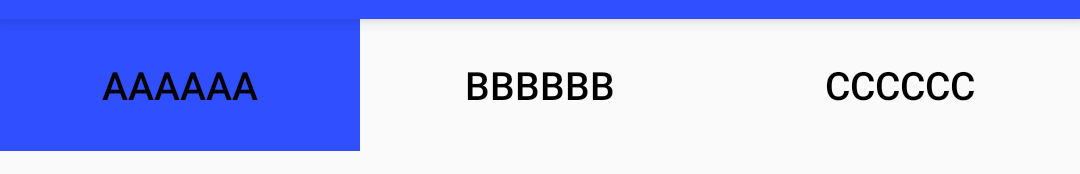
stretch:塗りつぶしになってしまうのでテキストの色を変えています
高さ
XMLからapp:tabIndicatorHeight、コードからvoid setSelectedTabIndicatorHeight(int height)でインジケーターの高さ(太さ)を指定できます。デフォルトは2dpのようです。ただしDeprecatedです。drawableを指定することができるので、変更したい場合は形状含めてそちらで指定すべきと言うことのようです。
形状
XMLからapp:tabIndicator、コードからvoid setSelectedTabIndicator(@DrawableRes int tabSelectedIndicatorResourceId)もしくはvoid setSelectedTabIndicator(@Nullable Drawable tabSelectedIndicator)で、indicatorとして表示する形状を指定することができます。
表示する大きさ(高さ)は(Gravityがstretch以外の場合)DrawableのintrinsicHeightが使われますので、Drawableを作る時に注意してください、GradientDrawableはsizeタグがない場合、intrinsicHeightが0になってしまうので表示されません。IndicatorHeightで指定することもできますが、こちらはDeprecatedです。
Drawableはあくまで形状を指定するのみで、描画する色はIndicatorColorが使われます。不透明度はだけは残りますが、色の情報は失われます。Drawableの色をどんなに頑張って指定しても反映されないので注意しましょう。
こんなGradientDrawableを定義すると、少し丸みを帯びたIndicatorにすることができます。(色は関係ないので黒を指定しています)
<shape
    xmlns:android="http://schemas.android.com/apk/res/android"
    android:shape="rectangle">
    <solid android:color="@color/black"/>
    <corners android:topLeftRadius="4dp" android:topRightRadius="4dp"/>
    <size android:height="4dp"/>
</shape>
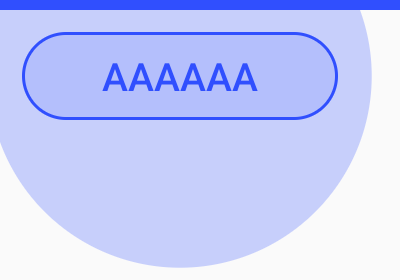
形状+stretch
tabIndicatorGravityをstretchするとタブの大きさでindicatorが表示されます。これを利用してボタン形状を表示させることができます。
タブの大きさいっぱいに表示されてしまうのでlayer-listで囲んで周囲のマージンを設定します。
<layer-list xmlns:android="http://schemas.android.com/apk/res/android">
    <item android:bottom="8dp" android:left="8dp" android:right="8dp" android:top="8dp">
        <shape android:shape="rectangle">
            <solid android:color="#20000000" />
            <stroke android:width="1dp" android:color="#000000" />
            <corners android:radius="20dp" />
        </shape>
    </item>
</layer-list>
<com.google.android.material.tabs.TabLayout
    android:id="@+id/tabs"
    android:layout_width="match_parent"
    android:layout_height="wrap_content"
    app:tabSelectedTextColor="@color/colorPrimary"
    app:tabTextColor="@color/black"
    app:tabIndicator="@drawable/indicator"
    app:tabIndicatorGravity="stretch"
    />
これでそれっぽく表示させることができました。
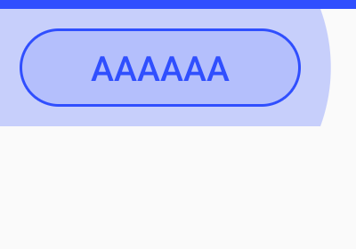
背景も併せてカスタマイズすると、スライドスイッチ風の表示もできますね。ドロップシャドウが使えないのがちょっと残念です。またスイッチ風にする場合、マージンを詰めて角丸部分をオーバーラップさせたいところですがそれも無理ですね。

その他
リップル指定
XMLからapp:tabRippleColor、コードからvoid setTabRippleColor(@Nullable ColorStateList color)でタブをタップしたときのリップルエフェクトの色を指定することができます。
<com.google.android.material.tabs.TabLayout
    android:id="@+id/tabs"
    android:layout_width="match_parent"
    android:layout_height="wrap_content"
    app:tabSelectedTextColor="@color/colorPrimary"
    app:tabTextColor="@color/black"
    app:tabIndicator="@drawable/indicator"
    app:tabIndicatorGravity="stretch"
    app:tabRippleColor="#10304FFE"
    />

また、通常はrippleの境界がtabのエリアになっていますが、app:tabUnboundedRipple="true"を指定することで、tabのエリアを越えて境界線を丸くすることができます。
<com.google.android.material.tabs.TabLayout
    android:id="@+id/tabs"
    android:layout_width="match_parent"
    android:layout_height="wrap_content"
    android:background="@android:color/transparent"
    app:tabIndicator="@drawable/indicator"
    app:tabIndicatorGravity="stretch"
    app:tabSelectedTextColor="@color/colorPrimary"
    app:tabTextColor="@android:color/black"
    app:tabRippleColor="#20304FFE"
    app:tabUnboundedRipple="true"
    />
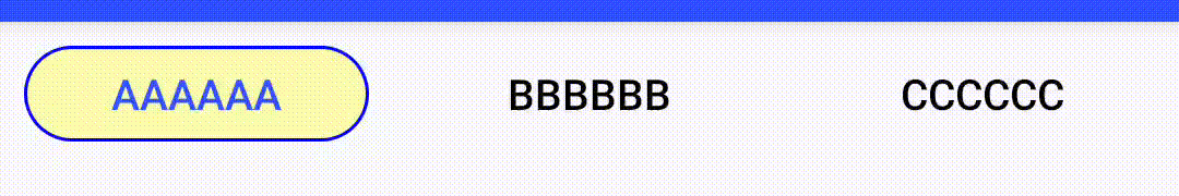
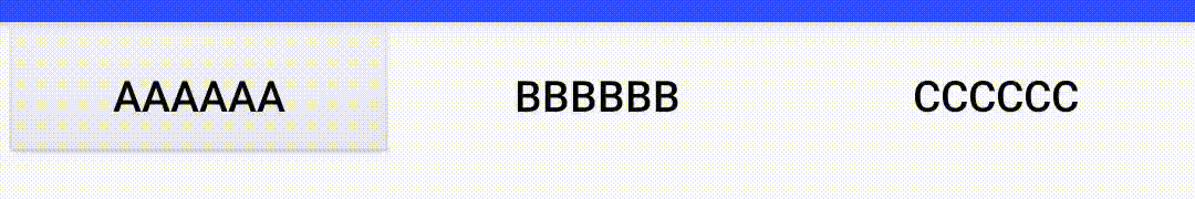
app:tabUnboundedRipple="true"を指定した場合、rippleはtabの大きさを超えて広がります。何も指定しないと最大でTabが内接する円の大きさまで広がります。
この範囲を限定したい場合は、backgroundを指定します。指定するのは透過色(@android:color/transparent)でもかまいません。TabLayoutにbackgroundを指定すればTabLayoutの範囲内に収まります。TabLayoutにはbackgroundを指定しないで、その親レイアウトでbackgroundを指定すると、その親の範囲内で広がります。
| backgroundがない場合 | TabLayoutにbackgroundを指定した場合 |
|---|---|
 |
 |
もう一歩
さて、大分当初の目的は達成できたような気がしないでもないのですが、app:tabIndicatorで指定できるdrawableは形状(+透過率)しか反映されず、app:tabIndicatorColorで塗りつぶされてしまうため、単色しか使うことができないですね。これが任意のDrawableを指定できるようになれば……ということでインジケータの描画がどのように行われるか、実装を調べてみます。
Drawable selectedIndicator;
selectedIndicator =
    DrawableCompat.wrap(
        tabSelectedIndicator != null ? tabSelectedIndicator : defaultSelectionIndicator);
selectedIndicator.setBounds(indicatorLeft, indicatorTop, indicatorRight, indicatorBottom);
if (selectedIndicatorPaint != null) {
  if (VERSION.SDK_INT == VERSION_CODES.LOLLIPOP) {
    // Drawable doesn't implement setTint in API 21
    selectedIndicator.setColorFilter(
        selectedIndicatorPaint.getColor(), PorterDuff.Mode.SRC_IN);
  } else {
    DrawableCompat.setTint(selectedIndicator, selectedIndicatorPaint.getColor());
  }
}
selectedIndicator.draw(canvas);
setColorFilterもしくはsetTintで描画色が上書きされてしまっていますね。(selectedIndicatorPaintがnullなら設定されなさそうですが、selectedIndicatorPaintはNonNullです)DrawableCompat.wrapを挟んでいるのもめんどくさそうです。DrawableCompat.wrapの実装は以下のようになっています。
public static Drawable wrap(@NonNull Drawable drawable) {
    if (Build.VERSION.SDK_INT >= 23) {
        return drawable;
    } else if (Build.VERSION.SDK_INT >= 21) {
        if (!(drawable instanceof TintAwareDrawable)) {
            return new WrappedDrawableApi21(drawable);
        }
        return drawable;
    } else {
        if (!(drawable instanceof TintAwareDrawable)) {
            return new WrappedDrawableApi14(drawable);
        }
        return drawable;
    }
}
TintAwareDrawableであればそのまま使われる……ということで、TintAwareDrawableを実装してTintを無視するDrawableWrapperを作ってやればいいんじゃないか?ってことでやってみました。
最低限使われているメソッドだけ実装すればいいのでここまでやる必要は無いでしょうが、WrappedDrawableApi21を参考に実装します。
class TintDisabledDrawableWrapper(
    private val wrappedDrawable: Drawable
) : Drawable(), TintAwareDrawable {
    override fun getDirtyBounds(): Rect = wrappedDrawable.dirtyBounds
    override fun jumpToCurrentState() = wrappedDrawable.jumpToCurrentState()
    override fun draw(canvas: Canvas) = wrappedDrawable.draw(canvas)
    override fun getChangingConfigurations(): Int = wrappedDrawable.changingConfigurations
    override fun isStateful(): Boolean = wrappedDrawable.isStateful
    override fun setState(stateSet: IntArray): Boolean = wrappedDrawable.setState(stateSet)
    override fun getState(): IntArray = wrappedDrawable.state
    override fun getCurrent(): Drawable = wrappedDrawable.current
    override fun getOpacity(): Int = wrappedDrawable.opacity
    override fun getTransparentRegion(): Region? = wrappedDrawable.transparentRegion
    override fun getIntrinsicWidth(): Int = wrappedDrawable.intrinsicWidth
    override fun getIntrinsicHeight(): Int = wrappedDrawable.intrinsicHeight
    override fun getMinimumWidth(): Int = wrappedDrawable.minimumWidth
    override fun getMinimumHeight(): Int = wrappedDrawable.minimumHeight
    override fun getPadding(padding: Rect): Boolean = wrappedDrawable.getPadding(padding)
    override fun isAutoMirrored(): Boolean = wrappedDrawable.isAutoMirrored
    override fun getConstantState(): ConstantState? = null
    override fun mutate(): Drawable = wrappedDrawable.mutate()
    override fun onLevelChange(level: Int): Boolean = wrappedDrawable.setLevel(level)
    override fun setTint(tint: Int) = Unit
    override fun setTintList(tint: ColorStateList?) = Unit
    override fun setTintMode(tintMode: PorterDuff.Mode?) = Unit
    override fun setHotspot(x: Float, y: Float) {
        wrappedDrawable.setHotspot(x, y)
    }
    override fun setHotspotBounds(left: Int, top: Int, right: Int, bottom: Int) {
        wrappedDrawable.setHotspotBounds(left, top, right, bottom)
    }
    override fun getOutline(outline: Outline) {
        wrappedDrawable.getOutline(outline)
    }
    override fun onBoundsChange(bounds: Rect) {
        wrappedDrawable.bounds = bounds
    }
    override fun setChangingConfigurations(configs: Int) {
        wrappedDrawable.changingConfigurations = configs
    }
    override fun setDither(dither: Boolean) {
        wrappedDrawable.setDither(dither)
    }
    override fun setFilterBitmap(filter: Boolean) {
        wrappedDrawable.isFilterBitmap = filter
    }
    override fun setAlpha(alpha: Int) {
        wrappedDrawable.alpha = alpha
    }
    override fun setColorFilter(cf: ColorFilter?) {
        wrappedDrawable.colorFilter = cf
    }
    override fun setAutoMirrored(mirrored: Boolean) {
        wrappedDrawable.isAutoMirrored = mirrored
    }
    override fun setVisible(visible: Boolean, restart: Boolean): Boolean =
        wrappedDrawable.setVisible(visible, restart)
}
これにDrawableを包んで指定します。
tabs.setSelectedTabIndicator(TintDisabledDrawableWrapper(getDrawable(R.drawable.indicator)!!))
indicatorは適当に2色使ってみます
<?xml version="1.0" encoding="utf-8"?>
<layer-list xmlns:android="http://schemas.android.com/apk/res/android">
    <item android:bottom="8dp" android:left="8dp" android:right="8dp" android:top="8dp">
        <shape android:shape="rectangle">
            <solid android:color="#50ffff00" />
            <stroke android:width="1dp" android:color="#0000ff" />
            <corners android:radius="20dp" />
        </shape>
    </item>
</layer-list>
これで、Drawableの色を直接描画させてやることができました。
標準ボタンの背景(画像)でもいけます。
ただし、これはTabLayoutの実装を調べてその裏をつくような細工な訳なので、TabLayoutの実装が変わったりすると使えなくなるなどの問題が起こる可能性があります。ちょっとこれを本番アプリに実装しようとは思えないですね。。。
スクロールさせる場合
インジケータそのものとはちょっと違いますが、タブ3つぐらいまでなら一つの画面に収まりますが、収まらない場合は、app:tabMode="scrollable"を指定することでタブ全体をスクロールさせるようになります。
app:tabMode="auto"なら画面内に収まるまでは画面幅をいっぱいに使い、収まらなくなるとスクロールするように自動的に変わってくれます。
スクロールさせる場合に、最初や最後のタブを選択している場合に、画面端ではなく、すこしパディングを開けたい場合があります。この場合の常套手段として、paddingを設定した上でandroid:clipToPadding="false"を設定するというものがありますが
<com.google.android.material.tabs.TabLayout
...
    android:paddingStart="64dp"
    android:paddingEnd="64dp"
    android:clipToPadding="false"
    app:tabMode="scrollable"
    />
これでもそれっぽく動くのですが、困ったことに、スクロール中中央にあった現在タブの位置がpaddingStart分だけ中央からずれてしまいます。
これを回避するには、android:paddingStartの代わりに、app:tabContentStartを指定します。
<com.google.android.material.tabs.TabLayout
...
    android:clipToPadding="false"
    android:paddingStart="0dp"
    android:paddingEnd="64dp"
    app:tabContentStart="64dp"
    app:tabMode="scrollable"
    />
これで、開始と末尾にマージンが設定され、スクロール中のインジケータの位置がずれることがありません。
まとめ
以上、TabLayoutのインジケーターをカスタマイズする方法を紹介しました。
あらかじめ用意されている機能だけでも想像以上にいろいろと変更することができるんですね。