FacebookやYoutubeなどで最近良く見かけるコンテンツローダーを手軽に実装できるvue-content-loaderの紹介です。
簡単に導入できてSPAぽいリッチな表現ができるのでおすすめです。
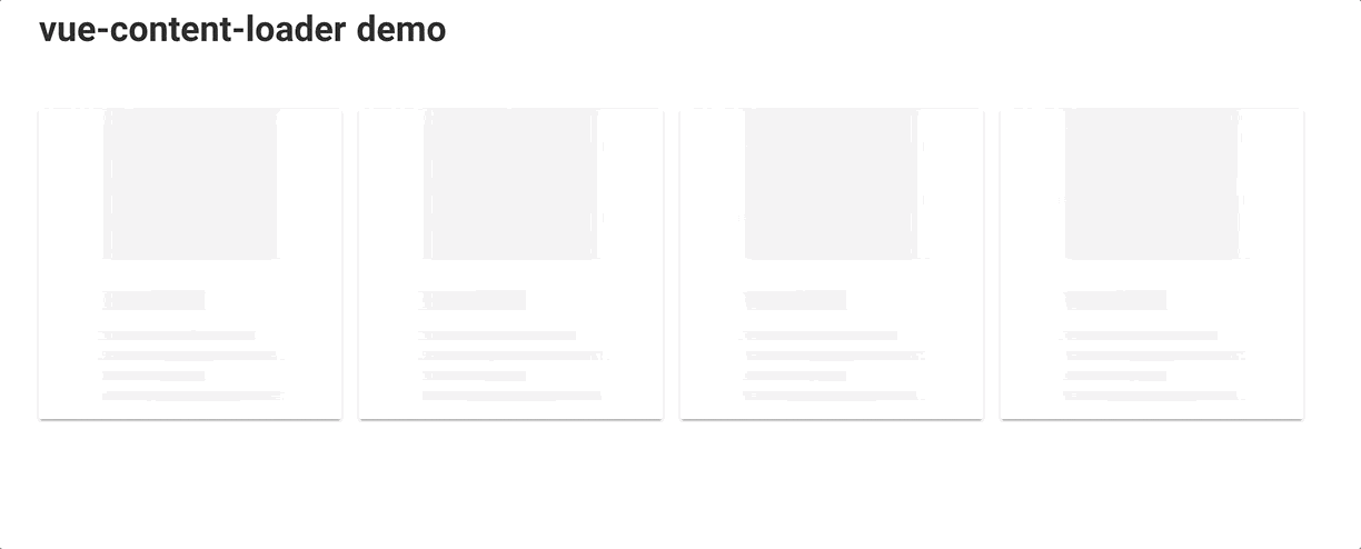
以下のようなものを作成します。
(GIFの都合上カクついてますが、実際はもっとなめらかです。)
vue-content-loaderのインストール
https://github.com/egoist/vue-content-loader
を利用します。Reactにあるreact-content-loaderのvue版のようです、
Vueプロジェクト上で、パッケージを追加します。
$ yarn add vue-content-loader
実装サンプル
あとは、importして使うだけです。
LoadingBlogSectionコンポーネントというものを作成します。
見栄えを整えるため、vuetify (https://vuetifyjs.com/en) を使っています。
<template lang="pug">
  v-container(grid-list-lg fluid pa-0)
    v-layout(row wrap)
      v-flex(v-for="n in 4" :key="n" xs12 md3)
        v-card
          content-loader(:width="300" :height="300")
            rect(width="100%" height="150")
            rect(y="180" x="15" width="150" height="20")
            rect(y="220" x="15" width="200" height="10")
            rect(y="240" x="15" width="250" height="10")
            rect(y="260" x="15" width="150" height="10")
            rect(y="280" x="15" width="250" height="10")
</template>

<script>
import { ContentLoader } from 'vue-content-loader'

export default {
  components: {
    ContentLoader
  }
}
</script>
以下部分でContentLoaderの読み込みと、componentsへの登録を行います。
<script>
import { ContentLoader } from 'vue-content-loader'

export default {
  components: {
    ContentLoader
  }
}
</script>
次にLoader表示部分です。
content-loader内部のrectというコンポーネントで四角のSVGを表示しています。
yが上部からの絶対位置、xが左部からの絶対位置です。
<template lang="pug">
...
        v-card
          content-loader(:width="300" :height="300")
            rect(width="100%" height="150")
            rect(y="180" x="15" width="150" height="20")
            rect(y="220" x="15" width="200" height="10")
            rect(y="240" x="15" width="250" height="10")
            rect(y="260" x="15" width="150" height="10")
            rect(y="280" x="15" width="250" height="10")
...
これでローディング用のコンポーネントが出来たので、
あとは、v-ifでローディング状態を判定して、ローディング中のみ表示するようにすればOKです。
以下Apolloの例で、$apollo.loadingでローディング状態を判定しています。
BlogSectionがAjaxで取得したデータの表示用のコンポーネントです。
<template lang="pug">
  v-content
    v-container
      h1(class="mb-5") vue-content-loader demo
      <!-- この部分でv-ifで判定して、表示を切り替えている -->
      BlogSection(:posts="posts" v-if="!$apollo.loading")
      LoadingBlogSection(v-if="$apollo.loading")
</template>

<script>
import { FETCH_POST_BY_LIMIT } from '@/apollo/query/posts'
import BlogSection from '@/components/BlogSection'
import LoadingBlogSection from '@/components/LoadingBlogSection'

const POSTS_LIMIT = 4

export default {
  components: {
    BlogSection,
    LoadingBlogSection
  },
  apollo: {
    posts: {
      query: FETCH_POST_BY_LIMIT,
      variables () {
        return {
          first: POSTS_LIMIT
        }
      }
    }
  }
}
</script>
これで完成です。
参考: ローディングのSVGをGUIで調整する
svgで表示する部分は、以下サイトにてGUI上で調整が行えます。
https://create-vue-content-loader.netlify.com/
完了したら、左ペインのコードをコピペして使ってください。
