概要
Cardコンポーネントの初歩的な使い方のまとめです。
環境
- Windows 10 Professional 1909
- Node.js 12.14.1
- Vue.js 2.6.11
- Vuetify.js 2.2.8 (投稿時は2.2.6)
参考
- [Quick start - Vuetify.js] (https://vuetifyjs.com/en/getting-started/quick-start)
- [Components] (https://vuetifyjs.com/en/components/api-explorer)
- [Colors] (https://vuetifyjs.com/en/styles/colors)
- [Material Design Icons] (https://cdn.materialdesignicons.com/4.5.95/)
[Cards] (https://vuetifyjs.com/en/components/cards)
構造
Cardはv-cardコンポーネントと、v-card-title、v-card-subtitle、v-card-text、v-card-actions関数型コンポーネントからなります。
これらを使った場合の構造は下記のようになりますが、v-card以外は必須ではありません。
v-card
   |
   `--- v-card-title
   |
   `--- v-card-subtitle
   |
   `--- v-card-text
   |
   `--- v-card-actions
v-containerを使った例
v-card
   |
   `--- v-container
            |
            `--- v-row
                    |
                    `--- v-col
                    `--- v-col
v-list-itemを使った例
v-card
   |
   `--- v-list-item
   |       |
   |       `--- v-list-item-content
   |       |       |
   |       |       `--- v-list-item-title
   |       |       |
   |       |       `--- v-list-item-subtitle
   |       |
   |       `--- v-list-item-avatar
   |
   `--- v-card_actions
Props
VCard
- [VCard] (https://github.com/vuetifyjs/vuetify/blob/v2.2.8/packages/vuetify/src/components/VCard/VCard.ts)
- [VSheet] (https://github.com/vuetifyjs/vuetify/blob/v2.2.8/packages/vuetify/src/components/VSheet/VSheet.ts)
- [Loadable] (https://github.com/vuetifyjs/vuetify/blob/v2.2.8/packages/vuetify/src/mixins/loadable/index.ts)
- [Routable] (https://github.com/vuetifyjs/vuetify/blob/v2.2.8/packages/vuetify/src/mixins/routable/index.ts)
VCard  ---- VSheet    ---- BindsAttrs
       |              `--- Colorable
       |              `--- Elevatable
       |              `--- Measurable
       |              `--- Themeable
       |
       `--- Loadable
       `--- Routable
| name | type | default | relation | src | |
|---|---|---|---|---|---|
| VCard | flat | boolean | false | ||
| hover | boolean | false | elevation | ||
| img | string | undefined | v-img | ||
| link | boolean | false | |||
| loader-height | number or string | 4 | 4 | ||
| outlined | boolean | false | |||
| raised | boolean | false | elevation | ||
| shaped | boolean | false | |||
| VSheet | tag | string | 'div' | 'div' | |
| tile | boolean | false | |||
| Colorable | color | string | undefined | ||
| Elevatable | elevation | number or string | undefined | ||
| Measurable | height | number or string | undefined | ||
| max-height | number or string | undefined | |||
| max-width | number or string | undefined | |||
| min-height | number or string | undefined | |||
| min-width | number or string | undefined | |||
| width | number or string | undefined | |||
| Themeable | dark | boolean | false | null | |
| light | boolean | false | null | ||
| Loadable | loading | boolean or string | false | false | |
| loader-height | number or string | - | 2 | ||
| Routable | active-class | string | undefined | ||
| append | boolean | false | |||
| disabled | boolean | false | |||
| exact | boolean | false | undefined | ||
| exact-active-class | string | undefined | |||
| link | boolean | - | |||
| href | string or object | undefined | target, link | ||
| to | string or object | undefined | link | ||
| nuxt | boolean | false | nuxt framework | ||
| replace | boolean | false | |||
| ripple | boolean or object | undefined | null | ||
| tag | string | - | |||
| target | string | undefined | href |
実装例
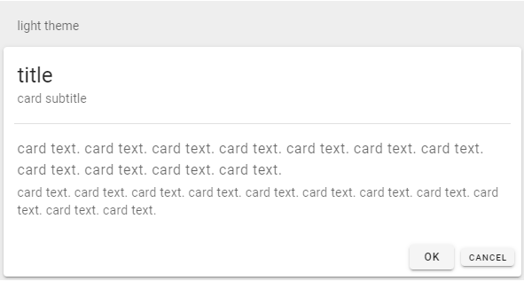
テーマ
dark
<v-card dark>
  <v-card-title class="headline">title</v-card-title>
  <v-card-subtitle>card subtitle</v-card-subtitle>
  <v-divider class="mx-3"></v-divider>
  <v-card-text>
    <div class="body-1 mb-1">card text. card text. card text. card text. card text. card text. card text. card text. card text. card text. card text.</div>
    <div class="body-2 mb-1">card text. card text. card text. card text. card text. card text. card text. card text. card text. card text. card text.</div>
  </v-card-text>
  <v-card-actions>
    <v-spacer></v-spacer>
    <v-btn small>OK</v-btn>
    <v-btn x-small>Cancel</v-btn>
  </v-card-actions>
</v-card>

light
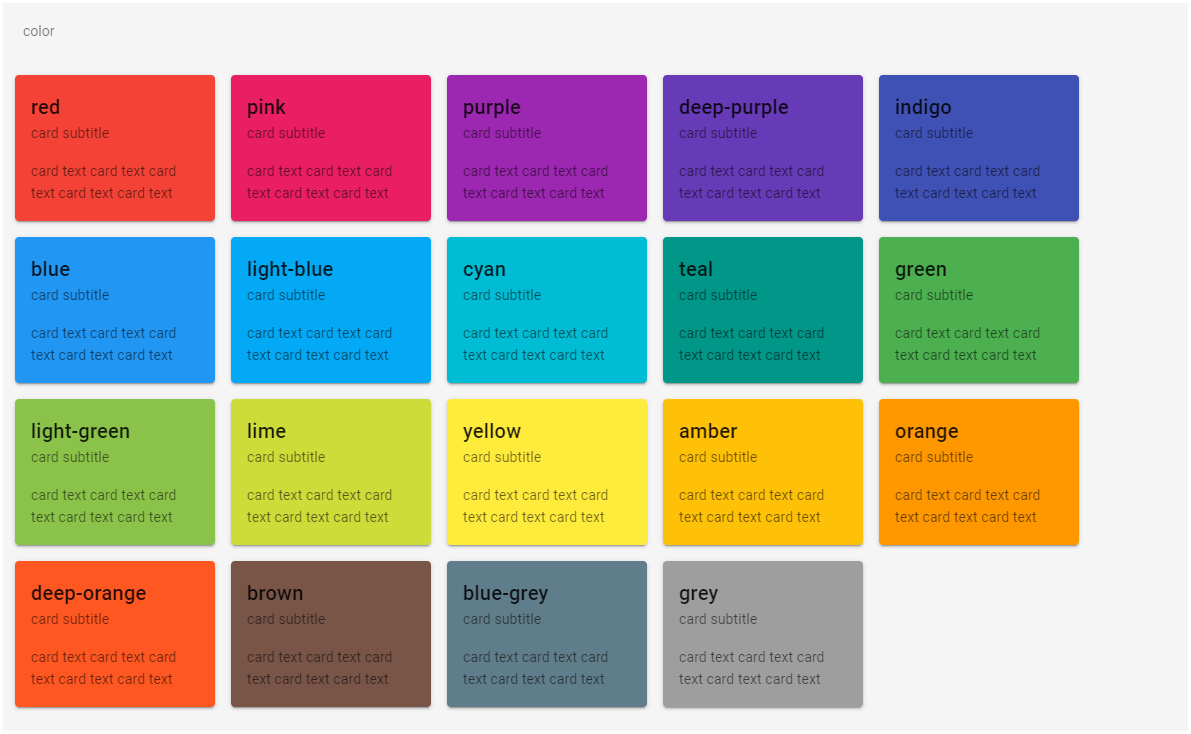
カラー
colorプロパティでカードの背景色を指定します。
<v-card color="red" width="200" class="ma-2">
  <v-card-title>red</v-card-title>
</v-card>
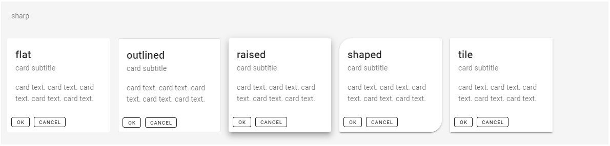
形状
カードの形状、外見を決めるプロパティにflat、outlined、raised、shaped、tileがあります。図の例ではそれぞれ単体で使用していますが、組み合わせることもできます。
<v-card flat width="200" class="ma-2">
  <v-card-title>flat</v-card-title>
  // ...省略 ...
</v-card>

<v-card outlined width="200" class="ma-2">
  <v-card-title>outlined</v-card-title>
  // ...省略 ...
</v-card>

<v-card raised width="200" class="ma-2">
    <v-card-title>raised</v-card-title>
    // ...省略 ...
</v-card>

<v-card shaped width="200" class="ma-2">
  <v-card-title>shaped</v-card-title>
  // ...省略 ...
</v-card>

<v-card tile width="200" class="ma-2">
  <v-card-title>tile</v-card-title>
  // ...省略 ...
</v-card>
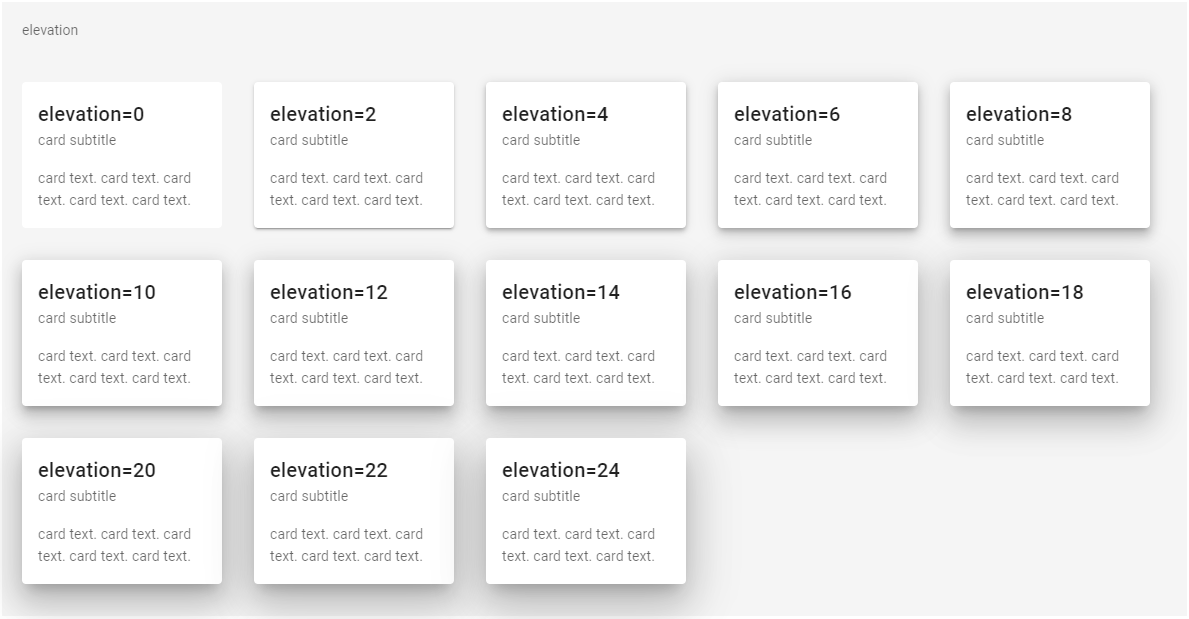
エレベーション
elevationプロパティには0から24までの数値を指定できます。数値が大きくなるほどカードが浮き上がって見えます。
<v-card elevation="0" width="200" class="ma-4">
  <v-card-title>elevation=0</v-card-title>
  // ...省略...
</v-card>
ホバー
hoverプロパティを指定するとマウスカーソルを合わせたときに、カーソルがポインターになりカードが浮き上がるエフェクトが発生します。なおhoverだけでは後述するリップルは発生しません。
<v-card hover width="200" class="ma-2">
  <v-card-title>card 1</v-card-title>
  // ...省略...
</v-card>

ページ遷移
カードをクリックしたときにページ遷移を行うにはto、nuxt、hrefプロパティを使います。
vue-routerの場合はto、Nuxtの場合はnuxt、外部のページへ遷移する場合はhrefが使用できます。hrefでは新しくタブを開きたい場合にtargetプロパティも使用できます。
<v-card :to="{ name: 'Card' }" exact-active-class="teal lighten-4" width="200" class="ma-2">
  <v-card-title>to + exact-active-class</v-card-title>
  // ...省略...
</v-card>

<v-card href="https://www.google.co.jp" target="_blank" width="200" class="ma-2">
  <v-card-title>href + target</v-card-title>
  // ...省略...
</v-card>
アンカーリンク
hrefプロパティの値に#から始まる文字列を指定することでカードをアンカーリンクとして使用できます。
<v-card href="#section1" width="200" class="ma-2">
  <v-card-title>section1</v-card-title>
  // ...省略...
</v-card>
リップル
クリック可能なカード(マウスカーソルがポインターになる)に、rippleプロパティを指定するとカードをクリックしたときにリップル(波紋)のエフェクトが発生します。デフォルトではクリックした点を中心に波紋が広がるエフェクトですが、center=trueという指定にすると必ずカードの中心から波紋が広がります。またclassで波紋の色を指定することもできます。
<v-card link width="200" class="ma-2">
  <v-card-title>default</v-card-title>
  // ...省略...
</v-card>

<v-card link :ripple="{ center: true }" width="200" class="ma-2">
  <v-card-title>center=true</v-card-title>
  // ...省略...
</v-card>

<v-card link :ripple="{ center: false, class: 'teal--text accent-1' }" width="200" class="ma-2">
  <v-card-title>center=false, class=teal--text</v-card-title>
  // ...省略...
</v-card>
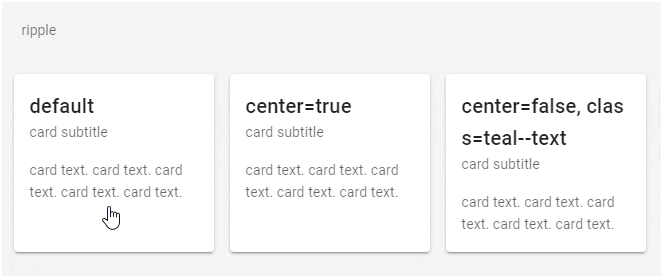
なお:ripple="false"とするとリップルのエフェクトは発生しなくなります。
<v-card link :ripple="false">
ローディング
loadingプロパティにtrueをセットするとローディングバーが表示されローディングのエフェクトが発生し、falseをセットすると終了します。
ローディングバーの高さ(太さ)はloader-heightで指定できます。
<v-card :loading="loading" loader-height="8" height="200" width="400" class="ma-2">
  <v-card-title class="headline">title</v-card-title>
  <v-card-subtitle>card subtitle</v-card-subtitle>
  <v-card-text>
    <div>card text. card text. card text. card text. card text. card text.</div>
  </v-card-text>
  <v-card-actions>
    <v-btn @click="load" :disabled="loading" v-text="loadLabel"></v-btn>
  </v-card-actions>
</v-card>
export default {
  data() {
    return {
      loading: false,
      loadLabel: "Load"
    };
  },
  methods: {
    load() {
      this.loading = true;
      this.loadLabel = "Now Loading";
      setTimeout(() => {
        this.loading = false;
        this.loadLabel = "Load";
      }, 5000);
    }
  }
};

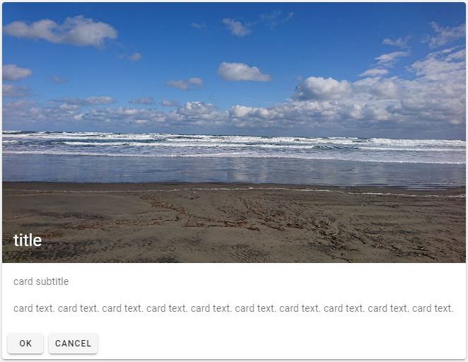
背景画像
imgプロパティでカードの背景画像を指定できます。
<v-card :img="require('@/assets/sea.png')" height="369" width="656">
  <v-card-title class="headline white--text">title</v-card-title>
  <v-card-subtitle class="white--text">card subtitle</v-card-subtitle>
  <v-card-text class="white--text">
    <div>card text. card text. card text. card text. card text. card text. card text. card text. card text. card text.</div>
  </v-card-text>
  <v-card-actions>
    <v-btn small>OK</v-btn>
    <v-btn small>Cancel</v-btn>
  </v-card-actions>
</v-card>

カード内に画像を表示するにはv-imgコンポーネントを使う方法もあります。
<v-card max-width="656">
  <v-img :src="require('@/assets/sea.png')" height="369" class="white--text align-end">
    <v-card-title class="headline">title</v-card-title>
  </v-img>
  <v-card-subtitle>card subtitle</v-card-subtitle>
  <v-card-text>
    <div>card text. card text. card text. card text. card text. card text. card text. card text. card text. card text.</div>
  </v-card-text>
  <v-card-actions>
    <v-btn small>OK</v-btn>
    <v-btn small>Cancel</v-btn>
  </v-card-actions>
</v-card>
Slots
progress
progressスロットで任意のローディングエフェクトを実装できます。この例ではローディングにv-progress-circularコンポーネントを使用しています。
<v-card :loading="loading2" height="200" width="400" class="ma-2">
  <template slot="progress">
    <div class="text-center py-12">
      <div class="headline">Now Loading...</div>
      <v-progress-circular :size="56" width="8" color="primary" indeterminate></v-progress-circular>
    </div>
  </template>
  <v-card-title class="headline">title</v-card-title>
  <v-card-subtitle>card subtitle</v-card-subtitle>
  <v-card-text>
    <div>card text. card text. card text. card text. card text. card text.</div>
  </v-card-text>
  <v-card-actions>
    <v-btn @click="load2" :disabled="loading2" v-text="loadLabel2"></v-btn>
  </v-card-actions>
</v-card>
export default {
    data() {
        return {
            loading2: false,
            loadLabel2: "Load"
        };
    },
    methods: {
        load2() {
            this.loading2 = true;
            this.loadLabel2 = "Now Loading";
            setTimeout(() => {
                this.loading2 = false;
                this.loadLabel2 = "Load";
            }, 5000);
        }
    }
};

Events
click
このイベントを使用するとカードはクリック可能になりリップルが有効になります。
<v-card @click="cardClick" width="400" class="ma-2">
    <v-card-title>click event</v-card-title>
    <v-card-subtitle>card subtitle</v-card-subtitle>
    <v-card-text>
        <div>card text. card text. card text. card text. card text.</div>
    </v-card-text>
    <v-card-actions>
        <v-btn small>OK</v-btn>
        <v-btn small>Cancel</v-btn>
    </v-card-actions>
</v-card>
引数にMouseEventを取ります。
methods: {
    cardClick(e) {
        // eslint-disable-next-line no-console
        console.log('card click', e);
    }
}