概要
Pagination、Stepperコンポーネントの初歩的な使い方のまとめです。
環境
- Windows 10 Professional 1909
- Node.js 12.14.1
- Vue.js 2.6.11
- Vuetify.js 2.2.8 (投稿時は2.2.4)
参考
- [Quick start - Vuetify.js] (https://vuetifyjs.com/en/getting-started/quick-start)
- [Components] (https://vuetifyjs.com/en/components/api-explorer)
- [Colors] (https://vuetifyjs.com/en/styles/colors)
[Paginations] (https://vuetifyjs.com/en/components/paginations)
Props
VPagination
- [VPagination] (https://github.com/vuetifyjs/vuetify/blob/v2.2.8/packages/vuetify/src/components/VPagination/VPagination.ts)
- [Colorable] (https://github.com/vuetifyjs/vuetify/blob/v2.2.8/packages/vuetify/src/mixins/colorable/index.ts)
- [Themeable] (https://github.com/vuetifyjs/vuetify/blob/v2.2.8/packages/vuetify/src/mixins/themeable/index.ts)
VPagination  ---- Colorable
             `--- Themeable
| name | type | default | relation | src | |
|---|---|---|---|---|---|
| VPagination | circle | boolean | false | ||
| disabled | boolean | false | |||
| length | number | 0 | 0 | ||
| next-icon | string | '$next' | '$next' | ||
| prev-icon | string | '$prev' | '$prev' | ||
| total-visible | number or string | undefined | |||
| value | number | 0 | 0 | ||
| Colorable | color | string | undefined | ||
| Themeable | dark | boolean | false | null | |
| light | boolean | false | null |
- value : 現在選択されているページ
実装例
テーマ
dark
上段左側はデフォルト、上段右側はcircleプロパティを指定したものです。
下段は両方にdisabledプロパティを指定したものです。
<v-pagination dark v-model="p1" :length="20"> </v-pagination>
<v-pagination dark v-model="p1" circle :length="20"> </v-pagination>
<v-pagination dark v-model="p1" disabled :length="20"> </v-pagination>
<v-pagination dark v-model="p1" circle disabled :length="20"> </v-pagination>

light
上段左側はデフォルト、上段右側はcircleプロパティを指定したものです。
下段は両方にdisabledプロパティを指定したものです。
<v-pagination light v-model="p2" :length="20"> </v-pagination>
<v-pagination light v-model="p2" circle :length="20"> </v-pagination>
<v-pagination light v-model="p2" disabled :length="20"> </v-pagination>
<v-pagination light v-model="p2" circle disabled :length="20"> </v-pagination>

カラー
<v-pagination v-model="p3" color="red" :length="3"> </v-pagination>

transparent
colorプロパティにtransparentを指定すると透明になり背景色が透過します。(上図の右下)
<v-col cols="6" md="3" class="teal accent-1">
    <v-pagination v-model="p3" color="transparent" :length="3"> </v-pagination>
</v-col>
アイコン
PreviousおよびNextを任意のアイコンにすることができます。
ちなみにアイコンは[Maderial Design Icons] (https://cdn.materialdesignicons.com/4.5.95/)を利用しています。
<v-pagination v-model="p4" prev-icon="mdi-arrow-left" next-icon="mdi-arrow-right" :length="3"> </v-pagination>
<v-pagination v-model="p4" prev-icon="mdi-arrow-left-bold" next-icon="mdi-arrow-right-bold" :length="3"> </v-pagination>
<v-pagination v-model="p4" prev-icon="mdi-arrow-left-drop-circle-outline" next-icon="mdi-arrow-right-drop-circle-outline" :length="3"> </v-pagination>
<v-pagination v-model="p4" prev-icon="mdi-pan-left" next-icon="mdi-pan-right" :length="3"> </v-pagination>

表示数
lengthプロパティに総ページ数を指定します。v-paginationコンポーネントが表示領域内に収まらなければ、図の2段目、3段目のようにページアイコンの表示が自動的に省略されます。
<!-- 1段目 -->
<v-col cols="12" md="10" class="grey darken-1">
    <v-pagination v-model="p5" :length="20"> </v-pagination>
</v-col>
<!-- 2段目 -->
<v-col cols="12" md="8" class="grey darken-1">
    <v-pagination v-model="p5" :length="20"> </v-pagination>
</v-col>
<!-- 3段目 -->
<v-col cols="12" md="6" class="grey darken-1">
    <v-pagination v-model="p5" :length="20"> </v-pagination>
</v-col>

表示領域の幅に関係なくページアイコンの表示数を固定したい場合は、total-visibleプロパティで表示できるページアイコンの数を指定できます。
<v-col cols="12" md="10" class="grey darken-1">
    <v-pagination v-model="p6" :length="20" :total-visible="8"> </v-pagination>
</v-col>
<v-col cols="12" md="8" class="grey darken-1">
    <v-pagination v-model="p6" :length="20" :total-visible="8"> </v-pagination>
</v-col>
<v-col cols="12" md="6" class="grey darken-1">
    <v-pagination v-model="p6" :length="20" :total-visible="8"> </v-pagination>
</v-col>

Evnents
input
バインドしたモデルが更新されたときに発生します。
next
次のアイテムに移動したときに発生します。
previous
前のアイテムに移動したときに発生します。
<v-pagination ref="page" v-model="p7" :length="20" @input="selected" @next="next" @previous="previous"> </v-pagination>
data() {
      return {
          p7: 1
      }
},
methods: {
    selected(num) {
        // eslint-disable-next-line no-console
        console.log("input:", num);
    },
    next() {
        // eslint-disable-next-line no-console
        console.log("next:", this.p7);
    },
    previous() {
        // eslint-disable-next-line no-console
        console.log("previous:", this.p7);
    }
}
[Steppers] (https://vuetifyjs.com/en/components/steppers)
構造
Stepperはv-stepper、v-stepper-step、v-stepper-contentコンポーネントとv-stepper-header、v-stepper-itemsからなります。
デフォルトの横表示のステップの構造は下記のようになります。
v-stepper
    |
    `--- v-stepper-header
    |        |
    |        `--- v-stepper-step (:step=1)
    |        |
    |        `--- v-stepper-step (:step=2)
    |        |
    |        `--- v-stepper-step (:step=3)
    |
    `--- v-stepper-items
             |
             `--- v-stepper-content (:step=1)
             |
             `--- v-stepper-content (:step=2)
             |
             `--- v-stepper-content (:step=3)
ステップを縦表示にする場合はverticalプロパティの指定が必要ですが、さらにステップの構造も下記のようにする必要があります。
v-stepper
    |
    `--- v-stepper-step (:step=1)
    |
    `--- v-stepper-content (:step=1)
    |
    `--- v-stepper-step (:step=2)
    |
    `--- v-stepper-content (:step=2)
    |
    `--- v-stepper-step (:step=3)
    |
    `--- v-stepper-content (:step=3)
Props
VStepper
- [VStepper] (https://github.com/vuetifyjs/vuetify/blob/v2.2.8/packages/vuetify/src/components/VStepper/VStepper.ts)
- [Registrable] (https://github.com/vuetifyjs/vuetify/blob/v2.2.8/packages/vuetify/src/mixins/registrable/index.ts)
- [Proxyable] (https://github.com/vuetifyjs/vuetify/blob/v2.2.8/packages/vuetify/src/mixins/proxyable/index.ts)
- [Themeable] (https://github.com/vuetifyjs/vuetify/blob/v2.2.8/packages/vuetify/src/mixins/themeable/index.ts)
VStepper  ---- Registrable
          `--- Proxyable
          `--- Themeable
Registrable
// Mixins
import { provide as RegistrableProvide } from '../../mixins/registrable'

const baseMixins = mixins(
  RegistrableProvide('stepper'),
  Proxyable,
  Themeable
)
| name | type | default | relation | src | |
|---|---|---|---|---|---|
| VStepper | alt-labels | boolean | false | ||
| non-linear | boolean | false | |||
| vertical | boolean | false | |||
| Proxyable | value | any | undefined | ||
| Themeable | dark | boolean | false | null | |
| light | boolean | false | null |
VStepperStep
- [VStepperStep] (https://github.com/vuetifyjs/vuetify/blob/v2.2.8/packages/vuetify/src/components/VStepper/VStepperStep.ts)
- [Colorable] (https://github.com/vuetifyjs/vuetify/blob/v2.2.8/packages/vuetify/src/mixins/colorable/index.ts)
- [Registrable] (https://github.com/vuetifyjs/vuetify/blob/v2.2.8/packages/vuetify/src/mixins/registrable/index.ts)
VStepperStep ---- Colorable
             `--- Registrable
Registrable
// Mixins
import { inject as RegistrableInject } from '../../mixins/registrable'

const baseMixins = mixins(
  Colorable,
  RegistrableInject('stepper', 'v-stepper-step', 'v-stepper')
)
| name | type | default | relation | src | |
|---|---|---|---|---|---|
| VStepperStep | color | string | 'primary' | 'primary' | |
| complete | boolean | false | |||
| complete-icon | string | '$complete' | '$complete' | ||
| edit-icon | string | '$edit' | '$edit' | ||
| editable | boolean | false | |||
| error-icon | string | '$error' | '$error' | ||
| rules | array | [] | [] | ||
| step | number or string | undefined | |||
| Colorable | color | string |
VStepperContent
- [VStepperContent] (https://github.com/vuetifyjs/vuetify/blob/v2.2.4/packages/vuetify/src/components/VStepper/VStepperContent.ts)
- [Registrable] (https://github.com/vuetifyjs/vuetify/blob/v2.2.4/packages/vuetify/src/mixins/registrable/index.ts)
VStepperContent ---- Registrable
Registrable
// Mixins
import { inject as RegistrableInject } from '../../mixins/registrable'

const baseMixins = mixins(
  RegistrableInject('stepper', 'v-stepper-content', 'v-stepper')
)
| name | type | default | relation | src | |
|---|---|---|---|---|---|
| VStepperContent | step | number or string | undefined |
実装例
テーマ
dark
<v-stepper v-model="s1" dark>
    <v-stepper-header>
        <v-stepper-step :complete="s1 > 1" step="1">
            <div>step<v-icon size="24" class="mx-1">mdi-numeric-1-box-outline</v-icon></div>
        </v-stepper-step>
        <v-divider></v-divider>
        <v-stepper-step :complete="s1 > 2" step="2">
            <div>step<v-icon size="24" class="mx-1">mdi-numeric-2-box-outline</v-icon></div>
            <small>optional</small>
        </v-stepper-step>
        <v-divider></v-divider>
        <v-stepper-step :complete="s1 > 3" step="3">
            <div>step<v-icon size="24" class="mx-1">mdi-numeric-3-box-outline</v-icon></div>
        </v-stepper-step>
    </v-stepper-header>

    <v-stepper-items>
        <v-stepper-content step="1">
            <v-card class="mb-12" height="200px" elevation="3">
                <v-card-title>step1</v-card-title>
                <v-card-text>{{ s1 }}</v-card-text>
            </v-card>
            <v-btn color="primary" @click="s1 = 2">
                Next
            </v-btn>
        </v-stepper-content>

        <v-stepper-content step="2">
            <v-card class="mb-12" height="200px" elevation="3">
                <v-card-title>step2</v-card-title>
                <v-card-text>{{ s1 }}</v-card-text>
            </v-card>
            <v-btn color="primary" @click="s1 = 3">
                Next
            </v-btn>
            <v-btn text @click="s1 = 1">Previous</v-btn>
        </v-stepper-content>

        <v-stepper-content step="3">
            <v-card class="mb-12" height="200px" elevation="3">
                <v-card-title>step3</v-card-title>
                <v-card-text>{{ s1 }}</v-card-text>
            </v-card>
            <v-btn color="info" @click="s1 = 4">
                Finish
            </v-btn>
            <v-btn text @click="s1 = 2">Previous</v-btn>
        </v-stepper-content>

        <v-stepper-content step="4">
            <v-card class="mb-12" height="200px" elevation="3">
                <v-card-title>Finish</v-card-title>
                <v-card-text>{{ s1 }}</v-card-text>
            </v-card>
            <v-btn color="success" @click="s1 = 1">
                Reset
            </v-btn>
        </v-stepper-content>
    </v-stepper-items>
</v-stepper>

light

※テーマの違いだけなのでligthはスクリーンショットです。
カラー
colorプロパティでアイコンの表示色を指定できます。
<v-stepper-step complete editable color="red" step="1">red</v-stepper-step>

代替ラベル
alt-labelsプロパティを指定するとラベルがアイコンの下に表示されます。
<v-stepper alt-labels>
    <v-stepper-header>
        <v-stepper-step step="1">step 1</v-stepper-step>
        <v-divider color="accent"></v-divider>

        // ...省略...

    </v-stepper-header>
</v-stepper>

区切り線
v-dividerコンポーネントをv-stepper-stepの間に挿入するとステップ間に区切り線を表示することができます。
<!-- 1段目 -->
<v-stepper>
    <v-stepper-header>
        <v-stepper-step step="1">step 1</v-stepper-step>
        <v-stepper-step step="2">step 2<small>optional</small></v-stepper-step>
        <v-stepper-step step="3">step 3</v-stepper-step>
        <v-stepper-step step="4">step 4<small>optional</small></v-stepper-step>
        <v-stepper-step step="5">step 5</v-stepper-step>
    </v-stepper-header>
</v-stepper>

<!-- 2段目 -->
<v-stepper>
    <v-stepper-header>
        <v-stepper-step step="1">step 1</v-stepper-step>
        <v-divider color="accent"></v-divider>
        <v-stepper-step step="2">step 2<small>optional</small></v-stepper-step>
        <v-divider color="accent"></v-divider>
        <v-stepper-step step="3">step 3</v-stepper-step>
        <v-divider color="accent"></v-divider>
        <v-stepper-step step="4">step 4<small>optional</small></v-stepper-step>
        <v-divider color="accent"></v-divider>
        <v-stepper-step step="5">step 5</v-stepper-step>
    </v-stepper-header>
</v-stepper>

<!-- 3段目 -->
<v-stepper>
    <v-stepper-header>
        <v-divider vertical class="transparent"></v-divider>
        <v-stepper-step step="1">step 1</v-stepper-step>
        <v-divider vertical></v-divider>
        <v-stepper-step step="2">step 2<small>optional</small></v-stepper-step>
        <v-divider vertical></v-divider>
        <v-stepper-step step="3">step 3</v-stepper-step>
        <v-divider vertical></v-divider>
        <v-stepper-step step="4">step 4<small>optional</small></v-stepper-step>
        <v-divider vertical></v-divider>
        <v-stepper-step step="5">step 5</v-stepper-step>
        <v-divider vertical class="transparent"></v-divider>
    </v-stepper-header>
</v-stepper>

アイコン
デフォルトのステップアイコンはcompleteやeditableプロパティの状態で変わります。
デフォルト
<v-stepper-step step="1">step 1</v-stepper-step>
ステップがアクティブのとき

ステップが非アクティブのとき

完了状態
completeプロパティを指定するとアイコンは完了状態となります。
<v-stepper-step complete step="2">step 2<small>complete</small></v-stepper-step>

完了状態のアイコンを変更するにはcomplete-iconプロパティを指定します。
<v-stepper-step complete complete-icon="mdi-check-underline" step="2">step 2<small>complete</small></v-stepper-step>

デフォルトの編集可
カーソルを合わせるとカーソルの形状とステップの色が変わります。
<v-stepper-step editable step="3">step 3<small>editable</small></v-stepper-step>
ステップがアクティブのとき

ステップが非アクティブのとき

エラー状態
rulesプロパティに指定した関数(複数指定可)が1つでもtrue以外(falseか文字列を返すとエラーとなる)を返すとアイコンはエラー状態となります。
<v-stepper-step editable :rules="[() => false]" step="4">step 4<small>rules</small></v-stepper-step>

エラー状態のアイコンを変更するにはerror-iconプロパティを指定します。
<v-stepper-step editable error-icon="mdi-comment-alert-outline" :rules="[() => false]" step="4">step 4<small>rules</small></v-stepper-step>

編集可で完了状態
<v-stepper-step complete editable step="5">step 5<small>complete editable</small></v-stepper-step>

編集可で完了状態のアイコンを変更するにはedit-iconプロパティを指定します。
<v-stepper-step complete editable edit-icon="mdi-keyboard-settings" step="5">step 5<small>complete editable</small></v-stepper-step>

エディタブル
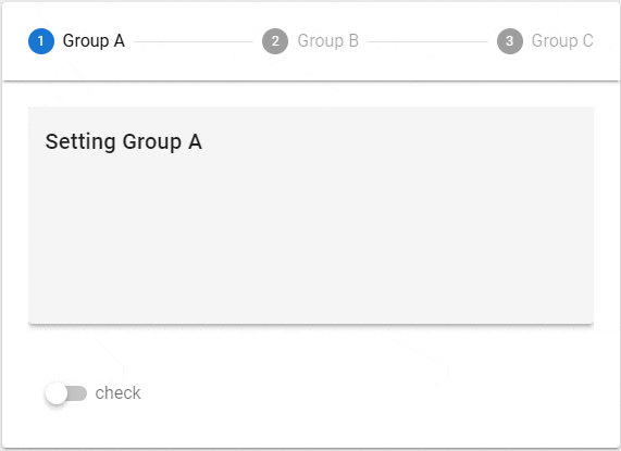
editableプロパティを有効にするとステップアイコンがクリックできるようになり、任意のステップを選択することができます。
<v-stepper v-model="s3">
    <v-stepper-header>
        <v-stepper-step :complete="s3_s1" editable edit-icon="$complete" step="A">Group A</v-stepper-step>
        <v-divider></v-divider>
        <v-stepper-step :complete="s3_s2" editable edit-icon="$complete" step="B">Group B</v-stepper-step>
        <v-divider></v-divider>
        <v-stepper-step :complete="s3_s3" editable edit-icon="$complete" step="C">Group C</v-stepper-step>
    </v-stepper-header>

    <v-stepper-items>
        <v-stepper-content step="A">
            <v-card class="mb-12" height="200px" color="grey lighten-4" elevation="3">
                <v-card-title>Setting Group A</v-card-title>
            </v-card>
            <div class="d-inline-block">
                <v-switch v-model="s3_s1" label="check" class="mt-0 ml-4">check</v-switch>
            </div>
        </v-stepper-content>

        <v-stepper-content step="B">
            <v-card class="mb-12" height="200px" color="grey lighten-4" elevation="3">
                <v-card-title>Setting Group B</v-card-title>
            </v-card>
            <div class="d-inline-block">
                <v-switch v-model="s3_s2" label="check" class="mt-0 ml-4">check</v-switch>
            </div>
        </v-stepper-content>

        <v-stepper-content step="C">
            <v-card class="mb-12" height="200px" color="grey lighten-4" elevation="3">
                <v-card-title>Setting Group C</v-card-title>
            </v-card>
            <div class="d-inline-block">
                <v-switch v-model="s3_s3" label="check" class="mt-0 ml-4">check</v-switch>
            </div>
        </v-stepper-content>
    </v-stepper-items>
</v-stepper>
バーティカル
verticalプロパティを指定するとステップが縦方向に表示されます。
<v-stepper v-model="s5" vertical non-linear>
    <v-stepper-step :complete="s5 > 1" step="1">step 1</v-stepper-step>
    <v-stepper-content step="1">
        <v-card class="mb-12" height="200px" elevation="3" color="grey lighten-4" >
            <v-card-title>step1</v-card-title>
            <v-card-text>{{ s5 }}</v-card-text>
        </v-card>
        <v-btn color="primary" @click="s5 = 2">
            Next
        </v-btn>
    </v-stepper-content>

    <v-stepper-step :complete="s5 > 2" step="2">step 2<small>optional</small></v-stepper-step>
    <v-stepper-content step="2">
        <v-card class="mb-12" height="200px" elevation="3" color="grey lighten-4" >
            <v-card-title>step2</v-card-title>
            <v-card-text>{{ s5 }}</v-card-text>
        </v-card>
        <v-btn color="primary" @click="s5 = 3">
            Next
        </v-btn>
        <v-btn text @click="s5 = 1">Previous</v-btn>
    </v-stepper-content>

    <v-stepper-step :complete="s5 > 3" step="3">step 3</v-stepper-step>
    <v-stepper-content step="3">
        <v-card class="mb-12" height="200px" elevation="3" color="grey lighten-4" >
            <v-card-title>step3</v-card-title>
            <v-card-text>{{ s5 }}</v-card-text>
        </v-card>
        <v-btn color="info" @click="s5 = 4">
            Finish
        </v-btn>
        <v-btn text @click="s5 = 2">Previous</v-btn>
    </v-stepper-content>

    <v-stepper-step :complete="s5 > 3" step="4">Finish</v-stepper-step>
    <v-stepper-content step="4">
        <v-card class="mb-12" height="200px" elevation="3" color="grey lighten-4" >
            <v-card-title>Finish</v-card-title>
            <v-card-text>{{ s5 }}</v-card-text>
        </v-card>
        <v-btn color="success" @click="s5 = 1">
            Reset
        </v-btn>
    </v-stepper-content>
</v-stepper>

ルール
rulesプロパティにステップの状態を検証(validation)する関数を1つ以上指定することができます。関数が1つ以上true以外の値(falseまたはエラーメッセージを表す文字列)を返すと、アイコンがエラー状態になります。
なお、APIドキュメントでは"入力値を引数として受け取る"と書かれていますが、実際には引数は取らないようです。
また、関数がエラーメッセージを意味する文字列を返してもそのメッセージが利用されることはないようです。
Accepts an array of functions that take an input value as an argument and return either true / false or a string with an error message
-----------------------------------------------------------------------------------------------
入力値を引数として受け取り、true / falseまたはエラーメッセージ付きの文字列を返す関数の配列を受け入れます。
<v-stepper v-model="s7">
    <v-stepper-header>
        <v-stepper-step :rules="[rules.rule1]" step="1">step 1<small v-if="s7_s1_error">{{ s7_s1_error }}</small></v-stepper-step>
        <v-divider></v-divider>
        <v-stepper-step :rules="[rules.rule2]" step="2">step 2<small v-if="s7_s2_error">{{ s7_s2_error }}</small></v-stepper-step>
        <v-divider></v-divider>
        <v-stepper-step :rules="[rules.rule3]" step="3">step 3<small v-if="s7_s3_error">{{ s7_s3_error }}</small></v-stepper-step>
        <v-divider></v-divider>
        <v-stepper-step :rules="[rules.rule1, rules.rule2]" step="4">step 4<small v-if="s7_s4_error">{{ s7_s4_error }}</small></v-stepper-step>
    </v-stepper-header>

    <v-stepper-items>
        // ...省略...
    </v-stepper-items>
</v-stepper>
<script>
  export default {
    data() {
      return {
        s7: 1,
        rules: {
          rule1: () => {
            // eslint-disable-next-line no-console
            console.log("rule1:")
            return true
          },
          rule2: () => {
            // eslint-disable-next-line no-console
            console.log("rule2:")
            return true
          },
          rule3: () => {
            // eslint-disable-next-line no-console
            console.log("rule3:")
            this.s7_s3_error = "error";
            return false;
          }
        },
        s7_s1_error: null,
        s7_s2_error: null,
        s7_s3_error: null,
        s7_s4_error: null
      };
    }
  };
</script>
