概要
GridSystemコンポーネントの初歩的な使い方のまとめです。
環境
- Windows 10 Professional 1909
- Node.js 12.14.1
- Vue.js 2.6.11
- Vuetify.js 2.2.15
参考
- [Quick start - Vuetify.js] (https://vuetifyjs.com/en/getting-started/quick-start)
- [Components] (https://vuetifyjs.com/en/components/api-explorer)
- [A Complete Guide to Flexbox] (https://css-tricks.com/snippets/css/a-guide-to-flexbox/)
[Grid system] (https://vuetifyjs.com/en/components/grids)
Vuetify.jsのグリッドは[CSS フレックスボックスレイアウト] (https://developer.mozilla.org/ja/docs/Web/CSS/CSS_Flexible_Box_Layout)を使用した12ポイントのグリッドシステムで、[Bootstrap] (https://getbootstrap.jp/docs/4.2/layout/grid/)のグリッドシステムの影響を受けています。
基本的なコンポーネントの構造
Vuetify.jsのグリッドは主に3つのコンポーネント(v-container、v-row、v-col)とv-spacerで構築します。
v-container
   |
   `--- v-row
   |       |
   |       `--- v-col
   |       `--- v-col
   |       `--- v-col
   |
   `--- v-row
           |
           `--- v-col
           `--- v-col
           `--- v-col
グリッドはネストすることが可能です。
v-container
   |
   `--- v-row
           |
           `--- v-col
           |      |
           |      `--- v-row
           |              |
           |              `--- v-col
           |              `--- v-col
           |              `--- v-col
           |
           `--- v-col
           `--- v-col
Vuetify.js 1.5では
Vuetify.js バージョン1.5と2.0では使用するコンポーネントが異なり、バージョン1.5では行をv-layout、カラムをv-flexコンポーネントで表現していました。
また、v-containerコンポーネントは名前は同じですがプロパティの種類が大きく変わっています。
v-container
   |
   `--- v-layout
   |       |
   |       `--- v-flex
   |       `--- v-flex
   |       `--- v-flex
   |
   `--- v-layout
           |
           `--- v-flex
           `--- v-flex
           `--- v-flex
Viewport Breakpoints
| code | mean | threshold | range |
|---|---|---|---|
| xs | Extra small | < 600px | |
| sm | Small | 600px | 600px >< 960px |
| md | Medium | 960px | 960px >< 1,264px* |
| lg | Large | 1,264px | 1,264px* >< 1,904px* |
| xl | Extra large | 1,904px | > 1,904px* |
- *の実際の表示領域は-16px(スクロールバーの幅)。
プロパティ名の接尾辞にsmやmdなど、Viewport Breakpointsのコードが付くものがあります。ただしxsについてはデフォルト扱いなのか接尾辞に付きません。
| code | align (v-row) |
justify (v-row) |
align-content (v-row) |
cols (v-col) |
offset (v-col) |
order (v-col) |
|---|---|---|---|---|---|---|
| xs | align | justify | align-content | cols | offset | order |
| sm | align-sm | justify-sm | align-content-sm | sm | offset-sm | order-sm |
| md | align-md | justify-md | align-content-md | md | offset-md | order-md |
| lg | align-lg | justify-lg | align-content-lg | lg | offset-lg | order-lg |
| xl | align-xl | justify-xl | align-content-xl | xl | offset-xl | order-xl |
Props
VContainer
- [VContainer] (https://github.com/vuetifyjs/vuetify/blob/v2.2.15/packages/vuetify/src/components/VGrid/VContainer.ts)
| name | type | default | relation | src | |
|---|---|---|---|---|---|
| VContainer | id | string | undefined | ||
| tag | string | 'div' | 'div' | ||
| fluid | boolean | false | false |
VRow
- [VRow] (https://github.com/vuetifyjs/vuetify/blob/v2.2.15/packages/vuetify/src/components/VGrid/VRow.ts)
| name | type | default | relation | src | |
|---|---|---|---|---|---|
| VRow | tag | string | 'div' | 'div' | |
| dense | boolean | false | v-col | ||
| no-gutters | boolean | false | v-col | ||
| align | string | undefined | null | ||
| align-sm | string | undefined | null | ||
| align-md | string | undefined | null | ||
| align-lg | string | undefined | null | ||
| align-xl | string | undefined | null | ||
| justify | string | undefined | null | ||
| justify-sm | string | undefined | null | ||
| justify-md | string | undefined | null | ||
| justify-lg | string | undefined | null | ||
| justify-xl | string | undefined | null | ||
| align-content | string | undefined | null | ||
| align-content-sm | string | undefined | null | ||
| align-content-md | string | undefined | null | ||
| align-content-lg | string | undefined | null | ||
| align-content-xl | string | undefined | null |
VCol
- [VCol] (https://github.com/vuetifyjs/vuetify/blob/v2.2.15/packages/vuetify/src/components/VGrid/VCol.ts)
| name | type | default | relation | src | |
|---|---|---|---|---|---|
| VCol | cols | boolean or string or number | false | false | |
| sm | boolean or string or number | false | false | ||
| md | boolean or string or number | false | false | ||
| lg | boolean or string or number | false | false | ||
| xl | boolean or string or number | false | false | ||
| offset | string or number | undefined | null | ||
| offset-sm | string or number | undefined | null | ||
| offset-md | string or number | undefined | null | ||
| offset-lg | string or number | undefined | null | ||
| offset-xl | string or number | undefined | null | ||
| order | string or number | undefined | null | ||
| order-sm | string or number | undefined | null | ||
| order-md | string or number | undefined | null | ||
| order-lg | string or number | undefined | null | ||
| order-xl | string or number | undefined | null | ||
| align-self | string | undefined | null | ||
| tag | string | 'div' | 'div' |
実装例
cols (v-col)
v-colコンポーネントのcolsおよびsm、md、lg、xlプロパティでviewport breakpointsを指定してデバイス毎のレイアウトを調整することができます。xsという名前のプロパティは無くcolsがその意味になります。
これらのプロパティに指定できる値は、
- ポイントを指す
1~12までの数値 -
autoという文字列 -
falseというboolean値
です。
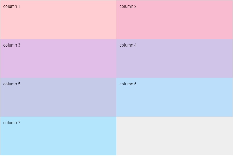
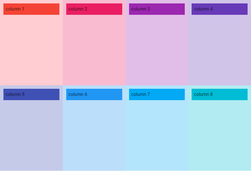
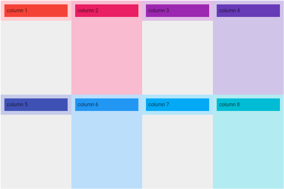
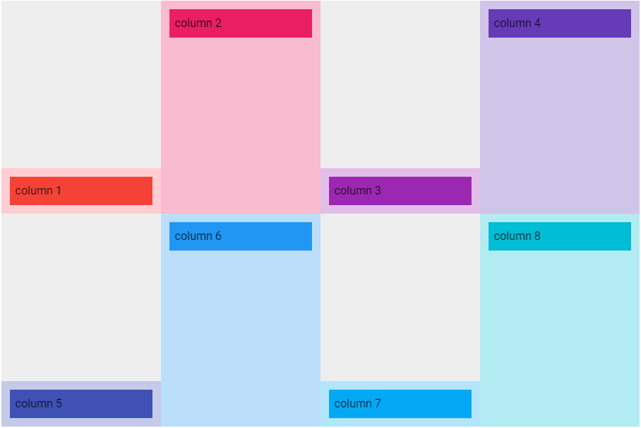
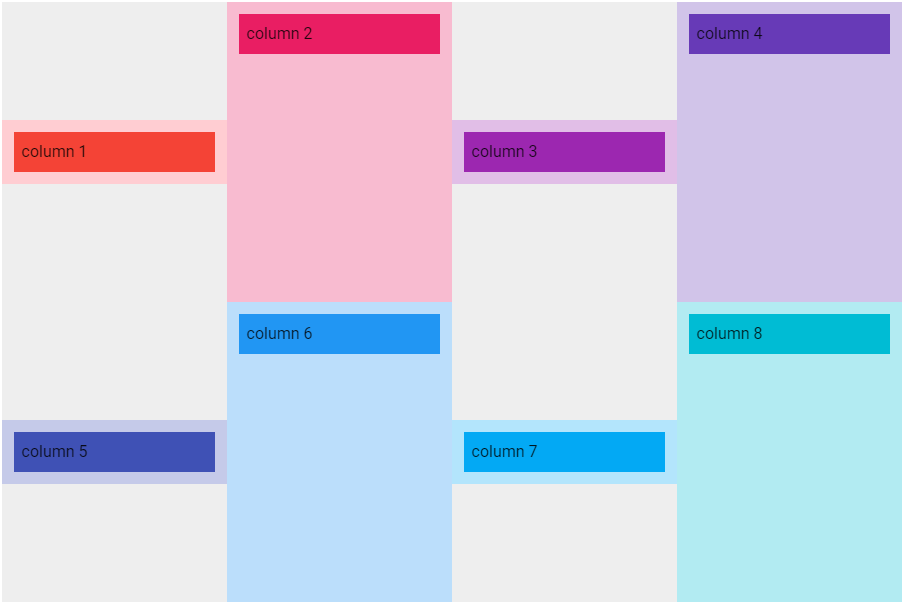
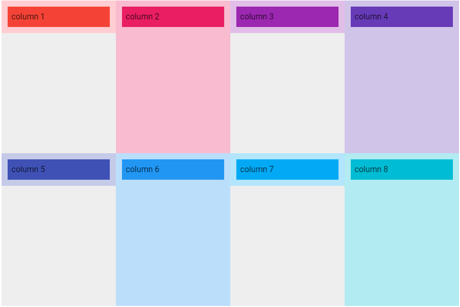
ポイントを指定する例
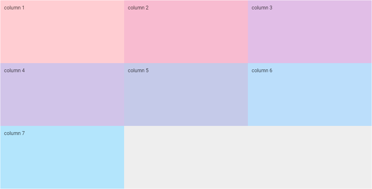
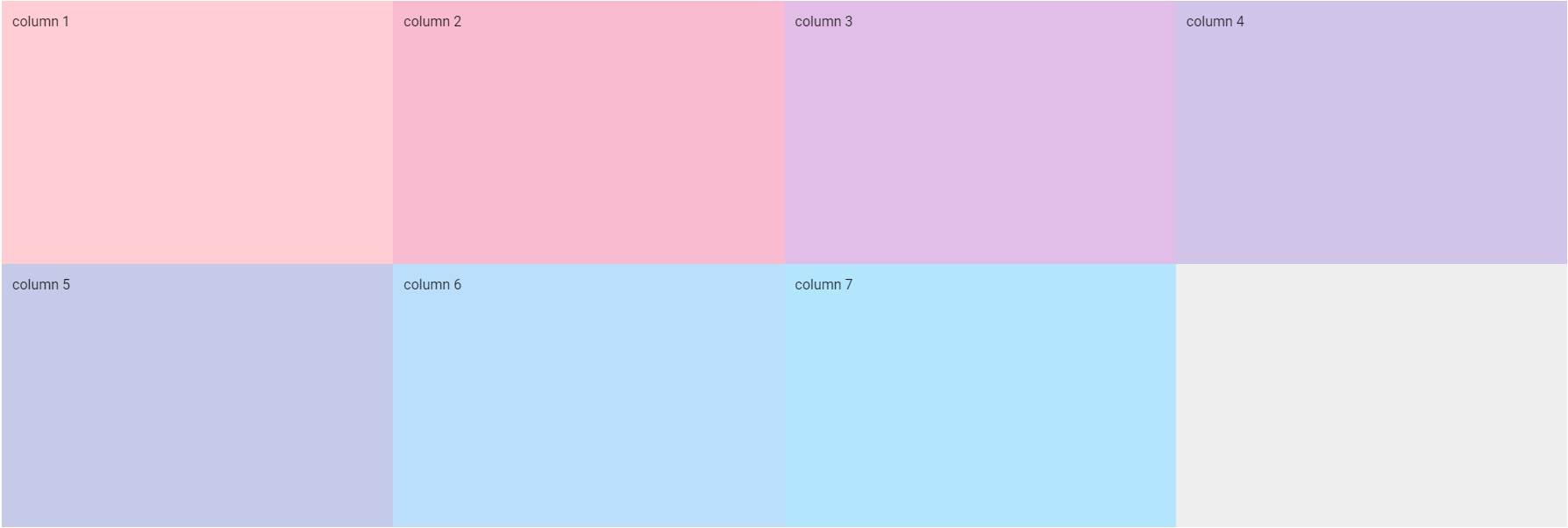
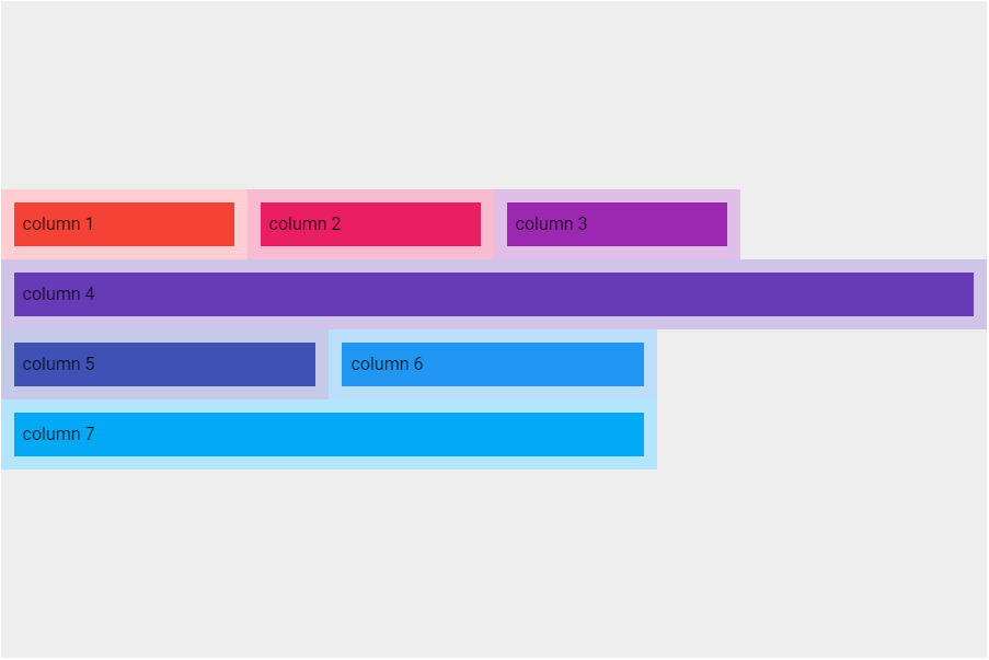
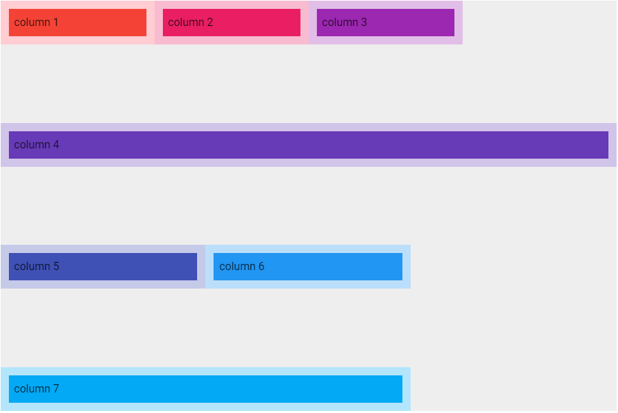
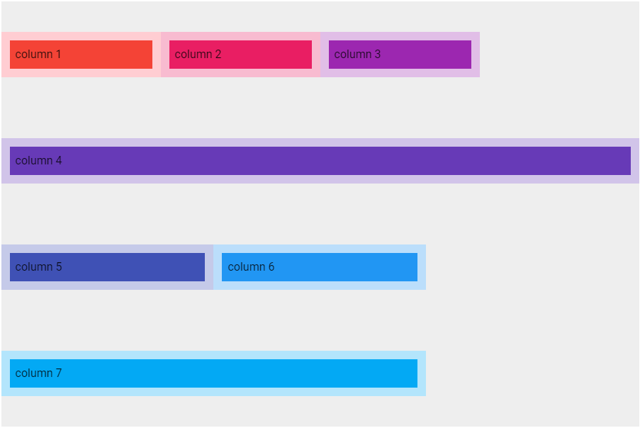
1つのv-rowに7つのv-colを配置する例です。viewport breakpointsは以下の通りcols=12、sm=8、md=6、lg=4、xl=3と指定しました。
<v-container>
  <v-row class="grey lighten-3" style="height: 600px;">
    <v-col cols="12" sm="8" md="6" lg="4" xl="3" style="background-color: #FFCDD2">
      column 1
    </v-col>
    <v-col cols="12" sm="8" md="6" lg="4" xl="3" style="background-color: #F8BBD0">
      column 2
    </v-col>
    <v-col cols="12" sm="8" md="6" lg="4" xl="3" style="background-color: #E1BEE7">
      column 3
    </v-col>
    <v-col cols="12" sm="8" md="6" lg="4" xl="3" style="background-color: #D1C4E9">
      column 4
    </v-col>
    <v-col cols="12" sm="8" md="6" lg="4" xl="3" style="background-color: #C5CAE9">
      column 5
    </v-col>
    <v-col cols="12" sm="8" md="6" lg="4" xl="3" style="background-color: #BBDEFB">
      column 6
    </v-col>
    <v-col cols="12" sm="8" md="6" lg="4" xl="3" style="background-color: #B3E5FC">
      column 7
    </v-col>
  </v-row>
</v-container>
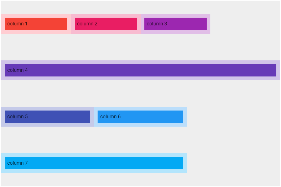
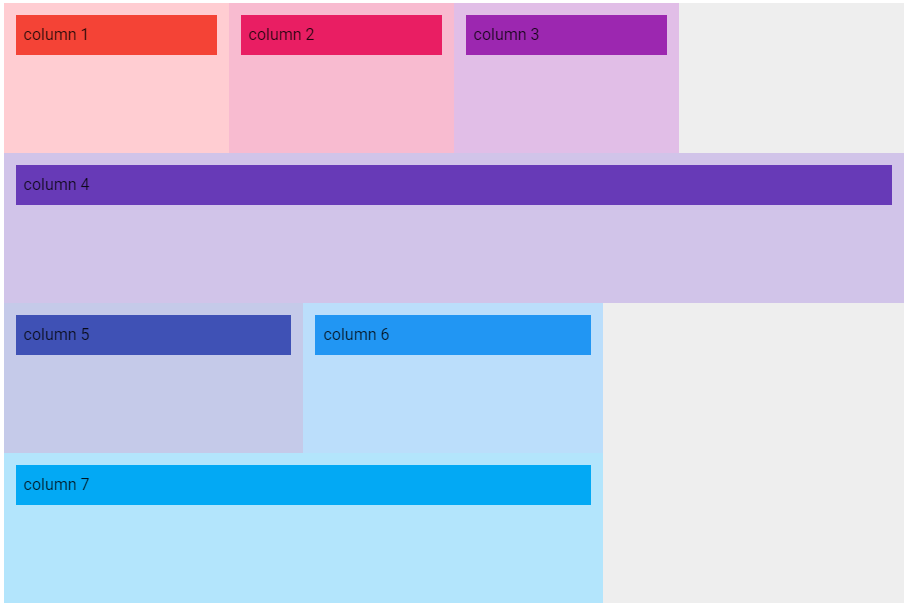
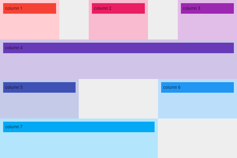
xs(Extra small)の場合
図は画面の横幅を500pxにしてviewport breakpointsをxsにした状態です。xsでは1カラムを12ポイントで表示するため1行に1カラムが配置されます。
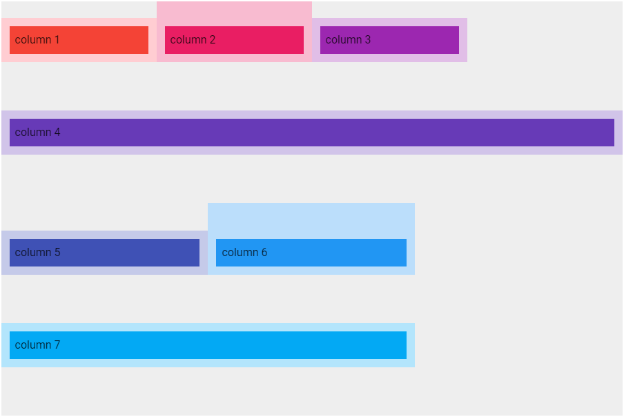
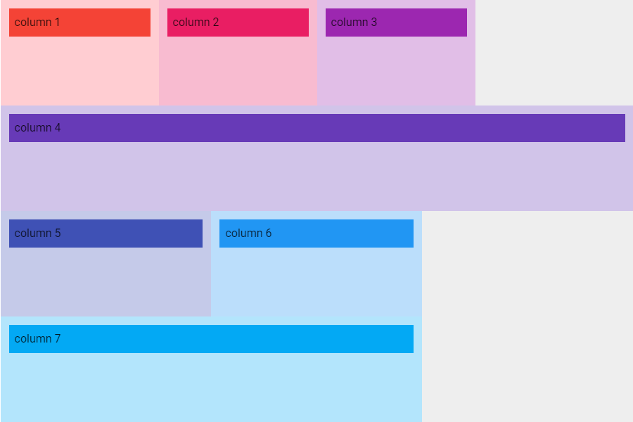
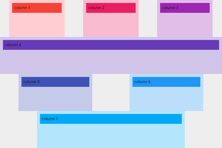
sm(Small)の場合
図は画面の横幅を800pxにしてviewport breakpointsをsmにした状態です。smでは1カラムを8ポイントで表示するので1行に1カラムが配置されますが、右側に4ポイント分の余白が発生します。
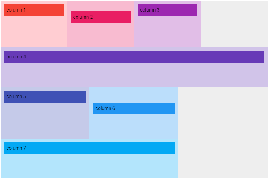
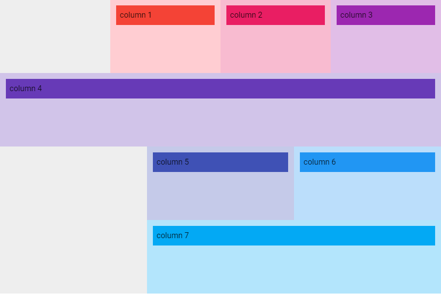
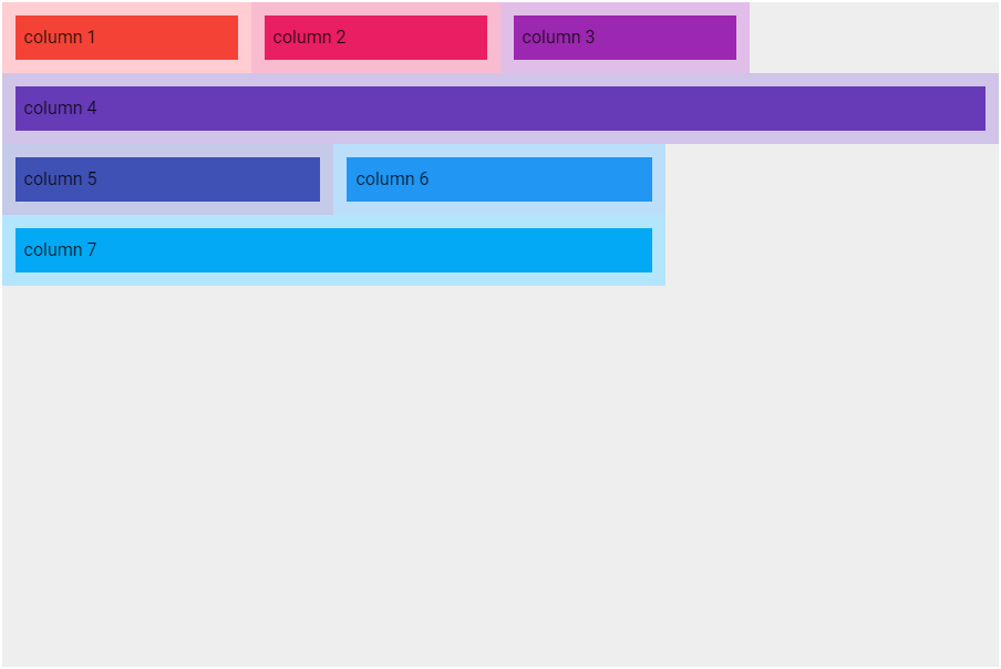
md(Medium)の場合
図は画面の横幅を1000pxにしてviewport breakpintsをmdにした状態です。mdでは1カラムを6ポイントで表示するので1行に2カラム配置されます。
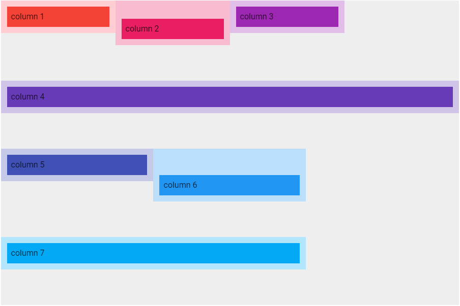
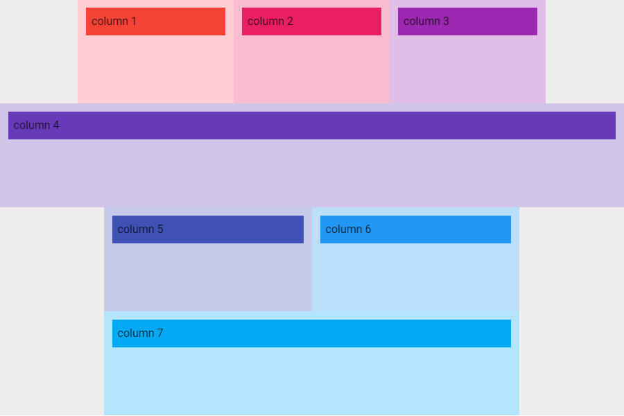
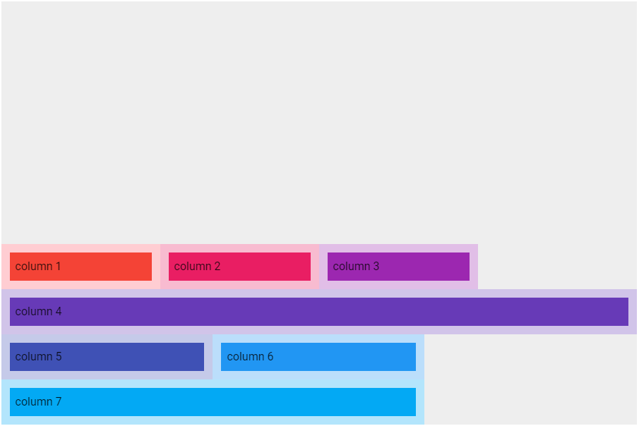
lg(Large)の場合
図は画面の横幅を1400pxにしてviewport breakpointsをlgにした状態です。lgでは1カラムを4ポイントで表示するので1行に3カラム配置されます。
xl(Extra large)の場合
図は画面の横幅を1920pxにしてviewport breakpointsをxlにした状態です。xlでは1カラムを3ポイントで表示するので1行に4カラム配置されます。
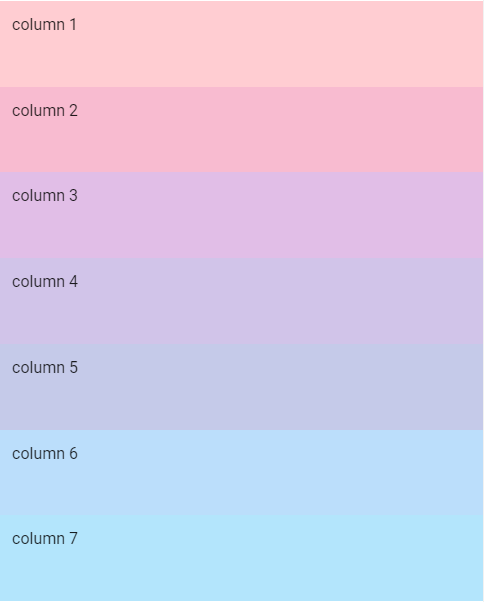
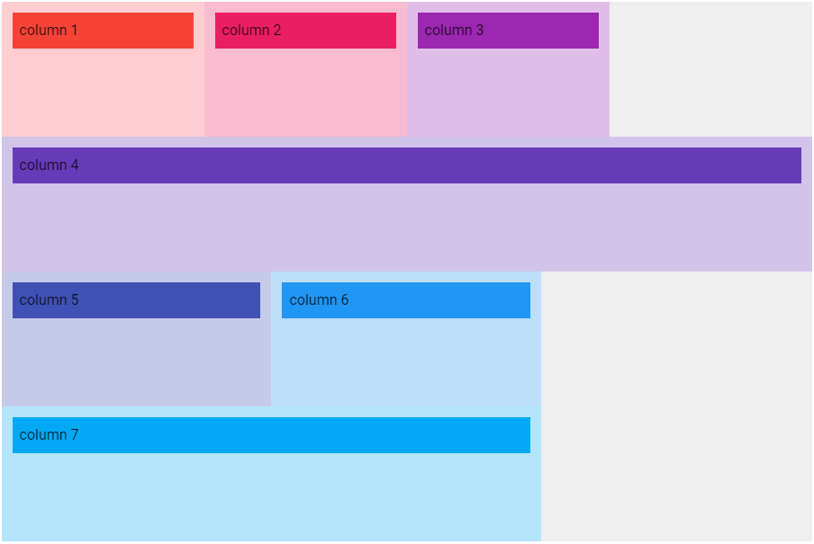
ポイントを指定しない例
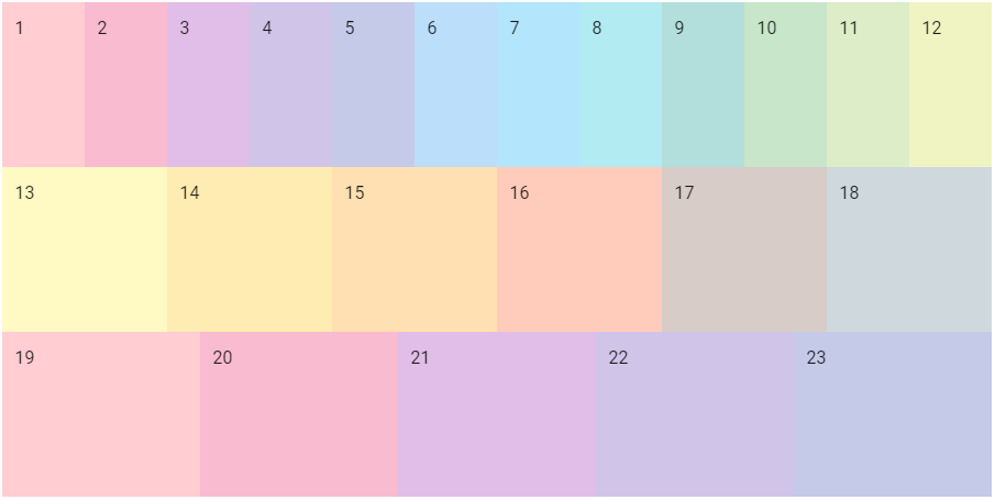
これらのプロパティを使用しない場合は自動的に表示幅が決められます。
以下は1行目を12カラム、2行目を6カラム、3行目を5カラム配置する例です。
<v-container>
  <v-row class="grey lighten-3" style="height: 150px;">
    <v-col style="background-color: #FFCDD2">
      1
    </v-col>
    <v-col style="background-color: #F8BBD0">
      2
    </v-col>
    <v-col style="background-color: #E1BEE7">
      3
    </v-col>
    <v-col style="background-color: #D1C4E9">
      4
    </v-col>
    <v-col style="background-color: #C5CAE9">
      5
    </v-col>
    <v-col style="background-color: #BBDEFB">
      6
    </v-col>
    <v-col style="background-color: #B3E5FC">
      7
    </v-col>
    <v-col style="background-color: #B2EBF2">
      8
    </v-col>
    <v-col style="background-color: #B2DFDB">
      9
    </v-col>
    <v-col style="background-color: #C8E6C9">
      10
    </v-col>
    <v-col style="background-color: #DCEDC8">
      11
    </v-col>
    <v-col style="background-color: #F0F4C3">
      12
    </v-col>
  </v-row>
  <v-row class="grey lighten-3" style="height: 150px;">
    <v-col style="background-color: #FFF9C4">
      13
    </v-col>
    <v-col style="background-color: #FFECB3">
      14
    </v-col>
    <v-col style="background-color: #FFE0B2">
      15
    </v-col>
    <v-col style="background-color: #FFCCBC">
      16
    </v-col>
    <v-col style="background-color: #D7CCC8">
      17
    </v-col>
    <v-col style="background-color: #CFD8DC">
      18
    </v-col>
  </v-row>
  <v-row class="grey lighten-3" style="height: 150px;">
    <v-col style="background-color: #FFCDD2">
      19
    </v-col>
    <v-col style="background-color: #F8BBD0">
      20
    </v-col>
    <v-col style="background-color: #E1BEE7">
      21
    </v-col>
    <v-col style="background-color: #D1C4E9">
      22
    </v-col>
    <v-col style="background-color: #C5CAE9">
      23
    </v-col>
  </v-row>
</v-container>
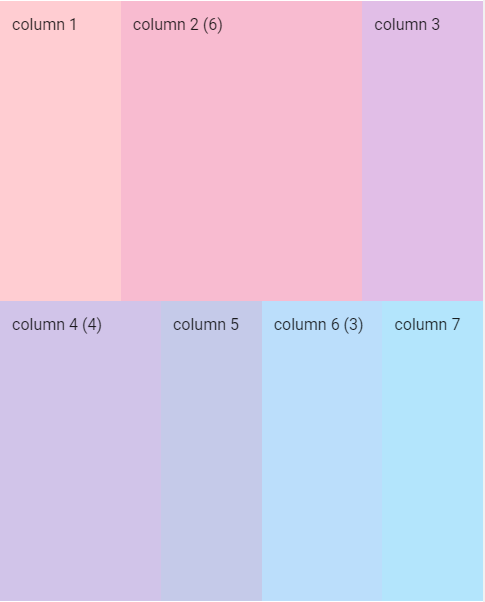
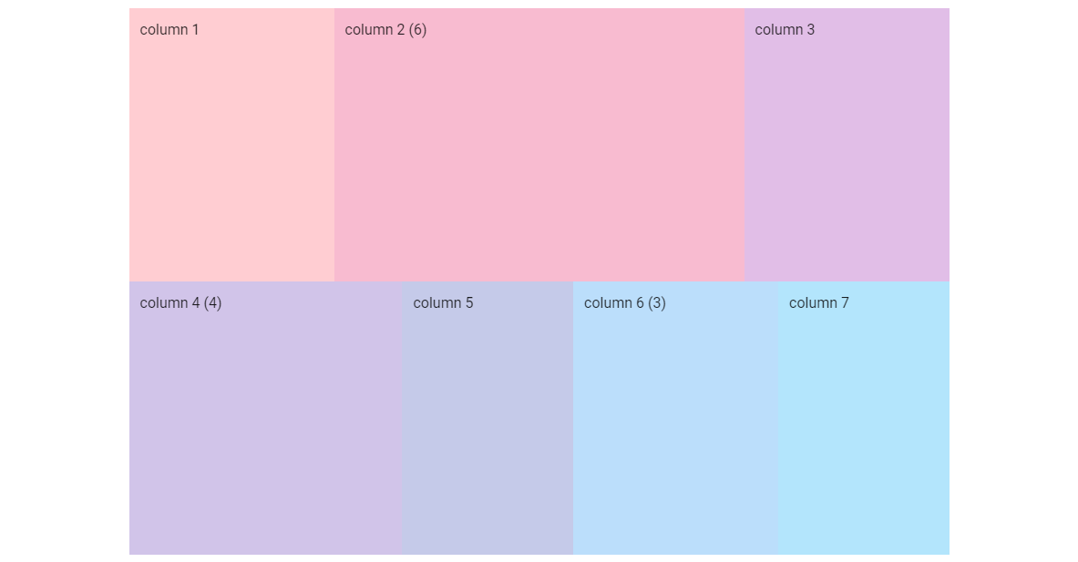
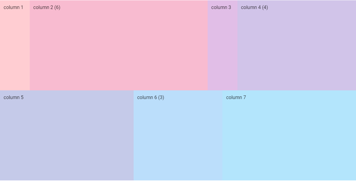
ポイント指定/未指定が混在する例
また、ポイントを指定するカラムと指定しないカラムの混在も可能です。ポイントを指定しないカラムの表示幅は自動的に計算されます。
<v-container>
  <v-row class="grey lighten-3" style="height: 600px;">
    <v-col style="background-color: #FFCDD2">
      column 1
    </v-col>
    <v-col cols="6" style="background-color: #F8BBD0">
      column 2 (6)
    </v-col>
    <v-col style="background-color: #E1BEE7">
      column 3
    </v-col>
    <v-col cols="4" style="background-color: #D1C4E9">
      column 4 (4)
    </v-col>
    <v-col style="background-color: #C5CAE9">
      column 5
    </v-col>
    <v-col cols="3" style="background-color: #BBDEFB">
      column 6 (3)
    </v-col>
    <v-col style="background-color: #B3E5FC">
      column 7
    </v-col>
  </v-row>
</v-container>
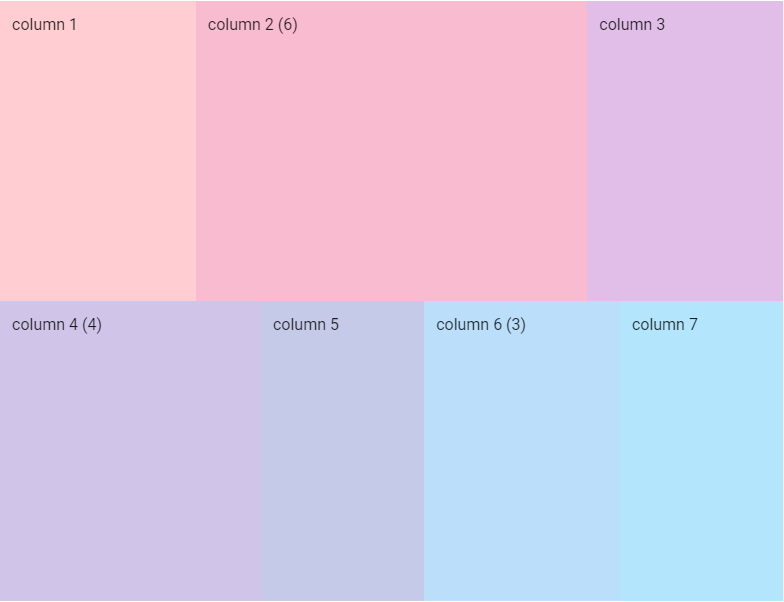
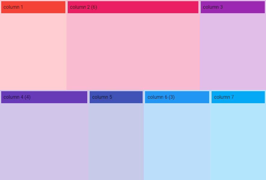
xs(Extra small)の場合
図は画面の横幅を500pxにしてviewport breakpointsをxsにした状態です。
v-rowの横幅: 483px、1カラムの幅: 40.25px
| カラム | cols | width | |
|---|---|---|---|
| column 1 | 120.75 | 40.25 * 3 = 120.75 | |
| column 2 | 6 | 241.5 | 40.25 * 6 = 241.5 |
| column 3 | 120.75 | 40.25 * 3 = 120.75 | |
| = 483 | |||
| column 4 | 4 | 160.98 | 40.25 * 4 = 161 |
| column 5 | 100.64 | 40.25 * 2.5 = 100.625 | |
| column 6 | 3 | 120.75 | 40.25 * 3 = 120.75 |
| column 7 | 100.64 | 40.25 * 2.5 = 100.625 | |
| = 483.01 |
sm(Small)の場合
図は画面の横幅を800pxにしてviewport breakpointsをsmにした状態です。
v-rowの横幅: 783px、 1カラムの幅: 65.25px
| カラム | cols | width | |
|---|---|---|---|
| column 1 | 195.75 | 65.25 * 3 = 195.75 | |
| column 2 | 6 | 391.5 | 65.25 * 6 = 391.5 |
| column 3 | 195.75 | 65.25 * 3 = 195.75 | |
| = 783 | |||
| column 4 | 4 | 260.98 | 65.25 * 4 = 261 |
| column 5 | 163.14 | 65.25 * 2.5 = 163.125 | |
| column 6 | 3 | 195.75 | 65.25 * 3 = 195.75 |
| column 7 | 163.14 | 65.25 * 2.5 = 163.125 | |
| = 783.01 |
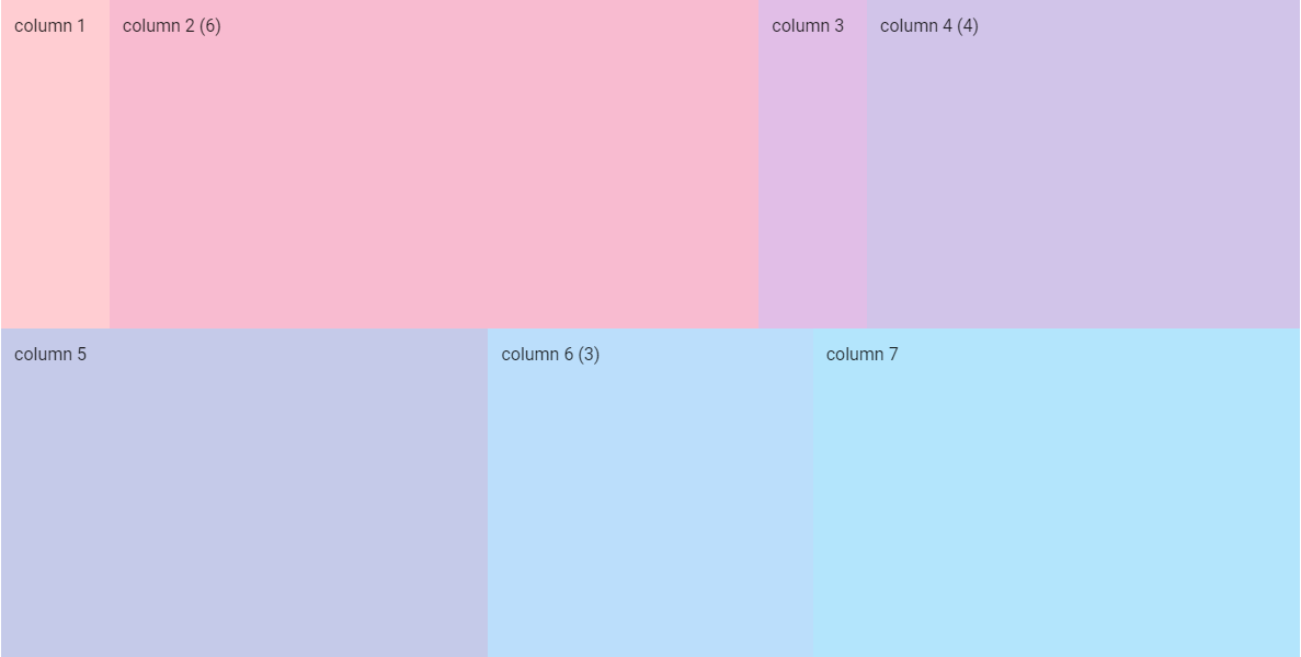
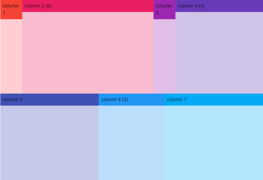
md(Medium)の場合
図は画面の横幅を1000pxにしてviewport breakpintsをmdにした状態です。
v-containerにfluidを指定せず且つmdでは下記のメディアクエリが適用されるので表示幅は最大900pxになります。
@media (min-width: 960px) {
  .container {
    max-width: 900px;
  }
}
v-rowの横幅: 900px、 1カラムの幅: 75px
| カラム | cols | width | |
|---|---|---|---|
| column 1 | 225 | 75 * 3 = 225 | |
| column 2 | 6 | 450 | 75 * 6 = 450 |
| column 3 | 225 | 75 * 3 = 225 | |
| = 900 | |||
| column 4 | 4 | 299.98 | 75 * 4 = 300 |
| column 5 | 187.52 | 75 * 2.5 = 187.5 | |
| column 6 | 3 | 225 | 75 * 3 = 225 |
| column 7 | 187.52 | 75 * 2.5 = 187.5 | |
| = 900.02 |

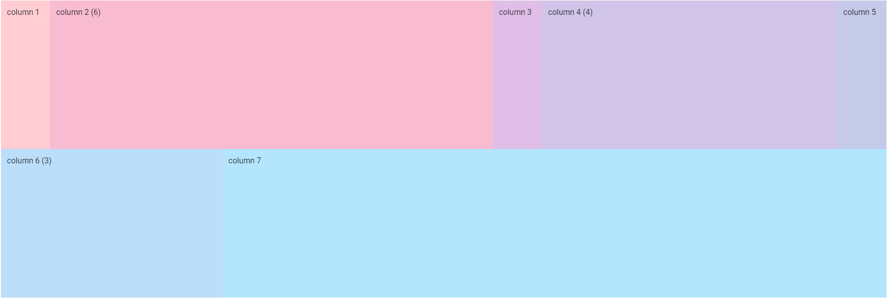
lg(Large)の場合
図は画面の横幅を1400pxにしてviewport breakpointsをlgにした状態です。
v-containerにfluidを指定せず且つlgでは下記のメディアクエリが適用されるので表示幅は最大1185pxになります。
@media (min-width: 1264px) {
  .container {
    max-width: 1185px;
  }
}
v-rowの横幅: 1185px、1カラムの幅: 98.75px
| カラム | cols | width | |
|---|---|---|---|
| column 1 | 98.75 | 98.75 * 1 = 98.75 | |
| column 2 | 6 | 592.5 | 98.75 * 6 = 592.5 |
| column 3 | 98.75 | 98.75 * 1 = 98.75 | |
| column 4 | 4 | 395 | 98.75 * 4 = 395 |
| = 1185 | |||
| column 5 | 444.38 | 98.75 * 4.5 = 444.375 | |
| column 6 | 3 | 296.25 | 98.75 * 3 = 296.25 |
| column 7 | 444.38 | 98.75 * 4.5 = 444.375 | |
| =1185.01 |
xl(Extra large)の場合
図は画面の横幅を1920pxにしてviewport breakpointsをxlにした状態です。
v-containerにfluidを指定せず且つxlでは下記のメディアクエリが適用されるので表示幅は最大1785pxになります。
@media (min-width: 1904px) {
  .container {
    max-width: 1785px;
  }
}
v-rowの横幅: 1785px、1カラムの幅: 148.75px
| カラム | cols | width | |
|---|---|---|---|
| column 1 | 99.17 | 148.75 * 0.6666666666666667 = 99.1666666 | |
| column 2 | 6 | 892.5 | 148.75 * 6 = 892.5 |
| column 3 | 99.17 | 148.75 * 0.6666666666666667 = 99.1666666 | |
| column 4 | 4 | 594.98 | 148.75 * 4 = 595 |
| column 5 | 99.17 | 148.75 * 0.6666666666666667 = 99.1666666 | |
| =1784.99 | |||
| column 6 | 3 | 446.25 | 148.75 * 3 = 446.25 |
| column 7 | 1338.75 | 148.75 * 9 = 1338.75 | |
| =1785 |
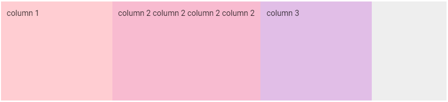
autoを指定する例
colsやsm、md、lg、xlプロパティにautoという文字列を指定すると、カラムの表示幅はコンテンツの長さに調整されます。
<v-container>
  <v-row class="grey lighten-3 mt-5" style="height: 200px;">
    <v-col cols="3" style="background-color: #FFCDD2">
      column 1
    </v-col>
    <v-col cols="auto" style="background-color: #F8BBD0">
      column 2 column 2 column 2 column 2
    </v-col>
    <v-col cols="3" style="background-color: #E1BEE7">
      column 3
    </v-col>
  </v-row>
</v-container>
指定なしの場合
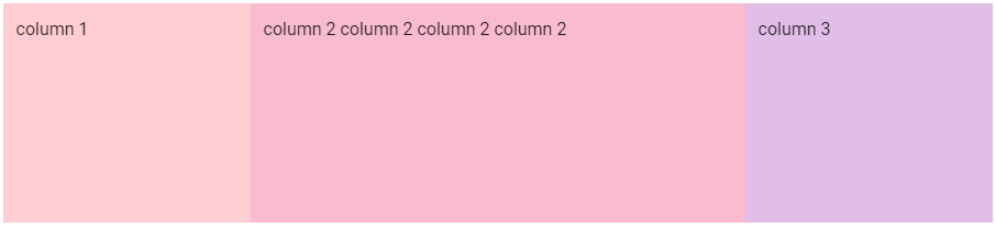
autoを指定した場合
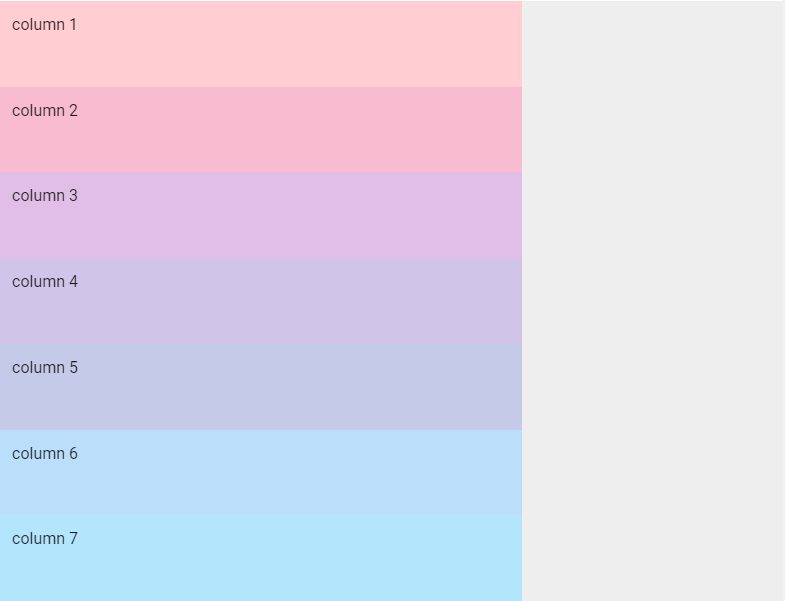
fluid (v-container)
バージョン1.5までのグリッドシステムと違って、2.x以降ではv-containerコンポーネントの主なプロパティはfluidだけです。
fluidプロパティを指定するとv-containerに相当するdiv要素にmax-width: 100%というスタイルが適用され表示幅一杯に広がります。
.container--fluid {
  max-width: 100%;
}
以下は画面の横幅を1200pxにしてviewport breakpintsをmdにした状態で、fluidの有無で表示がどのように変わるか確認した結果です。
fluidなし
v-rowの横幅: 900px、 1カラムの幅: 75px
| カラム | cols | width | |
|---|---|---|---|
| column 1 | 225 | 75 * 3 = 225 | |
| column 2 | 6 | 450 | 75 * 6 = 450 |
| column 3 | 225 | 75 * 3 = 225 | |
| = 900 | |||
| column 4 | 4 | 299.98 | 75 * 4 = 300 |
| column 5 | 187.52 | 75 * 2.5 = 187.5 | |
| column 6 | 3 | 225 | 75 * 3 = 225 |
| column 7 | 187.52 | 75 * 2.5 = 187.5 | |
| = 900.02 |
図では判別できませんが900pxで中央にグリッドが表示されており左右に空白があります。
fluidあり
v-rowの横幅: 1183px、 1カラムの幅: 98.583px
| カラム | cols | width | |
|---|---|---|---|
| column 1 | 98.59 | 98.583 * 1 = 98.583 | |
| column 2 | 6 | 591.5 | 98.583 * 6 = 591.498 |
| column 3 | 98.59 | 98.583 * 1 = 98.583 | |
| column 4 | 4 | 394.33 | 98.583 * 4 = 394.332 |
| =1183.01 | |||
| column 5 | 443.63 | 98.583 * 4.5 = 443.6235 | |
| column 6 | 3 | 295.75 | 98.583 * 3 = 295.749 |
| column 7 | 443.63 | 98.583 * 4.5 = 443.6235 | |
| =1183.01 |
表示幅いっぱいにグリッドが表示されています。
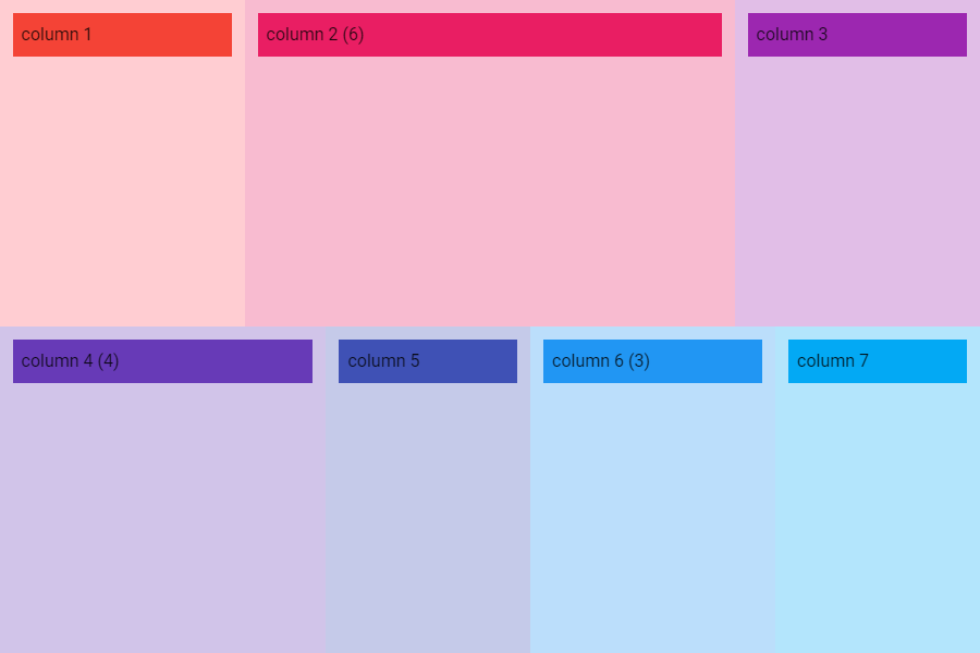
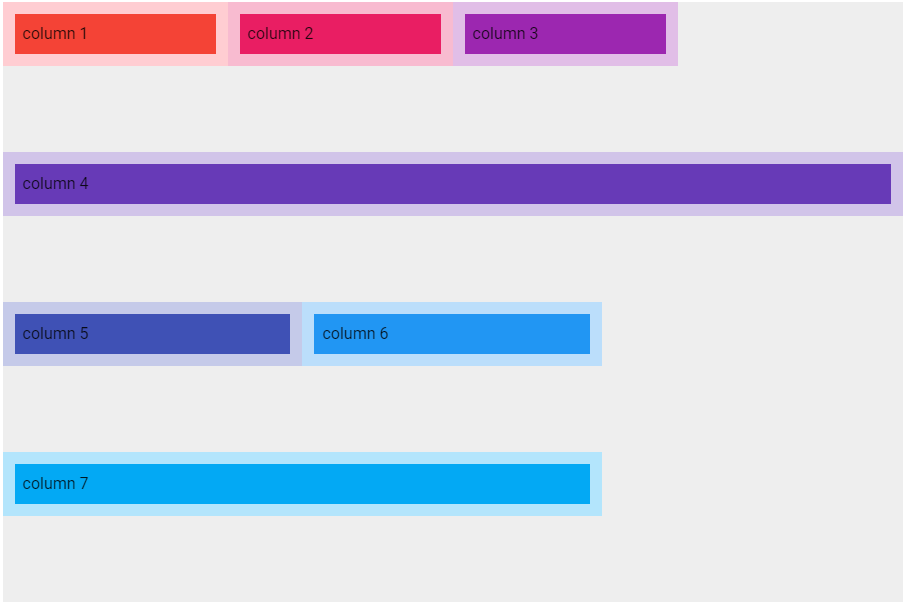
dense / no-gutters (v-row)
v-rowコンポーネントのdense、no-guttersプロパティはカラムのパディングを調整します。
デフォルトのカラムのパディングは12pxですが、denseを指定すると4px、no-guttersを指定するとパディングが無くなります。
以下は画面の横幅を1200pxにしてviewport breakpintsをmdにした状態で、dense / no-guttersの指定有無で表示がどのように変わるか確認した結果です。
パディングの有無が分かるようにカラム内にv-sheetを配置しています。
<v-container>
  <v-row class="grey lighten-3" style="height: 600px;">
    <v-col style="background-color: #FFCDD2">
      <v-sheet color="red" tile class="pa-2">column 1</v-sheet>
    </v-col>
    <v-col cols="6" style="background-color: #F8BBD0">
      <v-sheet color="pink" tile class="pa-2">column 2 (6)</v-sheet>
    </v-col>
    <v-col style="background-color: #E1BEE7">
      <v-sheet color="purple" tile class="pa-2">column 3</v-sheet>
    </v-col>
    <v-col cols="4" style="background-color: #D1C4E9">
      <v-sheet color="deep-purple" tile class="pa-2">column 4 (4)</v-sheet>
    </v-col>
    <v-col style="background-color: #C5CAE9">
      <v-sheet color="indigo" tile class="pa-2">column 5</v-sheet>
    </v-col>
    <v-col cols="3" style="background-color: #BBDEFB">
      <v-sheet color="blue" tile class="pa-2">column 6 (3)</v-sheet>
    </v-col>
    <v-col style="background-color: #B3E5FC">
      <v-sheet color="light-blue" tile class="pa-2">column 7</v-sheet>
    </v-col>
  </v-row>
</v-container>
dense / no-guttersなし
v-rowの横幅: 900px、 1カラムの幅: 75px
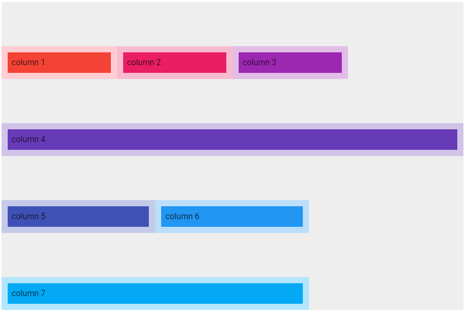
denseあり
<v-row class="grey lighten-3" style="height: 600px;" dense>
v-rowの横幅: 884px、 1カラムの幅: 73.666px
no-guttersあり
<v-row class="grey lighten-3" style="height: 600px;" no-gutters>
v-rowの横幅: 876px、 1カラムの幅: 73px
align (v-row)
v-rowコンポーネントのalignプロパティでカラムの縦方向の位置を設定できます。
| css class name | align-items prop value | |
|---|---|---|
| start | align-start | flex-start |
| end | align-end | flex-end |
| center | align-center | center |
| baseline | align-baseline | baseline |
| stretch | align-stretch | stretch |
CSS の align-items プロパティは、すべての直接の子要素に集合として align-self の値を設定します。フレックスボックスでは交差軸方向のアイテムの配置を制御します。グリッドレイアウトでは、グリッド領域におけるアイテムのブロック軸方向の配置を制御します。
<v-container>
  <v-row :align="align" :justify="justify" :align-content="alignContent" class="grey lighten-3" style="height: 600px;">
    <v-col cols="3" style="background-color: #FFCDD2">
      <v-sheet color="red" tile class="pa-2">column 1</v-sheet>
    </v-col>
    <v-col cols="3" style="background-color: #F8BBD0">
      <v-sheet color="pink" tile class="pa-2">column 2</v-sheet>
    </v-col>
    <v-col cols="3" style="background-color: #E1BEE7">
      <v-sheet color="purple" tile class="pa-2">column 3</v-sheet>
    </v-col>
    <v-col cols="12" style="background-color: #D1C4E9">
      <v-sheet color="deep-purple" tile class="pa-2">column 4</v-sheet>
    </v-col>
    <v-col cols="4" style="background-color: #C5CAE9">
      <v-sheet color="indigo" tile class="pa-2">column 5</v-sheet>
    </v-col>
    <v-col cols="4" style="background-color: #BBDEFB">
      <v-sheet color="blue" tile class="pa-2">column 6</v-sheet>
    </v-col>
    <v-col cols="8" style="background-color: #B3E5FC">
      <v-sheet color="light-blue" tile class="pa-2">column 7</v-sheet>
    </v-col>
  </v-row>

  <v-row style="height: 600px;" class="cyan lighten-3 mt-8">
    <v-sheet elevation="2" color="green lighten-4" tile class="pa-2 ma-2" max-width="500">
      <v-select v-model="align" :items="alignValues" label="align" return-object />
      <v-select v-model="justify" :items="justifyValues" label="justify" return-object />
      <v-select v-model="alignContent" :items="alignContentValues" label="align-content" return-object />
    </v-sheet>
  </v-row>
</v-container>
<script>
export default {
  data() {
    return {
      align: undefined,
      justify: undefined,
      alignContent: undefined,
      alignValues: [undefined, 'start', 'end', 'center', 'baseline', 'stretch'],
      justifyValues: [undefined, 'start', 'end', 'center', 'space-between', 'space-around'],
      alignContentValues: [undefined, 'start', 'end', 'center', 'space-between', 'space-around', 'stretch']
    }
  }
}
</script>
start
end
center
baseline
baselineの効果を確認しやすくするため、下記のようにcolumn 2とcolumn 6のv-sheetにトップマージンを設定します。
<v-col cols="3" style="background-color: #F8BBD0">
  <v-sheet color="pink" tile class="mt-6 pa-2">column 2</v-sheet>
</v-col>

<v-col cols="4" style="background-color: #BBDEFB">
  <v-sheet color="blue" tile class="mt-10 pa-2">column 6</v-sheet>
</v-col>
図はalignプロパティに何も指定していないデフォルトの状態です。
図はalignプロパティにstartを指定した状態です。
図はalignプロパティにbaselineを指定した状態です。
stretch
justify (v-row)
v-rowコンポーネントのjustifyプロパティでカラムの横方向の位置を設定できます。
| css class name | justify-content prop value | |
|---|---|---|
| start | justify-start | flex-start |
| end | justify-end | flex-end |
| center | justify-center | center |
| space-between | justify-space-between | space-between |
| space-around | justify-space-around | space-around |
CSS の justify-content プロパティは、フレックスコンテナーの主軸およびグリッドコンテナーのインライン軸に沿って、中身のアイテムの間や周囲に間隔を配置する方法を定義します。
start
end
center
space-between
space-around
align-content (v-row)
v-rowコンポーネントのalign-contentプロパティ
| css class name | align-content prop value | |
|---|---|---|
| start | align-content-start | flex-start |
| end | align-content-end | flex-end |
| center | align-content-center | center |
| space-between | align-content-space-between | space-between |
| space-around | align-content-space-around | space-around |
| stretch | align-content-stretch | stretch |
CSS の align-content プロパティは、フレックスボックスの交差軸またはグリッドのブロック軸方向の内部のアイテムの間または周囲の間隔の配分方法を設定します。
start
end
center
space-between
space-around
stretch
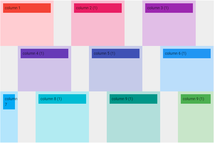
offset (v-col)
v-colコンポーネントのoffsetとoffset-{sm | md | lg | xl}プロパティに指定するポイントでカラムの左側にポイント分の間を空けます。
オフセットを調節することでカラム配置を微調整することができます。
<v-container>
  <v-row class="grey lighten-3" style="height: 600px;">
    <v-col cols="3" style="background-color: #FFCDD2">
      <v-sheet color="red" tile class="pa-2">column 1</v-sheet>
    </v-col>
    <v-col cols="3" offset="1" style="background-color: #F8BBD0">
      <v-sheet color="pink" tile class="pa-2">column 2 (1)</v-sheet>
    </v-col>
    <v-col cols="3" offset="1" style="background-color: #E1BEE7">
      <v-sheet color="purple" tile class="pa-2">column 3 (1)</v-sheet>
    </v-col>
    <v-col cols="3" offset="1" style="background-color: #D1C4E9">
      <v-sheet color="deep-purple" tile class="pa-2">column 4 (1)</v-sheet>
    </v-col>
    <v-col cols="3" offset="1" style="background-color: #C5CAE9">
      <v-sheet color="indigo" tile class="pa-2">column 5 (1)</v-sheet>
    </v-col>
    <v-col cols="3" offset="1" style="background-color: #BBDEFB">
      <v-sheet color="blue" tile class="pa-2">column 6 (1)</v-sheet>
    </v-col>
    <v-col cols="1" style="background-color: #B3E5FC">
      <v-sheet color="light-blue" tile class="pa-2">column 7</v-sheet>
    </v-col>
    <v-col cols="3" offset="1" style="background-color: #B2EBF2">
      <v-sheet color="cyan" tile class="pa-2">column 8 (1)</v-sheet>
    </v-col>
    <v-col cols="3" offset="1" style="background-color: #B2DFDB">
      <v-sheet color="teal" tile class="pa-2">column 9 (1)</v-sheet>
    </v-col>
    <v-col cols="2" offset="1" style="background-color: #C8E6C9">
      <v-sheet color="green" tile class="pa-2">column 9 (1)</v-sheet>
    </v-col>
  </v-row>
</v-container>
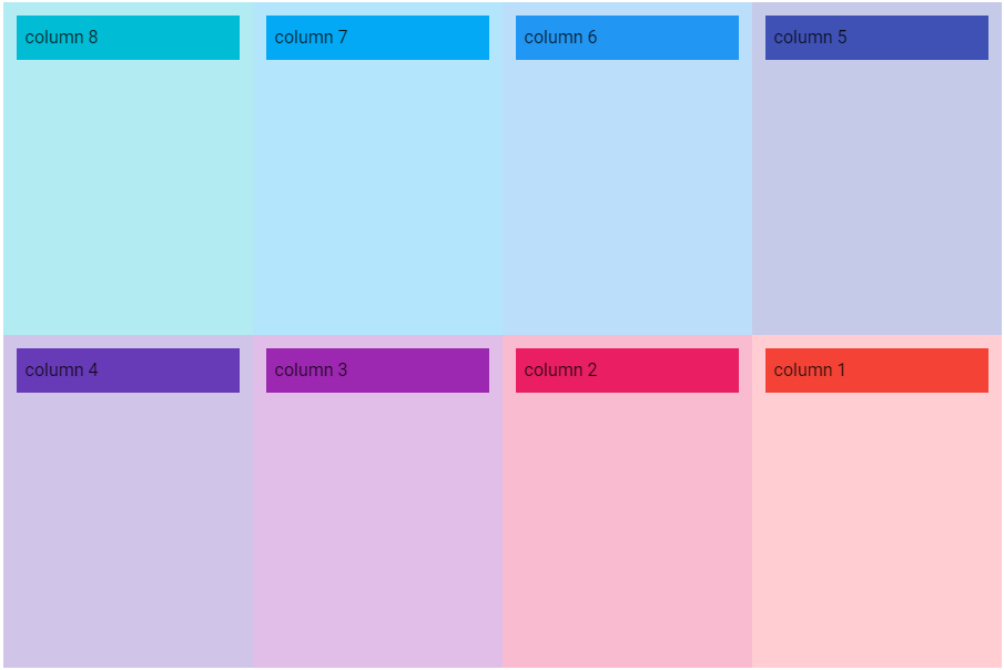
order (v-col)
v-colコンポーネントのorderとorder-{sm | md | lg | xl}プロパティでカラムの表示順を指定します。
これらのプロパティに指定できる値は、
-
-1~13までの数値 -
firstorlastという文字列-
firstは-1と同じ -
lastは13と同じ
-
です。
以下はviewport breakpointsがmd以上のときにカラムの表示順を逆転させる例です。
<v-container>
  <v-row class="grey lighten-3" style="height: 600px;">
    <v-col cols="3" order="1" order-md="8" style="background-color: #FFCDD2">
      <v-sheet color="red" tile class="pa-2">column 1</v-sheet>
    </v-col>
    <v-col cols="3" order="2" order-md="7" style="background-color: #F8BBD0">
      <v-sheet color="pink" tile class="pa-2">column 2</v-sheet>
    </v-col>
    <v-col cols="3" order="3" order-md="6" style="background-color: #E1BEE7">
      <v-sheet color="purple" tile class="pa-2">column 3</v-sheet>
    </v-col>
    <v-col cols="3" order="4" order-md="5" style="background-color: #D1C4E9">
      <v-sheet color="deep-purple" tile class="pa-2">column 4</v-sheet>
    </v-col>
    <v-col cols="3" order="5" order-md="4" style="background-color: #C5CAE9">
      <v-sheet color="indigo" tile class="pa-2">column 5</v-sheet>
    </v-col>
    <v-col cols="3" order="6" order-md="3" style="background-color: #BBDEFB">
      <v-sheet color="blue" tile class="pa-2">column 6</v-sheet>
    </v-col>
    <v-col cols="3" order="7" order-md="2" style="background-color: #B3E5FC">
      <v-sheet color="light-blue" tile class="pa-2">column 7</v-sheet>
    </v-col>
    <v-col cols="3" order="8" order-md="1" style="background-color: #B2EBF2">
      <v-sheet color="cyan" tile class="pa-2">column 8</v-sheet>
    </v-col>
  </v-row>
</v-container>
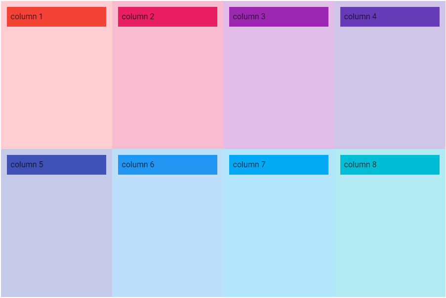
smの場合
mdの場合
align-self (v-col)
v-colコンポーネントのalign-selfプロパティでカラム単位で縦方向の位置を設定できます。これはv-rowコンポーネントのalignプロパティの設定を上書きします。
| css class name | align-self prop value | |
|---|---|---|
| auto | align-self-auto | auto |
| start | align-self-start | flex-start |
| end | align-self-end | flex-end |
| center | align-self-center | center |
| baseline | align-self-baseline | baseline |
| stretch | align-self-stretch | stretch |
align-self は CSS のプロパティで、グリッドやフレックスのアイテムの align-items の値を上書きします。グリッドでは、アイテムはグリッド領域内に配置されます。フレックスボックスでは、アイテムは交差軸上に配置されます。
<v-container>
  <v-row class="grey lighten-3" style="height: 600px;">
    <v-col cols="3" :align-self="alignSelf" style="background-color: #FFCDD2">
      <v-sheet color="red" tile class="pa-2">column 1</v-sheet>
    </v-col>
    <v-col cols="3" style="background-color: #F8BBD0">
      <v-sheet color="pink" tile class="pa-2">column 2</v-sheet>
    </v-col>
    <v-col cols="3" :align-self="alignSelf" style="background-color: #E1BEE7">
      <v-sheet color="purple" tile class="pa-2">column 3</v-sheet>
    </v-col>
    <v-col cols="3" style="background-color: #D1C4E9">
      <v-sheet color="deep-purple" tile class="pa-2">column 4</v-sheet>
    </v-col>
    <v-col cols="3" :align-self="alignSelf" style="background-color: #C5CAE9">
      <v-sheet color="indigo" tile class="pa-2">column 5</v-sheet>
    </v-col>
    <v-col cols="3" style="background-color: #BBDEFB">
      <v-sheet color="blue" tile class="pa-2">column 6</v-sheet>
    </v-col>
    <v-col cols="3" :align-self="alignSelf" style="background-color: #B3E5FC">
      <v-sheet color="light-blue" tile class="pa-2">column 7</v-sheet>
    </v-col>
    <v-col cols="3" style="background-color: #B2EBF2">
      <v-sheet color="cyan" tile class="pa-2">column 8</v-sheet>
    </v-col>
  </v-row>

  <v-row style="height: 600px;" class="cyan lighten-3 mt-8">
    <v-sheet elevation="2" color="green lighten-4" tile class="pa-2 ma-2" max-width="500">
      <v-select v-model="alignSelf" :items="alignSelfValues" label="align-self" return-object />
    </v-sheet>
  </v-row>
</v-container>
<script>
export default {
  data() {
    return {
      alignSelf: undefined,
      alignSelfValues: [undefined, 'auto', 'start', 'end', 'center', 'baseline', 'stretch']
    }
  }
}
</script>
auto
start
end
center
baseline
stretch

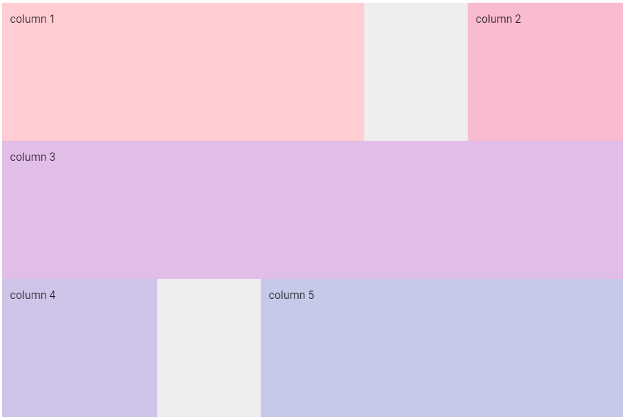
v-spacer
v-spacerコンポーネントを使うとカラム間にサイズが自動的に調整される空白を挿入することができます。
<v-container>
  <v-row class="grey lighten-3" style="height: 600px;">
    <v-col cols="7" style="background-color: #FFCDD2">
      column 1
    </v-col>
    <v-spacer />
    <v-col cols="3" style="background-color: #F8BBD0">
      column 2
    </v-col>
    <v-col cols="12" style="background-color: #E1BEE7">
      column 3
    </v-col>
    <v-col cols="3" style="background-color: #D1C4E9">
      column 4
    </v-col>
    <v-spacer />
    <v-col cols="7" style="background-color: #C5CAE9">
      column 5
    </v-col>
  </v-row>
<v-container>