ボタンにホバーを付けてみよう
ホバーとはカーソルを当てた時の動作
完成イメージ

(gif作ってみたのでが、見づらいですね、、、)
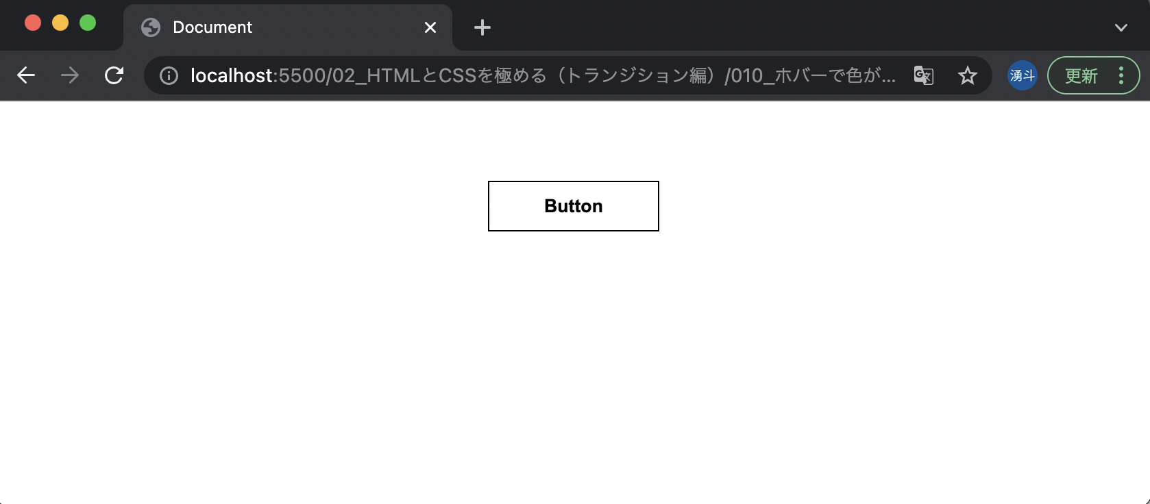
通常
ホバー時

要件
・ボタンの位置:中央
・ボタンの詳細(通常)
・背景色:白
・文字の色:黒
・枠の色:黒
・枠の太さ:1px
・枠の形状:実線
・パディング:上下10px、左右40px
・マージン:上50px、左右0
・文字の太さ:600
・カーソル:pointer(指のマーク)
・ホバーされて表示が変わる速度:0.3s
・ボタンの詳細(ホバー時)
・背景色:黒
・文字の色:白
手順
いつも通りindex.html、style.cssファイルを作成します。
※今回はCSSの話なのでHTMLの説明は省略します。index.htmlは以下を使用してください。
index.html
<!DOCTYPE html>
<html lang="en">
  <head>
    <meta charset="UTF-8" />
    <meta name="viewport" content="width=device-width, initial-scale=1.0" />
    <meta http-equiv="X-UA-Compatible" content="ie=edge" />
    <title>Document</title>
    <link rel="stylesheet" href="style.css" />
  </head>

  <body>
    <div id="container">
      <button class="btn">Button</button>
    </div>
  </body>
</html>
ソース
#container {
  text-align: center;
}

.btn {
  background-color: white;
  color: black;
  border: 1px solid black;
  padding: 10px 40px;
  margin: 50px 0;
  font-weight: 600;
  cursor: pointer;
  transition: all 0.3s;
}

.btn:hover {
  background-color: black;
  color: white;
}