ちょいちょい見かけるmatplot。便利そうなのでいつか使ってみたいなと思いためしてみました。
実行環境
- macOS High Sierra Version 10.13.1
- Python 3.6.3
- matplotlib 2.1.1
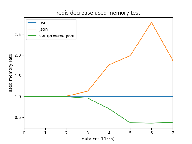
サンプルデータ
この表を、グラフに起こしてみる
コード
import math
from matplotlib import pyplot

# 元データの表をコピペしてlist形式に格納
datas = [
    [1,1.000649,1.000649,1.000649],
    [10,1.000648,1.001081,1.000648],
    [100,1.005793,1.008796,0.997640],
    [1000,1.005395,1.128072,0.961838],
    [10000,1.003097,1.763680,0.706436],
    [100000,1.000356,1.986330,0.364987],
    [1000000,1.000036,2.793968,0.356083],
    [10000000,1.000003,1.874999,0.375001],
]

# xyデータに再マッピング
x = []
y1 = []
y2 = []
y3 = []
for data in datas:
    x.append( math.log(data[0], 10) )
    y1.append(data[1])
    y2.append(data[2])
    y3.append(data[3])


# グラフ内容設定
pyplot.xlim([ x[0], x[len(x)-1] ])
pyplot.xlabel("data cnt(10**n)")
pyplot.ylabel("used memory rate")

pyplot.title('redis decrease used memory test')
pyplot.plot(x, y1, label = "hset")
pyplot.plot(x, y2, label = "json")
pyplot.plot(x, y3, label = "compressed json")
pyplot.legend()

# 表示
pyplot.show()
結果
感想
- 思っていた以上に簡単にできてものすごく嬉しい。
- x軸の値にもとは元データそのまま入れていたけど、X軸のラベルの表示の限界値を超えてしまったようなので、対数(log)に変換して表示した。
- なお対数値を出す方法を調べるにあたり「対数」という用語が思い出せずそれを調べるのに一番時間をとられた。(最終的に「10を底として」ってgoogleに入力したら出てきた)
参考情報
以下参考にさせていただきました。ありがとうございました。
Qiita - 【Python入門】ライブラリmatplotlibの基本的な使い方
ねこゆきのメモ - 横軸、縦軸を調整する。
matplotlib入門 - グラフの体裁を整える