量的変数と量的変数
二項目間の散布図
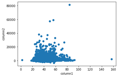
matplotlib
import matplotlib.pyplot as plt

# columnsの2項目から散布図作成
plt.scatter(df['column1'], df['column2'])
# 横軸と縦軸のラベルを追加
plt.xlabel('column1')
plt.ylabel('column2')
plt.show()

# column1とcolumn2の相関係数
print(df[['column1', 'column2']].corr())
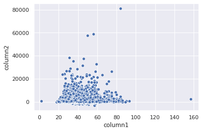
seaborn
import seaborn as sns

sns.scatterplot(data=df, x="column1", y="column2")

# column1とcolumn2の相関係数
print(df[['column1', 'column2']].corr())
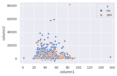
量的変数の散布図+質的変数
sns.scatterplot(data=df, x="column1", y="column2", hue="y")
# hue="y"は色で区別/style="y"で形で区別
# 重なりが多い場合 alpha = 0~1 で濃度調整

# column1とcolumn2の相関係数
print(df[['column1', 'column2']].corr())
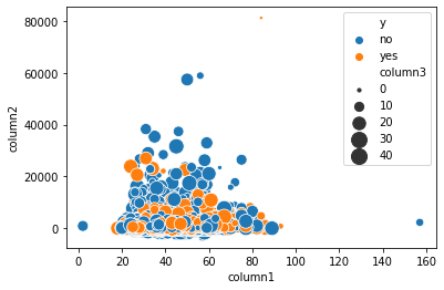
量的変数の散布図+量的変数(バブルチャート)
import seaborn as sns

sns.scatterplot(data=df, x="column1", y="column2", hue="y", size="column3", sizes=(10,200))

# scatterplot関数の引数sizeに量的変数を指定する
# sizesではplotの大きさ範囲を指定
# alpha=0~1で濃度調整

# ageとbalanceの相関係数
print(df[['column1', 'column2']].corr())
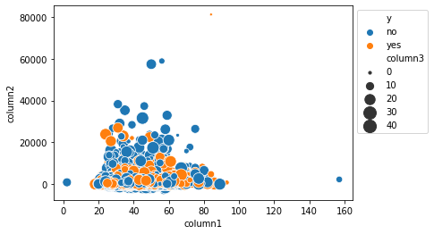
凡例項目の外出し
ax = sns.scatterplot(data=df, x="column1", y="column2", hue="y", size="column3", sizes=(10,200))
ax.legend(loc="upper left", bbox_to_anchor=(1,1))

print(df[['column1', 'column2']].corr())
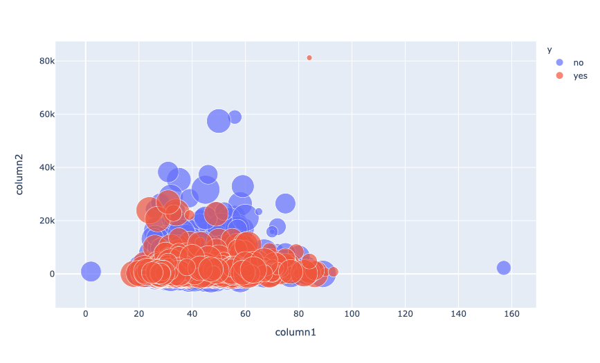
plotly
# pip install plotly

import plotly.express as px

fig=px.scatter(df,x="column1", y="column2", size ="column3", color="y",size_max=30)
fig.show()
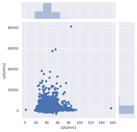
ジョイントプロット
import seaborn as sns

sns.jointplot(data=df, x="column1", y="column2",marginal_kws={"bins":10})
# ヒストグラムの本数を指定する marginal_kws={"bins":本数}
# 色の指定:color
# kind="hex" でplotから六角形のビン表示になる。濃度がプロットの密度を表す。
# hueを引数には持てない模様


# column1とcolumn2の相関係数
print(df[['column1', 'column2']].corr())
# 相関係数とp値の表示
sns.jointplot(data=df, x="column1", y="column2",marginal_kws={"bins":10}).annotate(stats.pearsonr)

# 表示枠消し
sns.jointplot(data=df, x="column1", y="column2",marginal_kws={"bins":10}).annotate(stats.pearsonr, frameon=False)
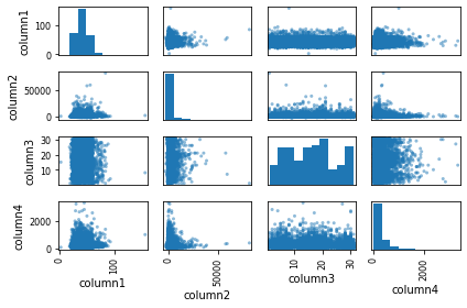
散布図行列
2つの項目間の関係を一括で表示する
matplotlib
import matplotlib.pyplot as plt

# 散布図行列の描画
pd.plotting.scatter_matrix(df[['column1','column2','column3','column4']])
plt.tight_layout()
plt.show()
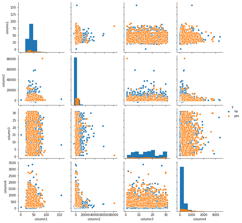
散布図行列→相関係数行列→heatmap
import seaborn as sns
sns.pairplot(data=df[['column1','column2','column3','column4',"y"]],hue="y", diag_kind = "hist")
plt.show()
# ここでも hue を引数にとって質的変数の分布を見ることができる
# 質的変数ごとに色分けを指定する場合:palette={'yes': 'red','no':'blue'}
# plotするmarkerを指定する場合markers='+' / markers=['+', 's', 'd']
# 対角成分のプロット ヒストグラム:diag_kind = "hist" / カーネル密度推定 diag_kind = "kde"
# plotの濃度調整:alpha=0~1
# 二項目間の散布図に回帰直線を書く:kind='reg'
# 出力グラフサイズの指定:height=2
# グラフ化する列を指定する:x_vars=['column1', 'column2'],y_vars=['column1', 'column2']
# 指定するdf内にhueに指定したいobject型データが必要
# sns.pairplot(df[['column1','column2','column3','column4']],hue="y") だとエラー
# type(df[['column1','column2','column3','column4',"y"]]) # pandas.core.frame.DataFrame
# 出力したpairplotを.pngで保存
# sns.pairplot(df[['column1','column2','column3','column4',"y"]],hue="y").savefig('file.png')
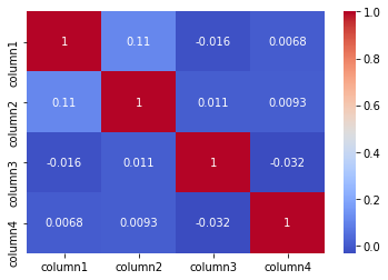
# 相関係数行列
corr = df[['column1','column2','column3','column4',"y"]].corr(method="pearson")
print(corr)
# 相関係数行列からheatmapを作る
sns.heatmap(corr, cmap='coolwarm', annot=True)
plt.show()
# annnotで相関係数の記載のオンオフ
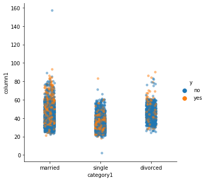
量的変数と質的変数
import seaborn as sns

sns.catplot(data=df,x="category1", y="column1",hue="y",alpha=0.5)