HTMLとCSSで正六角形つくってみた
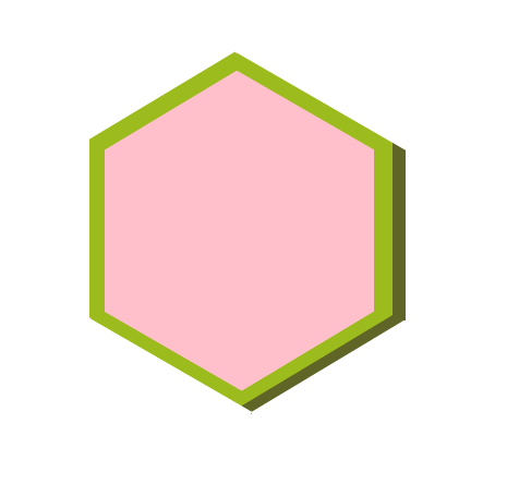
正六角形をつくってみました。
ちょっと浮き出ている正六角形です。
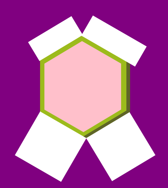
背景を紫にしてみました。こうなっています。
コードはこちらです。
最初は緑の部分をborderで実装していました。
しかしborderは長さをpxでしか指定出来なく、
可変な正六角形を実装することができなかったのでやめました。
<div class="box">
</div>
の中で作業をすることでwindow拡大縮小による形崩れが起きないようにしています。
参考→windowの高さを変更してもデザインが崩れない方法
hexagon.html
    <div class = "box">
      <div class="rightshadow shadow right"></div>
      <div class="center">
        <div class="hexagon shadow topleftshadow"></div>
        <div class="hexagon shadow toprightshadow"></div>
        <div class="hexagon shadow bottomleftshadow"></div>
        <div class="hexagon shadow bottomrightshadow"></div>

        <div class="hexagon shadow right"></div>
        <div class="hexagon shadow left"></div>

        <div class="hexagon topleft"></div>
        <div class="hexagon topright"></div>
        <div class="hexagon bottomright greenshadow"></div>
        <div class="hexagon bottomright"></div>
        <div class="hexagon bottomleft"></div>
      </div>
    </div>
hexagon.css
  .box{
    top: 31%;
    left: 18%;
    position: absolute;
    width: 26%;
    padding-top: 28.36%;
  }

  .center{
    position: absolute;
    background-color: pink;
    width: 92%;
    height: 100%;
    top: 0%;
    left: 0%;
  }

  .hexagon{
    position: absolute;
    height: 49.9%;
    width: 58.8%;
    background-color: white;
    transform: rotate(59deg);
  }

  .shadow{
    background-color: #9cbb1c;
  }

  .topleft{
    top: -22%;
    left: 5%;
    width: 26%;
  }

  .topright{
    transform: rotate(30deg);
    top: -6%;
    left: 50%;
    width: 73%;
    height: 22.9%;
  }

  .bottomleft{
    width: 62.8%;
    top: 85%;
    left: -19%;
    transform: rotate(30deg);
  }

  .bottomright{
    top: 85%;
    left: 65%;
  }

  .greenshadow{
    background-color: #5f6527;
    width: 4%;
    height: 52.9%;
    top: 62%;
    left: 75%;
  }

  .topleftshadow{
    top: -9.5%;
    left: 22.5%;
    width: 6%;
    height: 48%;
  }

  .toprightshadow{
    top: 12%;
    left: 44%;
    height: 5%;
    transform: rotate(30deg);
  }

  .bottomleftshadow{
    top: 84%;
    left: -3%;
    height: 5%;
    transform: rotate(30deg);
  }

  .bottomrightshadow{
    width: 5%;
    top: 61%;
    left: 72%;
  }

  .right{
    top: 25%;
    left: 95%;
    width: 6%;
    transform: rotate(0deg);
  }

  .rightshadow{
    position: absolute;
    width: 5%;
    height: 50.8%;
    background-color: #5f6527;
    left: 92%;
  }

  .left{
    top: 25%;
    width: 5%;
    transform: rotate(0deg);
  }