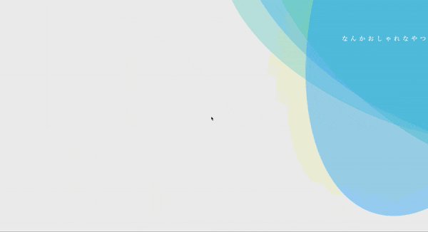
最終成果物
これです。
なんかおしゃれ。
(個人差があります。)
実装
土台になるhtmlの用意
さっくりと。
index.html
<!DOCTYPE html>
<html lang ="ja">
<head>
    <link rel="stylesheet" href="../css/background.css">
</head>
<body>
    <div class='background'>
        <div class='wave -one'></div>
        <div class='wave -two'></div>
        <div class='wave -three'></div>
        <div class='wave -four'></div>
        <div class='wave -five'></div>
        <div class='title'>なんかおしゃれなやつ</div>
      </div>
    </body>
</html>
CSS
こちらもさっくりと。
解説はあとあと。
background.css
html {
  background: #eee;
}


.background {
  width: 100%;
  height: 100%;
  background: lighten(#f0f4c3, 10%);
  position: fixed;
  overflow: hidden;
}

.wave {
  opacity: .4;
  position: absolute;
  top: 0%;
  left: 75%;
  background: #0af;
  width: 100%;
  height: 100vh;
  margin-left: -25%;
  margin-top: -25%;
  transform-origin: 50% 48%;
  border-radius: 59%;
  animation: drift 4000ms infinite linear;
}

.wave.-two {
  animation: drift 5000ms infinite linear;
  opacity: .1;
  background: yellow;
}

.wave.-three {
  animation: drift 6000ms infinite linear;
  background: rgb(124, 214, 210);
}

.wave.-four {
  animation: drift 7000ms infinite linear;
  background: rgb(96, 212, 183);
}

.wave.-five {
  animation: drift 8000ms infinite linear;
}

.box:after {
  content: '';
  display: block;
  left: 0;
  top: 0;
  width: 100%;
  height: 100%;
  z-index: 11;
}

.title {
  position: absolute;
  left: 0;
  top: 0;
  width: 100%;
  z-index: 1;
  line-height: 300px;
  text-align: right;
  color: white;
  text-transform: uppercase;
  font-family: 'Playfair Display', serif;
  letter-spacing: .4em;
  font-size: 24px;
  text-shadow: 0 1px 0 rgba(black, .1);
  text-indent: .3em;
}
@keyframes drift {
  from { transform: rotate(0deg); }
  from { transform: rotate(360deg); }
}
ちょっとだけ解説
cssもほとんど装飾ですね。
重要なのは以下3つ
- @keyframes drift
- border-radius
- animation
- position: fiexd;
keyframesでは要素を回転させるアニメーションを登録しています。
そして、全てを円にしてしまうと変化が起きないので縦横サイズとborder-radiusで楕円を用意します。
さらに、楕円全てを同じタイミング同じスピードでアニメーションさせても残念な感じになってしまうのでアニメーションの実行時間を1000msずつずらします。
あとは要素が増えた時にスクロールしても常に画面に表示されるようにfixedで固定。
これで背景アニメーションとして機能しますね。
まとめ
うーん、おしゃれ。
実用的にはちょっと主張が強すぎますけど調整すればいろんな場面で使えるかもしれません。