この記事のターゲット
- CSSはある程度わかる
- CSSアニメーションは全然わかんない
- どんなもんか経験してみたい
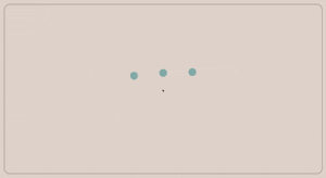
最終成果物
これです。
実用とかは置いておいて無限にローディングしてるイメージ。
実装
大きく分けて以下の手順で進めます。
- 土台になるhtmlの用意
- 背景の設定
- 丸のやつ配置
- アニメーション実装
1. 土台になるhtmlの用意
cssは別ファイルに切り出します。
背景になるのがstageクラス、丸のやつになるのがeffect ball_xクラスですね。
<!DOCTYPE html>
<html lang ="ja">
<head>
    <link rel="stylesheet" href="../css/main.css">
</head>
<body>
    <main class="stage">
        <!-- ball_1 -->
        <section class="effect ball_1">
            <div></div>
        </section>

        <!-- ball_2 -->
        <section class="effect ball_2">
            <div></div>
        </section>

        <!-- ball_3 -->
        <section class="effect ball_3">
            <div></div>
        </section>
    </main>
</body>
</html>
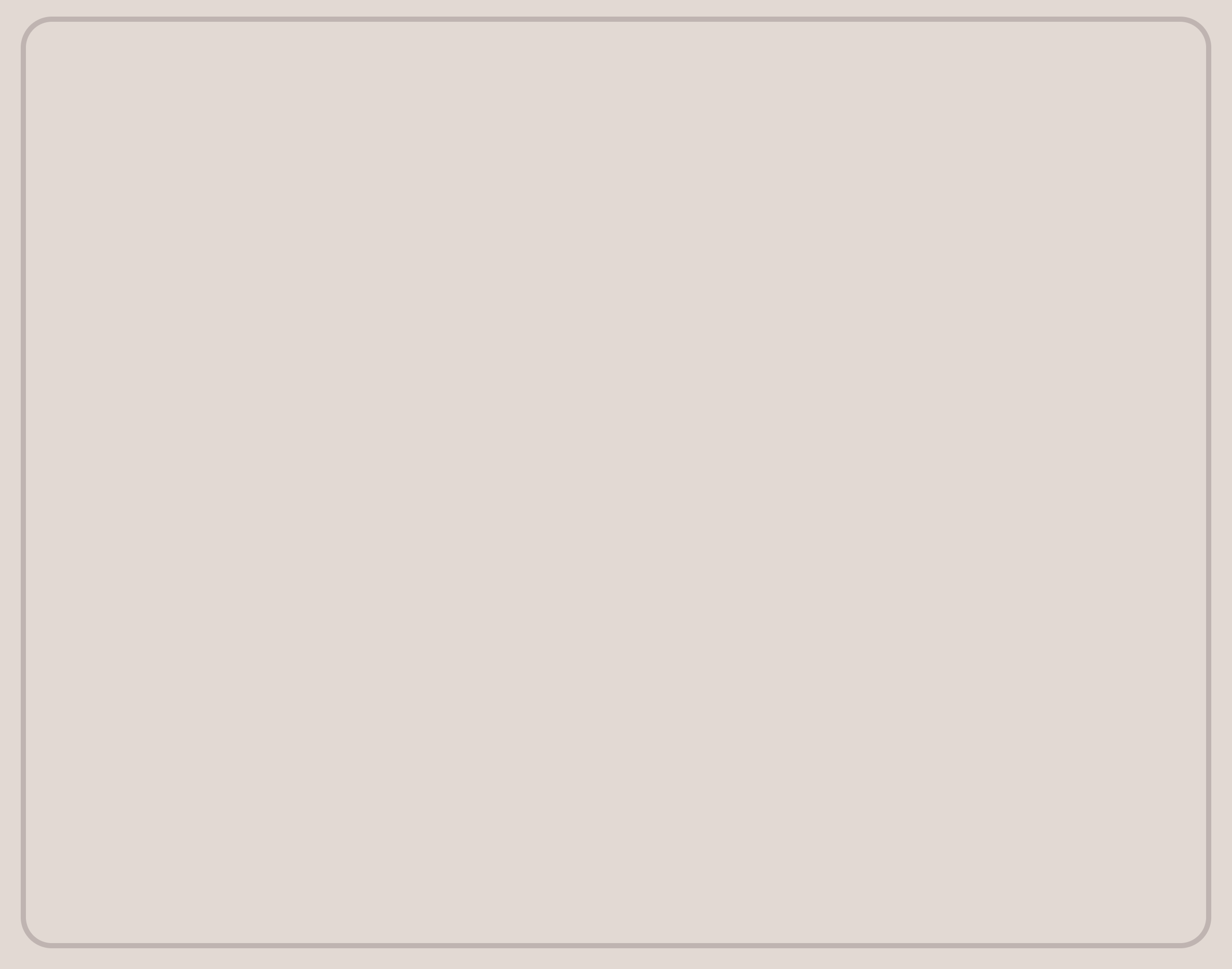
2. 背景の設定
ちょっとおしゃれにするだけなので別になくてもいいです。
* {
  margin: 0;
  padding: 0;
}

/**
* stage
*/
.stage {
  position: absolute;
  width: 100%; height: 100%;
  background-color: rgb(228, 217, 210);
}
.stage:before,
.stage:after { position: absolute; content: ""; display: block; }
.stage:before {
  top: 20px; left: 20px;
  width: calc(100% - 40px); height: calc(100% - 40px);
  border: solid 5px #6e5c60;
  border-radius: 30px;
  box-sizing: border-box;
  opacity: 0.3;
}
ここまででこんな感じ。
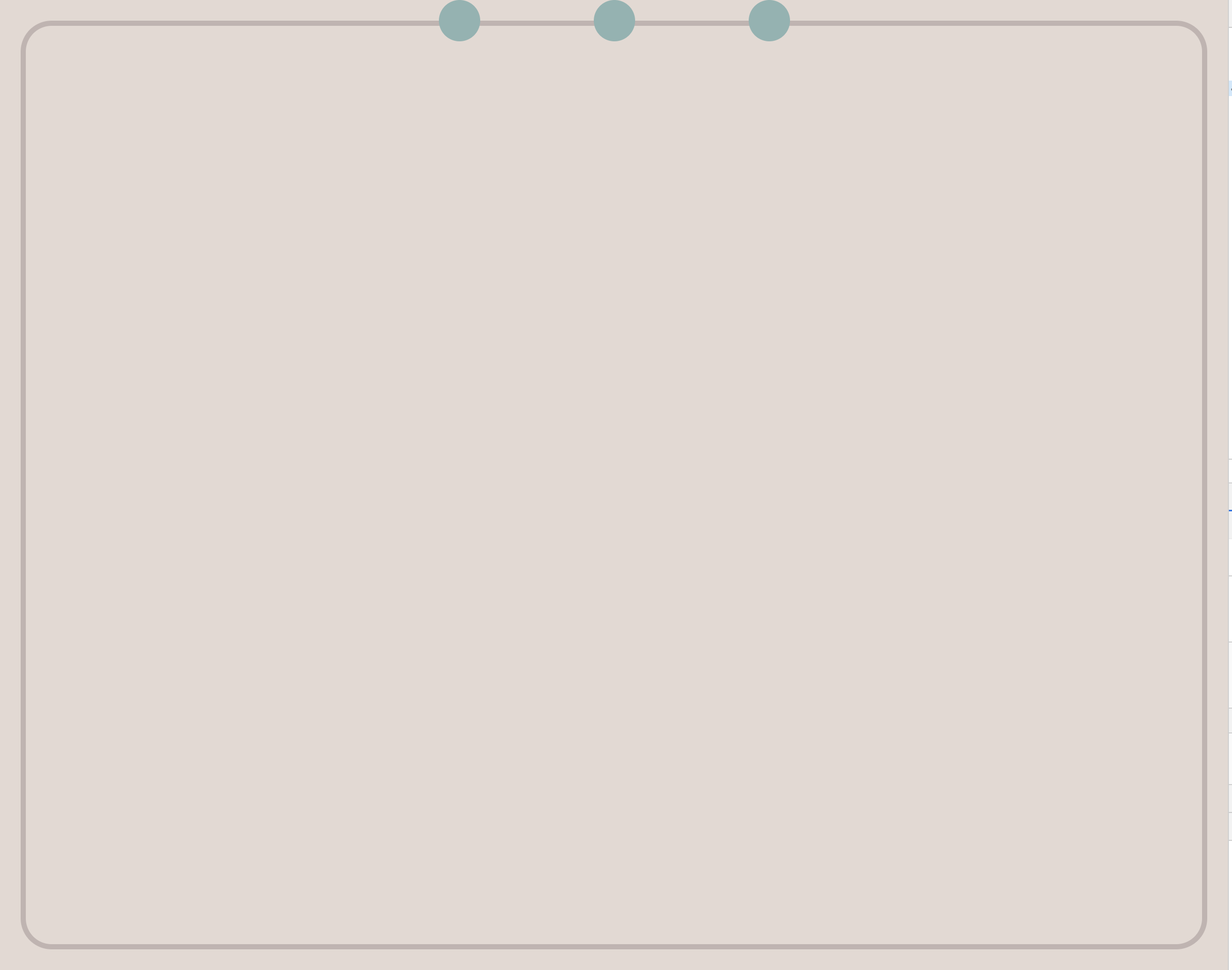
3. 丸のやつ配置
main.cssに追記していきます。
特にカスケーディングを気にする必要もないですが一応下に追記していきましょう。
丸にする要素をhtmlに三つ用意していあるのでクラスも3つ用意します。
全てに共通する様なものはeffectクラスに。
3つ横並びにするためにleftだけ均等にずらします。
...

/**
* stage
*/

...

/**
* effect
*/

.effect {
  position: absolute;
  width:  400px; height: 400px;
}
.effect div:after {
  content: ""; display: block;
  position: absolute;
}

/*** ball_1 ***/
.ball_1 {
  left: calc(50% - 50px);
}

/*** ball_2 ***/
.ball_2 {
  left: calc(50% - 200px);
}

/*** ball_3 ***/
.ball_3 {
  left: calc(50% - 350px);
}

.ball_1 div:after,
.ball_2 div:after,
.ball_3 div:after  {
  left: calc(50% - 20px);
  width: 40px; height: 40px;
  background-color: #8db3b1;
  border-radius: 50%;
  opacity: 1;
}
これでこんな感じ。
4. アニメーションの実装
さて、やっと本題です。
説明は後にしてまずは動かしてみましょう。
...

/**
* stage
*/

...

/**
* effect
*/

...

/*********************************************************************************
*  animation
*********************************************************************************/

/*** stage ***/
.ball_1 div:after {
  animation:
    pop 1s ease 0s infinite;
}

.ball_2 div:after {
  animation:
    pop 1s ease 0.1s infinite;
}

.ball_3 div:after {
  animation:
    pop 1s ease 0.2s infinite;
}

/*********************************************************************************
 *  keyframes
 *********************************************************************************/
@keyframes pop {
  0%   { top: 450px; }
  50%  { top: 350px; }
  100% { top: 450px; }
}
うまくいけばこうなるかと。(再掲)

ではざっくりはじめの第一歩レベルで解説していきます。
重要なのは
- animationプロパティ
-
@keyframes
ですね。
animationプロパティ
animationプロパティではその要素に付与するアニメーションの詳細を設定します。
引数は以下の8つで、右辺は何も指定しなかった時の初期値です。
- animation-name: none
- animation-duration: 0s
- animation-timing-function: ease
- animation-delay: 0s
- animation-iteration-count: 1
- animation-direction: normal
- animation-fill-mode: none
- animation-play-state: running
今回で言えばball_1クラスだと以下の様に指定したことになります。
- animation-name: pop
- animation-duration: 1s
- animation-timing-function: ease
- animation-delay: 0s
- animation-iteration-count: infinite
- animation-direction: normal(初期値)
- animation-fill-mode: none(初期値)
- animation-play-state: running(初期値)
指定したものについて簡単に説明します。
今回指定しなかったものについてはググれば出てくるので気になったら調べてみてください。
animation-name: pop
ここには適用するアニメーションの名前を指定します。
今回は「pop」というアニメーションで、このpopは@keyframesで宣言してあるやつですね。
animation-duration: 1s
これは指定したアニメーションを何秒かけて実行するかという指定です。
今回は「1s」なのでちょっと跳ねて元の場所に戻ってくるまでが1秒となります。
animation-timing-function: ease
ここはあまり馴染みのない項目かもしれません。
この項目で指定するのはアニメーションの動き方です。
こちらがアニメーション付きで詳しいのです。
【CSS3】@keyframes と animation 関連のまとめ
今回は「ease」を指定してあるので最初と最後だけ若干緩やかになる動き方ですね。
animation-delay: 0s
名前の通りアニメーションが始まるまでの遅れ時間を指定します。
今回見ているball_1クラスは「0s」なので遅れなしとなってます。
残りのball_2, ball_3クラスはそれぞれ0.1sずつずらすことでタイミングをずらしています。
animation-iteration-count: infinite
イテレーションカウント、ということでアニメーションの実行回数を指定します。
今回は「infinite」なので無限ループになってます。
数字で2とすれば2回実行したらアニメーションが止まります。
@keyframes
再掲です。
@keyframes pop {
  0%   { top: 450px; }
  50%  { top: 350px; }
  100% { top: 450px; }
}
このkeyframesではアニメーションの具体的な動作の中身を指定します。
今回でいうとちょっと跳ねて元の場所に戻る動きのことです。
%で書かれているのはアニメーションのタイミングで、今回だと1sかけてアニメーションするので以下のようになります。
0%   → 0s
50%  → 0.5s
100% → 1s
この%はそれなりに自由に指定できるので25%や75%なども追加してもっと細かくすることもできます。
右側にあるのがそのタイミングで適用するcssのプロパティになります。
今回はちょっと跳ねさせるのにtopプロパティを変更させて実現しています。
なので例えば350pxと450pxを入れ替えればちょっと跳ねるのではなくちょっと沈むアニメーションにもできます。
opacityを変化させればfadeinやfadeoutが、boder-radiusを変化させれば丸から四角にするようなことができます。
どのタイミングでどのように変化させるかがcssアニメーションのクリエイティブなところですね!
まとめ
自分も第一歩を踏み出してからまだまだ経験が浅いので自分の理解確認もかねて書きました。
今回実装したものは画面全体を使ってアニメーションしているのでそのまま実サイトに利用するのは難しいかもしれませんが、中身がわかっていれば取り込むのも簡単だと思います。
どう実装するかよりもどんなアニメーションにするかを考える方が難しい(小並感)