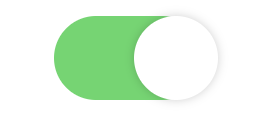
完成物
これです。

html
index.html
<!DOCTYPE html>
<html lang ="ja">
<head>
    <link rel="stylesheet" href="../css/toggle.css">
</head>
<body>
    <div class="toggle-switch">
        <input id="toggle" class="toggle-input" type='checkbox' />
        <label for="toggle" class="toggle-label"/>
    </div>
</body>
</html>
css
toggle.css
.toggle-input {
  position: absolute;
  left: 0;
  top: 0;
  width: 100%;
  height: 100%;
  z-index: 5;
  opacity: 0;
  cursor: pointer;
}

.toggle-label {
  width: 75px;
  height: 42px;
  background: #ccc;
  position: relative;
  display: inline-block;
  border-radius: 46px;
  transition: 0.4s;
  box-sizing: border-box;
}
.toggle-label:after {
  content: "";
  position: absolute;
  width: 42px;
  height: 42px;
  border-radius: 100%;
  left: 0;
  top: 0;
  z-index: 2;
  background: #fff;
  box-shadow: 0 0 5px rgba(0, 0, 0, 0.2);
  transition: 0.4s;
}

.toggle-input:checked + .toggle-label {
  background-color: #4BD865;
}
.toggle-input:checked + .toggle-label:after {
  left: 40px;
}

.toggle-switch {
  position: relative;
  width: 75px;
  height: 42px;
  margin: auto;
}
ちょっと説明
よくあるやり方ですがcheckboxにデザインをあてて実現してます。
上に乗っている丸いボタンはlabelタグです。
checkedの時に背景色を変え、labelタグを動かし、この時の変化をアニメーションにするためにtransitionを付与します。
あとはデザインの話なのでお好きにどうぞで。