はじめに
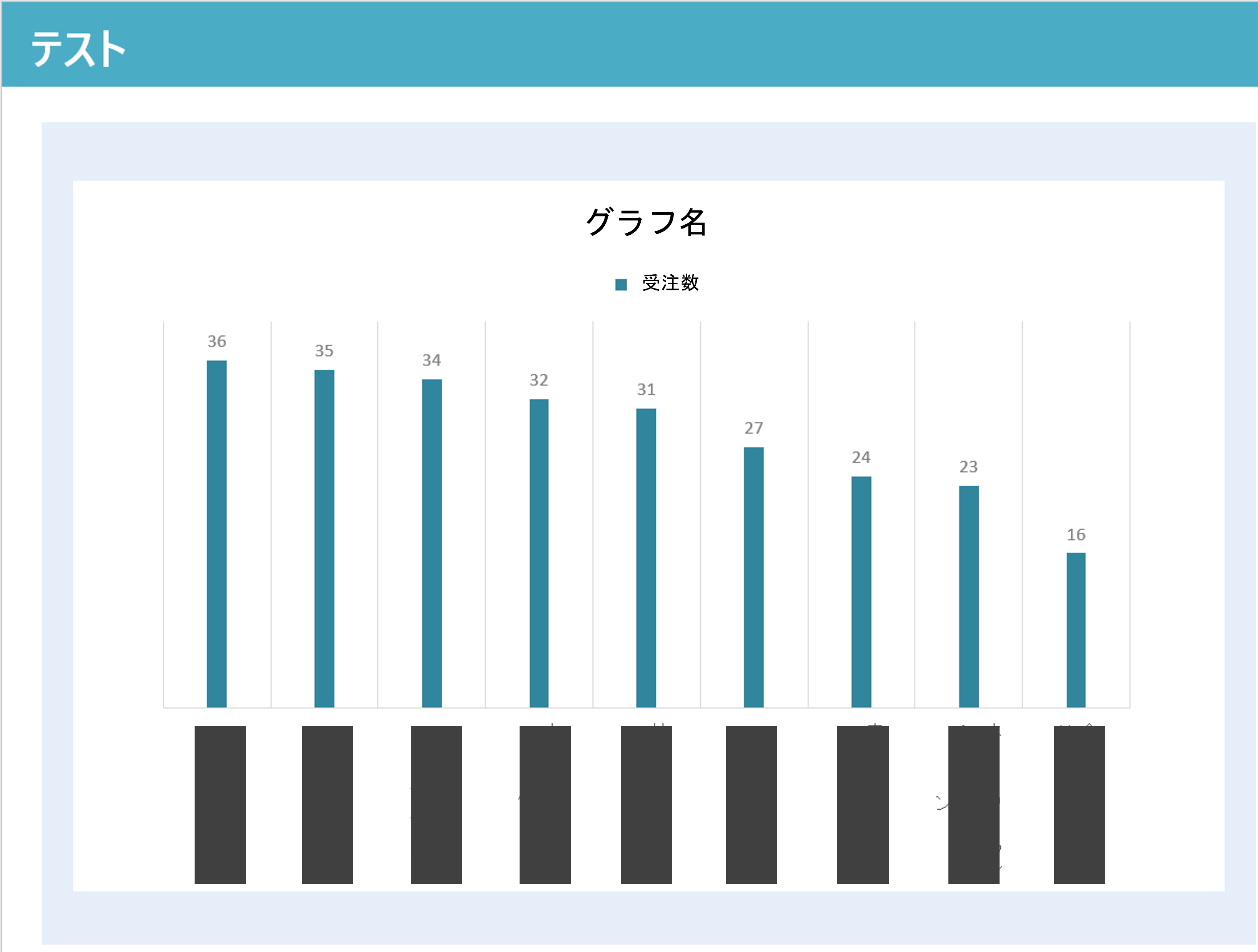
以下の画像のようにgooglechartsで背景色を設定したい。
けれどgooglechartsってoptionの設定がいっぱいあってどう書けばどの範囲のbackground color を指定できるのかわからない。
日本語文献も少なそうなのでまとめました。
ソースコード
test.blade.php
<div class="p-header base-bg">
    テスト
</div>
<section class="pg-body">
    <div class="bg-white">
        <div id="group-graph" style="background-color:black;"></div>
    </div>

</section>
cssは以下のように設定
test.css
.p-header{
    margin-top:0pt;
    margin-bottom:10pt;
    font-size:45pt;
    height:50pt;
    padding-top:40pt;
    padding-left:15pt;
    font-weight:bold;
}
.base-bg{
    background-color:#4BACC6;(タイトル背景色の青系の色)
    color:#fff;
}

.pg-body{
    background-color:#B8E2DB;(水色っぽい色)
}
.bg-white{
    background-color:#fff;(白)
}
test.blade.php javascript
function drawChartGroup(){
const groups_count = {{ $groups_count }};
const groups = @json($getData);
var data = new google.visualization.DataTable();
data.addColumn('string', 'title');
data.addColumn('number', '受注数');
var count = 0;
while(count < groups_count){
data.addRow([groups[count]['name'], groups[count]['count']]);
count++;
}
var view = new google.visualization.DataView(data);
view.setColumns([0, 1, {
calc: 'stringify',
role: 'annotation',
sourceColumn: 1,
type: 'string'
}]);
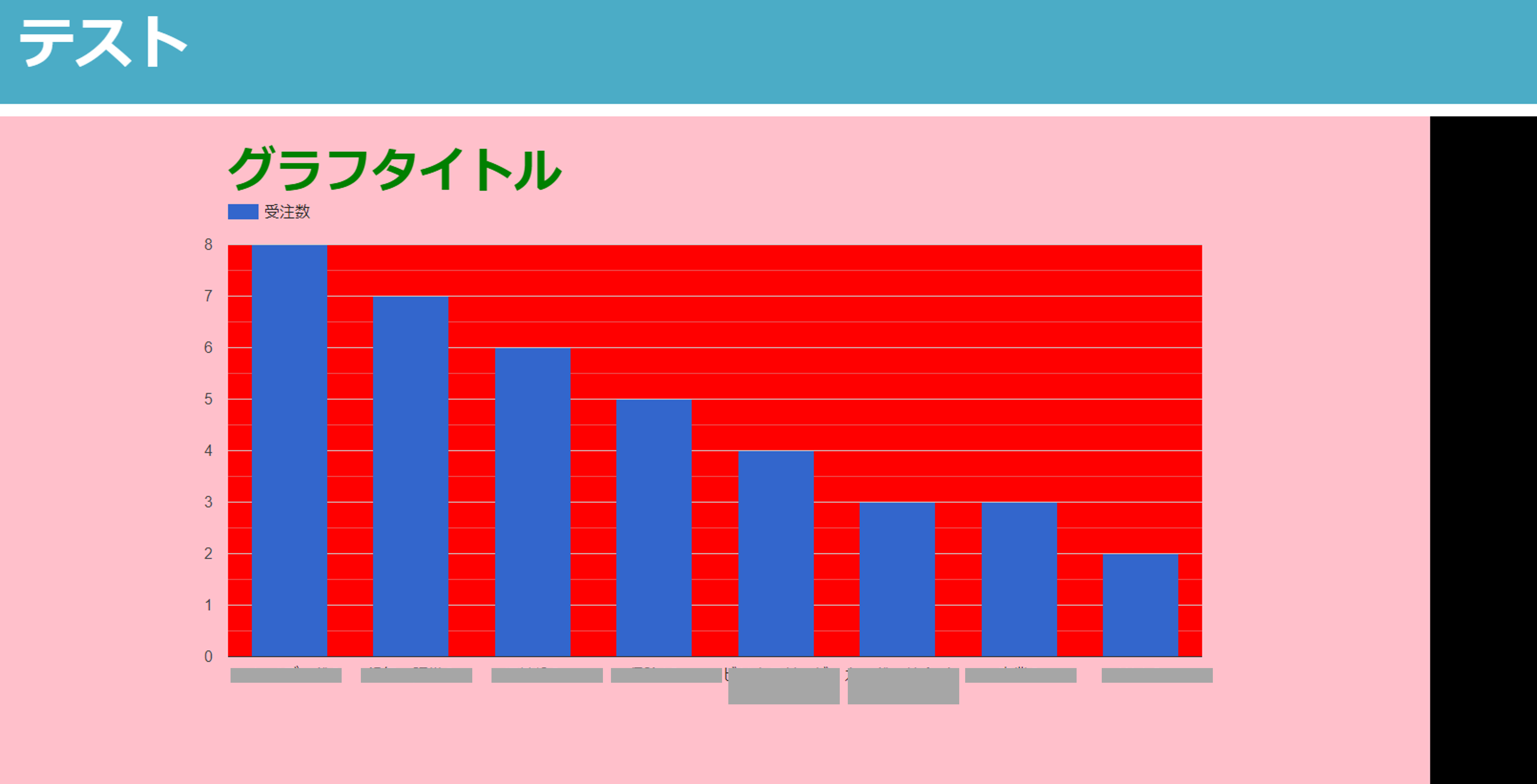
var options = {
title: 'グラフタイトル',
titleTextStyle:{
fontSize:50,
color: 'green',
},
height:700,
width:1500,
chartArea: { backgroundColor : {
fill: 'red',
fillOpacity: 100
},
},
backgroundColor: 'pink',
vAxis: { format: '###' },
legend: { position: 'top', alignment: 'start' },
}
var chart = new google.visualization.ColumnChart(document.getElementById('group-graph'));
chart.draw(data, options);
}
わかりやすいように各所で激しめの(?)色を設定してみました。
上記のソースコードで入力の結果、以下の画像の結果になりました。
まとめ
ソースコードに書いた色と、出力結果を照らし合わせてまとめると。。
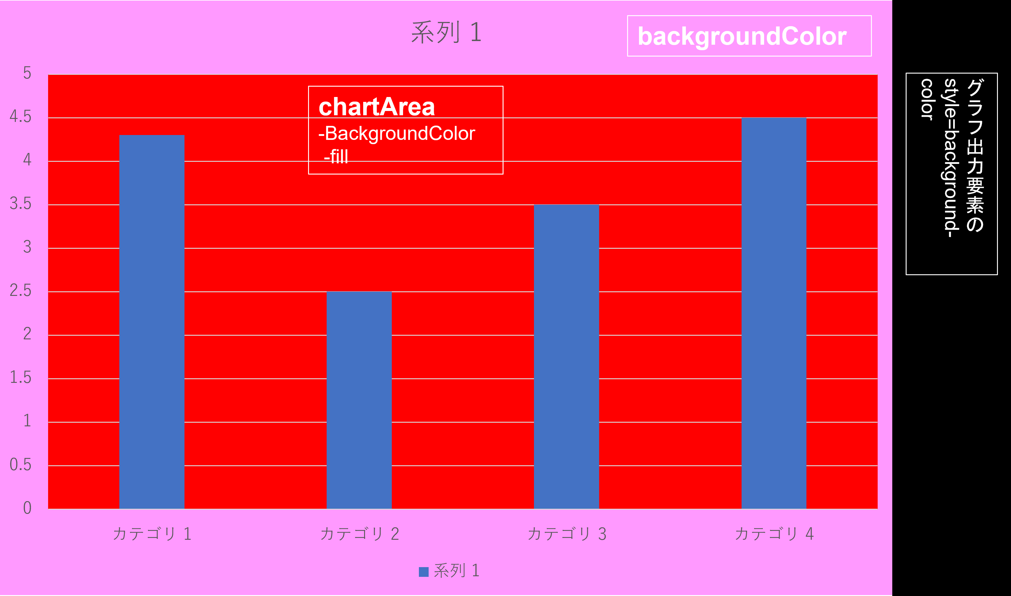
optionではこの項目で指定して背景色を設定すれば
自分の意図した箇所に色を設定できることがわかりました!!