はじめに
とある事情でchart.jsを3.x系にバージョンアップできないので、いろいろこねくり回して角が丸くできるようにしました。
今後なんかあったとき見返せるように記事にして残しておこうと思います。
vue-chart.jsってタグ入ってるけど、chart.jsの機能で作ってるのでchart.jsだけでも動くと思います。
環境
vue 2.7.10
nuxt 2.15.8
vue-chartjs 3.4.2
chart.js 2.8.0
作りたいもの

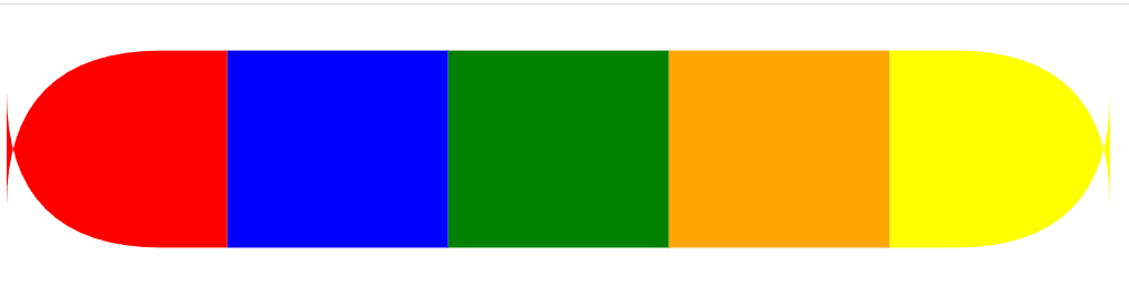
こんな感じでグラフの各データの最大合計値が決まってて、足りない分はグレーで表示される積み上げ横棒のグラフの角を丸くする。
その際にはデータの種類にかかわらず、その時一番右と左にあるデータが丸くなって欲しい。
方法を探したところ、このサイト通りにChartの拡張機能を使えば大体はできるのですが、そのままだとデータごとに設定されたborderSkippedの通りにしか丸くしたりしなかったりと、描写が静的によって決まってしまいます。
datasets: [
    {
        label: '',
		backgroundColor: "red",
		hoverBackgroundColor: "red",
		data: [20, 10, 100, 25],
        borderSkipped: true ← これが設定されたやつによって丸くするか決まる
	}
]
しかし私が作りたいグラフは、必ずすべての種類のデータが入力されるわけではなく、中には一つのデータで最大合計値を満たすケースも出てきます。
その場合、丸くするしないは動的に変更していくしかありません。
詳しくは下の実装を見ていただきたいですが、datasetsを回して判別していきます
実装
癖でlodash入れてるんですが、lodash使ってない方は、適宜該当箇所を別の手段に置き換えてください
<script>
import { mixins, generateChart } from 'vue-chartjs'
import Chart from 'chart.js'
import _ from 'lodash'
const reactiveProp = mixins

// 両側丸くするやつ
Chart.helpers.drawRoundedRectangle = function(ctx, x, y, width, height, radius) {
	ctx.beginPath()
	ctx.moveTo(x, y)
	// 右上
	ctx.lineTo(x + width - radius, y)
	ctx.quadraticCurveTo(x + width, y, x + width, y + radius)
	// 右下
	ctx.lineTo(x + width, y + height - radius)
	ctx.quadraticCurveTo(x + width, y + height, x + width - radius, y + height)
	// 左下
	ctx.lineTo(x + radius, y + height)
	ctx.quadraticCurveTo(x, y + height, x, y + height - radius)
	// 左上
	ctx.lineTo(x, y + radius)
	ctx.quadraticCurveTo(x, y, x + radius, y)
	ctx.closePath()
}

// 左側だけ丸くするやつ
Chart.helpers.drawRoundedLeftRectangle = function(ctx, x, y, width, height, radius) {
	ctx.beginPath()
	ctx.moveTo(x + radius, y)
	// 右上
	ctx.lineTo(x + width, y)
	// 右下
	ctx.lineTo(x + width, y + height)
	// 左下
	ctx.lineTo(x + radius, y + height)
	ctx.quadraticCurveTo(x, y + height, x, y + height - radius)
	// 左上
	ctx.lineTo(x, y + radius)
	ctx.quadraticCurveTo(x, y, x + radius, y)
	ctx.closePath()
}

// 右側だけ丸くするやつ
Chart.helpers.drawRoundedRightRectangle = function(ctx, x, y, width, height, radius) {
	ctx.beginPath()
	ctx.moveTo(x, y)
	// 右上
	ctx.lineTo(x + width - radius, y)
	ctx.quadraticCurveTo(x + width, y, x + width, y + radius)
	// 右下
	ctx.lineTo(x + width, y + height - radius)
	ctx.quadraticCurveTo(x + width, y + height, x + width - radius, y + height)
	// 左下
	ctx.lineTo(x, y + height)
	// 左上
	ctx.lineTo(x, y)
	ctx.closePath()
}

// 直線
Chart.helpers.drawStraightBar = function(ctx, x, y, width, height) {
	ctx.beginPath()
	ctx.moveTo(x, y)
	ctx.lineTo(x + width, y)
	ctx.lineTo(x + width, y + height)
	ctx.lineTo(x, y + height)
	ctx.lineTo(x, y)
	ctx.closePath()
}

Chart.elements.RoundedRectangle = Chart.elements.Rectangle.extend({
  draw: function() {
    // ここからdataによって丸くするしないを判別する
	const dataList = _.map(this._chart.data.datasets, `data[${this._index}]`)
	const firstDataIndex = _.findIndex(dataList, value => value > 0)
	const lastDataIndex = _.findIndex(
		dataList,
		(value, currentIndex, dataList) =>
		_.sum(_.slice(dataList, 0, currentIndex + 1)) === 100
	)
    // 一種類のデータで最大値まで満たす場合
	if (firstDataIndex === lastDataIndex) {
		if (this._datasetIndex !== firstDataIndex) {
			borderSkipped = 'none'
		} else {
			borderSkipped = 'both'
		}
	} else if (this._datasetIndex === firstDataIndex) {
		borderSkipped = 'left'
	} else if (this._datasetIndex === lastDataIndex) {
		borderSkipped = 'right'
	} else {
    	borderSkipped = 'straight'
	}
    // ここまで

	const ctx = this._chart.ctx
	const vm = this._view
	let left, right, top, bottom, borderSkipped
	let borderWidth = vm.borderWidth

	left = vm.base
	right = vm.x
	top = vm.y - vm.height / 2
	bottom = vm.y + vm.height / 2

	const barWidth = Math.abs(left - right)
	// グラフの大きさによってradiusが異なるので、optionから取得する
	const radius = this._chart.config.options.barRoundness

	const prevTop = top
	top = prevTop + radius
	const barRadius = top - prevTop

	ctx.beginPath()
	ctx.fillStyle = vm.backgroundColor
	ctx.strokeStyle = vm.borderColor
	ctx.lineWidth = borderWidth

	if (borderSkipped === 'both') {
		Chart.helpers.drawRoundedRectangle(ctx, left, (top - barRadius + 1), barWidth, bottom - prevTop, barRadius)
	} else if (borderSkipped === 'left') {
		Chart.helpers.drawRoundedLeftRectangle(ctx, left, (top - barRadius + 1), barWidth, bottom - prevTop, barRadius)
	} else if (borderSkipped === 'right') {
		Chart.helpers.drawRoundedRightRectangle(ctx, left, (top - barRadius + 1), barWidth, bottom - prevTop, barRadius)
	} else {
		Chart.helpers.drawStraightBar(ctx, left, (top - barRadius + 1), barWidth, bottom - prevTop)
	}

    // noneに設定したものは描写しないようにしないと丸くした部分の後ろに背景色として出てくる
	if (borderSkipped !== 'none') {
		ctx.fill()
	}
	if (borderWidth) {
	  ctx.stroke()
	}
  },
})

Chart.defaults.roundedBar = Chart.helpers.clone(Chart.defaults.horizontalBar)

Chart.controllers.roundedBar = Chart.controllers.horizontalBar.extend({
	dataElementType: Chart.elements.RoundedRectangle
})

const CustomBar = generateChart('custom-bar', 'roundedBar')

export default {
	mixins: [CustomBar, reactiveProp],
	props: {
		chartData: {
			type: Object,
			default: () => {}
		},
		options: {
			type: Object,
			default: () => {}
		}
	},
	mounted() {
		this.renderChart(this.chartData, this.options)
	}
}

</script>
<template>
  <!-- <Tutorial/> -->
	<bar-chart :chart-data="chartData" :options="options" style="width: 1000px;"></bar-chart>
</template>

<script lang="ts">
import Vue from 'vue'
import BarChart from '@/components/BarChart.vue'

export default Vue.extend({
  name: 'IndexPage',
	data() {
		return {
			chartData: {
				labels:['', '', '', ''],
				datasets: [
					{
						label: '国語',
						backgroundColor: "red",
						hoverBackgroundColor: "red",
						data: [20, 10, 100, 25]
					},
					{
						label: '数学',
						backgroundColor: "blue",
						hoverBackgroundColor: "blue",
						data: [20, 10, 0, 25]
					},
					{
						label: '英語',
						backgroundColor: "green",
						hoverBackgroundColor: "green",
						data: [20, 10, 0, 25]
					},
					{
						label: '社会',
						backgroundColor: "orange",
						hoverBackgroundColor: "orange",
						data: [20, 10, 0, 0]
					},
					{
						label: '理科',
						backgroundColor: "yellow",
						hoverBackgroundColor: "yellow",
						data: [20, 10, 0, 25]
					},
					{
						label: '',
						backgroundColor: "gray",
						hoverBackgroundColor: "gray",
						data: [0, 50, 0, 0]
					}
				]
			},
			options: {
				responsive: true,
				barRoundness: 90, // ここで曲がり具合を指定する グラフの大きさによって適正値が変わるので表示したいグラフに合わせて設定してください
				legend: {
					display: false
				},
				scales: {
					xAxes: [
						{
							stacked: true,
							display: false
						}
					],
					yAxes: [{ stacked: true, gridLines: true }]
				}
			}
		}
	}
})
</script>
結果

上手く表示できました!
ただ課題としてbarRoundnessの値が一定値を超えると描画が崩壊するんですよね…
私はそこまで丸くする必要がないので妥協しましたが、もしもっと丸くするならこの実装のままじゃダメなので何かしらの対策が必要です。
もしもこの問題を解決出来たら、その方法を是非教えてください!(他力本願)