matplotlibを使ってグラフを描く
折れ線グラフ
graph001.py
# pyplotを用意
import matplotlib.pyplot as plt
# ggplotを使う
plt.style.use("ggplot")
# プロットするテーブルを用意
fig = plt.figure()
ax = fig.add_subplot(111)
# 描きたいグラフのx,yを用意
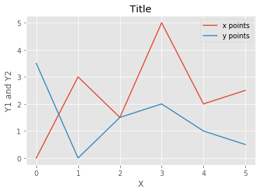
x = [0, 1, 2, 3, 4, 5]
y1 = [0, 3, 1.5, 5, 2, 2.5]
y2 = [3.5, 0, 1.5, 2, 1, 0.5]
# 折れ線グラフの用意
ax.plot(x, y1, label = "x points")
ax.plot(x, y2, label = "y points")
# タイトルを用意
ax.set_title("Title")
ax.set_ylabel("Y1 and Y2")
ax.set_xlabel("X")
# 凡例を付ける
ax.legend()
# グラフを描く
plt.show()
こんな感じ
散布図
graph002.py
import matplotlib.pyplot as plt
import numpy as np

plt.style.use("ggplot")

fig = plt.figure()
ax = fig.add_subplot(111)

np.random.seed(3)

x = np.arange(1, 101)
y = 10 * x * np.random.rand(100)

ax.scatter(x, y, label = "point")

# タイトルを用意
ax.set_title("Title")

# 凡例を付ける
ax.legend()

plt.show()
こんな感じ

棒グラフ
graph003.py
import matplotlib.pyplot as plt

plt.style.use("ggplot")
fig = plt.figure()
ax = fig.add_subplot(111)

x = [1, 2, 3, 4, 5]
y = [1, 3, 2 ,5 ,4]

labels = ['aaa', 'bbb', 'ccc', 'ddd', 'eee' ]
ax.bar(x, y, tick_label=labels)

plt.show()
こんな感じ
