はじめに
- 最近、時系列のグラフを多く見かけますが、一部の軸ラベルは傾いています。
- 恐らく見栄えを弄る時間が無かったか?もしくは対処法が見つからなかったかもしれません。
- 私自身も、軸ラベルを傾けるかあるいは横向けのグラフで妥協して作図していました。
背景
- 「データ視覚化のデザイン#4」で軸ラベルは傾けないという記事をTwitterで見かけました。
- その記事では、軸ラベルを傾ければ文字の認識に要する時間が伸びていくという研究の紹介がありました。
- ではどうすればと、軸ラベルを傾ない方法を調べました。
サンプルデータ
import pandas as pd
import numpy as np
import matplotlib.pyplot as plt
import matplotlib.dates as mdates
import matplotlib.ticker as ticker

# サンプルデータ
data = pd.DataFrame({'MAU':np.random.randint(5000, 8500,(10,))},
                     index=pd.date_range('2019/12/25', freq='d', periods=10))
| MAU | |
|---|---|
| 2019-12-25 | 6831 |
| 2019-12-26 | 6829 |
| 2019-12-27 | 5477 |
| 2019-12-28 | 8204 |
| 2019-12-29 | 8227 |
| 2019-12-30 | 6257 |
| 2019-12-31 | 5828 |
| 2020-01-01 | 5868 |
| 2020-01-02 | 5355 |
| 2020-01-03 | 5548 |
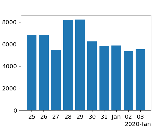
いつも通りのグラフ
fig = plt.figure(figsize=(4,3), dpi=144)
ax = fig.add_subplot(111)

ax.bar(data.index, data['MAU'])
ax.set_xticklabels(data.index, rotation=45)

plt.tight_layout()
plt.savefig('test01.svg')
plt.show()

- 確かに傾いたラベルに合わせて、頭を傾けている自分がいる。
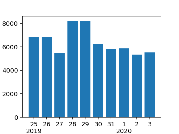
こんな便利なのがあったのか!
# Locatorとformatterを使って見栄えよく
fig = plt.figure(figsize=(4,3), dpi=144)
ax = fig.add_subplot(111)

locator = mdates.AutoDateLocator()
formatter = mdates.ConciseDateFormatter(locator)

ax.xaxis.set_major_locator(locator)
ax.xaxis.set_major_formatter(formatter)

ax.bar(data.index, data['MAU'])

plt.savefig('test02.svg')
plt.show()
- 上記のグラフの軸ラベルの見え方でOKならば、以下の4行を追加するべし!たったこれだけ!
locator = mdates.AutoDateLocator()
formatter = mdates.ConciseDateFormatter(locator)

ax.xaxis.set_major_locator(locator)
ax.xaxis.set_major_formatter(formatter)
もうちょっとカスタマイズしたい!
- 先ほどのグラフの軸ラベルは、年・月・日情報がすべて含まれているで十分なのですが、年をまたぐ場合は、頭の中で引き算が必要です。
- 例えば、軸ラベルの最初には年情報が欲しい!など、どうする?
軸ラベルを自ら作成する
fmt = []
yy = ''
for x in data.index:
    years = x.year
    days = x.day
    if yy != x.year:
        fmt.append(str(days)+'\n'+str(years))
    else:
        fmt.append(str(days))
    yy = x.year

fig = plt.figure(figsize=(4,3), dpi=144)
ax = fig.add_subplot(111)

ax.set_xticklabels(fmt)
ax.bar(data.index, data['MAU'])

plt.savefig('test03.png')
plt.show()
- 単一のグラフや軸ラベルが少ない場合に適していると思います。
matplotlibのformatterでFixedFormatterを使ってみる。
fig = plt.figure(figsize=(4,3), dpi=144)
ax = fig.add_subplot(111)

# positions = [0,1,2,3,4,5,6,7,8,9]
labels = ['Dec\n2019','26','27','28','29','30','31','Jan\n2020','2','3']
# ax.xaxis.set_major_locator(ticker.FixedLocator(positions))
ax.xaxis.set_major_formatter(ticker.FixedFormatter(labels))

ax.bar(data.index, data['MAU'])

plt.savefig('test04.png')
plt.show()

- 使い方は、リスト形式で軸ラベルを作成して、それをformatterに設定するだけです。
- Locatorは設定すると、軸ラベルが表示されなかったのでコメントアウトしています。
- これも、独自に作成する点は同じですが、複数グラフに適してると思います。
matplotlibのformatterでFuncFormatterを使ってみる。
# matplotlibはグレゴリオ暦を使用する
fig = plt.figure(figsize=(4,3), dpi=144)
ax = fig.add_subplot(111)

YY = ''
@ticker.FuncFormatter
def major_fmt(x, pos):
    global YY
    y = mdates.num2date(int(x)).year
    d = mdates.num2date(int(x)).day
    if YY != y:
        t = '{}\n{}'.format(d, y)
    else:
        t = '{}'.format(d)
    YY = y
    return t

ax.xaxis.set_major_formatter(major_fmt)

ax.bar(data.index, data['MAU'])

plt.savefig('test05.png')
plt.show()

- ユーザー定義の関数を使って軸ラベルを作成します。
- @ticker.FuncFormatterから関数が自動的に実行されます。
- この記事を書くまで、matplotlibはグレゴリオ暦が基準と知りませんでした。

- なので、
num2date(int(x))で変換が必要です。
locatorとFormatterについて
- Locatorは軸ラベルをどのように配置するか
- Formatterは軸ラベルをどのような表示形式で表示するか
- 以下の公式マニュアルを読み込んでみれば、軸ラベル力が各段に上達します。
[Matplotlib]公式サイト
まとめ
-
「軸ラベル」を傾けないについて、
MatplotlibのFormatterを使ってカスタマイズする。 - 1)自力で軸ラベルを作成する。2)自動設定を使う。3)FixedFormatterを使う。4)FuncFormatterを使う。
- この記事を書いてデータ視覚化のデザイン力が少し上がった気分になりました。