Flexbox
inline-blockを使用してもできるが、細かいところを自動で修正してくれ、簡単にレイアウトを作成することができるプロパティー。
正式名称は「Flexible Box Layout Module」
横並び、縦並びどちらもできる。
レスポンシブのときはdisplay:blockではなく、flex-directionプロパティをつかって縦並びにするといい感じ
使い方
親要素にdisplay:flex;を指定する。
<div class="f-container">
	<div class="f-itema">1</div>
	<div class="f-itemb">2</div>
	<div class="f-itemc">3</div>
</div>
.f-container{
  display:flex;
}
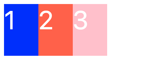
デフォルト
アイテムが水平方向に左から右へと配置される。
.f-container{
  display:flex;
  width: 200px;
  color: white;
  font-size: 50px;
}
.f-itema {
  background-color: blue;
  height: 100px;
  width: 100px;
}
.f-itemb {
  background-color: tomato;
  height: 100px;
  width: 100px;

}
.f-itemc {
  background-color: pink;
  height: 100px;
  width: 100px;
}
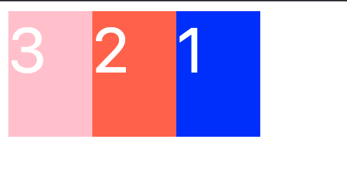
逆順にしたい
.f-container {
  display:flex;
  flex-direction: row-reverse;
}
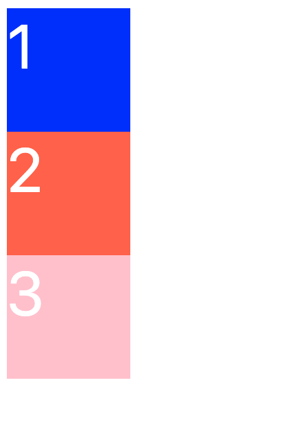
垂直にしたい
.f-container{
  display:flex;
  flex-direction: column;
}
子要素を折り返したい
.f-container{
	display:flex;
  flex-wrap:wrap;
  width: 200px;
  color: white;
  font-size: 50px;
}
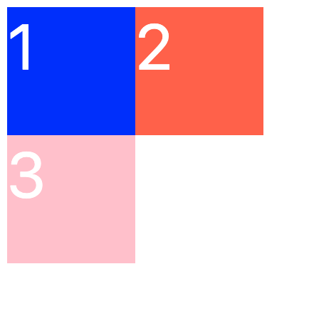
親のwidthが200pxで、子のboxにwidth 100px,height 100px を指定しているので、親のwidth幅を超え、要素が折り返される。
参考