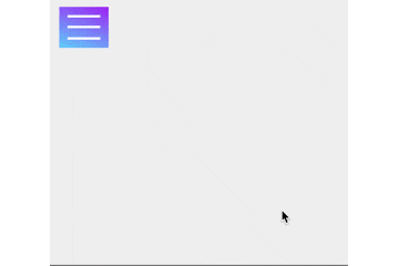
PCやスマホを触っていると間違いなく目にするハンバーガーメニュー
ハンバーガーメニューはどんどん進化していき,アイコン自体がくるくる回って✗に変わったり,あの3本線が様々な動きをするようになった.
しかし,メニュー自体は至ってシンプルであり,横や上からスライドしてくるものばかり...
何か違う動きのハンバーガーメニューのデザインを考えてみようという記事.
DEMO
今回はハンバーガーをクリックすると円が広がるメニューを作成.
中身の説明
円の大きさは固定で直径600pxとし,上と左に300pxずらしている.
css
.hbg-menu {
  position: fixed;
  top: 12px;
  left: 12px;
  width: 60px;
  height: 50px;
  z-index: 1;
}

.hbg-menu-open {
  top: -300px;
  left: -300px;
  width: 600px;
  height: 600px;
  border-radius: 300px;
}
最後に
ハンバーガーメニューはもっともっと進化してほしい!
以上