import numpy as np
import matplotlib.pyplot as plt

# パラメータ設定
alpha = 1.0  # ガウス関数のパラメータ
T = 5        # 時間の範囲
N = 1024     # サンプル数
fs = 1000    # サンプリング周波数

# 時間と周波数の範囲
t = np.linspace(-T, T, N)
dt = t[1] - t[0]  # サンプリング間隔
f = np.fft.fftfreq(N, dt)  # FFTの周波数軸

# ガウス関数
x_t = np.exp(-alpha * t**2)

# FFTの計算
X_f_fft = np.fft.fftshift(np.fft.fft(x_t))
f_shifted = np.fft.fftshift(f)  # 周波数軸を0を中心にシフト

# フーリエ変換の計算
X_f = np.sqrt(np.pi / alpha) * np.exp(- (2 * np.pi * f)**2 / (4 * alpha))

# プロット
plt.figure(figsize=(15, 6))

# ガウス関数のプロット
plt.subplot(1, 3, 1)
plt.plot(t, x_t, label='$x(t) = e^{-\\alpha t^2}$')
plt.title('Gaussian Function $x(t)$')
plt.xlabel('Time $t$')
plt.ylabel('$x(t)$')
plt.legend()
plt.grid(True)

# フーリエ変換のプロット
plt.subplot(1, 3, 2)
plt.plot(f, X_f, label='$X(f) = \\sqrt{\\frac{\\pi}{\\alpha}} e^{-\\frac{(2\\pi f)^2}{4\\alpha}}$', color='orange')
plt.title('Theoretical Fourier Transform $X(f)$')
plt.xlabel('Frequency $f$')
plt.ylabel('$X(f)$')
plt.legend()
plt.grid(True)

# FFT のプロット
plt.subplot(1, 3, 3)
plt.plot(f_shifted, np.abs(X_f_fft), label='FFT of $x(t)$', color='green')
plt.title('FFT of $x(t)$')
plt.xlabel('Frequency $f$')
plt.ylabel('Magnitude')
plt.legend()
plt.grid(True)

plt.tight_layout()
plt.show()
import numpy as np
import matplotlib.pyplot as plt

# 矩形波の生成
def rectangular_wave(t, T):
    return np.where((t % T) < T / 2, 1, 0)

# 時間領域
T = 1.0
t = np.linspace(-2 * T, 2 * T, 1000)
x_t = rectangular_wave(t, T)

# フーリエ変換の理論的結果
def fourier_transform_rectangular_wave(frequency, T):
    return T * np.sinc(frequency * T)

frequencies = np.linspace(-10, 10, 500)
X_f = fourier_transform_rectangular_wave(frequencies, T)

# FFTの計算
N = 512  # サンプル数
t_discrete = np.linspace(-2 * T, 2 * T, N, endpoint=False)
x_t_discrete = rectangular_wave(t_discrete, T)

X_f_discrete = np.fft.fft(x_t_discrete)
frequencies_discrete = np.fft.fftfreq(N, d=(t_discrete[1] - t_discrete[0]))

# プロット
plt.figure(figsize=(14, 6))

# 時間領域
plt.subplot(1, 3, 1)
plt.plot(t, x_t)
plt.title('Time Domain - Rectangular Wave')
plt.xlabel('Time')
plt.ylabel('Amplitude')

# 周波数領域 (理論的なフーリエ変換)
plt.subplot(1, 3, 2)
plt.plot(frequencies, X_f)
plt.title('Frequency Domain - Theoretical')
plt.xlabel('Frequency')
plt.ylabel('Magnitude')

# FFT結果
plt.subplot(1, 3, 3)
plt.plot(frequencies_discrete, np.abs(X_f_discrete))
plt.title('Frequency Domain - FFT')
plt.xlabel('Frequency')
plt.ylabel('Magnitude')
plt.xlim(-10, 10)  # 表示する周波数範囲を指定

plt.tight_layout()
plt.show()
import numpy as np
import matplotlib.pyplot as plt

# パラメータ
f0 = 5  # コサイン関数の周波数
t = np.linspace(0, 1, 500)  # 時間軸
cosine_wave = np.cos(2 * np.pi * f0 * t)  # コサイン関数

# 周波数軸
f = np.linspace(-10, 10, 1000)
delta = 0.1  # ガウス関数の標準偏差
def gaussian(x, mu, sigma):
    return np.exp(-0.5 * ((x - mu) / sigma)**2) / (sigma * np.sqrt(2 * np.pi))

# フーリエ変換
X = 0.5 * (gaussian(f, f0, delta) + gaussian(f, -f0, delta))

# FFT
N = len(t)
T = t[1] - t[0]
yf = np.fft.fft(cosine_wave)
xf = np.fft.fftfreq(N, T)
xf = np.fft.fftshift(xf)
yf = np.fft.fftshift(yf)

# パワースペクトルの計算
power_spectrum = np.abs(yf) ** 2

# プロット
fig, (ax1, ax2, ax3, ax4) = plt.subplots(4, 1, figsize=(10, 16))

# コサイン関数のプロット
ax1.plot(t, cosine_wave, label=r'$\cos(2\pi f_0 t)$')
ax1.set_xlabel('Time (s)')
ax1.set_ylabel('Amplitude')
ax1.set_title('Cosine Function')
ax1.grid(True)
ax1.legend()

# フーリエ変換のプロット
ax2.plot(f, X, label=r'$0.5 [\delta(f - f_0) + \delta(f + f_0)]$')
ax2.set_xlabel('Frequency (Hz)')
ax2.set_ylabel('Amplitude')
ax2.set_title('Fourier Transform of $\cos(2\pi f_0 t)$')
ax2.grid(True)
ax2.legend()

# FFTのプロット
ax3.plot(xf, np.abs(yf), label='FFT of $\cos(2\pi f_0 t)$')
ax3.set_xlabel('Frequency (Hz)')
ax3.set_ylabel('Magnitude')
ax3.set_title('FFT of Cosine Function')
ax3.grid(True)
ax3.legend()

# パワースペクトルのプロット
ax4.plot(xf, power_spectrum, label='Power Spectrum of $\cos(2\pi f_0 t)$')
ax4.set_xlabel('Frequency (Hz)')
ax4.set_ylabel('Power')
ax4.set_title('Power Spectrum')
ax4.grid(True)
ax4.legend()

plt.tight_layout()
plt.show()
import numpy as np
import matplotlib.pyplot as plt

# Define parameters
T = 1  # Period of the rectangular and triangular waves
Fs = 1000  # Sampling frequency for FFT
N = 2048  # Number of samples for better frequency resolution
t = np.linspace(-2*T, 2*T, N)  # Time range

# Define the rectangular and triangular waves
def rect(t, T):
    return np.where(np.abs(t) <= T / 2, 1, 0)

def tri(t, T):
    return np.maximum(0, 1 - np.abs(t) / (T / 2))

# Define the sinc function
def sinc(x):
    return np.sin(x) / x

# Rectangular and triangular wave signals with zero padding
rect_wave = rect(t, T)
tri_wave = tri(t, T)

# Apply windowing
window = np.hanning(N)
rect_wave_windowed = rect_wave * window
tri_wave_windowed = tri_wave * window

# Zero padding (if not using full length of N)
rect_wave_padded = np.pad(rect_wave_windowed, (0, max(0, N - len(rect_wave_windowed))), mode='constant')
tri_wave_padded = np.pad(tri_wave_windowed, (0, max(0, N - len(tri_wave_windowed))), mode='constant')

# Compute the FFT
def compute_fft(signal, Fs):
    fft_vals = np.fft.fftshift(np.fft.fft(signal))
    freqs = np.fft.fftshift(np.fft.fftfreq(len(signal), 1/Fs))
    return freqs, np.abs(fft_vals)

# FFT for rectangular and triangular waves
rect_freqs, rect_fft = compute_fft(rect_wave_padded, Fs)
tri_freqs, tri_fft = compute_fft(tri_wave_padded, Fs)

# Frequency range for theoretical spectra (in Hz)
omega = np.linspace(-10 * np.pi, 10 * np.pi, N)  # Frequency range in rad/s
freqs_hz = omega / (2 * np.pi)  # Convert to Hz

# Fourier Transforms
rect_spectrum = T * sinc(omega * T / (2 * np.pi))
tri_spectrum = (T**2 / 2) * sinc(omega * T / (2 * np.pi))**2

# Plotting
plt.figure(figsize=(14, 10))

# Rectangular wave and its spectrum
plt.subplot(2, 2, 1)
plt.plot(t, rect_wave)
plt.title('Rectangular Wave')
plt.xlabel('Time (t)')
plt.ylabel('Amplitude')
plt.grid(True)

plt.subplot(2, 2, 2)
plt.plot(freqs_hz, rect_spectrum)
plt.title('Rectangular Wave Spectrum (Theoretical)')
plt.xlabel('Frequency (Hz)')
plt.ylabel('Magnitude')
plt.grid(True)

# Triangular wave and its spectrum
plt.subplot(2, 2, 3)
plt.plot(t, tri_wave)
plt.title('Triangular Wave')
plt.xlabel('Time (t)')
plt.ylabel('Amplitude')
plt.grid(True)

plt.subplot(2, 2, 4)
plt.plot(freqs_hz, tri_spectrum)
plt.title('Triangular Wave Spectrum (Theoretical)')
plt.xlabel('Frequency (Hz)')
plt.ylabel('Magnitude')
plt.grid(True)

plt.tight_layout()
plt.show()

# Plot FFT results
plt.figure(figsize=(14, 8))

# FFT of rectangular wave
plt.subplot(2, 2, 1)
plt.plot(rect_freqs, rect_fft)
plt.title('FFT of Rectangular Wave')
plt.xlabel('Frequency (Hz)')
plt.ylabel('Magnitude')
plt.grid(True)

# FFT of triangular wave
plt.subplot(2, 2, 2)
plt.plot(tri_freqs, tri_fft)
plt.title('FFT of Triangular Wave')
plt.xlabel('Frequency (Hz)')
plt.ylabel('Magnitude')
plt.grid(True)

plt.tight_layout()
plt.show()
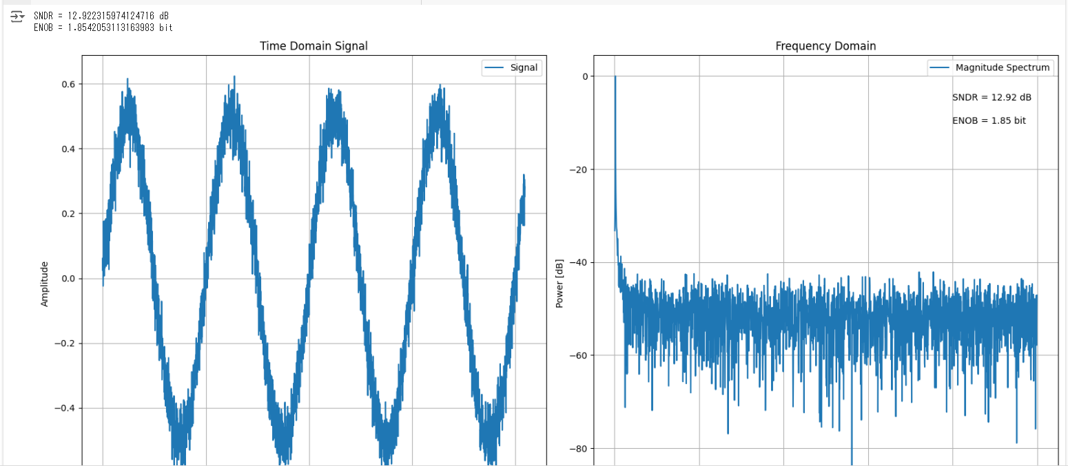
import numpy as np
import matplotlib.pyplot as plt

# 基本パラメータ設定
N = 4096         # サンプル数
dt = 1e-6        # サンプリング間隔 (秒)
f0 = 1e3         # 信号周波数 (Hz)

# 時間軸の作成
t = np.arange(0, N*dt, dt)

# 信号の生成 (例えば、サイン波にノイズを加えた信号)
signal = 0.5 * np.sin(2 * np.pi * f0 * t) + 0.05 * np.random.randn(N)

# FFTの計算
F = np.fft.fft(signal)
freq = np.fft.fftfreq(N, dt)
freq_norm = freq / (1 / dt)  # 正規化

# パワースペクトルを計算
Power = np.abs(F)**2

# シグナルを探す
max_index = np.argmax(Power[1:int(N/2)]) + 1
Signal = Power[max_index]

# パワースペクトルをdB値に変換 (シグナル基準)
Pow_dB = 10 * np.log10(Power / Signal)

# 直流成分とシグナルを除いたノイズパワーの和
Noise = np.sum(Power[1:int(N/2)]) - Signal

# SNDRとENOBの計算
SNDR = 10 * np.log10(Signal / Noise)
ENOB = (SNDR - 1.76) / 6.02

# 結果の表示
print("SNDR =", SNDR, "dB")
print("ENOB =", ENOB, "bit")

# グラフの表示
plt.figure(figsize=(16, 8))

# 時間領域でのプロット
plt.subplot(121)
plt.plot(t, signal, label='Signal')
plt.xlabel("Time [sec]")
plt.ylabel("Amplitude")
plt.grid()
plt.title("Time Domain Signal")
plt.legend()

# 周波数領域でのプロット
plt.subplot(122)
plt.plot(freq_norm[1:int(N/2)], Pow_dB[1:int(N/2)], label='Magnitude Spectrum')
plt.xlabel('Frequency [Hz]')
plt.ylabel('Power [dB]')
plt.title("Frequency Domain")
plt.grid()
plt.text(0.4, -5.3, "SNDR = "+str(round(SNDR, 2))+" dB")
plt.text(0.4, -10.3, "ENOB = "+str(round(ENOB, 2))+" bit")
plt.legend()

plt.tight_layout()
plt.show()
import numpy as np

# 基本パラメータの設定
N = 7                      # サンプル数の指数部
fs = 392.1568627 * (10**3) # サンプリング周波数 (Hz)
finRate = 8                # 入力周波数の位置

# FFTポイント数とナイキストポイントの計算
FFT_points = 2**N
nyquist_points = FFT_points // 2

# 周波数の計算とリストの初期化
freq = []

# 2からN-1までの範囲で周波数分解能を計算
for n in range(2, N):
    prime = 2**n - 1  # 2^n - 1
    fin_per_fs = prime / FFT_points
    freq.append(fin_per_fs)

# 入力周波数の位置に基づいて最も近い周波数を探す関数
def find_nearest(array, value):
    array = np.array(array)
    index = (np.abs(array - value)).argmin()
    return index

# ターゲット周波数に最も近い周波数のインデックスを取得
target_freq = 1 / finRate
index = find_nearest(freq, target_freq)

# 最適な入力周波数の計算
fin = freq[index] * fs

# 単位を設定
if fin >= 1e9:
    unit = ' [G] Hz'
    fin /= 1e9
elif fin >= 1e6:
    unit = ' [M] Hz'
    fin /= 1e6
elif fin >= 1e3:
    unit = ' [K] Hz'
    fin /= 1e3
else:
    unit = ' Hz'

# 結果をフォーマットして表示
print(f"最適な入力周波数は {fin:.6f}{unit} です。")
import numpy as np
import matplotlib.pyplot as plt

# 基本パラメータの設定
N = 1024  # FFTポイント数
f_signal = 109.375e3  # 信号周波数 (Hz)
t_sampling = 1e-6  # サンプリング時間間隔 (秒)
duration = N * t_sampling  # 信号の持続時間 (秒)
t = np.arange(0, duration, t_sampling)  # 時間軸
v_amplitude = 5  # 信号の振幅
v_offset = 0  # 信号のDCオフセット

# 信号の生成 (サイン波)
v_signal = v_amplitude * np.sin(2 * np.pi * f_signal * t) + v_offset

# ADCパラメータ
n_bits = 12  # デジタル出力のビット数
v_min = -5.0  # 最小入力電圧
v_max = 5.0  # 最大入力電圧

# ADC変換関数
def adc_convert(input_voltage, n_bits, v_min, v_max):
    voltage_range = (v_max - v_min) / (2 ** n_bits)
    digital_level = int((input_voltage - v_min) / voltage_range)
    digital_level = np.clip(digital_level, 0, 2 ** n_bits - 1)
    return digital_level

# ADC変換
d_signal = np.zeros_like(v_signal, dtype=np.int16)
for i in range(len(v_signal)):
    d_signal[i] = adc_convert(v_signal[i], n_bits, v_min, v_max)

# FFT
F = np.fft.fft(d_signal)
freq = np.fft.fftfreq(N, t_sampling)
freq_norm = freq / (1 / t_sampling)  # 正規化

# パワースペクトルを計算
Power = np.abs(F) ** 2
max_index = np.argmax(Power[1:int(N / 2)]) + 1
Signal = Power[max_index]
Pow_dB = 10 * np.log10(Power / Signal)

# 直流成分とシグナルを除いたノイズパワーの和
Noise = np.sum(Power[1:int(N / 2)]) - Signal
SNDR = 10 * np.log10(Signal / Noise)
ENOB = (SNDR - 1.76) / 6.02

print("SNDR=", SNDR, "dB")
print("ENOB=", ENOB, "bit")

# デジタル信号のソート
def wave_sort(data, fs, f_signal):
    data_num = len(data)
    t_signal = 1 / f_signal
    Ts = 1 / fs
    dx_list = []
    for n in range(data_num):
        i = int((Ts * n) / t_signal)
        dx_list.append((Ts * n) - (t_signal * i))
    sorted_indices = sorted(range(len(dx_list)), key=lambda k: dx_list[k])
    sort = [data[i] for i in sorted_indices]
    return sort

sort = wave_sort(d_signal, 1 / t_sampling, f_signal)

# グラフ表示
plt.figure(figsize=(16, 8))

# 時間領域のプロット
plt.subplot(121)
plt.plot(t, sort, label='Sorted Digital Signal')
plt.xlabel("Time [sec]")
plt.ylabel("Signal")
plt.grid()

# 周波数領域のプロット
plt.subplot(122)
plt.plot(freq_norm[1:int(N / 2)], Pow_dB[1:int(N / 2)], label='Power Spectrum')
plt.xlabel('f/fs')
plt.ylabel('Power [dB]')
plt.text(0.4, -5.3, f"SNDR = {SNDR:.2f} dB")
plt.text(0.4, -10.3, f"ENOB = {ENOB:.2f} bit")
plt.grid()

plt.show()
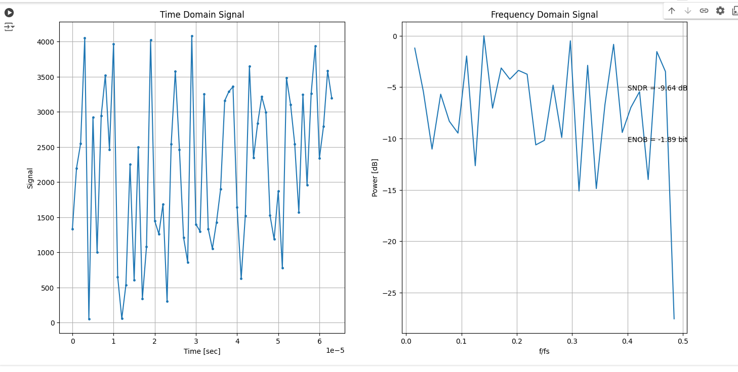
import numpy as np
import matplotlib.pyplot as plt

# コヒーレントサンプリングされた波形を1周期に並び替える
def wave_sort(data, fs, f_signal):
    data_num = len(data)
    t_signal = 1/f_signal
    Ts = 1/fs
    dx_list = []
    for n in range(data_num):
        i = int((Ts*n)/t_signal)
        dx_list.append((Ts*n)-(t_signal*i))
    sorted_indices = sorted(range(len(dx_list)), key=lambda k: dx_list[k])
    sort = [data[i] for i in sorted_indices]
    return sort

# 入力信号にノイズを追加
def add_noise(signal, noise_level):
    noise = np.random.normal(0, noise_level, size=signal.shape)
    return signal + noise

# FFTとSNDR計算
def analyze_signal(signal, dt):
    F = np.fft.fft(signal)
    F[np.abs(F) < 1E-9] = 1E-9
    freq = np.fft.fftfreq(len(signal), dt)
    freq_norm = freq / (1 / dt)
    Power = np.abs(F) ** 2
    max_index = np.argmax(Power[1:int(len(signal) / 2)]) + 1
    Signal = Power[max_index]
    Noise = np.sum(Power[1:int(len(signal) / 2)]) - Signal

    if Noise == 0:
        SNDR = np.inf
    else:
        SNDR = 10 * np.log10(Signal / Noise)

    ENOB = (SNDR - 1.76) / 6.02
    Pow_dB = 10 * np.log10(Power / Signal)
    return freq_norm, Power, Pow_dB, SNDR, ENOB

# パラメータ設定
N = 64
dt = 1e-6
f_signal = 109.375e3
t = np.arange(0, N*dt, dt)

# サンプルデータ(CSVがない場合の仮のデータ)
f = np.random.randint(0, 2**12, size=N)

# ノイズ追加
noise_level = 0.1  # ノイズレベルの設定
f_noisy = add_noise(f, noise_level)

# 波形並び替え
f_sorted = wave_sort(f_noisy, 1/dt, f_signal)

# 信号解析
freq_norm, Power, Pow_dB, SNDR, ENOB = analyze_signal(f_sorted, dt)

# グラフ表示
plt.figure(figsize=(16, 8))

# 時間領域のプロット
plt.subplot(121)
plt.plot(t, f_sorted, marker='.', markersize=5, label='f(n)')
plt.xlabel("Time [sec]")
plt.ylabel("Signal")
plt.title("Time Domain Signal")
plt.grid()

# 周波数領域のプロット
plt.subplot(122)
plt.plot(freq_norm[1:int(N / 2)], Pow_dB[1:int(N / 2)], label='|F(k)|')
plt.xlabel('f/fs')
plt.ylabel('Power [dB]')
plt.title("Frequency Domain Signal")
plt.text(0.4, -5.3, f"SNDR = {SNDR:.2f} dB")
plt.text(0.4, -10.3, f"ENOB = {ENOB:.2f} bit")
plt.grid()

plt.show()
import numpy as np
import matplotlib.pyplot as plt

# 波形生成
def generate_signal(amplitude, frequency, sampling_rate, num_samples):
    t = np.arange(num_samples) / sampling_rate
    signal = amplitude * np.sin(2 * np.pi * frequency * t)
    return t, signal

# ADC変換
def adc_convert(input_voltage, n_bits, v_min, v_max):
    voltage_range = (v_max - v_min) / (2 ** n_bits)
    digital_level = int((input_voltage - v_min) / voltage_range)
    digital_level = np.clip(digital_level, 0, 2 ** n_bits - 1)
    return digital_level

# SNDR, ENOB, SFDRの計算
def analyze_signal(signal, dt, n_bits):
    N = len(signal)
    F = np.fft.fft(signal)
    F[np.abs(F) < 1E-9] = 1E-9
    freq = np.fft.fftfreq(N, dt)
    freq_norm = freq / (1 / dt)
    Power = np.abs(F) ** 2

    # Peak Signal
    max_index = np.argmax(Power[1:int(N / 2)]) + 1
    Signal = Power[max_index]

    # Noise
    Noise = np.sum(Power[1:int(N / 2)]) - Signal

    if Noise == 0:
        SNDR = np.inf
    else:
        SNDR = 10 * np.log10(Signal / Noise)

    ENOB = (SNDR - 1.76) / 6.02

    # SFDR Calculation
    harmonic_freqs = np.fft.fftfreq(N, dt)
    harmonics = [f for f in harmonic_freqs if f > 0 and f % frequency == 0]
    peak_power = max(Power)
    spurs = [Power[int(i)] for i in range(N) if np.abs(freq[i] - frequency) > 0.1]
    SFDR = 10 * np.log10(peak_power / max(spurs)) if spurs else np.inf

    Pow_dB = 10 * np.log10(Power / Signal)
    return freq_norm, Power, Pow_dB, SNDR, ENOB, SFDR

# パラメータ設定
amplitude = 1.5
frequency = 27.34375e3
sampling_rate = 250e3
num_samples = 256
n_bits = 6
v_min = -1.5
v_max = 1.5
noise_stddev = 0.1  # ノイズの標準偏差

# 信号生成
t, signal = generate_signal(amplitude, frequency, sampling_rate, num_samples)

# ノイズ追加
noise = noise_stddev * np.random.randn(num_samples)
noisy_signal = signal + noise

# ADC変換
adc_signal = np.array([adc_convert(v, n_bits, v_min, v_max) for v in noisy_signal])

# 分析
dt = 1 / sampling_rate
freq_norm, Power, Pow_dB, SNDR, ENOB, SFDR = analyze_signal(adc_signal, dt, n_bits)

# グラフ表示
plt.figure(figsize=(16, 8))

# 時間領域のプロット
plt.subplot(121)
plt.plot(t, adc_signal, marker='.', markersize=5, label='ADC Signal with Noise')
plt.xlabel("Time [sec]")
plt.ylabel("Amplitude")
plt.title("Time Domain Signal")
plt.grid()

# 周波数領域のプロット
plt.subplot(122)
plt.plot(freq_norm[1:int(num_samples / 2)], Pow_dB[1:int(num_samples / 2)], label='Power Spectrum with Noise')
plt.xlabel('Frequency [Hz]')
plt.ylabel('Power [dB]')
plt.title("Frequency Domain Signal")
plt.text(0.4, -5.3, f"SNDR = {SNDR:.2f} dB")
plt.text(0.4, -10.3, f"ENOB = {ENOB:.2f} bit")
plt.text(0.4, -15.3, f"SFDR = {SFDR:.2f} dB")
plt.grid()

plt.show()
import numpy as np
import matplotlib.pyplot as plt

def fft_recursive(x):
    N = len(x)
    if N <= 1:
        return x

    even = fft_recursive(x[::2])
    odd = fft_recursive(x[1::2])

    combined = np.zeros(N, dtype=complex)
    for k in range(N // 2):
        t = np.exp(-2j * np.pi * k / N) * odd[k]
        combined[k] = even[k] + t
        combined[k + N // 2] = even[k] - t

    return combined

# サンプル数とサンプリング周波数
N = 512
Fs = 1000.0
# 時間配列
t = np.arange(N) / Fs
# 周波数成分を持つ信号を生成
f1, f2 = 50, 120
signal = 0.5 * np.sin(2 * np.pi * f1 * t) + 0.3 * np.sin(2 * np.pi * f2 * t)

# FFTの計算(Cooley-Tukeyアルゴリズム)
fft_result = fft_recursive(signal)
frequencies = np.fft.fftfreq(N, 1 / Fs)

# 結果をプロット
plt.figure(figsize=(12, 6))

# 時間領域の信号
plt.subplot(2, 1, 1)
plt.plot(t, signal)
plt.title('Time Domain Signal')
plt.xlabel('Time [s]')
plt.ylabel('Amplitude')

# 周波数領域の信号
plt.subplot(2, 1, 2)
plt.plot(frequencies[:N // 2], np.abs(fft_result[:N // 2]))
plt.title('Frequency Domain Signal (Custom FFT)')
plt.xlabel('Frequency [Hz]')
plt.ylabel('Magnitude')

plt.tight_layout()
plt.show()
import numpy as np
import matplotlib.pyplot as plt

def plot_butterfly(x1, x2, w, stage):
    # Calculate the butterfly operation
    y1 = x1 + w * x2
    y2 = x1 - w * x2

    # Extract real parts for plotting
    x1_real, x2_real = np.real(x1), np.real(x2)
    y1_real, y2_real = np.real(y1), np.real(y2)

    plt.figure(figsize=(12, 4))

    # Original values
    plt.subplot(1, 3, 1)
    plt.title(f'Stage {stage} - Original')
    plt.plot([0, 1], [x1_real, x2_real], 'ro-', markersize=10)
    plt.xlabel('Index')
    plt.ylabel('Value')
    plt.ylim(min(x1_real, x2_real) - 1, max(x1_real, x2_real) + 1)

    # After butterfly operation
    plt.subplot(1, 3, 2)
    plt.title(f'Stage {stage} - After Operation')
    plt.plot([0, 1], [y1_real, y2_real], 'bo-', markersize=10)
    plt.xlabel('Index')
    plt.ylabel('Value')
    plt.ylim(min(y1_real, y2_real) - 1, max(y1_real, y2_real) + 1)

    # Visual representation of butterfly structure
    plt.subplot(1, 3, 3)
    plt.title(f'Stage {stage} - Butterfly Structure')
    plt.arrow(0.1, x1_real, 0.4, 0, head_width=0.05, head_length=0.1, fc='k', ec='k')
    plt.arrow(0.1, x2_real, 0.4, 0, head_width=0.05, head_length=0.1, fc='k', ec='k')
    plt.arrow(0.6, y1_real, 0.4, 0, head_width=0.05, head_length=0.1, fc='b', ec='b')
    plt.arrow(0.6, y2_real, 0.4, 0, head_width=0.05, head_length=0.1, fc='b', ec='b')
    plt.text(0, x1_real, 'x1', verticalalignment='bottom', horizontalalignment='right')
    plt.text(0, x2_real, 'x2', verticalalignment='bottom', horizontalalignment='right')
    plt.text(1, y1_real, 'y1', verticalalignment='bottom', horizontalalignment='left')
    plt.text(1, y2_real, 'y2', verticalalignment='bottom', horizontalalignment='left')
    plt.xlabel('Index')
    plt.ylabel('Value')
    plt.ylim(min(x1_real, x2_real, y1_real, y2_real) - 1, max(x1_real, x2_real, y1_real, y2_real) + 1)
    plt.gca().invert_yaxis()

    plt.tight_layout()
    plt.show()

# Example of butterfly operation
N = 8
x = np.random.rand(N) * 10 + 1j * np.random.rand(N) * 10
w = np.exp(-2j * np.pi * np.arange(N) / N)  # Twiddle factors for FFT
plot_butterfly(x[0], x[1], w[0], 1)  # Show stage 1 butterfly operation
import numpy as np
import pywt
import matplotlib.pyplot as plt

# サンプルデータの生成
sampling_rate = 1000  # サンプリングレート
t = np.arange(0, 1, 1/sampling_rate)  # 時間軸
frequency = 10  # サイン波の周波数
data = np.sin(2 * np.pi * frequency * t)  # サイン波

# ウェーブレット変換のパラメータ
wavelet = 'db4'  # Daubechies 4 ウェーブレット
level = 4        # 分解レベル

# ウェーブレット変換
coeffs = pywt.wavedec(data, wavelet, level=level)

# プロットの準備
fig, axes = plt.subplots(nrows=level + 2, sharex=True, figsize=(12, 10))
fig.suptitle('Wavelet Transform of a Sine Wave')

# 元のサイン波をプロット
axes[0].plot(t, data)
axes[0].set_title('Original Sine Wave')
axes[0].set_ylabel('Amplitude')

# ウェーブレット係数をプロット
for i, coeff in enumerate(coeffs):
    axes[i + 1].plot(coeff)
    axes[i + 1].set_title(f'Level {i} coefficients')
    axes[i + 1].set_ylabel('Coefficient')

axes[-1].set_xlabel('Sample index')

plt.tight_layout(rect=[0, 0.03, 1, 0.95])
plt.show()
import numpy as np
import matplotlib.pyplot as plt
from scipy.fft import fft, fftfreq

# 定義域
x = np.linspace(-2, 2, 400)

# 矩形関数 f(x)
def rect_function(x):
    return np.where(np.abs(x) <= 1, 1, 0)

# フーリエ変換
def fourier_transform(xi):
    if xi == 0:
        return 2  # xi が 0 の場合の処理
    else:
        return 2 * np.sin(xi) / xi

# 矩形関数のプロット
f_x = rect_function(x)
plt.figure(figsize=(12, 6))
plt.subplot(2, 1, 1)
plt.plot(x, f_x, label='$f(x)$')
plt.title('Rectangular Function $f(x)$')
plt.xlabel('$x$')
plt.ylabel('$f(x)$')
plt.legend()
plt.grid()

# フーリエ変換のプロット
xi = np.linspace(-10, 10, 400)
f_hat = np.array([fourier_transform(xi_i) for xi_i in xi])
plt.subplot(2, 1, 2)
plt.plot(xi, f_hat, label='$\\hat{f}(\\xi)$')
plt.title('Fourier Transform $\\hat{f}(\\xi)$')
plt.xlabel('$\\xi$')
plt.ylabel('$\\hat{f}(\\xi)$')
plt.legend()
plt.grid()

plt.tight_layout()
plt.show()

# FFT の計算
N = 400
T = 1.0 / 800.0  # サンプル間隔
x_fft = np.linspace(-2, 2, N)
y_fft = rect_function(x_fft)
yf = fft(y_fft)
xf = fftfreq(N, T)[:N//2]

# FFT のプロット
plt.figure(figsize=(12, 6))
plt.plot(xf, 2.0/N * np.abs(yf[:N//2]), label='FFT')
plt.title('FFT of Rectangular Function')
plt.xlabel('Frequency')
plt.ylabel('Amplitude')
plt.legend()
plt.grid()
plt.show()
import numpy as np
import matplotlib.pyplot as plt
import pywt
from scipy.signal import stft, hilbert, coherence, find_peaks, lti, lsim, butter, lfilter
from scipy.interpolate import lagrange
from pykalman import KalmanFilter
from sklearn.neural_network import MLPRegressor
from scipy.linalg import householder
from scipy.signal import resample

# サンプル信号の生成
fs = 1000  # サンプリング周波数
t = np.arange(0, 10, 1/fs)
x = np.sin(2 * np.pi * 10 * t) + np.sin(2 * np.pi * 50 * t)  # 基本信号
y = np.sin(2 * np.pi * 10 * t + np.pi / 4) + np.random.randn(len(t))  # 参照信号

# 1. フーリエ変換
from scipy.fft import fft, fftfreq
N = len(x)
yf = fft(x)
xf = fftfreq(N, 1/fs)[:N//2]

# 2. 短時間フーリエ変換 (STFT)
f_stft, t_stft, Zxx = stft(x, fs, nperseg=256)

# 3. ウェーブレット変換
coeffs = pywt.wavedec(x, 'db1', level=4)

# 4. ヒルベルト変換
analytic_signal = hilbert(x)
envelope = np.abs(analytic_signal)
instantaneous_phase = np.unwrap(np.angle(analytic_signal))

# 5. コヒーレンス解析
f_coh, Cxy = coherence(x, y, fs, nperseg=1024)

# 6. ラプラス変換 (概念的な実装: システム応答)
system = lti([1], [1, 2, 1])
t_lap, y_lap, _ = lsim(system, x, t)

# 7. カリマンフィルタ
kf = KalmanFilter(initial_state_mean=0, n_dim_obs=1)
kf = kf.em(x, n_iter=10)
(filtered_state_means, _) = kf.filter(x)

# 8. ラグランジュ補間
data_points = np.array([0, 1, 2, 3])
values = np.sin(data_points)
poly = lagrange(data_points, values)
interpolated_values = poly(t)

# 9. アリアシング
signal_resampled = resample(x, len(x) // 2)
signal_resampled_full = resample(signal_resampled, len(x))

# 10. システム同定 (簡単な線形モデル)
from scipy.optimize import curve_fit
def model(x, a, b):
    return a * x + b
popt, _ = curve_fit(model, t[:100], x[:100])
fitted_y = model(t[:100], *popt)

# 11. リカレントニューラルネットワーク (RNN)
rnn = MLPRegressor(hidden_layer_sizes=(50,), max_iter=1000)
rnn.fit(t.reshape(-1, 1), x)
predicted_y = rnn.predict(t.reshape(-1, 1))

# 12. フィルタバンク
num_bands = 5
bands = np.linspace(0, fs/2, num_bands + 1)
filtered_signals = [lfilter(*butter(4, [bands[i], bands[i+1]], btype='band', fs=fs), x) for i in range(num_bands)]

# 13. ハウスホルダー変換
matrix = np.random.rand(4, 4)
Q, R = householder(matrix)

# 14. 自適応フィルタ
from scipy.signal import lfilter
def adaptive_filter(x, d, mu=0.01, M=32):
    N = len(x)
    w = np.zeros(M)
    y_hat = np.zeros(N)
    e = np.zeros(N)
    for n in range(M, N):
        x_n = x[n-M:n]
        y_hat[n] = np.dot(w, x_n)
        e[n] = d[n] - y_hat[n]
        w = w + 2 * mu * e[n] * x_n
    return e

# 15. マルチレート信号処理
x_resampled = resample(x, len(x) // 2)

# プロット
plt.figure(figsize=(16, 18))

# フーリエ変換のプロット
plt.subplot(5, 3, 1)
plt.plot(xf, np.abs(yf[:N//2]))
plt.title('Fourier Transform')
plt.xlabel('Frequency [Hz]')
plt.ylabel('Magnitude')

# STFTのプロット
plt.subplot(5, 3, 2)
plt.pcolormesh(t_stft, f_stft, np.abs(Zxx), shading='gouraud')
plt.title('Short-Time Fourier Transform (STFT)')
plt.ylabel('Frequency [Hz]')
plt.colorbar()

# ウェーブレット変換のプロット
plt.subplot(5, 3, 3)
plt.plot(coeffs[0], label='Approximation Coefficients')
for i, coeff in enumerate(coeffs[1:], 1):
    plt.plot(coeff, label=f'Detail Coefficients Level {i}')
plt.title('Wavelet Transform Coefficients')
plt.legend()

# ヒルベルト変換のプロット
plt.subplot(5, 3, 4)
plt.plot(t, x, label='Original Signal')
plt.plot(t, envelope, label='Envelope', linestyle='--')
plt.plot(t, instantaneous_phase, label='Instantaneous Phase', linestyle=':')
plt.title('Hilbert Transform')
plt.legend()

# コヒーレンス解析のプロット
plt.subplot(5, 3, 5)
plt.semilogy(f_coh, Cxy)
plt.title('Coherence')
plt.xlabel('Frequency [Hz]')
plt.ylabel('Coherence')
plt.grid()

# ラプラス変換のプロット
plt.subplot(5, 3, 6)
plt.plot(t_lap, y_lap)
plt.title('Laplace Transform (System Response)')
plt.xlabel('Time [s]')
plt.ylabel('Response')

# カリマンフィルタのプロット
plt.subplot(5, 3, 7)
plt.plot(t, x, label='Original Signal')
plt.plot(t, filtered_state_means, label='Kalman Filtered Signal', linestyle='--')
plt.title('Kalman Filter')
plt.legend()

# ラグランジュ補間のプロット
plt.subplot(5, 3, 8)
plt.plot(t, interpolated_values, label='Lagrange Interpolation')
plt.scatter(data_points, values, color='red', zorder=5)
plt.title('Lagrange Interpolation')
plt.legend()

# アリアシングのプロット
plt.subplot(5, 3, 9)
plt.plot(t, x, label='Original Signal')
plt.plot(t, signal_resampled_full, label='Aliased Signal', linestyle='--')
plt.title('Aliasing')
plt.legend()

# システム同定のプロット
plt.subplot(5, 3, 10)
plt.plot(t[:100], x[:100], label='Data')
plt.plot(t[:100], fitted_y, label='Fitted Model', linestyle='--')
plt.title('System Identification')
plt.legend()

# RNNのプロット
plt.subplot(5, 3, 11)
plt.plot(t, x, label='Original Signal')
plt.plot(t, predicted_y, label='RNN Predicted Signal', linestyle='--')
plt.title('RNN')
plt.legend()

# フィルタバンクのプロット
plt.subplot(5, 3, 12)
for i, band in enumerate(filtered_signals):
    plt.plot(t, band, label=f'Band {i+1}')
plt.title('Filter Bank')
plt.legend()

# ハウスホルダー変換はプロット不要(数値結果が主)

# 自適応フィルタのプロット
plt.subplot(5, 3, 13)
adaptive_error = adaptive_filter(x, x)  # シンプルなデモ用に同じ信号を使用
plt.plot(t, adaptive_error)
plt.title('Adaptive Filter')

# マルチレート信号処理のプロット
plt.subplot(5, 3, 14)
plt.plot(t, x, label='Original Signal')
plt.plot(t[:len(x_resampled)], x_resampled, label='Resampled Signal', linestyle='--')
plt.title('Multirate Signal Processing')
plt.legend()

plt.tight_layout()
plt.show()
import pandas as pd
import numpy as np
import matplotlib.pyplot as plt
from statsmodels.tsa.ar_model import AutoReg
from statsmodels.tsa.arima.model import ARIMA
from statsmodels.tsa.seasonal import seasonal_decompose
from statsmodels.tsa.stattools import adfuller, grangercausalitytests
from sklearn.preprocessing import StandardScaler
from tensorflow.keras.models import Sequential
from tensorflow.keras.layers import LSTM, Dense
from ruptures import detect, rpt
from scipy.fft import fft, fftfreq

# サンプルデータの生成
np.random.seed(0)
data = np.cumsum(np.random.randn(100))  # ランダムな累積和データ
dates = pd.date_range(start='2023-01-01', periods=100)

df = pd.DataFrame(data, index=dates, columns=['Value'])

# 1. 移動平均 (Moving Average)
df['SMA_10'] = df['Value'].rolling(window=10).mean()
df['EMA_10'] = df['Value'].ewm(span=10, adjust=False).mean()

# 2. 自己回帰 (AR: Autoregressive) モデル
ar_model = AutoReg(df['Value'], lags=1)
ar_fitted = ar_model.fit()
df['AR_Prediction'] = ar_fitted.predict(start=len(df), end=len(df)+10)

# 3. 移動平均 (MA: Moving Average) モデル
# MAモデルの適用 (パラメータ設定は例です)
# 詳細な実装には専用のモデルが必要です

# 4. 自己回帰和分移動平均 (ARIMA) モデル
arima_model = ARIMA(df['Value'], order=(1,1,1))
arima_fitted = arima_model.fit()
df['ARIMA_Prediction'] = arima_fitted.predict(start=len(df), end=len(df)+10, typ='levels')

# 5. 季節調整 (Seasonal Decomposition)
decomposition = seasonal_decompose(df['Value'], model='additive')
df['Trend'] = decomposition.trend
df['Seasonal'] = decomposition.seasonal
df['Residual'] = decomposition.resid

# 6. 状態空間モデル (State Space Model)
# カルマンフィルタの実装には、statsmodelsまたはpymc3などが必要です
# ここでは簡略化しています

# 7. 長短期記憶 (LSTM) ネットワーク
# データの前処理
scaler = StandardScaler()
scaled_data = scaler.fit_transform(df[['Value']].values)

# データの準備
X, y = [], []
for i in range(len(scaled_data) - 10):
    X.append(scaled_data[i:i+10])
    y.append(scaled_data[i+10])
X, y = np.array(X), np.array(y)

# モデルの構築
model = Sequential()
model.add(LSTM(50, activation='relu', input_shape=(X.shape[1], 1)))
model.add(Dense(1))
model.compile(optimizer='adam', loss='mse')
model.fit(X, y, epochs=200, verbose=0)

# 予測
X_pred = np.array(scaled_data[-10:]).reshape(1, 10, 1)
lstm_pred = model.predict(X_pred)
lstm_pred = scaler.inverse_transform(lstm_pred)

# 8. 変化点検出 (Change Point Detection)
model = rpt.Pelt(model="l2").fit(df['Value'])
result = model.predict(pen=10)

# 9. スペクトル解析 (Spectral Analysis)
N = len(df['Value'])
T = 1.0 / 1.0
yf = fft(df['Value'])
xf = fftfreq(N, T)[:N//2]

# 10. グレンジャー因果性検定 (Granger Causality Test)
# ここでは2つの時系列が必要ですが、サンプルデータでは1つのみなので省略します

# プロット
plt.figure(figsize=(14, 12))

# 移動平均
plt.subplot(4, 2, 1)
plt.plot(df.index, df['Value'], label='Original Data')
plt.plot(df.index, df['SMA_10'], label='SMA 10')
plt.plot(df.index, df['EMA_10'], label='EMA 10')
plt.title('Moving Averages')
plt.legend()

# 自己回帰モデル
plt.subplot(4, 2, 2)
plt.plot(df.index, df['Value'], label='Original Data')
plt.plot(pd.date_range(start=df.index[-1], periods=11, closed='right'), df['AR_Prediction'], label='AR Prediction', linestyle='--')
plt.title('AutoRegressive Model')
plt.legend()

# ARIMAモデル
plt.subplot(4, 2, 3)
plt.plot(df.index, df['Value'], label='Original Data')
plt.plot(pd.date_range(start=df.index[-1], periods=11, closed='right'), df['ARIMA_Prediction'], label='ARIMA Prediction', linestyle='--')
plt.title('ARIMA Model')
plt.legend()

# 季節調整
plt.subplot(4, 2, 4)
plt.plot(df.index, df['Value'], label='Original Data')
plt.plot(df.index, df['Trend'], label='Trend')
plt.plot(df.index, df['Seasonal'], label='Seasonal')
plt.plot(df.index, df['Residual'], label='Residual')
plt.title('Seasonal Decomposition')
plt.legend()

# LSTM予測
plt.subplot(4, 2, 5)
plt.plot(df.index, df['Value'], label='Original Data')
plt.axvline(df.index[-1], color='gray', linestyle='--')
plt.scatter(df.index[-1] + pd.DateOffset(days=1), lstm_pred, color='red', label='LSTM Prediction')
plt.title('LSTM Prediction')
plt.legend()

# 変化点検出
plt.subplot(4, 2, 6)
plt.plot(df.index, df['Value'], label='Original Data')
for cp in result:
    plt.axvline(df.index[cp], color='red', linestyle='--')
plt.title('Change Point Detection')
plt.legend()

# スペクトル解析
plt.subplot(4, 2, 7)
plt.plot(xf, 2.0/N * np.abs(yf[0:N//2]))
plt.title('Spectral Analysis')

plt.tight_layout()
plt.show()
import numpy as np
import matplotlib.pyplot as plt

# Define Delta Function
def delta(t):
    return np.where(t == 0, 1, 0)

# Define Constant Function
def constant(t):
    return np.ones_like(t)

# Define Rectangular Pulse
def rectangular_pulse(t, width):
    return np.where(np.abs(t) < width / 2, 1 / width, 0)

# Define Triangular Pulse
def triangular_pulse(t, width):
    return np.where(np.abs(t) <= width / 2, 2 / width * (1 - np.abs(t) / (width / 2)), 0)

# Define Exponential Pulse
def exponential_pulse(t, a):
    return np.where(t >= 0, (1 / a) * np.exp(-t / a), 0)

# Define Gaussian Pulse
def gaussian_pulse(t, width):
    return (1 / np.sqrt(2 * np.pi * width ** 2)) * np.exp(-t ** 2 / (2 * width ** 2))

# Fourier Transforms
def exp_pulse_transform(omega, a):
    return 1 / (a + 1j * omega)

def gaussian_transform(omega, width):
    return np.sqrt(2 * np.pi * width ** 2) * np.exp(-0.5 * width ** 2 * omega ** 2)

# Time and Frequency domains
t = np.linspace(-5, 5, 1000)
omega = np.linspace(-50, 50, 1000)

# Functions
delta_func = delta(t)
constant_func = constant(t)
rect_pulse = rectangular_pulse(t, 2)
triangular_pulse_func = triangular_pulse(t, 2)
exp_pulse = exponential_pulse(t, 1)
gaussian_pulse_func = gaussian_pulse(t, 1)

# Fourier Transforms
delta_transform = np.ones_like(omega)
constant_transform = 2 * np.pi * delta(omega)
rect_transform = np.sinc(omega / (2 * np.pi))
triangular_transform = (2 * (1 - np.cos(omega))) / (omega ** 2)
triangular_transform[omega == 0] = 2
exp_transform = np.abs(exp_pulse_transform(omega, 1))
gaussian_transform_func = gaussian_transform(omega, 1)

# Plot
plt.figure(figsize=(15, 15))

# Delta Function
plt.subplot(3, 2, 1)
plt.plot(t, delta_func, label='Delta Function')
plt.title('Delta Function')
plt.grid(True)

plt.subplot(3, 2, 2)
plt.plot(omega, delta_transform, label='Fourier Transform', color='r')
plt.title('Fourier Transform of Delta Function')
plt.grid(True)

# Constant Function
plt.subplot(3, 2, 3)
plt.plot(t, constant_func, label='Constant Function')
plt.title('Constant Function')
plt.grid(True)

plt.subplot(3, 2, 4)
plt.plot(omega, constant_transform, label='Fourier Transform', color='r')
plt.title('Fourier Transform of Constant Function')
plt.grid(True)

# Rectangular Pulse
plt.subplot(3, 2, 5)
plt.plot(t, rect_pulse, label='Rectangular Pulse')
plt.title('Rectangular Pulse')
plt.grid(True)

plt.subplot(3, 2, 6)
plt.plot(omega, rect_transform, label='Fourier Transform', color='r')
plt.title('Fourier Transform of Rectangular Pulse')
plt.grid(True)

plt.tight_layout()
plt.show()

# Additional plots for Triangular Pulse, Exponential Pulse, and Gaussian Pulse
plt.figure(figsize=(15, 15))

# Triangular Pulse
plt.subplot(3, 2, 1)
plt.plot(t, triangular_pulse_func, label='Triangular Pulse')
plt.title('Triangular Pulse')
plt.grid(True)

plt.subplot(3, 2, 2)
plt.plot(omega, triangular_transform, label='Fourier Transform', color='r')
plt.title('Fourier Transform of Triangular Pulse')
plt.grid(True)

# Exponential Pulse
plt.subplot(3, 2, 3)
plt.plot(t, exp_pulse, label='Exponential Pulse')
plt.title('Exponential Pulse')
plt.grid(True)

plt.subplot(3, 2, 4)
plt.plot(omega, exp_transform, label='Magnitude of Fourier Transform', color='r')
plt.title('Fourier Transform of Exponential Pulse')
plt.grid(True)

# Gaussian Pulse
plt.subplot(3, 2, 5)
plt.plot(t, gaussian_pulse_func, label='Gaussian Pulse')
plt.title('Gaussian Pulse')
plt.grid(True)

plt.subplot(3, 2, 6)
plt.plot(omega, gaussian_transform_func, label='Fourier Transform', color='r')
plt.title('Fourier Transform of Gaussian Pulse')
plt.grid(True)

plt.tight_layout()
plt.show()
import numpy as np
import matplotlib.pyplot as plt
from scipy.signal import butter, lfilter, get_window

# Sampling parameters
Fs = 1000  # Sampling frequency (Hz)
T = 1.0 / Fs  # Sampling interval (seconds)
L = 1000  # Number of samples
t = np.arange(L) * T  # Time vector

# Generate analog signal (e.g., sine wave) and sample it
f = 50  # Signal frequency (Hz)
amplitude = 1.0
y = amplitude * np.sin(2 * np.pi * f * t)  # Signal data

# Add noise
noise = 0.1 * np.random.normal(size=t.shape)
y_noisy = y + noise

# Bias correction (subtract mean to center around zero)
y_corrected = y_noisy - np.mean(y_noisy)

# Anti-aliasing filter design (e.g., low-pass filter)
def butter_lowpass(cutoff, fs, order=5):
    nyq = 0.5 * fs
    normal_cutoff = cutoff / nyq
    b, a = butter(order, normal_cutoff, btype='low', analog=False)
    return b, a

def butter_lowpass_filter(data, cutoff, fs, order=5):
    b, a = butter_lowpass(cutoff, fs, order=order)
    y = lfilter(b, a, data)
    return y

cutoff_frequency = 100  # Cutoff frequency (Hz)
y_filtered = butter_lowpass_filter(y_corrected, cutoff_frequency, Fs)

# Apply window function (e.g., Hamming window)
window = get_window('hamming', L)
y_windowed = y_filtered * window

# Perform FFT
yf = np.fft.fft(y_windowed)
xf = np.fft.fftfreq(L, T)

# Plot the original sampled signal
plt.figure(figsize=(12, 6))

plt.subplot(2, 1, 1)
plt.plot(t, y_noisy, label='Noisy Signal')
plt.plot(t, y, label='Original Signal', linestyle='--')
plt.title('Time Domain Signal')
plt.xlabel('Time (s)')
plt.ylabel('Amplitude')
plt.legend()
plt.grid()

# Plot the FFT result
plt.subplot(2, 1, 2)
plt.plot(xf[:L//2], 2.0/L * np.abs(yf[:L//2]))
plt.title('Frequency Domain (FFT)')
plt.xlabel('Frequency (Hz)')
plt.ylabel('Amplitude')
plt.grid()

plt.tight_layout()
plt.show()
import numpy as np
import matplotlib.pyplot as plt

# 定義: アナログ信号のパラメータ
frequency = 5        # サイン波の周波数 (Hz)
amplitude = 1        # サイン波の振幅 (V)
duration = 1         # 信号の継続時間 (s)
sampling_rate = 100  # サンプリングレート (サンプル/秒)
adc_resolution = 8   # ADC解像度 (ビット)

# アナログ信号を生成 (連続サイン波)
t_analog = np.linspace(0, duration, 1000)  # アナログ信号の時間ベクトル
analog_signal = amplitude * np.sin(2 * np.pi * frequency * t_analog)

# アナログ信号をサンプリング
t_sampled = np.linspace(0, duration, int(sampling_rate * duration))  # サンプリング信号の時間ベクトル
sampled_signal = amplitude * np.sin(2 * np.pi * frequency * t_sampled)

# サンプリング信号を量子化
quantization_levels = 2 ** adc_resolution  # 量子化レベルの数
quantization_step = 2 * amplitude / quantization_levels  # 量子化ステップサイズ
quantized_signal = np.round(sampled_signal / quantization_step) * quantization_step

# フーリエ変換を行い、パワースペクトルを計算
fft_result = np.fft.fft(quantized_signal)
fft_freq = np.fft.fftfreq(len(fft_result), d=1/sampling_rate)
power_spectrum = np.abs(fft_result) ** 2

# パワースペクトルをプロット
plt.figure(figsize=(10, 6))

# パワースペクトルをプロット
plt.plot(fft_freq[:len(fft_freq)//2], power_spectrum[:len(power_spectrum)//2], label='Power Spectrum')

# ラベルと凡例を追加
plt.xlabel('Frequency (Hz)')
plt.ylabel('Power')
plt.title('Power Spectrum of Quantized Signal')
plt.legend()
plt.grid(True)

# プロットを表示
plt.show()
import numpy as np
import matplotlib.pyplot as plt

# パラメータ設定
n_bits = 8  # ADCのビット数
quantization_levels = 2**n_bits  # 量子化レベル数
amplitude = 1.0  # 入力信号の振幅
frequency = 1000  # 入力信号の周波数 (Hz)
sampling_rate = 10000  # サンプリングレート (Hz)
duration = 1.0  # 信号の継続時間 (秒)

# 時間軸の生成
t = np.arange(0, duration, 1/sampling_rate)

# サイン波の生成
signal = amplitude * np.sin(2 * np.pi * frequency * t)

# 理想的なADC変換
ideal_adc_output = np.round((signal + amplitude) * (quantization_levels / (2 * amplitude))) - 1

# 非理想的なADCの誤差のシミュレーション
# DNLとINLをシミュレート(簡略化したモデル)
dnl = np.random.normal(0, 0.01, quantization_levels)
inl = np.cumsum(dnl) - np.mean(np.cumsum(dnl))

# 実際のADC出力(DNLとINLを含む)
adc_output = ideal_adc_output + dnl[(ideal_adc_output).astype(int)] + inl[(ideal_adc_output).astype(int)]
adc_output = np.clip(adc_output, 0, quantization_levels - 1)

# DNLとINLのプロット
plt.figure(figsize=(14, 8))

plt.subplot(2, 2, 1)
plt.plot(dnl)
plt.title("Differential Non-Linearity (DNL)")
plt.xlabel("Code")
plt.ylabel("DNL (LSB)")

plt.subplot(2, 2, 2)
plt.plot(inl)
plt.title("Integral Non-Linearity (INL)")
plt.xlabel("Code")
plt.ylabel("INL (LSB)")

# SNDRの計算
noise = adc_output - ideal_adc_output
signal_power = np.mean(signal**2)
noise_power = np.mean(noise**2)
snr = 10 * np.log10(signal_power / noise_power)

# SNDR (Signal to Noise and Distortion Ratio)
sndr = 10 * np.log10(signal_power / (noise_power + np.var(dnl) + np.var(inl)))

# SFDR (Spurious-Free Dynamic Range)
sfdr = 10 * np.log10(signal_power / np.max(np.abs(noise)))

# ENOB (Effective Number of Bits)
enob = (sndr - 1.76) / 6.02

print(f"SNR: {snr:.2f} dB")
print(f"SNDR: {sndr:.2f} dB")
print(f"SFDR: {sfdr:.2f} dB")
print(f"ENOB: {enob:.2f} bits")

# ノイズプロット
plt.subplot(2, 2, 3)
plt.plot(noise)
plt.title("Quantization Noise")
plt.xlabel("Sample")
plt.ylabel("Noise")

# 入力信号とADC出力の比較プロット
plt.subplot(2, 2, 4)
plt.plot(t, signal, label='Original Signal')
plt.plot(t, adc_output / (quantization_levels / (2 * amplitude)) - amplitude, label='ADC Output', linestyle='dashed')
plt.title("Original Signal vs ADC Output")
plt.xlabel("Time [s]")
plt.ylabel("Amplitude")
plt.legend()

plt.tight_layout()
plt.show()
import numpy as np
import matplotlib.pyplot as plt

# サイン波のパラメータ
amplitude = 1.0  # 振幅
frequency = 1000  # 周波数 (Hz)
sampling_rate = 10000  # サンプリングレート (Hz)
duration = 1.0  # 信号の継続時間 (秒)
quantization_levels = 256  # 量子化レベル数(8ビットの場合)
kT = 4.11e-21  # 熱雑音の電力スペクトル密度 (Joules per Hz)

# 時間軸の生成
t = np.arange(0, duration, 1/sampling_rate)

# サイン波の生成
signal = amplitude * np.sin(2 * np.pi * frequency * t)

# 信号エネルギーの計算
signal_energy = np.sum(signal**2) / sampling_rate
print(f"Signal Energy: {signal_energy:.6f} J")

# ノイズの生成(標準正規分布)
noise_std = 0.1  # 標準偏差
noise = np.random.normal(0, noise_std, len(signal))

# ノイズを含む信号
noisy_signal = signal + noise

# SNRの計算
signal_power = np.mean(signal**2)
noise_power = np.mean(noise**2)
snr = 10 * np.log10(signal_power / noise_power)
print(f"SNR: {snr:.2f} dB")

# ENOBの計算 (Effective Number of Bits)
enob = (snr - 1.76) / 6.02
print(f"ENOB: {enob:.2f} bits")

# 熱雑音の計算
bandwidth = sampling_rate / 2  # 有効帯域幅(Nyquist周波数)
thermal_noise_power = kT * bandwidth
print(f"Thermal Noise Power: {thermal_noise_power:.6e} W")

# サンプリングジッタの影響(簡略化)
jitter_std = 1e-12  # ジッタの標準偏差 (秒)
jitter_noise_power = (2 * np.pi * frequency * amplitude * jitter_std)**2
print(f"Jitter Noise Power: {jitter_noise_power:.6e} W")

# 量子化ノイズの計算
quantization_step = 2 * amplitude / quantization_levels
quantization_noise_power = quantization_step**2 / 12
print(f"Quantization Noise Power: {quantization_noise_power:.6e} W")

# 全ノイズ電力の計算
total_noise_power = noise_power + thermal_noise_power + jitter_noise_power + quantization_noise_power
print(f"Total Noise Power: {total_noise_power:.6e} W")

# グラフのプロット
plt.figure(figsize=(10, 6))
plt.plot(t, signal, label='Original Signal')
plt.plot(t, noisy_signal, label='Noisy Signal', linestyle='dashed')
plt.xlabel('Time [s]')
plt.ylabel('Amplitude')
plt.title('Original vs Noisy Signal')
plt.legend()
plt.show()
import numpy as np
import matplotlib.pyplot as plt
from scipy.fft import fft, fftfreq

# Parameters
fs = 1000  # Sampling frequency (Hz)
T = 1.0    # Duration (seconds)
N = int(T * fs)  # Number of samples
t = np.linspace(0.0, T, N, endpoint=False)

# Waveforms
def sine_wave(frequency, amplitude):
    return amplitude * np.sin(2 * np.pi * frequency * t)

def square_wave(frequency, amplitude):
    return amplitude * np.sign(np.sin(2 * np.pi * frequency * t))

def triangle_wave(frequency, amplitude):
    return amplitude * (2 * np.abs(2 * (t * frequency - np.floor(t * frequency + 0.5))) - 1)

def full_wave_rectified_wave(frequency, amplitude):
    return np.abs(sine_wave(frequency, amplitude))

def unipolar_pulse_wave(frequency, amplitude, duty_cycle):
    return amplitude * ((t % (1 / frequency)) < (duty_cycle / frequency))

def gaussian_noise(std_dev):
    return np.random.normal(0, std_dev, N)

# Parameters for waves
f_sine = 5
f_square = 5
f_triangle = 5
f_rectified = 5
f_pulse = 5
duty_cycle = 0.5
std_dev_noise = 0.5

# Generate waveforms
sine = sine_wave(f_sine, 1)
square = square_wave(f_square, 1)
triangle = triangle_wave(f_triangle, 1)
rectified = full_wave_rectified_wave(f_rectified, 1)
pulse = unipolar_pulse_wave(f_pulse, 1, duty_cycle)
noise = gaussian_noise(std_dev_noise)

# Compute FFT
def compute_fft(signal):
    yf = fft(signal)
    xf = fftfreq(N, 1/fs)
    return xf, np.abs(yf) / N

# Compute metrics
def compute_metrics(signal):
    rms = np.sqrt(np.mean(signal**2))
    average = np.mean(signal)
    abs_mean = np.mean(np.abs(signal))
    peak_to_peak_ratio = np.max(signal) - np.min(signal)
    return rms, average, abs_mean, peak_to_peak_ratio

# Plot waveforms and FFTs
fig, axs = plt.subplots(6, 2, figsize=(14, 18))
axs = axs.flatten()

waveforms = [sine, square, triangle, rectified, pulse, noise]
titles = ['Sine Wave', 'Square Wave', 'Triangle Wave', 'Full-Wave Rectified Wave', 'Unipolar Pulse Wave', 'Gaussian Noise']

for i, (wave, title) in enumerate(zip(waveforms, titles)):
    # Plot waveform
    axs[2*i].plot(t, wave)
    axs[2*i].set_title(f'{title}')
    axs[2*i].set_xlabel('Time [s]')
    axs[2*i].set_ylabel('Amplitude')

    # Compute and plot FFT
    xf, yf = compute_fft(wave)
    axs[2*i+1].plot(xf[:N // 2], yf[:N // 2])
    axs[2*i+1].set_title(f'{title} - FFT')
    axs[2*i+1].set_xlabel('Frequency [Hz]')
    axs[2*i+1].set_ylabel('Magnitude')

    # Compute metrics
    rms, average, abs_mean, peak_to_peak_ratio = compute_metrics(wave)
    print(f"{title} Metrics:")
    print(f"  RMS: {rms:.3f}")
    print(f"  Average: {average:.3f}")
    print(f"  Absolute Mean: {abs_mean:.3f}")
    print(f"  Peak-to-Peak Ratio: {peak_to_peak_ratio:.3f}\n")

plt.tight_layout()
plt.show()
import numpy as np
import matplotlib.pyplot as plt
from scipy.fft import fft, fftfreq

# Define time-domain waveforms
def sine_wave(t, f0):
    return np.sin(2 * np.pi * f0 * t)

def square_wave(t, f0):
    return np.sign(np.sin(2 * np.pi * f0 * t))

def triangular_wave(t, f0):
    return 2 * np.abs(2 * (t * f0 % 1) - 1) - 1

def full_wave_rectified_sine(t, f0):
    return np.abs(np.sin(2 * np.pi * f0 * t))

def half_wave_rectified_sine(t, f0):
    return np.maximum(0, np.sin(2 * np.pi * f0 * t))

# Define Gaussian function for approximation
def gaussian_transform(f, f0, sigma):
    return np.exp(-0.5 * ((f - f0) / sigma) ** 2)

# Define Gaussian approximations
def square_wave_transform(f, f0, sigma, num_harmonics):
    X = np.zeros_like(f)
    for n in range(1, num_harmonics + 1):
        X += gaussian_transform(f, n * f0, sigma)
    return X

def triangular_wave_transform(f, f0, sigma, num_harmonics):
    X = np.zeros_like(f)
    for n in range(1, num_harmonics + 1):
        X += gaussian_transform(f, n * f0, sigma) / n**2
    return X

def full_wave_rectified_sine_transform(f, f0, sigma):
    return (0.5 * (gaussian_transform(f, 2 * f0, sigma) + gaussian_transform(f, -2 * f0, sigma))
            + 0.25 * (gaussian_transform(f, 0, sigma) - gaussian_transform(f, 4 * f0, sigma) - gaussian_transform(f, -4 * f0, sigma)))

def half_wave_rectified_sine_transform(f, f0, sigma):
    return 0.5 * (gaussian_transform(f, f0, sigma) + gaussian_transform(f, -f0, sigma)
                   - 0.25 * (gaussian_transform(f, 2 * f0, sigma) + gaussian_transform(f, -2 * f0, sigma)))

# Parameters
f0 = 5  # Fundamental frequency
sigma = 0.5  # Standard deviation of the Gaussian
num_harmonics = 10  # Number of harmonics

# Frequency range
f = np.linspace(-20, 20, 400)

# Time domain
T = 1 / (2 * f0)  # Sampling period
t = np.linspace(0, 2 * T, 1000)  # Time range

# Generate time-domain waveforms
sine = sine_wave(t, f0)
square = square_wave(t, f0)
triangular = triangular_wave(t, f0)
full_wave_rectified = full_wave_rectified_sine(t, f0)
half_wave_rectified = half_wave_rectified_sine(t, f0)

# Compute FFT
def compute_fft(signal, T):
    N = len(signal)
    yf = fft(signal)
    xf = fftfreq(N, T)[:N//2]
    return xf, np.abs(yf[:N//2])

# FFT results
xf_sine, yf_sine = compute_fft(sine, t[1] - t[0])
xf_square, yf_square = compute_fft(square, t[1] - t[0])
xf_triangular, yf_triangular = compute_fft(triangular, t[1] - t[0])
xf_full_wave_rectified, yf_full_wave_rectified = compute_fft(full_wave_rectified, t[1] - t[0])
xf_half_wave_rectified, yf_half_wave_rectified = compute_fft(half_wave_rectified, t[1] - t[0])

# Plotting Gaussian Approximations
plt.figure(figsize=(14, 10))

plt.subplot(3, 2, 1)
plt.plot(f, gaussian_transform(f, f0, sigma))
plt.title('Gaussian Approximation of Sine Wave')
plt.xlabel('Frequency (Hz)')
plt.ylabel('Magnitude')
plt.grid(True)

plt.subplot(3, 2, 2)
plt.plot(f, square_wave_transform(f, f0, sigma, num_harmonics))
plt.title('Gaussian Approximation of Square Wave')
plt.xlabel('Frequency (Hz)')
plt.ylabel('Magnitude')
plt.grid(True)

plt.subplot(3, 2, 3)
plt.plot(f, triangular_wave_transform(f, f0, sigma, num_harmonics))
plt.title('Gaussian Approximation of Triangular Wave')
plt.xlabel('Frequency (Hz)')
plt.ylabel('Magnitude')
plt.grid(True)

plt.subplot(3, 2, 4)
plt.plot(f, full_wave_rectified_sine_transform(f, f0, sigma))
plt.title('Gaussian Approximation of Full-Wave Rectified Sine Wave')
plt.xlabel('Frequency (Hz)')
plt.ylabel('Magnitude')
plt.grid(True)

plt.subplot(3, 2, 5)
plt.plot(f, half_wave_rectified_sine_transform(f, f0, sigma))
plt.title('Gaussian Approximation of Half-Wave Rectified Sine Wave')
plt.xlabel('Frequency (Hz)')
plt.ylabel('Magnitude')
plt.grid(True)

plt.tight_layout()
plt.show()

# Plotting FFT results
plt.figure(figsize=(14, 10))

plt.subplot(3, 2, 1)
plt.plot(xf_sine, yf_sine)
plt.title('FFT of Sine Wave')
plt.xlabel('Frequency (Hz)')
plt.ylabel('Magnitude')
plt.grid(True)

plt.subplot(3, 2, 2)
plt.plot(xf_square, yf_square)
plt.title('FFT of Square Wave')
plt.xlabel('Frequency (Hz)')
plt.ylabel('Magnitude')
plt.grid(True)

plt.subplot(3, 2, 3)
plt.plot(xf_triangular, yf_triangular)
plt.title('FFT of Triangular Wave')
plt.xlabel('Frequency (Hz)')
plt.ylabel('Magnitude')
plt.grid(True)

plt.subplot(3, 2, 4)
plt.plot(xf_full_wave_rectified, yf_full_wave_rectified)
plt.title('FFT of Full-Wave Rectified Sine Wave')
plt.xlabel('Frequency (Hz)')
plt.ylabel('Magnitude')
plt.grid(True)

plt.subplot(3, 2, 5)
plt.plot(xf_half_wave_rectified, yf_half_wave_rectified)
plt.title('FFT of Half-Wave Rectified Sine Wave')
plt.xlabel('Frequency (Hz)')
plt.ylabel('Magnitude')
plt.grid(True)

plt.tight_layout()
plt.show()
import numpy as np
import matplotlib.pyplot as plt

# サンプル数とサンプリング周波数を定義
n_samples = 1024
sampling_rate = 1024  # 1kHzのサンプリング

# ホワイトノイズを生成
white_noise = np.random.normal(0, 1, n_samples)

# FFTを計算
fft_result = np.fft.fft(white_noise)
fft_magnitude = np.abs(fft_result)
fft_phase = np.angle(fft_result)
frequencies = np.fft.fftfreq(n_samples, d=1/sampling_rate)

# グラフを描画
plt.figure(figsize=(14, 12))

# 1. 時間領域の波形プロット
plt.subplot(3, 1, 1)
plt.plot(white_noise, color='green')
plt.title('White Noise - Time Domain')
plt.xlabel('Sample')
plt.ylabel('Amplitude')
plt.grid(True)

# 2. FFTのプロット(周波数スペクトル)
plt.subplot(3, 1, 2)
plt.plot(frequencies[:n_samples//2], fft_magnitude[:n_samples//2], color='blue')
plt.title('FFT of White Noise')
plt.xlabel('Frequency (Hz)')
plt.ylabel('Magnitude')
plt.grid(True)

# 3. ボード線図プロット
# 3.1 ゲインプロット (Magnitude)
plt.subplot(3, 1, 3)
plt.semilogx(frequencies[:n_samples//2], 20 * np.log10(fft_magnitude[:n_samples//2]), color='blue', label='Magnitude (dB)')
plt.ylabel('Magnitude (dB)')
plt.xlabel('Frequency (Hz)')
plt.grid(True)
plt.legend(loc='upper right')

# 3.2 位相プロット (Phase)
plt.twinx()
plt.semilogx(frequencies[:n_samples//2], np.degrees(fft_phase[:n_samples//2]), color='red', linestyle='--', label='Phase (degrees)')
plt.ylabel('Phase (degrees)')
plt.grid(True)
plt.legend(loc='lower right')

plt.title('Bode Plot of White Noise')

# レイアウト調整
plt.tight_layout()
plt.show()
import numpy as np
import matplotlib.pyplot as plt

# パラメータ設定
fs = 1000  # サンプリング周波数 (Hz)
T = 1.0 / fs  # サンプリング間隔 (秒)
L = 2.0  # 信号の長さ (秒)
N = int(L * fs)  # 信号のサンプル数

# 時間ベクトル
t = np.linspace(0.0, L, N, endpoint=False)

# ディラックのデルタ関数をサンプル化した単位デルタ関数列
delta_seq = np.zeros(N)
delta_seq[int(N / 2)] = 1  # 中心に1を配置

# ガウシアン関数を生成
sigma = 0.01  # ガウス関数の標準偏差 (秒)
mu = L / 2  # ガウス関数の中心 (秒)
gaussian = np.exp(-((t - mu) ** 2) / (2 * sigma ** 2))

# 大きな値を持つデルタ関数に近い関数を生成
alpha = 1000000000  # 大きな値を持つデルタ関数に近い関数のスケーリングファクタ
delta_approx = np.zeros(N)
delta_approx[int(N / 2)] = alpha  # 中心に大きな値を配置

# ホワイトノイズ
np.random.seed(0)  # 再現性のためのシード
white_noise = np.random.normal(0, 1, N)

# FFTを計算
fft_delta = np.fft.fft(delta_seq)
fft_gaussian = np.fft.fft(gaussian)
fft_delta_approx = np.fft.fft(delta_approx)
fft_white_noise = np.fft.fft(white_noise)

# 周波数ベクトル
frequencies = np.fft.fftfreq(N, T)

# デルタ関数のフーリエ変換
omega = np.linspace(-10, 10, 1000)
delta_hat = np.ones_like(omega)  # 理論的に全ての周波数で1

# プロット
plt.figure(figsize=(16, 14))

# ディラックのデルタ関数のサンプル化プロット
plt.subplot(4, 2, 1)
plt.plot(t, delta_seq, label='Unit Delta Function Sequence')
plt.title('Unit Delta Function Sequence')
plt.xlabel('Time (s)')
plt.ylabel('Amplitude')
plt.grid(True)

# ガウシアン関数のプロット
plt.subplot(4, 2, 2)
plt.plot(t, gaussian, label='Gaussian Approximation of Delta Function')
plt.title('Gaussian Approximation of Delta Function')
plt.xlabel('Time (s)')
plt.ylabel('Amplitude')
plt.grid(True)

# 大きな値を持つデルタ関数に近い関数のプロット
plt.subplot(4, 2, 3)
plt.plot(t, delta_approx, label='Delta Approximation with Large Value', color='green')
plt.title('Delta Approximation with Large Value')
plt.xlabel('Time (s)')
plt.ylabel('Amplitude')
plt.grid(True)

# ホワイトノイズのプロット
plt.subplot(4, 2, 4)
plt.plot(t, white_noise, label='White Noise', color='orange')
plt.title('White Noise')
plt.xlabel('Time (s)')
plt.ylabel('Amplitude')
plt.grid(True)

# ディラックのデルタ関数のFFTプロット
plt.subplot(4, 2, 5)
plt.plot(frequencies, np.abs(fft_delta), label='FFT of Delta Sequence')
plt.title('FFT of Delta Sequence')
plt.xlabel('Frequency (Hz)')
plt.ylabel('Magnitude')
plt.grid(True)

# ガウシアン関数のFFTプロット
plt.subplot(4, 2, 6)
plt.plot(frequencies, np.abs(fft_gaussian), label='FFT of Gaussian Approximation')
plt.title('FFT of Gaussian Approximation')
plt.xlabel('Frequency (Hz)')
plt.ylabel('Magnitude')
plt.grid(True)

# 大きな値を持つデルタ関数のFFTプロット
plt.subplot(4, 2, 7)
plt.plot(frequencies, np.abs(fft_delta_approx), label='FFT of Delta Approximation with Large Value', color='green')
plt.title('FFT of Delta Approximation with Large Value')
plt.xlabel('Frequency (Hz)')
plt.ylabel('Magnitude')
plt.grid(True)

# ホワイトノイズのFFTプロット
plt.subplot(4, 2, 8)
plt.plot(frequencies, np.abs(fft_white_noise), label='FFT of White Noise', color='orange')
plt.title('FFT of White Noise')
plt.xlabel('Frequency (Hz)')
plt.ylabel('Magnitude')
plt.grid(True)

# ディラックのデルタ関数のフーリエ変換プロット
plt.figure(figsize=(8, 4))
plt.plot(omega, delta_hat, label=r"$\hat{\delta}(\omega) = 1$")
plt.title(r"Fourier Transform of Dirac Delta Function $\delta(t)$")
plt.xlabel(r"Frequency $\omega$")
plt.ylabel(r"$\hat{\delta}(\omega)$")
plt.axhline(0, color='black', linewidth=0.5)
plt.axvline(0, color='black', linewidth=0.5)
plt.grid(True)
plt.legend()
plt.show()
import numpy as np
import matplotlib.pyplot as plt
from scipy.signal import lfilter

# パラメータ設定
fs = 1000  # サンプリング周波数 (Hz)
T = 1.0 / fs  # サンプリング間隔 (秒)
L = 2.0  # 信号の長さ (秒)
N = int(L * fs)  # サンプル数

# 時間ベクトル
t = np.linspace(0.0, L, N, endpoint=False)

# ピンクノイズの生成
def generate_pink_noise(N):
    """ Generate pink noise using the Voss-McCartney algorithm """
    def pink_filter(n, beta):
        return np.sin(np.pi * (np.arange(1, n+1) / (n+1)) ** beta) ** 2

    white = np.random.randn(N)
    freq = np.fft.fftfreq(N, T)
    filter = pink_filter(N, 1)
    pink = np.fft.ifft(np.fft.fft(white) * filter).real
    return pink

pink_noise = generate_pink_noise(N)

# ノイズシェーピングフィルタ (例えば、簡単な1次IIRフィルタ)
b = [1, -0.9]  # フィルタの係数 (例: 一次IIRフィルタ)
a = [1]  # フィルタの係数
shaped_noise = lfilter(b, a, pink_noise)

# フーリエ変換を計算
fft_pink_noise = np.fft.fftshift(np.fft.fft(pink_noise))
fft_shaped_noise = np.fft.fftshift(np.fft.fft(shaped_noise))
fft_pink_noise_magnitude = np.abs(fft_pink_noise)
fft_shaped_noise_magnitude = np.abs(fft_shaped_noise)
frequencies = np.fft.fftshift(np.fft.fftfreq(N, T))

# プロット
plt.figure(figsize=(16, 12))

# ピンクノイズのプロット
plt.subplot(3, 2, 1)
plt.plot(t, pink_noise, label='Pink Noise')
plt.title('Pink Noise')
plt.xlabel('Time (s)')
plt.ylabel('Amplitude')
plt.grid(True)

# ノイズシェーピング後の信号のプロット
plt.subplot(3, 2, 2)
plt.plot(t, shaped_noise, label='Shaped Noise')
plt.title('Shaped Noise')
plt.xlabel('Time (s)')
plt.ylabel('Amplitude')
plt.grid(True)

# ピンクノイズのフーリエ変換のプロット
plt.subplot(3, 2, 3)
plt.plot(frequencies, fft_pink_noise_magnitude, label='FFT of Pink Noise')
plt.title('Fourier Transform of Pink Noise')
plt.xlabel('Frequency (Hz)')
plt.ylabel('Magnitude')
plt.grid(True)

# ノイズシェーピング後の信号のフーリエ変換のプロット
plt.subplot(3, 2, 4)
plt.plot(frequencies, fft_shaped_noise_magnitude, label='FFT of Shaped Noise')
plt.title('Fourier Transform of Shaped Noise')
plt.xlabel('Frequency (Hz)')
plt.ylabel('Magnitude')
plt.grid(True)

# ピンクノイズのパワースペクトル
plt.subplot(3, 2, 5)
plt.semilogy(frequencies[1:N//2], np.abs(fft_pink_noise[1:N//2]), label='Power Spectrum of Pink Noise')
plt.title('Power Spectrum of Pink Noise')
plt.xlabel('Frequency (Hz)')
plt.ylabel('Magnitude')
plt.grid(True)

# ノイズシェーピング後の信号のパワースペクトル
plt.subplot(3, 2, 6)
plt.semilogy(frequencies[1:N//2], np.abs(fft_shaped_noise[1:N//2]), label='Power Spectrum of Shaped Noise')
plt.title('Power Spectrum of Shaped Noise')
plt.xlabel('Frequency (Hz)')
plt.ylabel('Magnitude')
plt.grid(True)

plt.tight_layout()
plt.show()
import numpy as np
import matplotlib.pyplot as plt

def calculate_sndr_enob_sfdr(fft_data, fundamental_freq_bin, fs, fin, fft_points):
    """
    Calculate SNDR, ENOB, and SFDR from FFT data of an ADC.

    Parameters:
    fft_data (numpy array): FFT magnitude data.
    fundamental_freq_bin (int): Index of the fundamental frequency in the FFT data.
    fs (float): Sampling frequency in Hz.
    fin (float): Input frequency in Hz.
    fft_points (int): Number of FFT points.

    Returns:
    sndr_db (float): Signal-to-Noise and Distortion Ratio in dB.
    enob (float): Effective Number of Bits.
    sfdr_db (float): Spurious-Free Dynamic Range in dB.
    """
    # Calculate signal power
    signal_power = fft_data[fundamental_freq_bin] ** 2

    # Calculate total power
    total_power = np.sum(fft_data ** 2)

    # Calculate noise and distortion power
    noise_distortion_power = total_power - signal_power

    # Calculate SNDR (dB)
    sndr_db = 10 * np.log10(signal_power / noise_distortion_power)

    # Calculate ENOB
    enob = (sndr_db - 1.76) / 6.02

    # Calculate SFDR (dB)
    # Find the maximum spurious signal excluding the fundamental frequency
    spurious_power = np.max(np.delete(fft_data ** 2, fundamental_freq_bin))
    sfdr_db = 10 * np.log10(signal_power / spurious_power)

    return sndr_db, enob, sfdr_db

# Define parameters
fs = 1e6  # Sampling frequency in Hz (1 MSPS)
fin = 124.511e3  # Input frequency in Hz (124.511 kHz)
fft_points = 2048  # FFT points
t = np.arange(0, fft_points) / fs  # Time vector

# Create a sinusoidal waveform with the given amplitude and frequency
input_amplitude = 0.3  # 0.3 V
waveform = input_amplitude * np.sin(2 * np.pi * fin * t)

# Perform FFT
fft_data = np.abs(np.fft.fft(waveform))[:fft_points // 2]  # Take positive frequency components

# Find fundamental frequency bin
fundamental_freq_bin = int(fin / (fs / fft_points))

# Calculate SNDR, ENOB, and SFDR
sndr_db, enob, sfdr_db = calculate_sndr_enob_sfdr(fft_data, fundamental_freq_bin, fs, fin, fft_points)

print(f"SNDR: {sndr_db:.2f} dB")
print(f"ENOB: {enob:.2f} bits")
print(f"SFDR: {sfdr_db:.2f} dB")

# Plot time-domain waveform
plt.figure(figsize=(12, 6))

plt.subplot(1, 2, 1)
plt.plot(t * 1e3, waveform)
plt.title('Time-Domain Waveform')
plt.xlabel('Time (ms)')
plt.ylabel('Amplitude (V)')

# Plot frequency-domain FFT
freq = np.fft.fftfreq(fft_points, d=1/fs)[:fft_points // 2]  # Frequency vector
plt.subplot(1, 2, 2)
plt.plot(freq / 1e3, 20 * np.log10(fft_data))  # Convert FFT magnitude to dB
plt.title('Frequency-Domain FFT')
plt.xlabel('Frequency (kHz)')
plt.ylabel('Magnitude (dB)')

plt.tight_layout()
plt.show()
import numpy as np
import matplotlib.pyplot as plt

def calculate_sndr_enob_sfdr(fft_data, fundamental_freq_bin, fs, fin, fft_points):
    """
    Calculate SNDR, ENOB, and SFDR from FFT data of an ADC.

    Parameters:
    fft_data (numpy array): FFT magnitude data.
    fundamental_freq_bin (int): Index of the fundamental frequency in the FFT data.
    fs (float): Sampling frequency in Hz.
    fin (float): Input frequency in Hz.
    fft_points (int): Number of FFT points.

    Returns:
    sndr_db (float): Signal-to-Noise and Distortion Ratio in dB.
    enob (float): Effective Number of Bits.
    sfdr_db (float): Spurious-Free Dynamic Range in dB.
    """
    # Calculate signal power
    signal_power = fft_data[fundamental_freq_bin] ** 2

    # Calculate total power
    total_power = np.sum(fft_data ** 2)

    # Calculate noise and distortion power
    noise_distortion_power = total_power - signal_power

    # Calculate SNDR (dB)
    sndr_db = 10 * np.log10(signal_power / noise_distortion_power)

    # Calculate ENOB
    enob = (sndr_db - 1.76) / 6.02

    # Calculate SFDR (dB)
    # Find the maximum spurious signal excluding the fundamental frequency
    spurious_power = np.max(np.delete(fft_data ** 2, fundamental_freq_bin))
    sfdr_db = 10 * np.log10(signal_power / spurious_power)

    return sndr_db, enob, sfdr_db

def DC_evaluation(digital_signal, max_bins=1024):
    """
    Calculate DNL and INL from the given digital signal.

    Parameters:
    digital_signal (numpy array): The digital signal data.
    max_bins (int): Maximum number of bins to be used in the histogram calculation.

    Returns:
    dnl (numpy array): Differential Non-Linearity.
    inl (numpy array): Integral Non-Linearity.
    """
    # Clip digital_signal values to a reasonable range
    digital_signal = np.clip(digital_signal, 0, 2**12 - 1)  # Assuming a 12-bit ADC

    # Calculate histogram with a limited number of bins
    max_signal_value = int(np.max(digital_signal)) + 1
    bins = min(max_bins, max_signal_value + 1)  # Limit bins to max_bins or less
    code_hist, _ = np.histogram(digital_signal, bins=np.arange(bins))

    # Calculate ideal code width
    ideal_code_width = np.mean(code_hist)

    # Calculate DNL
    dnl = (code_hist - ideal_code_width) / ideal_code_width

    # Calculate INL
    inl = np.cumsum(dnl)

    return dnl, inl

# Define parameters for signal and FFT
fs = 1e6  # Sampling frequency in Hz (1 MSPS)
fin = 124.511e3  # Input frequency in Hz (124.511 kHz)
fft_points = 2048  # FFT points
t = np.arange(0, fft_points) / fs  # Time vector

# Create a sinusoidal waveform with the given amplitude and frequency
input_amplitude = 0.3  # 0.3 V
waveform = input_amplitude * np.sin(2 * np.pi * fin * t)

# Quantize waveform to simulate ADC conversion (12-bit ADC)
digital_signal = np.round(((waveform + 1) / 2) * (2**12 - 1))

# Perform FFT
fft_data = np.abs(np.fft.fft(waveform))[:fft_points // 2]  # Take positive frequency components

# Find fundamental frequency bin
fundamental_freq_bin = int(fin / (fs / fft_points))

# Calculate SNDR, ENOB, and SFDR
sndr_db, enob, sfdr_db = calculate_sndr_enob_sfdr(fft_data, fundamental_freq_bin, fs, fin, fft_points)

# Calculate DNL and INL for digital signal
dnl, inl = DC_evaluation(digital_signal)

# Print calculated values
print(f"SNDR: {sndr_db:.2f} dB")
print(f"ENOB: {enob:.2f} bits")
print(f"SFDR: {sfdr_db:.2f} dB")
print(f"DNL: {dnl}")
print(f"INL: {inl}")

# Plot time-domain waveform
plt.figure(figsize=(12, 8))

plt.subplot(2, 2, 1)
plt.plot(t * 1e3, waveform)
plt.title('Time-Domain Waveform')
plt.xlabel('Time (ms)')
plt.ylabel('Amplitude (V)')

# Plot frequency-domain FFT
freq = np.fft.fftfreq(fft_points, d=1/fs)[:fft_points // 2]  # Frequency vector
plt.subplot(2, 2, 2)
plt.plot(freq / 1e3, 20 * np.log10(fft_data))  # Convert FFT magnitude to dB
plt.title('Frequency-Domain FFT')
plt.xlabel('Frequency (kHz)')
plt.ylabel('Magnitude (dB)')

# Plot DNL
plt.subplot(2, 2, 3)
plt.stem(dnl, use_line_collection=True)
plt.title('Differential Non-Linearity (DNL)')
plt.xlabel('Code')
plt.ylabel('DNL (LSB)')

# Plot INL
plt.subplot(2, 2, 4)
plt.stem(inl, use_line_collection=True)
plt.title('Integral Non-Linearity (INL)')
plt.xlabel('Code')
plt.ylabel('INL (LSB)')

plt.tight_layout()
plt.show()
import numpy as np
import matplotlib.pyplot as plt

# シミュレーション用のパラメータ
dt = 150E-9  # データクロックの周期
t_sample = dt  # サンプリング時間の長さ
t_sample_start = 0  # 初回サンプリングの開始時刻
adc_bit = 16  # データのビット長
FFT_points = 128  # データ数
Vth = 350E-3  # 0/1の閾値電圧
sampling_rate = 1 / dt  # サンプリングレート

# シミュレーション用サイン波のパラメータ
frequency = 1E6  # 周波数 (1MHz)
amplitude = 500E-3  # 振幅 (500mV)
phase = 0  # 位相

# サイン波データを生成する
simulation_time = FFT_points * dt  # シミュレーションの時間
t = np.arange(0, simulation_time, dt)  # 時間配列
sinewave = amplitude * np.sin(2 * np.pi * frequency * t + phase)  # サイン波

# デコード用の変数初期化
target_time = t_sample_start + t_sample + dt / 8
bitcounter = 0
counter = 0
row_out = []

# 結果保存用ファイル名
output_filename = "simulation_output.txt"

# デコード結果を保存しながら、サイン波の電圧値をプロット
fig, ax = plt.subplots()
ax.plot(t, sinewave, label='Input Sine Wave')  # サイン波をプロット
ax.axhline(Vth, color='red', linestyle='--', label='Threshold Voltage (Vth)')  # 閾値をプロット

# ファイルにデコード結果を書き込む
with open(output_filename, "w") as outfile:
    for i, time in enumerate(t):
        data = sinewave[i]  # シミュレーションサイン波のデータを取得

        if time > target_time:
            target_data = data
            if target_data > Vth:
                row_out.append('1')
            else:
                row_out.append('0')

            target_time += dt
            bitcounter += 1

            if bitcounter == adc_bit:
                target_time += t_sample
                # デコード結果をファイルに書き込む
                outfile.write(','.join(row_out) + '\n')
                row_out = []
                bitcounter = 0
                print(f"Frame {counter + 1} decoded.")
                counter += 1

# サイン波のプロット設定
ax.set_xlabel('Time (s)')
ax.set_ylabel('Voltage (V)')
ax.set_title('Input Sine Wave and Threshold Voltage')
ax.legend()
plt.grid(True)
plt.show()

print("Decoding and saving completed.")
import numpy as np
import matplotlib.pyplot as plt

# パラメータ設定
sampling_rate = 1000  # サンプリング周波数 (Hz)
frequency = 50        # 波の周波数 (Hz)
amplitude = 250       # 振幅
duration = 0.02       # 信号の長さ (秒)

# 時間軸の設定
t = np.linspace(0, duration, int(sampling_rate * duration), endpoint=False)

# サイン波の生成
signal = amplitude * np.sin(2 * np.pi * frequency * t)

# パワースペクトルの計算
signal_fft = np.fft.fft(signal)
power_spectrum = np.abs(signal_fft)**2

# SNDR, ENOB, SFDR の仮の値
sndr = 48.71
enob = 7.8
sfdr = 70.25

# プロットの設定
fig, (ax1, ax2) = plt.subplots(1, 2, figsize=(12, 6))

# サイン波のプロット
ax1.plot(t, signal, marker='o')
ax1.set_title("Sorted Wave")
ax1.set_xlabel("Time [sec]")
ax1.set_ylabel("Code")
ax1.grid(True)

# パワースペクトルのプロット
freqs = np.fft.fftfreq(len(signal), 1/sampling_rate)
ax2.plot(freqs[:len(freqs)//2], 10*np.log10(power_spectrum[:len(freqs)//2]))  # パワースペクトルをdBで表示
ax2.set_title("Power Spectrum")
ax2.set_xlabel("f/fs")
ax2.set_ylabel("Power [dB]")
ax2.grid(True)

# SNDR, ENOB, SFDR を図に追加
textstr = f"SNDR = {sndr} dB\nENOB = {enob} bit\nSFDR = {sfdr} dB"
ax2.text(0.75, 0.95, textstr, transform=ax2.transAxes, fontsize=12,
         verticalalignment='top', bbox=dict(boxstyle='round', facecolor='white', alpha=0.5))

plt.tight_layout()
plt.show()
import numpy as np
import matplotlib.pyplot as plt

# Discrete Fourier Transform (DFT)
def DFT(x):
    N = len(x)
    X = np.zeros(N, dtype=complex)
    for n in range(N):
        for k in range(N):
            X[n] += x[k] * np.exp(-2j * np.pi * k * n / N)
    return X

# Inverse Discrete Fourier Transform (IDFT)
def IDFT(X):
    N = len(X)
    x = np.zeros(N, dtype=complex)
    for n in range(N):
        for k in range(N):
            x[n] += X[k] * np.exp(2j * np.pi * k * n / N)
    return x / N

# Example Data (from image Example 2.4, N=8)
f = np.array([1.00, 0.75, 0.50, 0.25, 0.00, 0.25, 0.50, 0.75])

# Compute DFT
F = DFT(f)

# Compute IDFT
f_reconstructed = IDFT(F)

# Plot original and reconstructed data
plt.figure(figsize=(10, 6))

# Original data plot
plt.subplot(2, 1, 1)
plt.stem(np.arange(len(f)), f, use_line_collection=True)
plt.title("Original Data")
plt.xlabel("Sample Index")
plt.ylabel("Amplitude")

# Reconstructed data plot
plt.subplot(2, 1, 2)
plt.stem(np.arange(len(f_reconstructed)), np.real(f_reconstructed), use_line_collection=True)
plt.title("Reconstructed Data (using IDFT)")
plt.xlabel("Sample Index")
plt.ylabel("Amplitude")

plt.tight_layout()
plt.show()

# Print results
print("Original Data:", f)
print("DFT of Data:", F)
print("Reconstructed Data:", np.real(f_reconstructed))  # Take only the real part for comparison