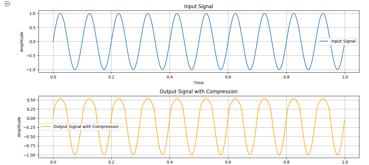
import numpy as np
import matplotlib.pyplot as plt

def compressor(input_signal, threshold, ratio):
    # コンプレッションを適用する関数
    output_signal = np.zeros_like(input_signal)
    for i in range(len(input_signal)):
        if input_signal[i] > threshold:
            output_signal[i] = threshold + (input_signal[i] - threshold) / ratio
        else:
            output_signal[i] = input_signal[i]
    return output_signal

# 入力信号の生成(サイン波)
fs = 1000  # サンプリング周波数
t = np.arange(0, 1, 1/fs)
input_signal = np.sin(2 * np.pi * 10 * t)  # ノイズなしのサイン波

# コンプレッサーの設定
threshold = 0.3  # 閾値
ratio = 3  # レシオ

# コンプレッサーを適用
output_signal = compressor(input_signal, threshold, ratio)

# グラフの描画
plt.figure(figsize=(12, 6))

# 入力信号のプロット
plt.subplot(2, 1, 1)
plt.plot(t, input_signal, label='Input Signal')
plt.xlabel('Time')
plt.ylabel('Amplitude')
plt.title('Input Signal')
plt.legend()
plt.grid(True)

# 出力信号のプロット
plt.subplot(2, 1, 2)
plt.plot(t, output_signal, label='Output Signal with Compression', color='orange')
plt.xlabel('Time')
plt.ylabel('Amplitude')
plt.title('Output Signal with Compression')
plt.legend()
plt.grid(True)

plt.tight_layout()
plt.show()
import numpy as np
import matplotlib.pyplot as plt

# Rectangular function
def rect(t, T):
    return np.where((t >= 0) & (t <= T), 1, 0)

# Gaussian function
def gaussian(x, a):
    return np.exp(-a * x**2)

# Exponential function
def exp_func(x):
    return np.exp(-x) * (x >= 0)

# Time and x ranges
T = 1
t = np.linspace(-2*T, 2*T, 500)
x = np.linspace(-5, 5, 500)

# Convolution 1: Rectangular functions
f_t_rect = rect(t, T)
g_t_rect = rect(t, T)
h_t_rect = np.convolve(f_t_rect, g_t_rect, mode='same') * (t[1] - t[0])

# Convolution 2: Gaussian functions
a = 1.0
b = 1.0
f_x_gauss = gaussian(x, a)
g_x_gauss = gaussian(x, b)
h_x_gauss = np.convolve(f_x_gauss, g_x_gauss, mode='same') * (x[1] - x[0])

# Normalize the Gaussian convolution
h_x_gauss /= np.max(h_x_gauss)
theoretical_h_x = np.sqrt(np.pi / (a + b)) * np.exp(-(a * b / (a + b)) * x**2)

# Convolution 3: Exponential function and rectangular function
X = 1
f_x_exp = exp_func(x)
g_x_rect = rect(x, X)
h_x_exp_rect = np.convolve(f_x_exp, g_x_rect, mode='same') * (x[1] - x[0])

# Plotting
plt.figure(figsize=(14, 12))

# Plot 1: Rectangular functions convolution
plt.subplot(3, 2, 1)
plt.plot(t, f_t_rect, label='f(t)')
plt.title('Rectangular Function f(t)')
plt.grid(True)

plt.subplot(3, 2, 2)
plt.plot(t, g_t_rect, label='g(t)')
plt.title('Rectangular Function g(t)')
plt.grid(True)

plt.subplot(3, 2, 3)
plt.plot(t, h_t_rect, label='h(t) = f * g(t)')
plt.title('Convolution of Rectangular Functions h(t)')
plt.grid(True)

# Plot 2: Gaussian functions convolution
plt.subplot(3, 2, 4)
plt.plot(x, f_x_gauss, label='f(x)')
plt.title('Gaussian Function f(x)')
plt.grid(True)

plt.subplot(3, 2, 5)
plt.plot(x, g_x_gauss, label='g(x)')
plt.title('Gaussian Function g(x)')
plt.grid(True)

plt.subplot(3, 2, 6)
plt.plot(x, h_x_gauss, label='h(x) = f * g(x)')
plt.plot(x, theoretical_h_x, label='Theoretical h(x)', linestyle='dashed')
plt.title('Convolution of Gaussian Functions h(x)')
plt.legend()
plt.grid(True)

plt.tight_layout()
plt.show()

# Plot 3: Exponential and rectangular functions convolution
plt.figure(figsize=(10, 6))

plt.subplot(3, 1, 1)
plt.plot(x, f_x_exp, label='f(x)')
plt.title('Exponential Function f(x)')
plt.grid(True)

plt.subplot(3, 1, 2)
plt.plot(x, g_x_rect, label='g(x)')
plt.title('Rectangular Function g(x)')
plt.grid(True)

plt.subplot(3, 1, 3)
plt.plot(x, h_x_exp_rect, label='h(x) = f * g(x)')
plt.title('Convolution of Exponential and Rectangular Functions h(x)')
plt.grid(True)

plt.tight_layout()
plt.show()
import numpy as np
import matplotlib.pyplot as plt

def simulate_reverberation(input_signal, delay_lengths, gains):
    # Initialize output signal with zeros
    output_signal = np.zeros_like(input_signal)

    # Apply reverb effect
    for i, delay_length in enumerate(delay_lengths):
        # Create delayed version of the input signal
        delayed_signal = np.zeros_like(input_signal)
        delayed_signal[delay_length:] = input_signal[:-delay_length]

        # Apply gain to the delayed signal
        delayed_signal *= gains[i]

        # Add the delayed and attenuated signal to the output
        output_signal += delayed_signal

    return output_signal

# Parameters
fs = 44100  # Sampling frequency
duration = 5  # Duration of the signal in seconds

# Create an impulse input signal
input_signal = np.zeros(int(fs * duration))
input_signal[0] = 1.0  # Impulse at the beginning

# Define delay lengths and gains for reverb simulation
delay_lengths = [int(fs * 0.1), int(fs * 0.2), int(fs * 0.3)]  # Delay lengths in samples (e.g., 0.1s, 0.2s, 0.3s)
gains = [0.8, 0.6, 0.4]  # Gains for each delayed signal

# Simulate reverberation effect
output_signal = simulate_reverberation(input_signal, delay_lengths, gains)

# Plotting input and output signals
t = np.linspace(0, duration, len(input_signal))

plt.figure(figsize=(12, 6))

plt.subplot(2, 1, 1)
plt.plot(t, input_signal, label='Input Signal (Impulse)')
plt.title('Impulse Input Signal')
plt.xlabel('Time (s)')
plt.ylabel('Amplitude')
plt.legend()

plt.subplot(2, 1, 2)
plt.plot(t, output_signal, label='Output Signal (Reverberation)')
plt.title('Output Signal with Reverberation Effect')
plt.xlabel('Time (s)')
plt.ylabel('Amplitude')
plt.legend()

plt.tight_layout()
plt.show()

import numpy as np
import matplotlib.pyplot as plt

def apply_clipping(input_signal, threshold):
    # クリッピングを適用する関数
    clipped_signal = np.clip(input_signal, -threshold, threshold)
    return clipped_signal

def compressor(input_signal, threshold, ratio):
    # コンプレッションを適用する関数
    output_signal = np.zeros_like(input_signal)
    for i in range(len(input_signal)):
        if input_signal[i] > threshold:
            output_signal[i] = threshold + (input_signal[i] - threshold) / ratio
        elif input_signal[i] < -threshold:
            output_signal[i] = -threshold + (input_signal[i] + threshold) / ratio
        else:
            output_signal[i] = input_signal[i]
    return output_signal

# 入力信号の生成(サイン波)
fs = 1000  # サンプリング周波数
t = np.arange(0, 1, 1/fs)
input_signal = np.sin(2 * np.pi * 10 * t)  # サイン波

# クリッピングの閾値
clip_threshold = 0.5

# クリッピングを適用した入力信号
clipped_input = apply_clipping(input_signal, clip_threshold)

# コンプレッサーの設定
comp_threshold = 0.3  # 閾値
comp_ratio = 3  # レシオ

# コンプレッサーを適用した出力信号
output_signal = compressor(clipped_input, comp_threshold, comp_ratio)

# グラフの描画
plt.figure(figsize=(12, 8))

# 入力信号とクリッピング後の信号のプロット
plt.subplot(3, 1, 1)
plt.plot(t, input_signal, label='Input Signal')
plt.plot(t, clipped_input, label='Clipped Input Signal', linestyle='--')
plt.xlabel('Time')
plt.ylabel('Amplitude')
plt.title('Input and Clipped Input Signals')
plt.legend()
plt.grid(True)

# コンプレッサーを適用した出力信号のプロット
plt.subplot(3, 1, 2)
plt.plot(t, output_signal, label='Output Signal with Compression', color='orange')
plt.xlabel('Time')
plt.ylabel('Amplitude')
plt.title('Output Signal with Compression')
plt.legend()
plt.grid(True)

# 入力信号と出力信号の比較プロット
plt.subplot(3, 1, 3)
plt.plot(t, clipped_input, label='Clipped Input Signal', linestyle='--')
plt.plot(t, output_signal, label='Output Signal with Compression', color='orange')
plt.xlabel('Time')
plt.ylabel('Amplitude')
plt.title('Clipped Input vs Output Signal')
plt.legend()
plt.grid(True)

plt.tight_layout()
plt.show()

import numpy as np
import matplotlib.pyplot as plt
from scipy.signal import lfilter

def karplus_strong(duration, sampling_rate, frequency):
    # Calculate the length of the buffer
    buffer_length = int(sampling_rate / frequency)

    # Generate random initial buffer (white noise)
    buffer = np.random.uniform(-1, 1, buffer_length)

    # Apply low-pass filter (moving average)
    b = np.array([0.5, 0.5])  # Simple moving average filter coefficients
    a = np.array([1.0])       # Denominator coefficients (for FIR filter, it's just 1)
    filtered_buffer = lfilter(b, a, buffer)

    # Trim to the desired duration
    generated_sound = filtered_buffer[:int(duration * sampling_rate)]

    return generated_sound, buffer

# Parameters
duration = 1.0          # Duration of the generated sound (seconds)
sampling_rate = 44100   # Sampling rate (samples per second)
frequency = 440         # Frequency of the sound (Hz)

# Generate sound using Karplus-Strong algorithm
generated_sound, initial_buffer = karplus_strong(duration, sampling_rate, frequency)

# Time axes
time_sound = np.linspace(0, duration, len(generated_sound))
time_buffer = np.linspace(0, len(initial_buffer) / sampling_rate, len(initial_buffer))

# Plot the generated sound and initial buffer
plt.figure(figsize=(14, 5))

plt.subplot(1, 2, 1)
plt.plot(time_buffer, initial_buffer, label='Initial Buffer (Input)')
plt.xlabel('Time (seconds)')
plt.ylabel('Amplitude')
plt.title('Initial Buffer (Input)')
plt.grid(True)
plt.legend()

plt.subplot(1, 2, 2)
plt.plot(time_sound, generated_sound, label='Generated Sound (Output)')
plt.xlabel('Time (seconds)')
plt.ylabel('Amplitude')
plt.title('Generated Sound (Output)')
plt.grid(True)
plt.legend()

plt.tight_layout()
plt.show()

import matplotlib.pyplot as plt
import numpy as np

def calculate_frequency(semitone):
    return 400 * 2**(semitone / 12)

# 半音数と対応する音名のリスト
note_names = [
    "C4", "C#4/Db4", "D4", "D#4/Eb4", "E4", "F4", "F#4/Gb4", "G4", "G#4/Ab4", "A4", "A#4/Bb4", "B4",
    "C5", "C#5/Db5", "D5", "D#5/Eb5", "E5", "F5", "F#5/Gb5", "G5", "G#5/Ab5", "A5", "A#5/Bb5", "B5"
]

# 半音数のリスト
semitones = np.arange(len(note_names))

# 周波数の計算
frequencies = [calculate_frequency(semi) for semi in semitones]

# プロット
plt.figure(figsize=(10, 6))

# 音名と周波数の値をプロット
for semi, freq in zip(semitones, frequencies):
    plt.text(semi, freq, f'{note_names[semi]} ({freq:.2f} Hz)', ha='center', va='bottom', fontsize=8, color='blue')

plt.plot(semitones, frequencies, marker='o', linestyle='-', color='b', label='Frequency')
plt.title('Frequencies of Notes')
plt.xlabel('Semitones')
plt.ylabel('Frequency (Hz)')
plt.xticks(semitones, note_names, rotation=45)
plt.grid(True)
plt.tight_layout()
plt.legend()
plt.show()

def calculate_tempo(d):
    return 60 / d

# 拍の間隔(秒)
d = 0.5  # 例として0.5秒とします

# テンポ(BPM)を計算
tempo = calculate_tempo(d)

print(f"Tempo: {tempo} BPM")

import numpy as np
import matplotlib.pyplot as plt

def chorus_effect(input_signal, fs, delay_time=0.03, depth=0.5, rate=1.5):
    """
    サイン波を使った簡単なコーラスエフェクターの実装例
    input_signal: 入力信号(numpy array)
    fs: サンプリング周波数
    delay_time: エフェクトの遅延時間(秒)
    depth: エフェクトの深さ(振幅の変化)
    rate: エフェクトの速度(周波数の変化)
    """
    time = np.arange(len(input_signal)) / fs
    delay_samples = int(delay_time * fs)
    output_signal = np.zeros_like(input_signal, dtype=np.float32)

    # サイン波による遅延信号の生成
    mod_signal = np.sin(2 * np.pi * rate * time)
    for i in range(delay_samples, len(input_signal)):
        output_signal[i] = input_signal[i] + depth * mod_signal[i - delay_samples]

    return output_signal

# テスト用のサイン波の生成
fs = 44100  # サンプリング周波数
duration = 1  # サイン波の長さ(秒)
frequency = 440  # サイン波の周波数

t = np.linspace(0, duration, int(fs * duration), endpoint=False)
input_signal = np.sin(2 * np.pi * frequency * t)

# コーラスエフェクトを適用
output_signal = chorus_effect(input_signal, fs)

# 波形のプロット
plt.figure(figsize=(10, 6))
plt.plot(t, input_signal, label='Input Signal', color='b')
plt.plot(t, output_signal, label='Output Signal (with Chorus Effect)', color='r', alpha=0.7)
plt.title('Input and Output Signal with Chorus Effect')
plt.xlabel('Time (seconds)')
plt.ylabel('Amplitude')
plt.legend()
plt.grid(True)
plt.tight_layout()
plt.show()

import numpy as np
import matplotlib.pyplot as plt

# サンプリング周波数と時間範囲の設定
fs = 44100  # サンプリング周波数 (Hz)
t = np.linspace(0, 2, 2 * fs, endpoint=False)  # 2秒間の時間軸

# トレモロのパラメータ
frequency = 5  # トレモロの周波数 (Hz)
depth = 0.5  # トレモロの深さ (振幅の最大変化割合)

# トレモロ波形の生成
tremolo_wave = (1 - depth) + depth * np.sin(2 * np.pi * frequency * t)

# オリジナルの信号 (例:サイン波)
original_signal = np.sin(2 * np.pi * 440 * t)  # 440Hzのサイン波

# トレモロ効果を適用した信号
tremolo_signal = tremolo_wave * original_signal

# プロット
plt.figure(figsize=(12, 6))

# オリジナルの信号のプロット
plt.subplot(2, 1, 1)
plt.plot(t, original_signal, label='Original Signal')
plt.xlabel('Time (s)')
plt.ylabel('Amplitude')
plt.title('Original Signal (440Hz)')
plt.legend()

# トレモロ効果を適用した信号のプロット
plt.subplot(2, 1, 2)
plt.plot(t, tremolo_signal, label='Tremolo Signal')
plt.xlabel('Time (s)')
plt.ylabel('Amplitude')
plt.title('Tremolo Effect (Frequency: {}Hz, Depth: {})'.format(frequency, depth))
plt.legend()

plt.tight_layout()
plt.show()

class MixerChannel:
    def __init__(self, volume=1.0, pan=0.0):
        self.volume = volume  # 初期音量
        self.pan = pan        # 初期パン位置

    def set_volume(self, volume):
        # 音量を設定する
        self.volume = max(0.0, min(1.0, volume))  # 音量は0から1の範囲にクリップする

    def set_pan(self, pan):
        # パンを設定する (-1.0: 左, 0.0: 中央, 1.0: 右)
        self.pan = max(-1.0, min(1.0, pan))  # パンは-1から1の範囲にクリップする

    def apply_effects(self, signal):
        # 仮想的なオーディオ信号処理をシミュレート
        adjusted_signal = signal * self.volume  # 音量を適用
        left_gain = (1 + self.pan) / 2
        right_gain = (1 - self.pan) / 2
        left_channel = adjusted_signal * left_gain
        right_channel = adjusted_signal * right_gain
        return left_channel, right_channel

# 使用例
if __name__ == "__main__":
    # チャンネルを作成
    channel1 = MixerChannel(volume=0.8, pan=0.5)
    channel2 = MixerChannel(volume=0.6, pan=-0.3)

    # 仮想的な入力信号 (例: ホワイトノイズ)
    input_signal = 0.5  # ホワイトノイズの振幅

    # チャンネルに信号を適用して出力を取得
    left_output1, right_output1 = channel1.apply_effects(input_signal)
    left_output2, right_output2 = channel2.apply_effects(input_signal)

    # 出力を表示
    print("Channel 1 Output: Left={}, Right={}".format(left_output1, right_output1))
    print("Channel 2 Output: Left={}, Right={}".format(left_output2, right_output2))
import math

def calculate_sound_pressure_level(measured_pressure, reference_pressure=20e-6):
    """
    音圧レベル (dB) を計算する関数

    :param measured_pressure: 測定された音圧 (Pa)
    :param reference_pressure: 基準音圧 (Pa)、デフォルトは 20 μPa
    :return: 音圧レベル (dB)
    """
    # 音圧レベル (dB) の計算
    sound_pressure_level = 20 * math.log10(measured_pressure / reference_pressure)
    return sound_pressure_level

def calculate_loudness_level(sound_pressure_level):
    """
    ラウドネスレベル (phon) を計算する関数
    ここでは簡単なモデルとして、音圧レベル (dB) に対してラウドネスレベルを計算します。
    実際には周波数ごとの補正が必要ですが、ここでは簡略化しています。

    :param sound_pressure_level: 音圧レベル (dB)
    :return: ラウドネスレベル (phon)
    """
    # ラウドネスレベル (phon) の計算
    loudness_level = sound_pressure_level  # 仮に音圧レベルをそのままラウドネスレベルとする
    return loudness_level

# 例:測定された音圧が 0.1 Pa の場合
measured_pressure = 0.1
spl = calculate_sound_pressure_level(measured_pressure)
loudness = calculate_loudness_level(spl)

print(f"音圧レベル: {spl:.2f} dB")
print(f"ラウドネスレベル: {loudness:.2f} phon")
import numpy as np
import matplotlib.pyplot as plt
from scipy.signal import hilbert

# サンプルレートと時間軸を設定
fs = 1000  # サンプルレート (Hz)
t = np.linspace(0, 1.0, fs)  # 時間軸 (1秒)

# 正弦波信号を生成
frequency = 5  # 周波数 (Hz)
amplitude = np.sin(2 * np.pi * frequency * t)

# ヒルベルト変換を使用してエンベロープを計算
analytic_signal = hilbert(amplitude)
envelope = np.abs(analytic_signal)

# 信号とエンベロープをプロット
plt.figure(figsize=(10, 6))
plt.plot(t, amplitude, label='Original Signal')
plt.plot(t, envelope, label='Envelope', linestyle='--')
plt.xlabel('Time (s)')
plt.ylabel('Amplitude')
plt.title('Signal and Envelope')
plt.legend()
plt.show()
import numpy as np
import matplotlib.pyplot as plt
from scipy.signal import hilbert

# サンプルレートと時間軸を設定
fs = 1000  # サンプルレート (Hz)
t = np.linspace(0, 1.0, fs)  # 時間軸 (1秒)

# 異なる周波数を持つ正弦波信号を生成
frequency1 = 5   # 周波数1 (Hz)
frequency2 = 6   # 周波数2 (Hz)
signal = np.sin(2 * np.pi * frequency1 * t) + np.sin(2 * np.pi * frequency2 * t)

# ヒルベルト変換を使用してエンベロープを計算
analytic_signal = hilbert(signal)
envelope = np.abs(analytic_signal)

# 信号とエンベロープをプロット
plt.figure(figsize=(10, 6))
plt.plot(t, signal, label='Original Signal')
plt.plot(t, envelope, label='Envelope', linestyle='--', color='red')
plt.xlabel('Time (s)')
plt.ylabel('Amplitude')
plt.title('Signal and Envelope')
plt.legend()
plt.show()
import numpy as np
import matplotlib.pyplot as plt

def generate_adsr_envelope(attack, decay, sustain_level, sustain_time, release, sample_rate=1000):
    # 各フェーズのサンプル数を計算
    attack_samples = int(attack * sample_rate)
    decay_samples = int(decay * sample_rate)
    sustain_samples = int(sustain_time * sample_rate)
    release_samples = int(release * sample_rate)

    # 各フェーズのエンベロープを生成
    attack_phase = np.linspace(0, 1, attack_samples)
    decay_phase = np.linspace(1, sustain_level, decay_samples)
    sustain_phase = np.full(sustain_samples, sustain_level)
    release_phase = np.linspace(sustain_level, 0, release_samples)

    # エンベロープを結合
    envelope = np.concatenate([attack_phase, decay_phase, sustain_phase, release_phase])
    return envelope

# ADSRパラメータの設定
attack = 0.1        # アタックタイム (秒)
decay = 0.1         # ディケイタイム (秒)
sustain_level = 0.7 # サスティンレベル
sustain_time = 0.5  # サスティンタイム (秒)
release = 0.2       # リリースタイム (秒)

# エンベロープの生成
envelope = generate_adsr_envelope(attack, decay, sustain_level, sustain_time, release)

# 時間軸の生成
total_time = attack + decay + sustain_time + release
time = np.linspace(0, total_time, len(envelope))

# エンベロープのプロット
plt.figure(figsize=(10, 6))
plt.plot(time, envelope)
plt.xlabel('Time (s)')
plt.ylabel('Amplitude')
plt.title('ADSR Envelope')
plt.grid(True)
plt.show()
import numpy as np
import matplotlib.pyplot as plt
from scipy.signal import chirp, convolve

def generate_impulse_response(duration, sample_rate):
    """
    残響のインパルス応答を生成する関数
    """
    time = np.linspace(0, duration, int(sample_rate * duration))
    impulse_response = np.exp(-time * 3) * np.random.randn(len(time))
    return impulse_response

def generate_signal(duration, sample_rate):
    """
    テスト用の信号(チャープ信号)を生成する関数
    """
    t = np.linspace(0, duration, int(sample_rate * duration))
    signal = chirp(t, f0=20, f1=sample_rate/2, t1=duration, method='linear')
    return signal

# サンプルレートと期間の設定
sample_rate = 48000  # サンプルレート (Hz)
duration = 2.0      # 期間 (秒)

# インパルス応答の生成
impulse_response = generate_impulse_response(duration, sample_rate)

# テスト用信号の生成
signal = generate_signal(duration, sample_rate)

# テスト用信号とインパルス応答の畳み込み
output_signal = convolve(signal, impulse_response, mode='full')

# 時間軸の生成
time_ir = np.linspace(0, len(impulse_response) / sample_rate, len(impulse_response))
time_signal = np.linspace(0, len(signal) / sample_rate, len(signal))
time_output = np.linspace(0, len(output_signal) / sample_rate, len(output_signal))

# インパルス応答のプロット
plt.figure(figsize=(15, 5))
plt.subplot(1, 3, 1)
plt.plot(time_ir, impulse_response)
plt.title('Impulse Response')
plt.xlabel('Time (s)')
plt.ylabel('Amplitude')

# テスト用信号のプロット
plt.subplot(1, 3, 2)
plt.plot(time_signal, signal)
plt.title('Input Signal')
plt.xlabel('Time (s)')
plt.ylabel('Amplitude')

# 出力信号のプロット
plt.subplot(1, 3, 3)
plt.plot(time_output, output_signal)
plt.title('Output Signal (Convolved)')
plt.xlabel('Time (s)')
plt.ylabel('Amplitude')

plt.tight_layout()
plt.show()
import numpy as np
import matplotlib.pyplot as plt

# エコー効果を適用する関数
def apply_echo(signal, sample_rate, delay_ms, decay):
    delay_samples = int(sample_rate * delay_ms / 1000.0)
    output = np.copy(signal)

    for i in range(delay_samples, len(signal)):
        output[i] += decay * signal[i - delay_samples]

    return output

# サンプルの信号を生成
sample_rate = 44100  # サンプリングレート (Hz)
duration = 1.0       # 信号の長さ (秒)
frequency = 440.0    # 信号の周波数 (Hz)
t = np.linspace(0, duration, int(sample_rate * duration), endpoint=False)
signal = 0.5 * np.sin(2 * np.pi * frequency * t)  # 正弦波の生成

# エコー効果のパラメータ
delay_ms = 500  # 遅延時間(ミリ秒)
decay = 0.5     # 減衰率(0.0 - 1.0)

# エコー効果の適用
signal_with_echo = apply_echo(signal, sample_rate, delay_ms, decay)

# 結果をプロット
plt.figure(figsize=(12, 6))

plt.subplot(2, 1, 1)
plt.title('Original Signal')
plt.plot(t, signal)
plt.xlabel('Time [s]')
plt.ylabel('Amplitude')

plt.subplot(2, 1, 2)
plt.title('Signal with Echo')
plt.plot(t, signal_with_echo)
plt.xlabel('Time [s]')
plt.ylabel('Amplitude')

plt.tight_layout()
plt.show()
import numpy as np
import matplotlib.pyplot as plt

# リング変調を適用する関数
def ring_modulate(signal, carrier_freq, sample_rate):
    t = np.arange(len(signal)) / sample_rate
    carrier = np.sin(2 * np.pi * carrier_freq * t)
    return signal * carrier

# サンプルの信号を生成
sample_rate = 44100  # サンプリングレート (Hz)
duration = 1.0       # 信号の長さ (秒)
signal_freq = 5.0    # 信号の周波数 (Hz)
carrier_freq = 440.0 # キャリア信号の周波数 (Hz)

# 時間軸の生成
t = np.arange(int(sample_rate * duration)) / sample_rate

# 信号とキャリア信号の生成
signal = 0.5 * np.sin(2 * np.pi * signal_freq * t)  # 信号
carrier = np.sin(2 * np.pi * carrier_freq * t)      # キャリア信号

# リング変調の適用
modulated_signal = ring_modulate(signal, carrier_freq, sample_rate)

# 結果をプロット
plt.figure(figsize=(12, 6))

plt.subplot(3, 1, 1)
plt.title('Original Signal')
plt.plot(t, signal)
plt.xlabel('Time [s]')
plt.ylabel('Amplitude')

plt.subplot(3, 1, 2)
plt.title('Carrier Signal')
plt.plot(t, carrier)
plt.xlabel('Time [s]')
plt.ylabel('Amplitude')

plt.subplot(3, 1, 3)
plt.title('Modulated Signal')
plt.plot(t, modulated_signal)
plt.xlabel('Time [s]')
plt.ylabel('Amplitude')

plt.tight_layout()
plt.show()
import numpy as np
import matplotlib.pyplot as plt

# 指向性パターンを計算する関数(単一指向性の例)
def directivity_pattern(theta, pattern_type='cardioid'):
    if pattern_type == 'cardioid':
        return 1 + np.cos(theta)  # 心臓型(単一指向性)
    elif pattern_type == 'omnidirectional':
        return np.ones_like(theta)  # 無指向性
    elif pattern_type == 'supercardioid':
        return (1 + 0.5 * np.cos(theta)) / (1 + 0.2 * np.cos(theta))  # 超指向性
    else:
        raise ValueError("Unknown pattern type")

# パラメータの設定
num_points = 360  # 点の数(角度分解能)
theta = np.linspace(0, 2 * np.pi, num_points)  # 角度(ラジアン)

# 指向性パターンの計算
pattern_type = 'cardioid'  # 指向性パターンの種類('cardioid', 'omnidirectional', 'supercardioid')
directivity = directivity_pattern(theta, pattern_type)

# 結果をプロット
plt.figure(figsize=(8, 8))
plt.polar(theta, directivity, label=f'{pattern_type.capitalize()} Pattern')
plt.title('Microphone Directivity Pattern')
plt.legend()
plt.show()
import numpy as np
import matplotlib.pyplot as plt
from matplotlib.animation import FuncAnimation

# 定数の設定
A = 1  # 振幅
k = 2 * np.pi / 1  # 波数(波長 λ = 1 と仮定)
omega = 2 * np.pi  # 角周波数(周期 T = 1 と仮定)
x = np.linspace(0, 10, 1000)  # x 座標

# 時間の設定
t_max = 2  # アニメーションの総時間
dt = 0.01  # 時間ステップ

# 波の定義
def forward_wave(x, t):
    return A * np.sin(k * x - omega * t)

def backward_wave(x, t):
    return A * np.sin(k * x + omega * t)

def standing_wave(x, t):
    return forward_wave(x, t) + backward_wave(x, t)

# プロットの設定
fig, ax = plt.subplots()
ax.set_xlim(0, 10)
ax.set_ylim(-2 * A, 2 * A)
line1, = ax.plot(x, forward_wave(x, 0), label='Forward Wave')
line2, = ax.plot(x, backward_wave(x, 0), label='Backward Wave')
line3, = ax.plot(x, standing_wave(x, 0), label='Standing Wave')
ax.legend()

# アニメーションの更新関数
def update(t):
    y1 = forward_wave(x, t)
    y2 = backward_wave(x, t)
    y3 = standing_wave(x, t)
    line1.set_ydata(y1)
    line2.set_ydata(y2)
    line3.set_ydata(y3)
    return line1, line2, line3

# アニメーションの作成
ani = FuncAnimation(fig, update, frames=np.arange(0, t_max, dt), blit=True, interval=50)

plt.xlabel('x')
plt.ylabel('Amplitude')
plt.title('Forward Wave, Backward Wave, and Standing Wave')
plt.show()
import numpy as np

# 基準となるC4の周波数
C4_freq = 261.63  # 中央Cの周波数(Hz)

# ピタゴラス音律での純正5度の比率
pure_fifth_ratio = 3 / 2

# 音名とピタゴラス音律の順序
notes = ['C', 'G', 'D', 'A', 'E', 'B', 'F#', 'Db', 'Ab', 'Eb', 'Bb', 'F']
note_shifts = {
    'C': 0,
    'G': 1,
    'D': 2,
    'A': 3,
    'E': 4,
    'B': 5,
    'F#': 6,
    'Db': -6,
    'Ab': -5,
    'Eb': -4,
    'Bb': -3,
    'F': -2
}

# 周波数計算の関数
def calculate_pythagorean_frequencies(C4_freq):
    frequencies = {}
    for note in notes:
        shift = note_shifts[note]
        freq = C4_freq * (pure_fifth_ratio ** shift) / (2 ** (shift // 7))
        frequencies[note] = freq
    return frequencies

# 周波数を計算
frequencies = calculate_pythagorean_frequencies(C4_freq)

# 結果を表示
for note, freq in frequencies.items():
    print(f"{note}: {freq:.2f} Hz")
import numpy as np
import matplotlib.pyplot as plt

# 定数の設定
f1 = 440.0  # 第一の音の周波数(Hz)
f2 = 445.0  # 第二の音の周波数(Hz)
A = 1.0     # 振幅
duration = 1.0  # 持続時間(秒)
sampling_rate = 44100  # サンプリングレート(Hz)

# 時間軸の生成
t = np.linspace(0, duration, int(sampling_rate * duration), endpoint=False)

# 2つの音の生成
wave1 = A * np.sin(2 * np.pi * f1 * t)
wave2 = A * np.sin(2 * np.pi * f2 * t)

# 合成波の生成(うなりを生じる)
beat_wave = wave1 + wave2

# プロットの設定
plt.figure(figsize=(10, 6))

# 個々の波のプロット
plt.subplot(3, 1, 1)
plt.plot(t, wave1, label=f'{f1} Hz')
plt.title(f'Wave 1: {f1} Hz')
plt.xlabel('Time [s]')
plt.ylabel('Amplitude')

plt.subplot(3, 1, 2)
plt.plot(t, wave2, label=f'{f2} Hz')
plt.title(f'Wave 2: {f2} Hz')
plt.xlabel('Time [s]')
plt.ylabel('Amplitude')

# 合成波(うなり)のプロット
plt.subplot(3, 1, 3)
plt.plot(t, beat_wave)
plt.title('Beat Wave')
plt.xlabel('Time [s]')
plt.ylabel('Amplitude')

# プロットの表示
plt.tight_layout()
plt.show()
import numpy as np
import matplotlib.pyplot as plt

# 定数の設定
fs = 44100  # サンプリングレート
duration = 1.0  # 持続時間
t = np.linspace(0, duration, int(fs * duration), endpoint=False)
freq = 440  # 周波数
A = 0.5  # 振幅

# 音声信号の生成
signal = A * np.sin(2 * np.pi * freq * t)

# ウェーブシェーピング関数の定義
def wave_shaping(signal, shaping_function):
    return shaping_function(signal)

# いくつかのシェーピング関数
def soft_clip(signal):
    return np.tanh(signal * 10)  # ソフトクリッピング

def hard_clip(signal):
    return np.clip(signal, -0.5, 0.5)  # ハードクリッピング

def sigmoid(signal):
    return 1 / (1 + np.exp(-signal * 10))  # シグモイド変換

# シェーピング関数を適用
shaped_signals = {
    'Soft Clip': wave_shaping(signal, soft_clip),
    'Hard Clip': wave_shaping(signal, hard_clip),
    'Sigmoid': wave_shaping(signal, sigmoid)
}

# プロット
plt.figure(figsize=(15, 10))

# オリジナル信号
plt.subplot(4, 1, 1)
plt.plot(t[:1000], signal[:1000])
plt.title('Original Signal')
plt.xlabel('Time [s]')
plt.ylabel('Amplitude')

# 各ウェーブシェーピングのプロット
for i, (title, shaped_signal) in enumerate(shaped_signals.items(), 2):
    plt.subplot(4, 1, i)
    plt.plot(t[:1000], shaped_signal[:1000])
    plt.title(f'{title} Signal')
    plt.xlabel('Time [s]')
    plt.ylabel('Amplitude')

plt.tight_layout()
plt.show()
import numpy as np
import matplotlib.pyplot as plt
from scipy.signal import butter, filtfilt

# 矩形波のフーリエ級数展開による生成
def generate_square_wave_fourier(t, num_harmonics):
    signal = np.zeros_like(t)
    for k in range(1, num_harmonics + 1, 2):  # 奇数次の調和成分のみ
        signal += (4 / (np.pi * k)) * np.sin(2 * np.pi * k * t)
    return signal

# Butterworthフィルタの設計
def butter_lowpass(cutoff, fs, order=5):
    nyq = 0.5 * fs
    normal_cutoff = cutoff / nyq
    b, a = butter(order, normal_cutoff, btype='low', analog=False)
    return b, a

# 信号をフィルタリング
def lowpass_filter(data, cutoff, fs, order=5):
    b, a = butter_lowpass(cutoff, fs, order=order)
    y = filtfilt(b, a, data)
    return y

# サンプリング設定
fs = 5000  # サンプリング周波数
t = np.linspace(0, 1, fs, endpoint=False)  # 時間軸
num_harmonics = 1001  # 使用する調和成分の数(奇数次のみ)

# 矩形波生成
square_wave = generate_square_wave_fourier(t, num_harmonics)

# フィルタ設定
cutoff = 50  # カットオフ周波数
order = 6  # フィルタの次数

# 矩形波をフィルタリング
filtered_square_wave = lowpass_filter(square_wave, cutoff, fs, order)

# 結果をプロット
plt.figure(figsize=(14, 7))
plt.subplot(2, 1, 1)
plt.plot(t, square_wave, label='Original Square Wave')
plt.title('Original Square Wave with Gibbs Phenomenon')
plt.xlabel('Time [s]')
plt.ylabel('Amplitude')
plt.grid(True)
plt.legend()

plt.subplot(2, 1, 2)
plt.plot(t, filtered_square_wave, label='Filtered Square Wave', color='r')
plt.title('Filtered Square Wave')
plt.xlabel('Time [s]')
plt.ylabel('Amplitude')
plt.grid(True)
plt.legend()

plt.tight_layout()
plt.show()
import numpy as np
import matplotlib.pyplot as plt

# 波のパラメータ
amplitude = 1.0  # 振幅
wavelength = 2.0  # 波長
frequency = 1.0  # 周波数
omega = 2 * np.pi * frequency  # 角周波数
k = 2 * np.pi / wavelength  # 波数
speed = wavelength * frequency  # 波の速度
time = np.linspace(0, 2, 1000)  # 時間軸
position = np.linspace(0, 10, 1000)  # 位置軸

# 前進波の生成
def forward_wave(position, time):
    return amplitude * np.sin(k * position - omega * time)

# 後進波の生成
def backward_wave(position, time):
    return amplitude * np.sin(k * position + omega * time)

# 定常波の生成
def standing_wave(position, time):
    return 2 * amplitude * np.sin(k * position) * np.cos(omega * time)

# 各波の計算
time_grid, position_grid = np.meshgrid(time, position)
forward_wave_data = forward_wave(position_grid, time_grid)
backward_wave_data = backward_wave(position_grid, time_grid)
standing_wave_data = standing_wave(position_grid, time_grid)

# 結果をプロット
plt.figure(figsize=(14, 10))

plt.subplot(3, 1, 1)
plt.imshow(forward_wave_data, extent=[0, 2, 0, 10], aspect='auto', origin='lower', cmap='viridis')
plt.colorbar()
plt.title('Forward Wave')
plt.xlabel('Time [s]')
plt.ylabel('Position [m]')

plt.subplot(3, 1, 2)
plt.imshow(backward_wave_data, extent=[0, 2, 0, 10], aspect='auto', origin='lower', cmap='viridis')
plt.colorbar()
plt.title('Backward Wave')
plt.xlabel('Time [s]')
plt.ylabel('Position [m]')

plt.subplot(3, 1, 3)
plt.imshow(standing_wave_data, extent=[0, 2, 0, 10], aspect='auto', origin='lower', cmap='viridis')
plt.colorbar()
plt.title('Standing Wave')
plt.xlabel('Time [s]')
plt.ylabel('Position [m]')

plt.tight_layout()
plt.show()
import numpy as np
import matplotlib.pyplot as plt
from scipy.fftpack import fft

# サンプルデータの生成
fs = 1000  # サンプリング周波数
T = 1.0 / fs  # サンプリング間隔
L = 1000  # サンプル数
t = np.linspace(0, L * T, L, endpoint=False)  # 時間軸

# サンプル信号 (複数の正弦波を含む)
f1, f2 = 50, 120  # 信号周波数
signal = 0.7 * np.sin(2 * np.pi * f1 * t) + np.sin(2 * np.pi * f2 * t)

# FFTの計算
signal_fft = fft(signal)
P2 = np.abs(signal_fft / L)  # 2次元のパワースペクトル
P1 = P2[:L // 2 + 1]
P1[1:-1] = 2 * P1[1:-1]  # 1次元のパワースペクトル

# パワースペクトルの平方根 (振幅スペクトル)
amplitude_spectrum = np.sqrt(P1)

# 振幅比の計算 (各周波数成分の振幅を基準周波数の振幅で割る)
reference_frequency_index = np.argmax(P1)  # 基準周波数のインデックス(最大振幅の周波数成分)
reference_amplitude = P1[reference_frequency_index]
amplitude_ratio = P1 / reference_amplitude

# 周波数軸
f = fs * np.arange(L // 2 + 1) / L

# 結果をプロット
plt.figure(figsize=(14, 10))

plt.subplot(3, 1, 1)
plt.plot(t, signal)
plt.title('Time Domain Signal')
plt.xlabel('Time [s]')
plt.ylabel('Amplitude')
plt.grid(True)

plt.subplot(3, 1, 2)
plt.plot(f, P1)
plt.title('Single-Sided Amplitude Spectrum')
plt.xlabel('Frequency [Hz]')
plt.ylabel('Amplitude')
plt.grid(True)

plt.subplot(3, 1, 3)
plt.plot(f, amplitude_ratio)
plt.title('Amplitude Ratio Spectrum')
plt.xlabel('Frequency [Hz]')
plt.ylabel('Amplitude Ratio')
plt.grid(True)

plt.tight_layout()
plt.show()
import numpy as np
import matplotlib.pyplot as plt

# MIDI メッセージのサンプルデータ
# 各メッセージは (デルタタイム, メッセージタイプ, ノートナンバー, ベロシティ) で表される
midi_messages = [
    (0, 'Note On', 60, 100),
    (480, 'Note Off', 60, 0),
    (480, 'Note On', 62, 100),
    (480, 'Note Off', 62, 0),
    (480, 'Note On', 64, 100),
    (480, 'Note Off', 64, 0)
]

# デルタタイムを累積して、各メッセージの時間を求める
delta_times = np.cumsum([msg[0] for msg in midi_messages])
message_types = [msg[1] for msg in midi_messages]
note_numbers = [msg[2] for msg in midi_messages]
velocities = [msg[3] for msg in midi_messages]

# グラフの設定
fig, ax1 = plt.subplots(figsize=(12, 6))

# メッセージタイプのプロット
ax1.step(delta_times, message_types, label='Message Type', where='post')
ax1.set_xlabel('Time (ms)')
ax1.set_ylabel('Message Type', color='blue')
ax1.tick_params(axis='y', labelcolor='blue')

# ノートナンバーとベロシティのプロット用の2番目のy軸
ax2 = ax1.twinx()
ax2.plot(delta_times, note_numbers, 'go-', label='Note Number')
ax2.plot(delta_times, velocities, 'ro-', label='Velocity')
ax2.set_ylabel('Note Number / Velocity', color='black')
ax2.tick_params(axis='y', labelcolor='black')

# ラベルと凡例の設定
ax1.set_title('MIDI Messages')
fig.tight_layout()
ax1.legend(loc='upper left')
ax2.legend(loc='upper right')

plt.show()
import numpy as np
import matplotlib.pyplot as plt
from scipy.signal import butter, lfilter, freqz

# サンプリング設定
fs = 1000  # サンプリング周波数 (Hz)
f_signal = 50  # 信号の周波数 (Hz)
duration = 1.0  # 信号の長さ (秒)
t = np.linspace(0, duration, int(fs*duration), endpoint=False)
signal = 0.5 * np.sin(2 * np.pi * f_signal * t)

# サンプリング
sampling_ratios = [2, 4, 10]  # サンプリング比 (例: アンダーサンプリングとオーバーサンプリング)
plt.figure(figsize=(12, 8))

for ratio in sampling_ratios:
    sampled_fs = fs / ratio
    sampled_t = np.linspace(0, duration, int(sampled_fs*duration), endpoint=False)
    sampled_signal = 0.5 * np.sin(2 * np.pi * f_signal * sampled_t)

    plt.subplot(len(sampling_ratios), 1, sampling_ratios.index(ratio)+1)
    plt.plot(sampled_t, sampled_signal, 'o-', label=f'Sampling Ratio = {ratio}')
    plt.title(f'Sampled Signal with Ratio {ratio}')
    plt.xlabel('Time [s]')
    plt.ylabel('Amplitude')
    plt.grid()
    plt.legend()

plt.tight_layout()
plt.show()

# アンチエイリアシングフィルタの設計
def butter_lowpass(cutoff, fs, order=5):
    nyquist = 0.5 * fs
    normal_cutoff = cutoff / nyquist
    b, a = butter(order, normal_cutoff, btype='low', analog=False)
    return b, a

def butter_lowpass_filter(data, cutoff, fs, order=5):
    b, a = butter_lowpass(cutoff, fs, order=order)
    y = lfilter(b, a, data)
    return y

# フィルタ設定
cutoff = 100  # カットオフ周波数 (Hz)
filtered_signal = butter_lowpass_filter(signal, cutoff, fs)

# プロット
plt.figure(figsize=(12, 6))
plt.subplot(2, 1, 1)
plt.plot(t, signal, label='Original Signal')
plt.title('Original Signal')
plt.xlabel('Time [s]')
plt.ylabel('Amplitude')
plt.grid()
plt.legend()

plt.subplot(2, 1, 2)
plt.plot(t, filtered_signal, label='Filtered Signal (Anti-Aliasing Filter)', color='orange')
plt.title('Signal after Anti-Aliasing Filter')
plt.xlabel('Time [s]')
plt.ylabel('Amplitude')
plt.grid()
plt.legend()

plt.tight_layout()
plt.show()
import numpy as np
import matplotlib.pyplot as plt

# Parameters
Fs = 10000  # Sampling frequency (Hz)
T = 1       # Duration of the signal (seconds)
t = np.linspace(0, T, int(Fs * T), endpoint=False)  # Time axis

# Carrier signal parameters
f_c = 1000   # Carrier frequency (Hz)
A_c = 1      # Carrier amplitude

# Modulating signal parameters
f_m = 50     # Modulating signal frequency (Hz)
A_m = 0.5    # Modulating signal amplitude
modulating_signal = A_m * np.sin(2 * np.pi * f_m * t)

# Carrier signal
carrier_signal = A_c * np.cos(2 * np.pi * f_c * t)

# Amplitude Modulation (AM)
am_signal = (A_c + modulating_signal) * np.cos(2 * np.pi * f_c * t)

# Plotting
plt.figure(figsize=(12, 9))

# Carrier Signal
plt.subplot(3, 1, 1)
plt.plot(t, carrier_signal)
plt.title('Carrier Signal')
plt.xlabel('Time (s)')
plt.ylabel('Amplitude')
plt.grid()

# Modulating Signal
plt.subplot(3, 1, 2)
plt.plot(t, modulating_signal)
plt.title('Modulating Signal')
plt.xlabel('Time (s)')
plt.ylabel('Amplitude')
plt.grid()

# Amplitude Modulated Signal
plt.subplot(3, 1, 3)
plt.plot(t, am_signal)
plt.title('Amplitude Modulated Signal (AM)')
plt.xlabel('Time (s)')
plt.ylabel('Amplitude')
plt.grid()

plt.tight_layout()
plt.show()
import numpy as np
import matplotlib.pyplot as plt
from scipy.signal import butter, lfilter

# Parameters
Fs = 10000  # Sampling frequency (Hz)
T = 1       # Duration of the signal (seconds)
t = np.linspace(0, T, int(Fs * T), endpoint=False)  # Time axis

# VCO parameters
f_c_base = 440  # Base frequency (Hz)
f_m = 5         # Modulating frequency (Hz)
A_c = 1         # Carrier amplitude
vco_signal = A_c * np.sin(2 * np.pi * (f_c_base + 50 * np.sin(2 * np.pi * f_m * t)) * t)

# VCF parameters
cutoff_freq = 800  # Cutoff frequency of the filter (Hz)
order = 4          # Order of the filter
b, a = butter(order, cutoff_freq / (0.5 * Fs), btype='low')

# Apply VCF to VCO signal
vcf_signal = lfilter(b, a, vco_signal)

# VCA parameters
vca_control = 0.5 * (1 + np.sin(2 * np.pi * f_m * t))  # Control voltage for VCA
vca_signal = vcf_signal * vca_control

# Plotting
plt.figure(figsize=(12, 12))

# VCO Signal
plt.subplot(4, 1, 1)
plt.plot(t, vco_signal)
plt.title('VCO Signal')
plt.xlabel('Time (s)')
plt.ylabel('Amplitude')
plt.grid()

# VCF Signal
plt.subplot(4, 1, 2)
plt.plot(t, vcf_signal)
plt.title('VCF Signal')
plt.xlabel('Time (s)')
plt.ylabel('Amplitude')
plt.grid()

# VCA Control Signal
plt.subplot(4, 1, 3)
plt.plot(t, vca_control)
plt.title('VCA Control Signal')
plt.xlabel('Time (s)')
plt.ylabel('Control Voltage')
plt.grid()

# VCA Signal
plt.subplot(4, 1, 4)
plt.plot(t, vca_signal)
plt.title('VCA Signal')
plt.xlabel('Time (s)')
plt.ylabel('Amplitude')
plt.grid()

plt.tight_layout()
plt.show()
import numpy as np
import matplotlib.pyplot as plt
from scipy.io.wavfile import write

# Parameters
Fs = 44100  # Sampling frequency (Hz)
duration = 2  # Duration of the signal (seconds)
grain_size = 0.05  # Grain size (seconds)
overlap = 0.5  # Overlap factor
num_grains = 100  # Number of grains
grain_duration = int(grain_size * Fs)  # Grain duration in samples

# Generate a sample signal (e.g., a sine wave)
t = np.linspace(0, duration, int(Fs * duration), endpoint=False)
signal = 0.5 * np.sin(2 * np.pi * 440 * t)

# Granular synthesis
output_signal = np.zeros_like(signal)
for i in range(num_grains):
    start = int(i * grain_duration * (1 - overlap))
    end = start + grain_duration
    if end > len(signal):
        break
    grain = signal[start:end]
    position = int(np.random.uniform(0, len(grain)))
    grain = np.roll(grain, position)
    output_signal[start:end] += grain

# Normalize and save the output signal
output_signal /= np.max(np.abs(output_signal))  # Normalize
write('granular_synthesis.wav', Fs, (output_signal * 32767).astype(np.int16))

# Plotting
plt.figure(figsize=(12, 6))
plt.plot(t[:2000], output_signal[:2000])  # Plot a small segment for visibility
plt.title('Granular Synthesis Output')
plt.xlabel('Time (s)')
plt.ylabel('Amplitude')
plt.grid()
plt.show()
import numpy as np
import matplotlib.pyplot as plt
from scipy.io.wavfile import write

# Parameters
Fs = 44100  # Sampling frequency (Hz)
duration = 2  # Duration of the signal (seconds)
t = np.linspace(0, duration, int(Fs * duration), endpoint=False)

# Formant frequencies for the vowel sound (e.g., "A")
f1 = 730  # First formant (Hz)
f2 = 1090  # Second formant (Hz)
f3 = 2440  # Third formant (Hz)
A1 = 0.8   # Amplitude of the first formant
A2 = 0.5   # Amplitude of the second formant
A3 = 0.3   # Amplitude of the third formant

# Formant synthesis
formant_signal = (A1 * np.sin(2 * np.pi * f1 * t) +
                  A2 * np.sin(2 * np.pi * f2 * t) +
                  A3 * np.sin(2 * np.pi * f3 * t))

# Normalize and save the output signal
formant_signal /= np.max(np.abs(formant_signal))  # Normalize
write('formant_synthesis.wav', Fs, (formant_signal * 32767).astype(np.int16))

# Plotting
plt.figure(figsize=(12, 6))
plt.plot(t[:2000], formant_signal[:2000])  # Plot a small segment for visibility
plt.title('Formant Synthesis Output')
plt.xlabel('Time (s)')
plt.ylabel('Amplitude')
plt.grid()
plt.show()
import numpy as np
import matplotlib.pyplot as plt

# Parameters
Fs = 44100  # Sampling frequency (Hz)
duration = 1  # Duration of the signal (seconds)
t = np.linspace(0, duration, int(Fs * duration), endpoint=False)

# Generate signals
# Loud tone
frequency_loud = 1000  # Frequency of the loud tone (Hz)
amplitude_loud = 0.8   # Amplitude of the loud tone
loud_signal = amplitude_loud * np.sin(2 * np.pi * frequency_loud * t)

# Quiet tone
frequency_quiet = 1500  # Frequency of the quiet tone (Hz)
amplitude_quiet = 0.1   # Amplitude of the quiet tone
quiet_signal = amplitude_quiet * np.sin(2 * np.pi * frequency_quiet * t)

# Combined signal with masking
masked_signal = loud_signal + quiet_signal

# Compression function
def compress(signal, threshold=0.3, ratio=2.0):
    compressed_signal = np.copy(signal)
    above_threshold = np.abs(signal) > threshold
    compressed_signal[above_threshold] = np.sign(signal[above_threshold]) * (
        threshold + (np.abs(signal[above_threshold]) - threshold) / ratio
    )
    return compressed_signal

# Apply compression
compressed_signal = compress(masked_signal, threshold=0.3, ratio=2.0)

# Plotting
plt.figure(figsize=(12, 8))

# Masked Signal
plt.subplot(3, 1, 1)
plt.plot(t[:2000], masked_signal[:2000])
plt.title('Masked Signal')
plt.xlabel('Time (s)')
plt.ylabel('Amplitude')
plt.grid()

# Compression Input Signal
plt.subplot(3, 1, 2)
plt.plot(t[:2000], masked_signal[:2000])
plt.title('Signal Before Compression')
plt.xlabel('Time (s)')
plt.ylabel('Amplitude')
plt.grid()

# Compressed Signal
plt.subplot(3, 1, 3)
plt.plot(t[:2000], compressed_signal[:2000])
plt.title('Compressed Signal')
plt.xlabel('Time (s)')
plt.ylabel('Amplitude')
plt.grid()

plt.tight_layout()
plt.show()
import numpy as np
import matplotlib.pyplot as plt

# Parameters
Fs = 44100  # Sampling frequency (Hz)
duration = 0.01  # Duration of the signal (seconds)
L = 1.0  # Length of the pipe (meters)
t = np.linspace(0, duration, int(Fs * duration), endpoint=False)  # Time axis

# Pipe characteristics
speed_of_sound = 343  # Speed of sound in air (m/s)

# Fundamental frequencies for open-open and open-closed pipes
f_open_open = speed_of_sound / (2 * L)
f_open_closed = speed_of_sound / (4 * L)

# Harmonic frequencies
harmonics = 5  # Number of harmonics to include

# Open-Open Pipe
def standing_wave_open_open(t, L, harmonics):
    signal = np.zeros_like(t)
    for n in range(1, harmonics + 1):
        freq = n * speed_of_sound / (2 * L)
        signal += np.sin(2 * np.pi * freq * t)
    return signal

# Open-Closed Pipe
def standing_wave_open_closed(t, L, harmonics):
    signal = np.zeros_like(t)
    for n in range(1, harmonics + 1):
        freq = (2 * n - 1) * speed_of_sound / (4 * L)
        signal += np.sin(2 * np.pi * freq * t)
    return signal

# Generate standing waves
open_open_wave = standing_wave_open_open(t, L, harmonics)
open_closed_wave = standing_wave_open_closed(t, L, harmonics)

# Plotting
plt.figure(figsize=(12, 8))

# Open-Open Pipe
plt.subplot(2, 1, 1)
plt.plot(t[:2000], open_open_wave[:2000])
plt.title('Standing Waves in Open-Open Pipe')
plt.xlabel('Time (s)')
plt.ylabel('Amplitude')
plt.grid()

# Open-Closed Pipe
plt.subplot(2, 1, 2)
plt.plot(t[:2000], open_closed_wave[:2000])
plt.title('Standing Waves in Open-Closed Pipe')
plt.xlabel('Time (s)')
plt.ylabel('Amplitude')
plt.grid()

plt.tight_layout()
plt.show()
import numpy as np
import matplotlib.pyplot as plt
from scipy.io.wavfile import write
from scipy.signal import resample

# Parameters
Fs = 44100  # Sampling frequency (Hz)
duration = 1  # Duration of the sample (seconds)
frequency = 440  # Frequency of the sine wave (Hz)
amplitude = 0.5  # Amplitude of the sine wave

# Generate the original sample (sine wave)
t = np.linspace(0, duration, int(Fs * duration), endpoint=False)
original_sample = amplitude * np.sin(2 * np.pi * frequency * t)

# Save the original sample to a WAV file
write('original_sample.wav', Fs, (original_sample * 32767).astype(np.int16))

# Manipulate the sample
# Change pitch by resampling (e.g., increase frequency to 880 Hz)
new_frequency = 880  # New frequency (Hz)
num_samples = int(Fs * duration)
new_num_samples = int(num_samples * new_frequency / frequency)
manipulated_sample = resample(original_sample, new_num_samples)

# Normalize the manipulated sample
manipulated_sample /= np.max(np.abs(manipulated_sample))

# Save the manipulated sample to a WAV file
write('manipulated_sample.wav', Fs, (manipulated_sample * 32767).astype(np.int16))

# Time axes for plotting
t_original = np.linspace(0, duration, int(Fs * duration), endpoint=False)
t_manipulated = np.linspace(0, duration, len(manipulated_sample), endpoint=False)

# Plotting
plt.figure(figsize=(12, 8))

# Original Sample
plt.subplot(2, 1, 1)
plt.plot(t_original[:2000], original_sample[:2000])
plt.title('Original Sample (440 Hz Sine Wave)')
plt.xlabel('Time (s)')
plt.ylabel('Amplitude')
plt.grid()

# Manipulated Sample
plt.subplot(2, 1, 2)
plt.plot(t_manipulated[:2000], manipulated_sample[:2000])
plt.title('Manipulated Sample (880 Hz Sine Wave)')
plt.xlabel('Time (s)')
plt.ylabel('Amplitude')
plt.grid()

plt.tight_layout()
plt.show()
import numpy as np
import matplotlib.pyplot as plt
from scipy.io.wavfile import write
from scipy.signal import lfilter, firwin

# Parameters
Fs = 44100  # Sampling frequency (Hz)
duration = 2  # Duration of each signal (seconds)
fade_duration = 0.5  # Duration of the fade (seconds)
fade_samples = int(Fs * fade_duration)  # Number of samples in the fade

# Reverb Parameters
reverb_delay = int(Fs * 0.1)  # Delay in samples (0.1 seconds)
reverb_feedback = 0.5  # Feedback level

# EQ Parameters (Simple Bandpass Filter Example)
def bandpass_filter(signal, low_cutoff, high_cutoff, fs):
    nyquist = 0.5 * fs
    low = low_cutoff / nyquist
    high = high_cutoff / nyquist
    b = firwin(numtaps=101, cutoff=[low, high], pass_zero=False)
    return lfilter(b, 1.0, signal)

# Generate example signals
def generate_signal(frequency, amplitude, duration, fs):
    t = np.linspace(0, duration, int(fs * duration), endpoint=False)
    return amplitude * np.sin(2 * np.pi * frequency * t)

# Generate signals
signal1 = generate_signal(440, 0.5, duration, Fs)  # 440 Hz sine wave
signal2 = generate_signal(550, 0.5, duration, Fs)  # 550 Hz sine wave

# Apply reverb
def apply_reverb(signal, delay, feedback):
    delayed_signal = np.zeros(len(signal))
    delayed_signal[delay:] = signal[:-delay]
    return signal + feedback * delayed_signal

# Simple Mixing
def mix_signals(signal1, signal2):
    min_length = min(len(signal1), len(signal2))
    mixed = signal1[:min_length] + signal2[:min_length]
    return np.clip(mixed, -1, 1)  # Clip to avoid distortion

# Apply reverb and EQ
signal1_reverb = apply_reverb(signal1, reverb_delay, reverb_feedback)
signal1_eq = bandpass_filter(signal1_reverb, 300, 3000, Fs)  # Example band-pass filter

# Mix signals
mixed_signal = mix_signals(signal1_eq, signal2)

# Save processed signals
write('signal1_reverb.wav', Fs, (signal1_reverb * 32767).astype(np.int16))
write('signal1_eq.wav', Fs, (signal1_eq * 32767).astype(np.int16))
write('mixed_signal.wav', Fs, (mixed_signal * 32767).astype(np.int16))

# Plotting
plt.figure(figsize=(12, 8))

# Original Signal 1
plt.subplot(4, 1, 1)
plt.plot(signal1[:2000])
plt.title('Original Signal 1')
plt.xlabel('Sample')
plt.ylabel('Amplitude')
plt.grid()

# Reverb Effect
plt.subplot(4, 1, 2)
plt.plot(signal1_reverb[:2000])
plt.title('Signal 1 with Reverb')
plt.xlabel('Sample')
plt.ylabel('Amplitude')
plt.grid()

# Equalized Signal
plt.subplot(4, 1, 3)
plt.plot(signal1_eq[:2000])
plt.title('Signal 1 with Equalization')
plt.xlabel('Sample')
plt.ylabel('Amplitude')
plt.grid()

# Mixed Signal
plt.subplot(4, 1, 4)
plt.plot(mixed_signal[:2000])
plt.title('Mixed Signal')
plt.xlabel('Sample')
plt.ylabel('Amplitude')
plt.grid()

plt.tight_layout()
plt.show()
import numpy as np
import matplotlib.pyplot as plt
from scipy.io.wavfile import write

# Parameters
Fs = 44100  # Sampling frequency (Hz)
duration = 2  # Duration of the signal (seconds)
frequency = 440  # Frequency of the sine wave (Hz)
amplitude = 0.5  # Amplitude of the sine wave

# Compressor Parameters
threshold = 0.3  # Threshold level
ratio = 4  # Compression ratio
attack_time = 0.01  # Attack time in seconds
release_time = 0.1  # Release time in seconds
gain = 1.5  # Gain adjustment
knee = 0.05  # Knee width

# Generate sample signal (sine wave)
def generate_signal(frequency, amplitude, duration, fs):
    t = np.linspace(0, duration, int(fs * duration), endpoint=False)
    return amplitude * np.sin(2 * np.pi * frequency * t)

# Compressor function
def apply_compression(signal, threshold, ratio, attack_time, release_time, gain, knee, fs):
    attack_samples = int(fs * attack_time)
    release_samples = int(fs * release_time)
    knee_samples = int(fs * knee)

    compressed_signal = np.zeros_like(signal)
    envelope = np.zeros_like(signal)

    for i in range(1, len(signal)):
        # Envelope detection
        envelope[i] = max(np.abs(signal[i]), envelope[i - 1] * (1 - 1 / attack_samples) + np.abs(signal[i]) / attack_samples)

        if envelope[i] > threshold:
            # Compression
            over_threshold = envelope[i] - threshold
            compression_amount = over_threshold / (ratio * (1 - knee))
            compressed_signal[i] = np.sign(signal[i]) * min(abs(signal[i]), threshold + compression_amount)
        else:
            compressed_signal[i] = signal[i]

        # Apply gain
        compressed_signal[i] *= gain

    return compressed_signal

# Generate and process signal
signal = generate_signal(frequency, amplitude, duration, Fs)
compressed_signal = apply_compression(signal, threshold, ratio, attack_time, release_time, gain, knee, Fs)

# Save processed signal
write('compressed_signal.wav', Fs, (compressed_signal * 32767).astype(np.int16))

# Plotting
plt.figure(figsize=(12, 8))

# Original Signal
plt.subplot(3, 1, 1)
plt.plot(signal[:2000])
plt.title('Original Signal')
plt.xlabel('Sample')
plt.ylabel('Amplitude')
plt.grid()

# Compressed Signal
plt.subplot(3, 1, 2)
plt.plot(compressed_signal[:2000])
plt.title('Compressed Signal')
plt.xlabel('Sample')
plt.ylabel('Amplitude')
plt.grid()

# Envelope
plt.subplot(3, 1, 3)
plt.plot(np.abs(signal[:2000]), label='Envelope')
plt.title('Envelope')
plt.xlabel('Sample')
plt.ylabel('Amplitude')
plt.grid()

plt.tight_layout()
plt.show()
import numpy as np
import matplotlib.pyplot as plt

# Parameters
frequencies = np.linspace(20, 20000, 500)  # Frequency range from 20 Hz to 20 kHz

# Acoustic resistance (R) - constant value
R = 1  # Example value in Pa·s/m³

# Acoustic reactance (X) - combination of inductive and capacitive reactance
def reactance(frequency, mass, compliance):
    omega = 2 * np.pi * frequency
    inductive_reactance = omega * mass
    capacitive_reactance = -1 / (omega * compliance)
    return inductive_reactance + capacitive_reactance

# Acoustic stiffness (K) - example value
K = 1e4  # Example value in N/m

# Acoustic compliance (C) - inverse of stiffness
C = 1 / K

# Calculate resistance, reactance, stiffness, and compliance
reactances = reactance(frequencies, mass=0.01, compliance=C)
stiffness = np.full_like(frequencies, K)
compliance = np.full_like(frequencies, C)

# Plotting
plt.figure(figsize=(14, 10))

# Acoustic Resistance
plt.subplot(2, 2, 1)
plt.plot(frequencies, np.full_like(frequencies, R))
plt.title('Acoustic Resistance')
plt.xlabel('Frequency (Hz)')
plt.ylabel('Resistance (Pa·s/m³)')
plt.grid()

# Acoustic Reactance
plt.subplot(2, 2, 2)
plt.plot(frequencies, reactances)
plt.title('Acoustic Reactance')
plt.xlabel('Frequency (Hz)')
plt.ylabel('Reactance (Pa·s/m³)')
plt.grid()

# Acoustic Stiffness
plt.subplot(2, 2, 3)
plt.plot(frequencies, stiffness)
plt.title('Acoustic Stiffness')
plt.xlabel('Frequency (Hz)')
plt.ylabel('Stiffness (N/m)')
plt.grid()

# Acoustic Compliance
plt.subplot(2, 2, 4)
plt.plot(frequencies, compliance)
plt.title('Acoustic Compliance')
plt.xlabel('Frequency (Hz)')
plt.ylabel('Compliance (m³/Pa)')
plt.grid()

plt.tight_layout()
plt.show()
import numpy as np
import matplotlib.pyplot as plt

# Parameters
Fs = 100000  # Sampling frequency (Hz)
T = 0.01  # Total time (seconds)
N = int(Fs * T)  # Number of samples
t = np.linspace(0, T, N, endpoint=False)  # Time vector

# Input signal parameters
f_input = 1000  # Frequency of the input signal (Hz)
input_signal = np.sin(2 * np.pi * f_input * t)

# PLL parameters
f_vco = 1000  # Initial VCO frequency (Hz)
k_vco = 2 * np.pi * 100  # VCO sensitivity (rad/Hz)
kp = 0.1  # Phase detector gain
kf = 0.01  # Loop filter gain
alpha = 0.9  # Loop filter smoothing factor

# Initialize variables
phase_error = np.zeros(N)
vco_signal = np.zeros(N)
loop_filter_output = np.zeros(N)

# PLL simulation
for i in range(1, N):
    # Phase detector
    phase_error[i] = np.arctan2(np.sin(input_signal[i] - vco_signal[i-1]),
                                np.cos(input_signal[i] - vco_signal[i-1]))

    # Loop filter (simple low-pass filter)
    loop_filter_output[i] = alpha * loop_filter_output[i-1] + (1 - alpha) * phase_error[i]

    # VCO (Voltage Controlled Oscillator)
    vco_signal[i] = vco_signal[i-1] + 2 * np.pi * (f_vco + k_vco * loop_filter_output[i]) / Fs

# Convert VCO signal to actual signal
vco_signal = np.sin(vco_signal)

# Plotting
plt.figure(figsize=(12, 8))

# Input Signal
plt.subplot(3, 1, 1)
plt.plot(t[:1000], input_signal[:1000])
plt.title('Input Signal')
plt.xlabel('Time (s)')
plt.ylabel('Amplitude')
plt.grid()

# VCO Signal
plt.subplot(3, 1, 2)
plt.plot(t[:1000], vco_signal[:1000])
plt.title('VCO Output Signal')
plt.xlabel('Time (s)')
plt.ylabel('Amplitude')
plt.grid()

# Phase Error
plt.subplot(3, 1, 3)
plt.plot(t[:1000], phase_error[:1000])
plt.title('Phase Error')
plt.xlabel('Time (s)')
plt.ylabel('Phase Error (radians)')
plt.grid()

plt.tight_layout()
plt.show()
import numpy as np
import matplotlib.pyplot as plt
from scipy.signal import butter, lfilter, freqz

# Parameters
Fs = 44100  # Sampling frequency (Hz)
T = 2  # Duration (seconds)
N = int(Fs * T)  # Number of samples
t = np.linspace(0, T, N, endpoint=False)  # Time vector

# Generate example signals
def generate_signal(frequency, amplitude, duration, fs):
    t = np.linspace(0, duration, int(fs * duration), endpoint=False)
    return amplitude * np.sin(2 * np.pi * frequency * t)

# EQ Filter Design
def butter_bandpass(lowcut, highcut, fs, order=5):
    nyq = 0.5 * fs
    low = lowcut / nyq
    high = highcut / nyq
    b, a = butter(order, [low, high], btype='band')
    return b, a

def apply_eq(signal, fs, lowcut, highcut, boost=1.0):
    b, a = butter_bandpass(lowcut, highcut, fs)
    filtered_signal = lfilter(b, a, signal)
    return filtered_signal * boost

# EQ Settings
low_band = (20, 250)  # Low frequency range (Hz)
mid_band = (250, 2000)  # Mid frequency range (Hz)
high_band = (2000, 20000)  # High frequency range (Hz)

boost_low = 1.5  # Boost factor for low band
boost_mid = 1.0  # Boost factor for mid band
boost_high = 0.5  # Boost factor for high band

# Generate signals
signal_low = generate_signal(100, 0.5, T, Fs)
signal_mid = generate_signal(1000, 0.5, T, Fs)
signal_high = generate_signal(5000, 0.5, T, Fs)

# Apply EQ
eq_low = apply_eq(signal_low, Fs, *low_band, boost_low)
eq_mid = apply_eq(signal_mid, Fs, *mid_band, boost_mid)
eq_high = apply_eq(signal_high, Fs, *high_band, boost_high)

# Frequency response plotting
def plot_freq_response(lowcut, highcut, fs):
    b, a = butter_bandpass(lowcut, highcut, fs)
    w, h = freqz(b, a, worN=8000)
    plt.plot(0.5 * fs * w / np.pi, np.abs(h), 'b')
    plt.title('Frequency Response')
    plt.xlabel('Frequency (Hz)')
    plt.ylabel('Gain')
    plt.grid()

# Plotting
plt.figure(figsize=(14, 12))

# EQ Low Band
plt.subplot(3, 1, 1)
plt.plot(t[:2000], eq_low[:2000])
plt.title('Low Band EQ Applied Signal')
plt.xlabel('Time (s)')
plt.ylabel('Amplitude')
plt.grid()

# EQ Mid Band
plt.subplot(3, 1, 2)
plt.plot(t[:2000], eq_mid[:2000])
plt.title('Mid Band EQ Applied Signal')
plt.xlabel('Time (s)')
plt.ylabel('Amplitude')
plt.grid()

# EQ High Band
plt.subplot(3, 1, 3)
plt.plot(t[:2000], eq_high[:2000])
plt.title('High Band EQ Applied Signal')
plt.xlabel('Time (s)')
plt.ylabel('Amplitude')
plt.grid()

plt.tight_layout()
plt.show()

# Frequency Response Plots
plt.figure(figsize=(14, 6))

plt.subplot(1, 3, 1)
plot_freq_response(*low_band, Fs)
plt.title('Low Band EQ Response')

plt.subplot(1, 3, 2)
plot_freq_response(*mid_band, Fs)
plt.title('Mid Band EQ Response')

plt.subplot(1, 3, 3)
plot_freq_response(*high_band, Fs)
plt.title('High Band EQ Response')

plt.tight_layout()
plt.show()
import numpy as np
import matplotlib.pyplot as plt
from scipy.signal import lfilter, butter
from scipy.io.wavfile import write

# Parameters
Fs = 44100  # Sampling frequency (Hz)
duration = 2  # Duration of the signal (seconds)
N = int(Fs * duration)  # Number of samples

# Karplus-Strong Algorithm
def karplus_strong(frequency, Fs, duration):
    N = int(Fs / frequency)
    buffer = np.random.rand(N) * 2 - 1  # White noise
    signal = np.zeros(int(Fs * duration))
    for i in range(len(signal)):
        signal[i] = buffer[i % N]
        buffer[i % N] = 0.5 * (buffer[i % N] + buffer[(i + 1) % N])  # Averaging and delay
    return signal

# Comb Filter
def comb_filter(signal, delay, attenuation):
    buffer = np.zeros(delay)
    output = np.zeros_like(signal)
    for i in range(len(signal)):
        output[i] = signal[i] + attenuation * buffer[i % delay]
        buffer[i % delay] = signal[i]
    return output

# Equalizer (Simple 3-band EQ)
def equalizer(signal, Fs):
    # Low band (below 300 Hz)
    b, a = butter(1, 300 / (Fs / 2), btype='low')
    low = lfilter(b, a, signal)

    # Mid band (300 Hz - 3000 Hz)
    b, a = butter(1, [300 / (Fs / 2), 3000 / (Fs / 2)], btype='band')
    mid = lfilter(b, a, signal)

    # High band (above 3000 Hz)
    b, a = butter(1, 3000 / (Fs / 2), btype='high')
    high = lfilter(b, a, signal)

    return low + mid + high

# Voltage-Controlled Filter (VCF)
def vcf(signal, cutoff_freq, Fs):
    b, a = butter(4, cutoff_freq / (Fs / 2), btype='low')
    return lfilter(b, a, signal)

# Voltage-Controlled Amplifier (VCA)
def vca(signal, gain):
    return signal * gain

# Generate Karplus-Strong signal
frequency = 440  # A4 note
ks_signal = karplus_strong(frequency, Fs, duration)

# Apply Comb Filter
cf_signal = comb_filter(ks_signal, delay=500, attenuation=0.5)

# Apply Equalizer
eq_signal = equalizer(cf_signal, Fs)

# Apply Voltage-Controlled Filter (VCF)
vcf_signal = vcf(eq_signal, cutoff_freq=1000, Fs=Fs)

# Apply Voltage-Controlled Amplifier (VCA)
vca_signal = vca(vcf_signal, gain=0.5)

# Plot the signals
plt.figure(figsize=(14, 12))

# Original KS Signal
plt.subplot(5, 1, 1)
plt.plot(ks_signal[:2000])
plt.title('Karplus-Strong Signal')
plt.xlabel('Sample')
plt.ylabel('Amplitude')
plt.grid()

# After Comb Filter
plt.subplot(5, 1, 2)
plt.plot(cf_signal[:2000])
plt.title('After Comb Filter')
plt.xlabel('Sample')
plt.ylabel('Amplitude')
plt.grid()

# After Equalizer
plt.subplot(5, 1, 3)
plt.plot(eq_signal[:2000])
plt.title('After Equalizer')
plt.xlabel('Sample')
plt.ylabel('Amplitude')
plt.grid()

# After VCF
plt.subplot(5, 1, 4)
plt.plot(vcf_signal[:2000])
plt.title('After Voltage-Controlled Filter (VCF)')
plt.xlabel('Sample')
plt.ylabel('Amplitude')
plt.grid()

# After VCA
plt.subplot(5, 1, 5)
plt.plot(vca_signal[:2000])
plt.title('After Voltage-Controlled Amplifier (VCA)')
plt.xlabel('Sample')
plt.ylabel('Amplitude')
plt.grid()

plt.tight_layout()
plt.show()

# Save the final synthesized signal
write('synthesized_sound.wav', Fs, (vca_signal * 32767).astype(np.int16))
import numpy as np
import matplotlib.pyplot as plt

# パラメータ設定
fs = 44100  # サンプリング周波数
duration = 2.0  # 秒
t = np.linspace(0, duration, int(fs * duration), endpoint=False)

# 信号生成
signal_freq = 1000  # 信号の周波数
signal_amplitude = 1.0  # 信号の振幅
signal = signal_amplitude * np.sin(2 * np.pi * signal_freq * t)

# ノイズ生成
noise_amplitude = 0.1  # ノイズの振幅
noise = noise_amplitude * np.random.normal(size=t.shape)

# 合成信号(信号 + ノイズ)
combined_signal = signal + noise

# RMS(Root Mean Square)電圧計算
def rms_voltage(signal):
    return np.sqrt(np.mean(np.square(signal)))

signal_rms = rms_voltage(signal)
noise_rms = rms_voltage(noise)

# S/N比計算
snr = 20 * np.log10(signal_rms / noise_rms)
print(f"S/N比: {snr:.2f} dB")

# 波形のプロット
plt.figure(figsize=(12, 8))

plt.subplot(3, 1, 1)
plt.plot(t, signal)
plt.title('Signal')
plt.xlabel('Time [s]')
plt.ylabel('Amplitude')

plt.subplot(3, 1, 2)
plt.plot(t, noise)
plt.title('Noise')
plt.xlabel('Time [s]')
plt.ylabel('Amplitude')

plt.subplot(3, 1, 3)
plt.plot(t, combined_signal)
plt.title('Combined Signal (Signal + Noise)')
plt.xlabel('Time [s]')
plt.ylabel('Amplitude')

plt.tight_layout()
plt.show()
import numpy as np
import matplotlib.pyplot as plt

# パラメータ設定
fs = 44100  # サンプリング周波数
duration = 2.0  # 秒
t = np.linspace(0, duration, int(fs * duration), endpoint=False)

# 元のサイン波生成
signal_freq = 440  # 信号の周波数
signal_amplitude = 1.0  # 信号の振幅
original_signal = signal_amplitude * np.sin(2 * np.pi * signal_freq * t)

# ウェーブシェーピング関数
def waveshaper_tanh(x):
    return np.tanh(x)

def waveshaper_polynomial(x):
    return x - 0.333 * x ** 3

def waveshaper_exponential(x):
    return np.sign(x) * (1 - np.exp(-np.abs(x)))

# ウェーブシェーピング適用
shaped_signal_tanh = waveshaper_tanh(original_signal)
shaped_signal_polynomial = waveshaper_polynomial(original_signal)
shaped_signal_exponential = waveshaper_exponential(original_signal)

# 波形のプロット
plt.figure(figsize=(12, 8))

plt.subplot(4, 1, 1)
plt.plot(t, original_signal)
plt.title('Original Signal')
plt.xlabel('Time [s]')
plt.ylabel('Amplitude')
plt.ylim([-1.5, 1.5])

plt.subplot(4, 1, 2)
plt.plot(t, shaped_signal_tanh)
plt.title('Tanh Shaped Signal')
plt.xlabel('Time [s]')
plt.ylabel('Amplitude')
plt.ylim([-1.5, 1.5])

plt.subplot(4, 1, 3)
plt.plot(t, shaped_signal_polynomial)
plt.title('Polynomial Shaped Signal')
plt.xlabel('Time [s]')
plt.ylabel('Amplitude')
plt.ylim([-1.5, 1.5])

plt.subplot(4, 1, 4)
plt.plot(t, shaped_signal_exponential)
plt.title('Exponential Shaped Signal')
plt.xlabel('Time [s]')
plt.ylabel('Amplitude')
plt.ylim([-1.5, 1.5])

plt.tight_layout()
plt.show()
import numpy as np
import matplotlib.pyplot as plt

# 横波を生成する関数
def transverse_wave(x, t, amplitude=1, wavelength=1, frequency=1):
    k = 2 * np.pi / wavelength
    omega = 2 * np.pi * frequency
    return amplitude * np.sin(k * x - omega * t)

# 縦波を生成する関数
def longitudinal_wave(x, t, amplitude=1, wavelength=1, frequency=1):
    k = 2 * np.pi / wavelength
    omega = 2 * np.pi * frequency
    return amplitude * np.cos(k * x - omega * t)

# 縦波を横波のように見せるための関数
def longitudinal_wave_as_transverse(x, t, amplitude=1, wavelength=1, frequency=1):
    k = 2 * np.pi / wavelength
    omega = 2 * np.pi * frequency
    displacement = amplitude * np.cos(k * x - omega * t)
    return displacement

# プロット用の設定
x = np.linspace(0, 10, 1000)
t = 0  # 固定時間

# 横波のプロット
y_transverse = transverse_wave(x, t)

plt.figure(figsize=(14, 10))

# 横波プロット
plt.subplot(3, 1, 1)
plt.plot(x, y_transverse, label='Transverse Wave')
plt.title('Transverse Wave')
plt.xlabel('Position (x)')
plt.ylabel('Displacement (y)')
plt.legend()

# 縦波を横波のように見せるプロット
y_longitudinal_as_transverse = longitudinal_wave_as_transverse(x, t)

plt.subplot(3, 1, 2)
plt.plot(x, y_longitudinal_as_transverse, label='Longitudinal Wave (as Transverse)')
plt.title('Longitudinal Wave (as Transverse)')
plt.xlabel('Position (x)')
plt.ylabel('Displacement (y)')
plt.legend()

# 縦波のプロット
y_longitudinal = longitudinal_wave(x, t)
plt.subplot(3, 1, 3)
plt.quiver(x, np.zeros_like(x), y_longitudinal, np.zeros_like(x), angles='xy', scale_units='xy', scale=1)
plt.title('Longitudinal Wave')
plt.xlabel('Position (x)')
plt.ylabel('Displacement')

plt.tight_layout()
plt.show()
import numpy as np
import matplotlib.pyplot as plt
from scipy.fft import fft, fftfreq
import sounddevice as sd

# サンプル信号を生成する関数
def generate_signal(frequencies, amplitudes, duration, sample_rate=44100):
    t = np.linspace(0, duration, int(sample_rate * duration), endpoint=False)
    signal = np.zeros_like(t)
    for freq, amp in zip(frequencies, amplitudes):
        signal += amp * np.sin(2 * np.pi * freq * t)
    return t, signal

# パワースペクトルを計算する関数
def calculate_power_spectrum(signal, sample_rate=44100):
    N = len(signal)
    fft_result = fft(signal)
    power_spectrum = np.abs(fft_result)**2 / N
    frequencies = fftfreq(N, 1/sample_rate)
    return frequencies[:N//2], power_spectrum[:N//2]

# 振幅比を計算する関数
def calculate_amplitude_ratio(power_spectrum):
    return np.sqrt(power_spectrum)

# 信号生成パラメータ
frequencies = [440, 880]  # 周波数 (Hz)
amplitudes = [1.0, 0.5]   # 振幅
duration = 2.0  # 長さ (秒)

# 信号を生成
t, signal = generate_signal(frequencies, amplitudes, duration)

# サンプルレート
sample_rate = 44100

# パワースペクトルを計算
frequencies, power_spectrum = calculate_power_spectrum(signal, sample_rate)

# 振幅比を計算
amplitude_ratio = calculate_amplitude_ratio(power_spectrum)

# 結果を表示
plt.figure(figsize=(14, 5))

# 元の信号
plt.subplot(1, 2, 1)
plt.plot(t, signal)
plt.title('Original Signal')
plt.xlabel('Time [s]')
plt.ylabel('Amplitude')

# パワースペクトル
plt.subplot(1, 2, 2)
plt.plot(frequencies, power_spectrum)
plt.title('Power Spectrum')
plt.xlabel('Frequency [Hz]')
plt.ylabel('Power')

plt.tight_layout()
plt.show()

# パワースペクトルの表示
plt.figure(figsize=(14, 5))

# パワーの平方根(振幅)
plt.subplot(1, 2, 1)
plt.plot(frequencies, amplitude_ratio)
plt.title('Amplitude Spectrum (Power Root)')
plt.xlabel('Frequency [Hz]')
plt.ylabel('Amplitude')

# 振幅比
plt.subplot(1, 2, 2)
plt.plot(frequencies, amplitude_ratio / amplitude_ratio.max())
plt.title('Amplitude Ratio')
plt.xlabel('Frequency [Hz]')
plt.ylabel('Amplitude Ratio')

plt.tight_layout()
plt.show()
import numpy as np
import sounddevice as sd

# 微分音 (Microtonal Synthesis)
def microtonal_sine_wave(base_frequency, cents, duration, sample_rate=44100):
    """微分音のサイン波を生成する関数"""
    # 微分音の周波数を計算
    frequency = base_frequency * (2 ** (cents / 1200))
    # 時間配列を生成
    t = np.linspace(0, duration, int(sample_rate * duration), endpoint=False)
    # サイン波を生成
    wave = 0.5 * np.sin(2 * np.pi * frequency * t)
    return wave

# 基本周波数と微分音のセント
base_frequency = 440.0  # 基本周波数 (A4)
cents = 50  # 微分音のセント (例: 50セント)

# サイン波の生成
duration = 2.0  # 持続時間 (秒)
sample_rate = 44100  # サンプリングレート (Hz)
wave = microtonal_sine_wave(base_frequency, cents, duration, sample_rate)

# サイン波の再生
sd.play(wave, sample_rate)
sd.wait()  # 再生が終了するのを待つ

# サイン波のプロット
import matplotlib.pyplot as plt

plt.plot(wave[:1000])  # 最初の1000サンプルをプロット
plt.title(f'Microtonal Sine Wave: {base_frequency} Hz + {cents} cents')
plt.xlabel('Sample')
plt.ylabel('Amplitude')
plt.show()
import numpy as np
import matplotlib.pyplot as plt

# 音波のパラメータ
frequency = 440  # 周波数 (Hz)
sampling_rate = 44100  # サンプリング周波数 (Hz)
duration = 1  # 音波の持続時間 (秒)
t = np.linspace(0, duration, int(sampling_rate * duration), endpoint=False)  # 時間軸

# 基本音波 (正弦波)
signal = 0.5 * np.sin(2 * np.pi * frequency * t)

# 反射 (簡単なシミュレーション)
reflection_coefficient = 0.7
reflection_delay = int(sampling_rate * 0.2)  # 0.2秒後に反射
reflected_signal = np.zeros_like(signal)
reflected_signal[reflection_delay:] = reflection_coefficient * signal[:-reflection_delay]

# 屈折 (簡単なシミュレーション)
refraction_index = 1.2
refraction_delay = int(sampling_rate * (1 / refraction_index - 1))
refracted_signal = np.roll(signal, shift=refraction_delay)
refracted_signal[:refraction_delay] = 0  # シフトによる空白部分

# 吸収 (簡単なシミュレーション)
absorption_coefficient = 0.9
absorbed_signal = signal * np.exp(-absorption_coefficient * t)  # 吸収による減衰

# プロット
plt.figure(figsize=(14, 10))

plt.subplot(4, 1, 1)
plt.plot(t, signal, label='Original Signal', color='b')
plt.title('Original Signal')
plt.xlabel('Time [s]')
plt.ylabel('Amplitude')
plt.xlim(0, duration)
plt.ylim(-0.6, 0.6)
plt.grid(True)
plt.legend()

plt.subplot(4, 1, 2)
plt.plot(t, reflected_signal, label='Reflected Signal', color='r')
plt.title('Reflected Signal')
plt.xlabel('Time [s]')
plt.ylabel('Amplitude')
plt.xlim(0, duration)
plt.ylim(-0.6, 0.6)
plt.grid(True)
plt.legend()

plt.subplot(4, 1, 3)
plt.plot(t, refracted_signal, label='Refracted Signal', color='g')
plt.title('Refracted Signal')
plt.xlabel('Time [s]')
plt.ylabel('Amplitude')
plt.xlim(0, duration)
plt.ylim(-0.6, 0.6)
plt.grid(True)
plt.legend()

plt.subplot(4, 1, 4)
plt.plot(t, absorbed_signal, label='Absorbed Signal', color='m')
plt.title('Absorbed Signal')
plt.xlabel('Time [s]')
plt.ylabel('Amplitude')
plt.xlim(0, duration)
plt.ylim(-0.6, 0.6)
plt.grid(True)
plt.legend()

plt.tight_layout()
plt.show()
import numpy as np
import matplotlib.pyplot as plt
from scipy.io import wavfile
from scipy.signal import chirp, find_peaks

# 音声のサンプリングパラメータ
sampling_rate = 44100  # サンプリング周波数 (Hz)
duration = 1  # 音声の持続時間 (秒)
t = np.linspace(0, duration, int(sampling_rate * duration), endpoint=False)

# 音階の生成
def generate_scale(base_frequency, scale_type='major'):
    scale_intervals = {
        'major': [2, 2, 1, 2, 2, 2, 1],  # メジャー音階の半音間隔
        'minor': [2, 1, 2, 2, 1, 2, 2]   # マイナー音階の半音間隔
    }
    intervals = scale_intervals[scale_type]
    frequencies = [base_frequency]
    for interval in intervals:
        frequencies.append(frequencies[-1] * 2 ** (interval / 12))
    return np.array(frequencies)

# 和音の生成
def generate_chord(frequencies, chord_type='major'):
    if chord_type == 'major':
        intervals = [0, 4, 7]  # メジャーコードの和音のインターバル
    elif chord_type == 'minor':
        intervals = [0, 3, 7]  # マイナーコードの和音のインターバル
    chord = np.zeros(len(t))
    for interval in intervals:
        frequency = frequencies[0] * 2 ** (interval / 12)
        chord += 0.5 * np.sin(2 * np.pi * frequency * t)
    return chord

# 調の設定
def apply_key(signal, key_frequency):
    key_signal = 0.5 * np.sin(2 * np.pi * key_frequency * t)
    return signal + key_signal

# メジャー音階を生成
base_frequency = 440  # A4 (ラ) の周波数
frequencies_major = generate_scale(base_frequency, 'major')
frequencies_minor = generate_scale(base_frequency, 'minor')

# メジャーコードとマイナーコードを生成
chord_major = generate_chord(frequencies_major, 'major')
chord_minor = generate_chord(frequencies_minor, 'minor')

# 調の設定
key_frequency = 440  # 調としてA4を設定
chord_major_keyed = apply_key(chord_major, key_frequency)
chord_minor_keyed = apply_key(chord_minor, key_frequency)

# プロット
def plot_signals(signal1, signal2, title1, title2):
    plt.figure(figsize=(14, 8))

    plt.subplot(2, 1, 1)
    plt.plot(t, signal1, label='Signal 1')
    plt.title(title1)
    plt.xlabel('Time [s]')
    plt.ylabel('Amplitude')
    plt.grid(True)
    plt.legend()

    plt.subplot(2, 1, 2)
    plt.plot(t, signal2, label='Signal 2', color='r')
    plt.title(title2)
    plt.xlabel('Time [s]')
    plt.ylabel('Amplitude')
    plt.grid(True)
    plt.legend()

    plt.tight_layout()
    plt.show()

# プロット
plot_signals(chord_major_keyed, chord_minor_keyed, 'Major Chord with Key', 'Minor Chord with Key')
import numpy as np
import matplotlib.pyplot as plt

# 音名から周波数への変換
def note_to_freq(note):
    A4 = 440.0
    notes = ['C', 'C#', 'D', 'D#', 'E', 'F', 'F#', 'G', 'G#', 'A', 'A#', 'B']
    octave = int(note[-1])
    key_number = notes.index(note[:-1])
    if key_number < 9:
        key_number += (octave - 4) * 12
    else:
        key_number -= 12
        key_number += (octave - 3) * 12
    return A4 * 2**(key_number / 12.0)

# スケール定義
scales = {
    "Major": ['C4', 'D4', 'E4', 'F4', 'G4', 'A4', 'B4', 'C5'],
    "Natural Minor": ['A4', 'B4', 'C5', 'D5', 'E5', 'F5', 'G5', 'A5'],
    "Harmonic Minor": ['A4', 'B4', 'C5', 'D5', 'E5', 'F5', 'G#5', 'A5'],
    "Melodic Minor Ascending": ['A4', 'B4', 'C5', 'D5', 'E5', 'F#5', 'G#5', 'A5'],
    "Melodic Minor Descending": ['A5', 'G5', 'F5', 'E5', 'D5', 'C5', 'B4', 'A4'],
    "Pentatonic": ['C4', 'D4', 'E4', 'G4', 'A4', 'C5'],
    "Blues": ['C4', 'D#4', 'F4', 'F#4', 'G4', 'A#4', 'C5']
}

# 各スケールの周波数を計算
scale_freqs = {scale: [note_to_freq(note) for note in notes] for scale, notes in scales.items()}

# プロット
plt.figure(figsize=(12, 8))

for scale, freqs in scale_freqs.items():
    plt.plot(freqs, label=scale, marker='o')
    for i, freq in enumerate(freqs):
        plt.text(i, freq, f'{freq:.2f}', ha='center', va='bottom')

plt.xlabel('Note Number')
plt.ylabel('Frequency (Hz)')
plt.title('Music Scales')
plt.legend()
plt.grid(True)
plt.show()
import numpy as np
import matplotlib.pyplot as plt

# 音の周波数 (A4 = 440 Hz)
A4 = 440.0

# 音階の半音ステップに基づく周波数の計算
def note_frequency(note, octave):
    # note: 0 (C) to 11 (B)
    return A4 * 2 ** ((note + (octave - 4) * 12 - 9) / 12)

# トライアドの構成音
def triad_frequencies(root, quality):
    intervals = {
        'major': [0, 4, 7],
        'minor': [0, 3, 7],
        'diminished': [0, 3, 6],
        'augmented': [0, 4, 8]
    }
    return [note_frequency(root, 4) * 2 ** (i / 12) for i in intervals[quality]]

# セブンスコードの構成音
def seventh_frequencies(root, quality):
    intervals = {
        'maj7': [0, 4, 7, 11],
        'min7': [0, 3, 7, 10],
        'dom7': [0, 4, 7, 10],
        'half-dim7': [0, 3, 6, 10]
    }
    return [note_frequency(root, 4) * 2 ** (i / 12) for i in intervals[quality]]

# 信号生成
def generate_signal(frequencies, duration=1.0, sample_rate=44100):
    t = np.linspace(0, duration, int(sample_rate * duration), endpoint=False)
    signal = sum(np.sin(2 * np.pi * f * t) for f in frequencies)
    return t, signal

# プロット
def plot_signal(t, signal, title):
    plt.figure(figsize=(10, 4))
    plt.plot(t, signal)
    plt.title(title)
    plt.xlabel('Time [s]')
    plt.ylabel('Amplitude')
    plt.show()

# トライアドとセブンスコードのプロット
chords = [
    ('C', 'major', triad_frequencies(0, 'major')),
    ('C', 'minor', triad_frequencies(0, 'minor')),
    ('C', 'diminished', triad_frequencies(0, 'diminished')),
    ('C', 'augmented', triad_frequencies(0, 'augmented')),
    ('C', 'maj7', seventh_frequencies(0, 'maj7')),
    ('C', 'min7', seventh_frequencies(0, 'min7')),
    ('C', 'dom7', seventh_frequencies(0, 'dom7')),
    ('C', 'half-dim7', seventh_frequencies(0, 'half-dim7'))
]

for name, quality, freqs in chords:
    t, signal = generate_signal(freqs)
    plot_signal(t, signal, f'{name} {quality}')
import numpy as np
import matplotlib.pyplot as plt

# 信号生成
def generate_signal(frequencies, duration=1.0, sample_rate=44100):
    t = np.linspace(0, duration, int(sample_rate * duration), endpoint=False)
    signal = sum(np.sin(2 * np.pi * f * t) for f in frequencies)
    return t, signal

# リズムパターン生成
def generate_rhythm_pattern(pattern, bpm, duration, sample_rate=44100):
    beat_duration = 60 / bpm
    t = np.linspace(0, duration, int(sample_rate * duration), endpoint=False)
    signal = np.zeros_like(t)
    for i, beat in enumerate(pattern):
        if beat == 1:
            start_idx = int(i * beat_duration * sample_rate)
            end_idx = start_idx + int(beat_duration * sample_rate / 2)
            signal[start_idx:end_idx] = 1.0
    return t, signal

# シンコペーションパターン
bpm = 120
duration = 2.0  # seconds
upbeat_pattern = [0, 1, 0, 1, 0, 1, 0, 1]  # 8th notes with upbeats
offbeat_pattern = [1, 0, 1, 0, 1, 0, 1, 0]  # 8th notes with offbeats

# 信号生成
t_upbeat, signal_upbeat = generate_rhythm_pattern(upbeat_pattern, bpm, duration)
t_offbeat, signal_offbeat = generate_rhythm_pattern(offbeat_pattern, bpm, duration)

# プロット
def plot_signal(t, signal, title):
    plt.figure(figsize=(10, 4))
    plt.plot(t, signal)
    plt.title(title)
    plt.xlabel('Time [s]')
    plt.ylabel('Amplitude')
    plt.ylim(-0.1, 1.1)
    plt.grid(True)
    plt.show()

plot_signal(t_upbeat, signal_upbeat, 'Upbeat Syncopation')
plot_signal(t_offbeat, signal_offbeat, 'Offbeat Syncopation')
import numpy as np
import matplotlib.pyplot as plt
from scipy.signal import butter, lfilter, hilbert

# 信号生成
def generate_sine_wave(frequency, duration, sample_rate):
    t = np.linspace(0, duration, int(sample_rate * duration), endpoint=False)
    signal = np.sin(2 * np.pi * frequency * t)
    return t, signal

# イコライゼーション (ローパスフィルター)
def lowpass_filter(signal, cutoff, sample_rate, order=5):
    nyquist = 0.5 * sample_rate
    normal_cutoff = cutoff / nyquist
    b, a = butter(order, normal_cutoff, btype='low', analog=False)
    filtered_signal = lfilter(b, a, signal)
    return filtered_signal

# コンプレッション
def compress_signal(signal, threshold, ratio):
    analytic_signal = hilbert(signal)
    amplitude_envelope = np.abs(analytic_signal)
    compressed_signal = signal.copy()
    for i in range(len(signal)):
        if amplitude_envelope[i] > threshold:
            compressed_signal[i] = threshold + (signal[i] - threshold) / ratio
    return compressed_signal

# リミッティング
def limit_signal(signal, threshold):
    limited_signal = np.clip(signal, -threshold, threshold)
    return limited_signal

# プロット
def plot_signals(t, original, eq, compressed, limited):
    plt.figure(figsize=(16, 12))

    plt.subplot(4, 1, 1)
    plt.plot(t, original, color='blue', label='Original Signal')
    plt.title('Original Signal')
    plt.xlabel('Time [s]')
    plt.ylabel('Amplitude')
    plt.grid(True)
    plt.ylim(-1.2, 1.2)  # y軸の範囲を指定

    plt.subplot(4, 1, 2)
    plt.plot(t, eq, color='green', label='After EQ')
    plt.title('After EQ (Lowpass Filter)')
    plt.xlabel('Time [s]')
    plt.ylabel('Amplitude')
    plt.grid(True)
    plt.ylim(-1.2, 1.2)  # y軸の範囲を指定

    plt.subplot(4, 1, 3)
    plt.plot(t, compressed, color='orange', label='After Compression')
    plt.title('After Compression')
    plt.xlabel('Time [s]')
    plt.ylabel('Amplitude')
    plt.grid(True)
    plt.ylim(-1.2, 1.2)  # y軸の範囲を指定

    plt.subplot(4, 1, 4)
    plt.plot(t, limited, color='red', label='After Limiting')
    plt.title('After Limiting')
    plt.xlabel('Time [s]')
    plt.ylabel('Amplitude')
    plt.grid(True)
    plt.ylim(-1.2, 1.2)  # y軸の範囲を指定

    plt.tight_layout()
    plt.show()

# パラメータ設定
frequency = 440.0  # Hz
duration = 2.0     # seconds
sample_rate = 44100
cutoff_freq = 1000.0  # Hz
compress_threshold = 0.5
compress_ratio = 4.0
limit_threshold = 0.8

# 信号生成
t, original_signal = generate_sine_wave(frequency, duration, sample_rate)

# イコライゼーション
eq_signal = lowpass_filter(original_signal, cutoff_freq, sample_rate)

# コンプレッション
compressed_signal = compress_signal(eq_signal, compress_threshold, compress_ratio)

# リミッティング
limited_signal = limit_signal(compressed_signal, limit_threshold)

# プロット
plot_signals(t, original_signal, eq_signal, compressed_signal, limited_signal)
import numpy as np
import matplotlib.pyplot as plt
from scipy import signal

def plot_bode_response(b, a, title):
    system = signal.lti(b, a)
    w, mag, phase = signal.bode(system)

    plt.figure(figsize=(12, 6))

    # 振幅特性
    plt.subplot(2, 1, 1)
    plt.semilogx(w, mag)
    plt.title(f'{title} - Bode Plot')
    plt.xlabel('Frequency [Hz]')
    plt.ylabel('Magnitude [dB]')
    plt.grid(which='both', axis='both')

    # 位相特性
    plt.subplot(2, 1, 2)
    plt.semilogx(w, phase)
    plt.xlabel('Frequency [Hz]')
    plt.ylabel('Phase [degrees]')
    plt.grid(which='both', axis='both')

    plt.tight_layout()
    plt.show()

# ローパスフィルタ
wc = 1.0  # カットオフ周波数
b_lp, a_lp = [wc], [1, wc]
plot_bode_response(b_lp, a_lp, 'Low-Pass Filter')

# ハイパスフィルタ
wc = 1.0  # カットオフ周波数
b_hp, a_hp = [1, 0], [1, 1/wc]
plot_bode_response(b_hp, a_hp, 'High-Pass Filter')

# バンドパスフィルタ
omega_0 = 1.0  # 中心周波数
Q = 1.0  # 品質係数
b_bp, a_bp = [omega_0 / Q, 0], [1, omega_0 / Q, omega_0**2]
plot_bode_response(b_bp, a_bp, 'Band-Pass Filter')

# バンドストップフィルタ
omega_0 = 1.0  # 中心周波数
Q = 1.0  # 品質係数
b_bs, a_bs = [1, -2, 1], [1, 1 / Q, omega_0**2]
plot_bode_response(b_bs, a_bs, 'Band-Stop Filter')
import numpy as np
import matplotlib.pyplot as plt
from scipy.signal import butter, lfilter
import librosa
import librosa.display

# サンプルレートと時間
sr = 44100  # サンプリングレート
t = np.linspace(0, 1.0, sr)  # 1秒間の信号

# ギターの基本的なサイン波信号 (440 Hz)
frequency = 440  # A4音
signal = 0.5 * np.sin(2 * np.pi * frequency * t)

# 歪みエフェクトの適用
def distortion(signal, gain=20, threshold=0.3):
    distorted_signal = gain * signal
    distorted_signal[distorted_signal > threshold] = threshold
    distorted_signal[distorted_signal < -threshold] = -threshold
    return distorted_signal

distorted_signal = distortion(signal)

# ミッドレンジのブースト
def bandpass_filter(signal, lowcut, highcut, fs, order=5):
    nyquist = 0.5 * fs
    low = lowcut / nyquist
    high = highcut / nyquist
    b, a = butter(order, [low, high], btype='band')
    return lfilter(b, a, signal)

# ミッドブースト (500 Hz ~ 2 kHz)
mid_boosted_signal = bandpass_filter(distorted_signal, 500, 2000, sr)
boosted_signal = distorted_signal + mid_boosted_signal

# FFTで周波数成分を確認
def plot_fft(signal, sr):
    n = len(signal)
    yf = np.fft.fft(signal)
    xf = np.fft.fftfreq(n, 1 / sr)
    plt.plot(xf[:n // 2], np.abs(yf[:n // 2]))
    plt.xlabel('Frequency (Hz)')
    plt.ylabel('Magnitude')
    plt.title('Frequency Spectrum')
    plt.show()

# プロット
plt.figure(figsize=(12, 8))

plt.subplot(3, 1, 1)
librosa.display.waveshow(signal, sr=sr)
plt.title("Original Signal (440 Hz)")

plt.subplot(3, 1, 2)
librosa.display.waveshow(distorted_signal, sr=sr)
plt.title("Distorted Signal")

plt.subplot(3, 1, 3)
librosa.display.waveshow(boosted_signal, sr=sr)
plt.title("Mid-Boosted Distorted Signal")

plt.tight_layout()
plt.show()

# 周波数スペクトルをプロット
plot_fft(signal, sr)
plot_fft(distorted_signal, sr)
plot_fft(boosted_signal, sr)