この記事で紹介すること
INPUT: 周期表中の各元素に対して任意の値があるデータ
{'H': 772, 'He': 4,
'Li': 1822, 'Be': 129, 'B': 511, 'C': 458, 'N': 755, 'F': 1756,
'Na': 1214, 'Mg': 905, ..., 'Np': 58, 'Pu': 57}
に対して、
OUTPUT: 以下のような周期表ヒートマップ
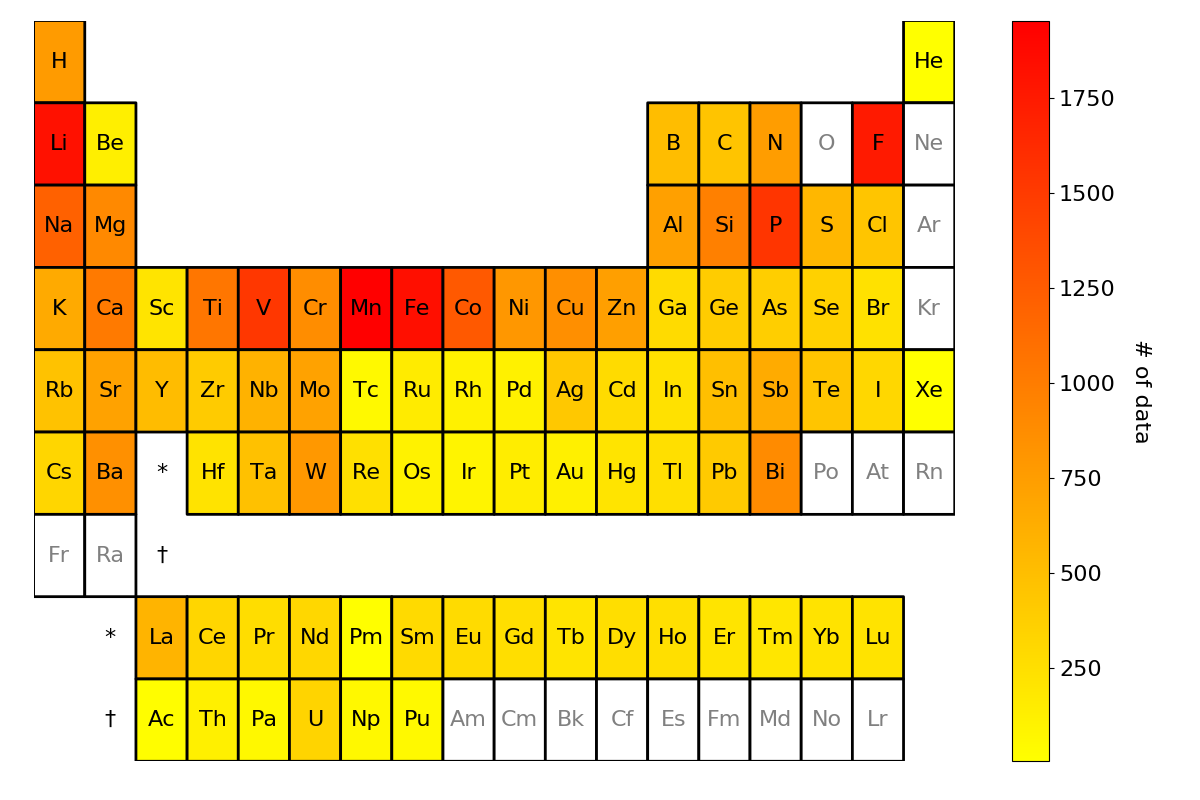
が得られるツールを紹介いたします。
どういう方々向け?

主に、普段大規模な化合物データを扱っている MI: Materials Informatics 関係者の方々向けの記事になっております。用途としては、化合物データの可視化に役立てられると考えられます。
使ったもの

周期表ヒートマップ描画には pymatgen(Python Materials Genomics)というMaterials Project が開発した材料分析用のオープンソースPythonライブラリの pymatgen.util.plotting に実装されているperiodic_table_heatmapを使わせて頂きました。
使ってみた
はい。早速使ってみました。
環境
$ python -V
Python 3.7.4
実行コード
pymatgen.util.plotting の テストコード に記載のコードを参考にしてみたものです。
# !/usr/bin/env python3

from pymatgen.util.plotting import periodic_table_heatmap

# The following code is based on:https://github.com/materialsproject/pymatgen/blob/master/pymatgen/util/tests/test_plotting.py
def main():
    random_data = {'Te': 0.11083818874391202,
                   'Au': 0.7575629917425387,
                   'Th': 1.2475885304040335,
                   'Ni': -2.0354391922547705}

    plt = periodic_table_heatmap(random_data, cmap="plasma")
    plt.savefig("periodic_table_heatmap.png")


if __name__ == '__main__':
    main()
実行結果
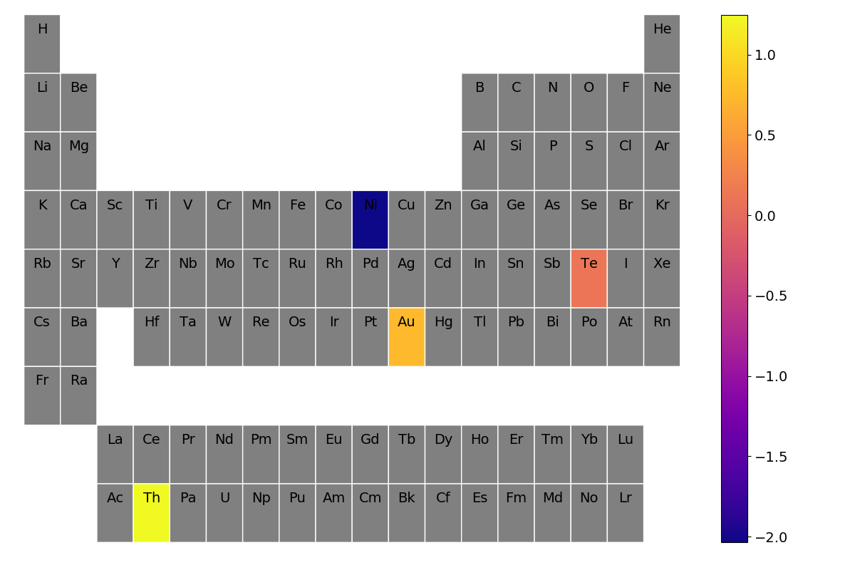
このように、与えられたデータ: random_data の各元素の値を反映したヒートマップのグラフが一発で生成されました。なんということでしょう。
もうちょっと凝った出力図が欲しい
個人的にデフォルトのコードの以下の点を(論文や発表で使うフォーマットとして)アレンジしたく、periodic_table_heatmap のソースコードを参考にしてコードを書いてみました。
-
元の関数 の引数で調整可能:
- データに不在の元素の色が灰色 →
blank_colorで調整 - カラーバーの色およびサイズを変えたい →
cmapとcbar_label_sizeで調整 - カラーバーのラベルをつけたい →
cbar_labelで調整
- データに不在の元素の色が灰色 →
-
元の関数 の引数では調整不可 → 要コード改変:
- 周期表の罫線を引く
- 元素名を中央に配置したい
- データに不在の元素名の文字色を黒以外にしたい
- ランタノイド・アクチノイドのラベルをつけたい(これは別に不要かも?)
そのコード例: 任意の化合物データの構成元素数ヒートマップの出力 が以下に示すものになります。
※また、下記コードの任意の化合物データ収集( mp_query() )の部分は、自著記事: Materials Projectのクエリ機能を使用して所望の計算材料データを大量に取得する。 を参考にしております。
# !/usr/bin/env python3

import numpy as np
import collections

from pymatgen import MPRester
from pymatgen.core.periodic_table import Element
from pymatgen.core.composition import Composition


def mp_query(YOUR_API_KEY):
    mp = MPRester(YOUR_API_KEY)

    # Properties you need: mp-id;
    # spacegroup number; composition formula; band gap
    basic_properties = ['task_id', 'spacegroup.number', 'pretty_formula']
    electronic_properties = ['band_gap']

    all_properties = basic_properties + electronic_properties

    # Query criteria: must include O element; less than 3 types of elements;
    # band gap value exists
    criteria = {"elements": {"$all": ["O"]},
                "nelements": {"$lte": 3},
                "band_gap": {"$exists": True}}

    # Retrieve material property data which satisfy query criteria
    data = mp.query(criteria=criteria, properties=all_properties)
    return data


# The following code is based on: https://pymatgen.org/pymatgen.util.plotting.html#pymatgen.util.plotting.periodic_table_heatmap
def plot_periodic_table_heatmap(elemental_data, cbar_label="",
                                cbar_label_size=14,
                                cmap="YlOrRd", cmap_range=None,
                                blank_color="grey", value_format=None,
                                max_row=9):

    # Convert primitive_elemental data in the form of numpy array for plotting.
    if cmap_range is not None:
        max_val = cmap_range[1]
        min_val = cmap_range[0]
    else:
        max_val = max(elemental_data.values())
        min_val = min(elemental_data.values())

    max_row = min(max_row, 9)

    if max_row <= 0:
        raise ValueError("The input argument 'max_row' must be positive!")

    value_table = np.empty((max_row, 18)) * np.nan
    blank_value = min_val - 0.01

    for el in Element:
        if el.row > max_row:
            continue
        value = elemental_data.get(el.symbol, blank_value)
        value_table[el.row - 1, el.group - 1] = value

    # Initialize the plt object
    import matplotlib.pyplot as plt
    fig, ax = plt.subplots()
    plt.gcf().set_size_inches(12, 8)

    # We set nan type values to masked values (ie blank spaces)
    data_mask = np.ma.masked_invalid(value_table.tolist())
    # changed edgecolors from 'w' to 'k', and linewidths from 2 to 1
    heatmap = ax.pcolor(data_mask, cmap=cmap, edgecolors='k', linewidths=2,
                        vmin=min_val - 0.001, vmax=max_val + 0.001)
    cbar = fig.colorbar(heatmap)

    # Grey out missing elements in input data
    cbar.cmap.set_under(blank_color)

    # Set the colorbar label and tick marks
    cbar.set_label(cbar_label, rotation=270, labelpad=25, size=cbar_label_size)
    cbar.ax.tick_params(labelsize=cbar_label_size)

    # Refine and make the table look nice
    ax.axis('off')
    ax.invert_yaxis()

    # Label each block with corresponding element and value
    for i, row in enumerate(value_table):
        for j, el in enumerate(row):
            if not np.isnan(el):
                symbol = Element.from_row_and_group(i + 1, j + 1).symbol

                # changed from i + 0.25 to i + 0.5
                # fixed symbol color if the element is absent from data
                if el != blank_value:
                    plt.text(j + 0.5, i + 0.5, symbol,
                             horizontalalignment='center',
                             verticalalignment='center', fontsize=16)
                else:
                    plt.text(j + 0.5, i + 0.5, symbol,
                             color="gray",
                             horizontalalignment='center',
                             verticalalignment='center', fontsize=16)

                if el != blank_value and value_format is not None:
                    plt.text(j + 0.5, i + 0.5, value_format % el,
                             horizontalalignment='center',
                             verticalalignment='center', fontsize=16)

            # added special symbols for Lanthanoid & Actinoid elements
            elif (i == 5 and j == 2) or (i == 7 and j == 1):
                plt.text(j + 0.5, i + 0.5, "*",
                         horizontalalignment='center',
                         verticalalignment='center', fontsize=16)
            elif (i == 6 and j == 2) or (i == 8 and j == 1):
                plt.text(j + 0.5, i + 0.5, "†",
                         horizontalalignment='center',
                         verticalalignment='center', fontsize=16)

    plt.tight_layout()
    plt.savefig("periodic_table_heatmap.png")

    return plt


def main():
    # get your API_KEY from here: https://materialsproject.org/open
    YOUR_API_KEY = "YOUR_API_KEY"

    data = mp_query(YOUR_API_KEY=YOUR_API_KEY)

    # collecting total # of each element
    elems = []
    for d in data:
        comp = d["pretty_formula"]
        tmp = list(Composition(comp).as_dict().keys())
        elems = elems + tmp

    # get dictionary of {"each element": total #}
    elem_data = collections.Counter(elems)
    elem_data.pop("O")

    plot_periodic_table_heatmap(elem_data,
                                cbar_label_size=16,
                                cbar_label="# of data",
                                cmap="autumn_r",
                                blank_color="white")


if __name__ == '__main__':
    main()
上記のコードを実行して得られた結果: periodic_table_heatmap.png が冒頭でもお示しした周期表のヒートマップになります。

感想
こんなんもっと早く知りたかったですわ。これまで periodic_table_heatmap の存在を知らず、かなり泥臭い(臭すぎて紹介する気にもならない)方法で ヒートマップを描画していたので、化合物のデータが更新されるたびに ヒーヒーと しておりました。(絶対零度)
MI関係者の方々がこの記事を見て一人でも作業効率を爆上げしてくださることを切に願っております。