python勉強記録①で取得したデーターをCSVへ出力し、Streamlitで可視化する。
chart.py
import streamlit as st
import pandas as pd

# CSVファイルの読み込み
df = pd.read_csv('out.csv')

# タイムスタンプをdatetime型に変換
df['timestamp'] = pd.to_datetime(df['timestamp'])

# スライダーで期間を指定
start_date, end_date = st.slider(
    "期間を選択してください",
    min_value=df['timestamp'].min().to_pydatetime(),
    max_value=df['timestamp'].max().to_pydatetime(),
    value=(df['timestamp'].min().to_pydatetime(), df['timestamp'].max().to_pydatetime()),format="MM-DD HH:mm"
)

# 指定した期間のデータをフィルタリング
filtered_df = df[(df['timestamp'] >= start_date) & (df['timestamp'] <= end_date)]

# タイトルの表示
st.title('CSVデータのグラフ化')

# データフレームの表示
st.write(filtered_df)

# タイムスタンプのフォーマットを24時間表記に設定
filtered_df['timestamp'] = filtered_df['timestamp'].dt.strftime('%H:%M')

# グラフの作成
st.line_chart(filtered_df.set_index('timestamp')[['usage_percent', 'memory_usage']])
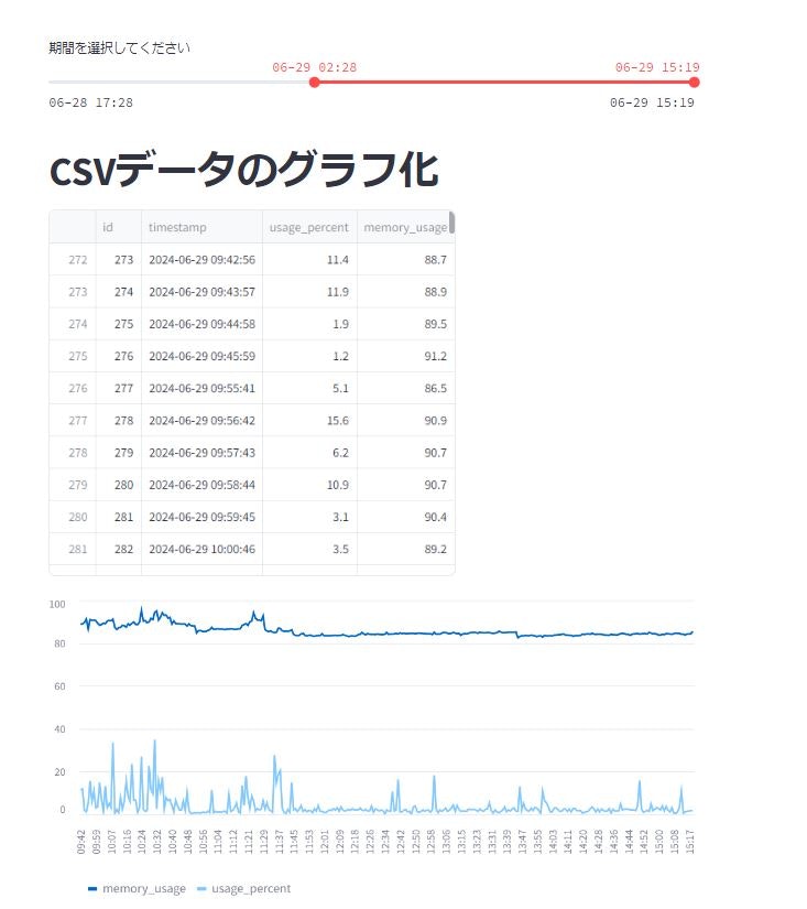
以下のように表示され、スライダーで参照したい期間を任意にしていすることができます。
取り込んだCSVのsampleは以下です。(一部のみ)
out.csv
id,timestamp,usage_percent,memory_usage
1,2024-06-28 17:28:20.000000,5.1,83.1
2,2024-06-28 17:29:21.000000,1.6,85
3,2024-06-28 17:30:22.000000,8.5,84.7
4,2024-06-28 17:31:23.000000,2.7,84.4
5,2024-06-28 17:32:24.000000,4.9,84.5
6,2024-06-28 17:33:25.000000,2.2,84.9
7,2024-06-28 17:34:26.000000,2.1,85
8,2024-06-28 17:35:27.000000,1,85
9,2024-06-28 17:36:28.000000,3.1,84.8
10,2024-06-28 17:37:29.000000,3.1,84.6
11,2024-06-28 17:38:30.000000,2.7,82.3