環境
- Linux Mint MATE 18.2
- gnuplot 5.0 patchlevel 3
gnuplotについて
gnuplotはフリーのグラフ描画ソフトです。WindowsやMac、Linuxで広く使えます。
gnuplotのインストール方法は以下のサイトが参考になると思います。
基本的な使い方
最初に基本的な使い方を説明したあと、グラフの細かい設定を説明したいと思います。ターミナルから「gnuplot」と入力することでgnuplotを起動します(ターミナル上の表示が「gnuplot>」に変わる)。
グラフを描画する
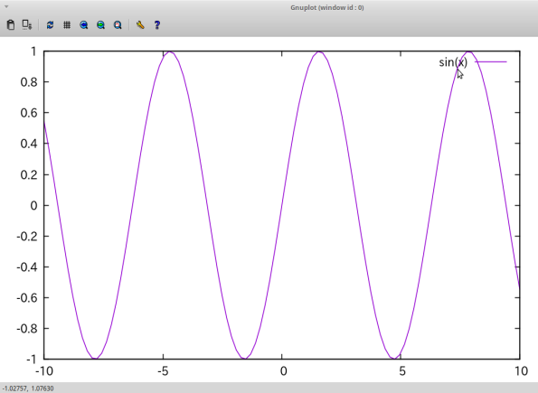
sin波を描画することを考えます。そのためには、
gnuplot> plot sin(x)
と入力します。すると別ウィンドウが立ち上がってsin波が描画されます。
複数のグラフを描画するには、
gnuplot> plot sin(x)
gnuplot> replot cos(x)
と、「replot」を使います。
グラフをファイルに出力する
描画したグラフをファイルとして出力することができます。ファイルの種類としては.pngファイルと.epsファイルがあります。
gnuplot> plot sin(x)
gnuplot> set terminal pngcairo
gnuplot> set out "sin.png"
gnuplot> replot
2行目は「set terminal png」でもいけますが、「pngcairo」とすることで解像度がぐっと良くなります。
最後のreplotを忘れないようにしてください。3行目の「set out」の段階で、.pngファイルは生成されますが中身は空です。(ファイルが出力されるディレクトリはpwdで確認することができます)
コマンド以外でも、グラフが表示されたときの画面の左上にあるフロッピーのアイコンを押すことでもグラフの保存をすることができます。
グラフの体裁を整える
上でグラフの書き方と保存の仕方を書きました。このグラフを利用するのが自分だけならここまでの情報でほぼ足りるのですが、他人に見せるとなるとグラフの体裁を整える必要があります。
それぞれの操作をしたあとにreplotをすることで変更が反映されます。
軸の設定
x軸、y軸の範囲を変更するには、
gnuplot> set xr[0:1]    #0<=x<=1
gnuplot> set yr[-1:1]    #-1<=y<=1
軸を対数スケールにするには、
gnuplot> set logscale y #y軸をlogスケールに
グラフの形状
アスペクト比を変更するには
gnuplot> set size ratio 2    #縦が横の2倍
gnuplot> set size square    #縦横比1
gnuplot> set size nosquare    #縦横比1を解除
サイズを変更するには、
gnuplot> set size 0.6, 0.4    #横を画面の0.6倍、縦を画面の0.4倍
gnuplot> set bmargin 6    #グラフの下の余白を6に広げる
グラフ自体の調整は、
gnuplot> plot sin(x) lw 10    #sin(x)のグラフを線の太さを10にして描画
gnuplot> plot sin(x) lt rgb "red"    #sin(x)のグラフを赤線で表示
gnuplot> plot sin(x) with lines    #sin(x)を線で描画(デフォルト)
gnuplot> plot sin(x) with points    #sin(x)を点で描画
目盛りの調整
gnuplot> set xtics 2    #2ごとに主目盛りを入れる
gnuplot> set mxtics 5    #主目盛り間を5等分するように副目盛りを入れる
gnuplot> set tics font "Arial, 24"    #目盛りの数字のフォントをArial、サイズを24に
軸ラベル
gnuplot> set xlabel "t [s]"    #x軸のラベルをt [s]にする
gnuplot> set ylabel "x [m]"    #y軸のラベルを x[m]にする
gnuplot> set xlabel font "Arial, 24"    #x軸のラベルのフォントをサイズ24のArialに
gnuplot> set xlabel offset 0,-1    #x軸のラベルを(0,-1)方向に動かす
最後に
ここまで書いてきたことだけを使って、最初に示したsin(x)のグラフを調整してみます。
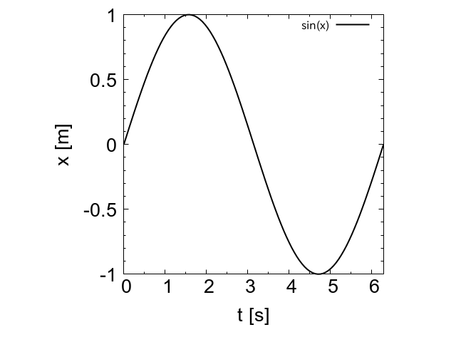
だいぶ綺麗になりました。論文等に使うとなると、ラベルのtやxを斜体にするなど細かい調整が更に必要になりますが、一般的な用途ならこれでも十分でしょう。
更に細かい調整はgnuplotスクリプトの解説のケーススタディが参考になると思います。