概要
ngx-onsenuiはモバイルアプリUIライブラリであるOnsen UIのAngular1バインディングです。
本記事ではngx-onsenuiを使った感想やTipsを紹介します。
Onsen UI
Onsen UIはアシアル株式会社が開発するOSSのUIライブラリです。Onsen UIを用いると<ons-button>のようなHTMLタグを書くだけでモバイルUIを構築できます。また、iOS/Androidでテーマが自動的に切り替わります。
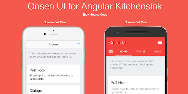 [公式のアレ](https://onsenui.github.io/vue-onsenui-kitchensink/)に触発されて作ったサンプル https://puku0x.github.io/ngx-onsenui-kitchensink/
同様のUIライブラリとして、IonicやF7などがありますが、Onsen UIはWeb Componentsを採用している2のでAngular/React/Vueと自分の好きなフレームワークを選べるのが特徴です。また、国産OSSなので日本語ドキュメントがあります。
ngx-onsenui (Angular + Onsen UI)
フレームワークにAngularを選んだ場合、ngx-onsenuiをインストールすることでOnsen UIコンポーネント(の一部)をAngularディレクティブとして利用することが出来ます。
npm install onsenui ngx-onsenui --save
ngx-onsenuiを使う場合は、モジュールにOnsenModuleのインポートとCUSTOM_ELEMENTS_SCHEMAの設定が必要です。
import { BrowserModule } from '@angular/platform-browser';
import { NgModule, CUSTOM_ELEMENTS_SCHEMA } from '@angular/core';
import { OnsenModule } from 'ngx-onsenui';

import { AppComponent } from './app.component';

@NgModule({
  declarations:    [AppComponent],
  entryComponents: [Page1Component],
  imports:         [BrowserModule, OnsenModule], // ← 追加
  providers:       [],
  bootstrap:       [AppComponent],
  schemas:         [CUSTOM_ELEMENTS_SCHEMA]      // ← 追加
})
export class AppModule { }
Tips
AngularのデータバインディングやTypeScriptによる静的型付けの恩恵を得ることで、アプリ開発の効率化が期待できますが、ngx-onsenuiはまだ開発途中なので思い通りに動かない場合もあります。ここでは開発Tipsとして幾つか紹介します。
ons.*を使いたい
onsenuiをインポートしましょう。ngx-onsenuiではなくonsenuiです。
import { Component } from '@angular/core';
import * as ons from 'onsenui';
//import { onsNotification } from 'ngx-onsenui;  // ons.notificationはこっちでも可

@Component({
  selector: 'ons-page[app-sample]',
  templateUrl: './sample.component.html',
  styleUrls: ['./sample.component.scss']
})
export class SampleComponent {

  confirm(name: string) {
    ons.notification.alert('Hello Onsen UI !');
    //onsNotification.alert('Hello Onsen UI !');
  }

}
現在はonsNotificationとonsPlatformが用意されています。
selector: 'ons-page[xxx]'でLintエラーが出ないようにしたい
構文エラーではないのでトランスパイル自体は可能ですが、エディタにエラーが表示され続けるのはあまり良い気はしませんよね。
そんなときはtslint.jsonのcomponent-selectorにons-pageを追加してあげましょう。
{
  "rules": {
    (略)
    "component-selector": [
      true,
      "element",
      ["app", "ons-page"],
      "kebab-case"
    ],
  }
}
動的にアイコンを変更したい
Angularの属性バインディング(Attribute Binding)を使いましょう。[icon]="icon名"やicon="{{'icon名'}}"のような使い方はできません。
<ons-icon [attr.icon]="icon"></ons-icon>
単純にiOS/Androidで表示を分ける場合はmaterialオプションで指定しましょう。
<ons-icon icon="ion-navicon, material: md-menu"></ons-icon>
同様に<ons-tab>のicon属性も[attr.icon]="icon名"で指定します。
<ons-tabbar>
  <ons-tab [attr.label]="tab1.label" [attr.icon]="tab1.icon" [page]="tabs1.page" active></ons-tab>
  <ons-tab [attr.label]="tab2.label" [attr.icon]="tab2.icon" [page]="tabs2.page" active></ons-tab>
   <ons-tab [attr.label]="tab3.label" [attr.icon]="tab3.icon" [page]="tabs3.page" active></ons-tab>
</ons-tabbar>
※ons-tabで*ngForを使うとエラーが出るので↑推奨です(面倒ですが)
動的にアイコンの回転を制御したい
属性バインディングを使って、[attr.spin]にnullを代入します。falseを代入してもアイコンの回転は止まりません。属性ごと消してください。
<ons-icon icon='fa-spinner' [attr.spin]="state === 'action' ? true : null"></ons-icon>
サイドメニューのアニメーションをiOS/Androidで変えたい
iOSではreveal、Androidではoverlayと切り替えることで、ネイティブアプリの動きに近くなります。
これを実現するには、まずons.platformで判定して、
anim = ons.platform.isAndroid() ? 'overlay' : 'reveal';
ons-iconのときと同じようにattr.animationで指定します。
<ons-splitter-side swipeable collapse [attr.animation]="anim" [page]="side" ></ons-splitter-side>
この例でもそうなのですが、コンポーネントのプロパティバインディングが効かない場合、とりあえず属性バインディングにするとなんとかなります(明確にHTML属性を書き換えるため)。
サイドメニューを開閉させたい
ngx-onsenuiを使って最初に躓くのがこれだと思います。スワイプだけでなく、メニューボタンを押したらメニューを出すにはどうすれば良いでしょうか。
Angularの作法的にはService経由で制御するのが良いと思われます。
https://ja.onsen.io/v2/api/angular2/ons-splitter-side.html
まず、↓のようなサービスを作ります。
import { Injectable } from '@angular/core';
import { Observable , Subject } from 'rxjs';    // RxJS 6.x
//import { Subject } from 'rxjs/Subject';       // RxJS 5.x
//import { Observable } from 'rxjs/Observable'; // RxJS 5.x

@Injectable()
export class MenuService {
  menu = new Subject();

  get menu$(): Observable<boolean> {
    return this.menu.asObservable();
  }

  toggle() {
    this.menu.next();
  }
}
ルートになるページコンポーネントのテンプレートが下記のようになっている場合、
<ons-splitter #splitter>
  <ons-splitter-side swipeable collapse [page]="side" ></ons-splitter-side>
  <ons-splitter-content [page]="content"></ons-splitter-content>
</ons-splitter>
contentコンポーネント内で先程のMenuServiceをDIしてtoggle()を呼び、
import { Component } from '@angular/core';
import { MenuService } from '../menu.service';

@Component({
  selector: 'ons-page[app-content]',
  templateUrl: './content.component.html',
  styleUrls: ['./content.component.scss']
})
export class ContentComponent implements OnInit, OnDestroy {

  constructor(private menuService: MenuService) { }

  toggleMenu() {
    this.menuService.toggle()
  }
}
<ons-toolbar>
  <div class="left">
    <ons-toolbar-button (click)="toggleMenu()>
      <ons-icon icon="ion-navicon, material:md-menu"></ons-icon>
    </ons-toolbar-button>
  </div>
  <div class="center">Content</div>
</ons-toolbar>
ルートでMenuServiceのmenu$を監視し、値が流れてきたらons-splitterのtoggle()を呼ぶという様に実装すればOKです。
import { Component, ViewChild, EventEmitter, OnInit, OnDestroy } from '@angular/core';
import { takeUntil } from 'rxjs/operators';

import { MenuService } from '../core/services/app.service';

@Component({
  selector: 'ons-page[app-splitter]',
  templateUrl: './splitter.component.html',
  styleUrls: ['./splitter.component.scss']
})
export class SplitterComponent implements OnInit {
  private readonly onDestroy$ = new EventEmitter();

  @ViewChild('splitter') splitter;

  constructor(private menuService: MenuService) { }

  ngOnInit() {
    this.appService.menu$
      .pipe(takeUntil(this.onDestroy$))
      .subscribe(() => {
        this.splitter.nativeElement.side.toggle();
      });
  }

  ngOnDestroy() {
    this.onDestroy$.emit();
  }
}
RxJSによるストリームの処理はAngularを使う以上は避けて通れないので、ここで使い方を覚えておきましょう。
無限スクロールがしたい
TwitterのUIのように、「スクロールしたら自動で追加読み込み」を実装したい場合、公式ドキュメントにはon-infinite-scroll属性を使うように書かれてありますが 使えません。ngx-onsenuiはon-infinite-scroll属性に未対応なので、代わりに
import { Component, ElementRef, OnInit } from '@angular/core';
import * as ons from 'onsenui';

@Component({
  selector: 'ons-page[app-load-more]',
  templateUrl: './load-more.component.html',
  styleUrls: ['./load-more.component.scss']
})
export class LoadMoreComponent implements OnInit {

  constructor(private element: ElementRef) { }

  // 初期化
  ngOnInit() {
    this.element.nativeElement.onInfiniteScroll = (done) => {
      this.loadMore(done);
    };
  }

  // 追加読み込み
  loadMore(done) {
    // -- 何らかの処理 --

    // 終了
    done();
  }
}
↑のようにElementRefをDIして、onInfiniteScrollにコールバックを設定しましょう。
ons-tabのスワイプ量を知りたい
ons-tabは最近スワイプによるタブ切り替えに対応しました。公式のKitchensinkサンプルではスワイプ量に応じてタブの色を変えるという使い方がされています。
スワイプ量を取得するには、ons-tabbarにローカル変数を設定して、
<ons-tabbar position="auto" swipeable #tabbar>
  <ons-tab></ons-tab>
  <ons-tab></ons-tab>
  <ons-tab></ons-tab>
</ons-tabbar>
@ViewChildで取得したons-tabbarのonSwipeにコールバックを設定します。
import { Component, ViewChild, OnInit } from '@angular/core';

@Component({
  selector: 'ons-page[app-tabbar]',
  templateUrl: './tabbar.component.html',
  styleUrls: ['./tabbar.component.scss']
})
export class TabbarComponent implements OnInit {

  @ViewChild('tabbar') tabbar;

  constructor() { }

  ngOnInit() {
    this.tabbar.nativeElement.onSwipe = (index, options) => {
      this.onSwipe(index, options);
    };
  }

  onSwipe(index, options) {
  }

}
※ ↑に対するons-tabbarディレクティブのPR出しました。次回リリースで対応予定です。
https://github.com/OnsenUI/OnsenUI/pull/2452
iOSだとコールバックの設定時にアクセス違反で動かない場合もあるようです(現在は解消)。
ons-pull-hookを引っ張った量を知りたい
他と同様にons-pull-hookにローカル変数を設定して、
<ons-pull-hook #pullhook></ons-pull-hook>
コンポーネント内でonPullのコールバックを設定してあげれば良いです。使い方によっては ratioが1.0を超えるときがある ので、エラーが出た場合はratioが1.0を超えないように制御するといった対策を取りましょう。
import { Component, ViewChild, OnInit } from '@angular/core';

@Component({
  selector: 'ons-page[app-pullhook]',
  templateUrl: './pullhook.component.html',
  styleUrls: ['./pullhook.component.scss']
})
export class PullhookComponent implements OnInit {
  ratio = 0;

  @ViewChild('pullhook') pullhook;

  constructor() { }

  onPull(ratio) {
    this.ratio = ratio;
  }

  ngOnInit() {
    this.pullhook.nativeElement.onPull = (ratio, options) => {
      // if (ratio > 1.0) ratio = 1.0;
      this.onPull(ratio);
    };
  }
}
(pull)="onPulle($event)"のようにイベントバインディング対応してくれるのが一番良いんですけどね。
※ ↑のPRがマージされました。次回リリースで対応予定です。
https://github.com/OnsenUI/OnsenUI/issues/2457
感想
去年Onsen UI 2 + AngularJSで頑張っていた頃と比較すると、Onsen UIは格段に安定して使いやすくなりました。パフォーマンスについてもAngular/React/Vueといったモダンなフレームワークの採用により気にならないレベルまで向上していると思います。
ngx-onsenuiを使う利点は、Angularのエコシステムの恩恵(モジュールやDI機構による再利用性、CLI連携による開発効率UP)を得られることにあると思います。また、標準でTypeScriptを採用しているため初歩的なバグが発生しにくく、IDEでの補完3が効く所も◎です。
公式は最近人気のVueに力を入れているようですが、Angularも十分魅力的ですので、これを機にngx-onsenuiを触ってみるのも良いのではないでしょうか?
拙作のサンプルも幾つか公開していますので、興味のある方はどうぞ。
- ngx-onsenui-kitchensink - 公式Kitchensinkサンプルのngx-onsenui版
- ngx-onsenui-phonegap-starter - ngx-onsneui + PhoneGap のサンプル
- ngx-onsenui-ngrx-todo - ngx-onsenui + Redux(@ngrx/store)のサンプル
- ngx-onsenui-pwa - ngx-onsenui のPWAサンプル
- ngx-onsenui on Plunker - Plunker のテンプレート
- ngx-onsenui on StackBlitz - StackBlitz のテンプレート
-
Ionicもv4からWeb Componentsを採用 ↩
-
テンプレートの補完にはAngular Language Serviceのインストールが必要です ↩