みなさんごきげんよう。HTML、CSSの勉強を始めて一年、ポートフォリオを作っているのですが難しかった部分を自分のより深い理解のために書きたいと思います。
早速ですがまずは実践したいものがこちらです。
各セクションの仕切りで、親要素を超える線です。(今回は擬似要素(before, after)を使って実装しました。)
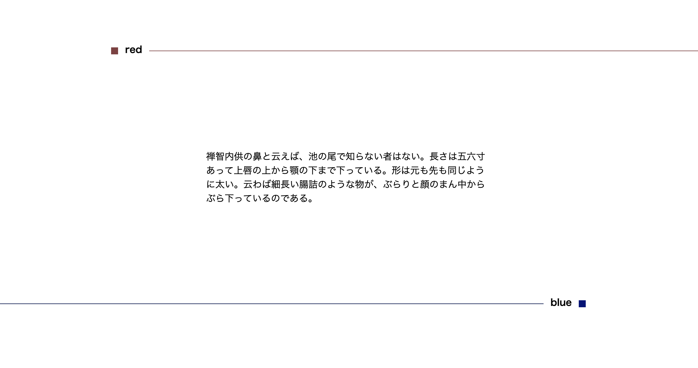
redは右にはみ出し、blueは左にはみ出しています
早速コードの解説をしていきます。
これが完成したHTMLとCSSです
下の方に詳しい説明をしているので見たい方は見てください。
sample.html
<body>
  <div class="p-main l-container">
    <section>
      <h2 class="p-section__title p-section__red"><span>red</span></h2>
      <div class="p-section__spacer">
        <p class="p-section__text">禅智内供の鼻と云えば、池の尾で知らない者はない。長さは五六寸あって上唇の上から顎の下まで下っている。形は元も先も同じように太い。云わば細長い腸詰のような物が、ぶらりと顔のまん中からぶら下っているのである。</p>
      </div>
      <h2 class="p-section__title p-section__blue"><span>blue</span></h2>
      <div class="p-section__spacer">
        <p class="p-section__text">五十歳を越えた内供は、沙弥の昔から、内道場供奉の職に陞った今日まで、内心では始終この鼻を苦に病んで来た。</p>
      </div>
    </section>
  </div>
</body>
sample.css
body {
  overflow: hidden;
}

.l-container {
  max-width: 1200px;
  width: 68%;
  margin: 0 auto;
  padding-top: 300px;
}

.p-section__title {
  display: flex;
  align-items: center;
}

.p-section__text {
  width: 60%;
}

.p-section__title span {
  margin: -5px .75em 0 .75em;
}

.p-section__spacer {
  padding: 10em 0;
  display: flex;
  justify-content: center;
}

.p-section__title:before {
  content: '';
  display: block;
  width: 12px;
  height: 12px;
  min-width: 12px;
}

.p-section__title:after {
  content: '';
  display: block;
  height: 1px;
  width: 100vw;
}


/*------------------------------------
red
------------------------------------*/

.p-section__red:before {
  background-color: #884a4a;
}

.p-section__red:after {
  background-color: #884a4a;
  margin-right: -50vw;
}
/*------------------------------------
blue
------------------------------------*/

.p-section__blue {
  flex-direction: row-reverse;
}

.p-section__blue:before {
  background-color: #061385;
}

.p-section__blue:after {
  background-color: #061358;
  margin-left: -50vw;
}
解説
まず最初にbeforeで文字の前の四角を作ります。今回は12pxの正方形にしました。
.p-section__title:before {
  content: '';
  display: block;
  width: 12px;
  height: 12px;
  min-width: 12px;
}
次にafterで線を作ります。
.p-section__title:after {
  content: '';
  display: block;
  height: 1px;
  width: 100px;
}
続いてdisplay: flex;でbefore 文字 afterを横並びにしていきます。
align-items: center;で上下方向の中央揃えにしています。
.p-section__title {
  display: flex;
  align-items: center;
}
さらに先ほど作った線を画面の外まで伸ばしたいので長くします。
.p-section__title:after {
  content: '';
  display: block;
  height: 1px;
- width: 100px;
+ width: 100vw;
}
最後にafterの線がbodyの横幅を突き抜けてしまってページが横に伸びるのを防ぐために、bodyにoverflow: hiddenをつける。
body {
  overflow: hidden;
}
今回は要素(線)がどれだけはみ出しても良かったのでbodyに overflow:hiddenをつけて実現させました。
*blueの線は擬似要素の順番変える(右から左にはみ出したい)ためにflex-direction: row-reverse;をつけてます。
参考になれば嬉しいです。