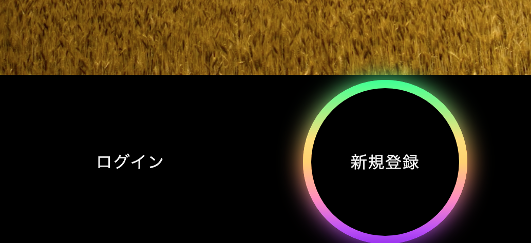
レインボーに光るボタンをつくってみた
・前回使用したWEBサイトを活用します
https://qiita.com/pontarou194/items/321305d55049022f06ed
・背景は黒にしました
・ボタンにカーソルをあわせると、レインボーに光る仕様にしました
完成したWEBサイトはこちら


完成したコードはこちらです。
<!DOCTYPE html>
<html lang="ja">
  <head>
    <meta charset="utf-8">
    <title>おしゃれWEBサイト</title>
    <link rel="stylesheet" href="30_3.css">
    <meta name="viewport" content="width=device-width, initial-scale=1.0">
    <script src="https://kit.fontawesome.com/a076d05399.js"></script>

  </head>
  <body>
    <nav>
      <input type="checkbox" id="check">
      <label for="check" class="checkbtn">
        <i class="fas fa-bars"></i>
      </label>
      <label class="logo">Cool♪</label>
      <ul>
        <li><a class="active" href="#">ホーム</a></li>
        <li><a href="#">会社概要</a></li>
        <li><a href="#">事業内容</a></li>
        <li><a href="#">お問い合わせ</a></li>
        <li><a href="#">採用情報</a></li>
      </ul>
    </nav>
    <video src="goomalling-storm.mp4" loop="" autoplay="" muted=""  width="100%" class="bgv"></video>

  <div class="center">
    <div class="outer button">
      <button>ログイン</button>
      <span></span>
      <span></span>
    </div>
    <div class="outer circle">
      <button>新規登録</button>
      <span></span>
      <span></span>
    </div>
  </div>
</body>
</html>
CSS
@import url('https://fonts.googleapis.com/css?family=Poppins:400,500,600,700&display=swap');
*{
  margin: 0;
  padding: 0;
  box-sizing: border-box;
  list-style: none;
  text-decoration: none;
}

html{
  background-color: black;
}

nav{
  background: black;
  height: 80px;
  width: 100%;
}
label.logo{
  color: white;
  font-size: 33px;
  line-height: 80px;
  padding: 0 140px;
  font-weight: 600;
  font-family: 'Poppins', sans-serif;
}
nav ul{
  float: right;
  margin-right: 60px;
}
nav ul li{
  display: inline-block;
  line-height: 80px;
  margin: 0 2px;
}
nav ul li a{
  color: #f2f2f2;
  font-weight: 500;
  font-size: 20px;
  padding: 7px 13px;
  border-radius: 3px;
  text-transform: uppercase;
  font-family: 'Poppins', sans-serif;
}
a.active,a:hover{
  background: black;
  transition: .5s;
}
.checkbtn{
  font-size: 30px;
  color: white;
  float: right;
  line-height: 80px;
  margin-right: 40px;
  cursor: pointer;
  display: none;
}
# check{
  display: none;
}
@media (max-width: 952px){
  label.logo{
    font-size: 27px;
    padding-left: 25px;
  }
  nav ul li a{
    font-size: 16px;
  }
}
@media (max-width: 858px){
  .checkbtn{
    display: block;
    margin-right: 40px;
  }
  ul{
    position: fixed;
    width: 100%;
    height: 100vh;
    background: black;
    top: 80px;
    left: -100%;
    text-align: center;
    transition: all .5s;
  }
  nav ul li{
    display: block;
    margin: 50px 0;
    line-height: 30px;
  }
  nav ul li a{
    font-size: 20px;
  }
  a:hover,a.active{
    background: none;
    color: black;
  }
  #check:checked ~ ul{
    left: 0;
  }
}
section{
  background-size: cover;
  height: calc(100vh - 80px);
}


.center{
  display: flex;
  text-align: center;
  align-items: center;
  justify-content: center;
}
.outer{
  position: relative;
  margin: 0 50px;
  background: black;
}
.button{
  height: 70px;
  width: 220px;
  border-radius: 50px;
}
.circle{
  height: 200px;
  width: 200px;
  border-radius: 50%;
}
.outer button, .outer span{
  position: absolute;
  top: 50%;
  left: 50%;
  transform: translate(-50%, -50%);
}
.outer button{
  background: black;
  color: #f2f2f2;
  outline: none;
  border: none;
  font-size: 20px;
  z-index: 9;
  letter-spacing: 1px;
  text-transform: uppercase;
  cursor: pointer;
}
.button button{
  height: 60px;
  width: 210px;
  border-radius: 50px;
}
.circle button{
  height: 180px;
  width: 180px;
  border-radius: 50%;
}
.outer span{
  height: 100%;
  width: 100%;
  background: inherit;
}
.button span{
  border-radius: 50px;
}
.circle span{
  border-radius: 50%;
}
.outer:hover span:nth-child(1){
  filter: blur(7px);
}
.outer:hover span:nth-child(2){
  filter: blur(14px);
}
.outer:hover{
  background: linear-gradient(#14ffe9, #ffeb3b, #ff00e0);
  animation: rotate 2.5s linear infinite;
}
@keyframes rotate {
  0%{
    filter: hue-rotate(0deg);
  }
  100%{
    filter: hue-rotate(360deg);
  }
}
@media (max-width: 640px){
  .center{
    flex-wrap: wrap;
    flex-direction: column;
  }
  .outer{
    margin: 50px 0;
  }
}
ボタンはログインボタンと新規登録ボタンにしてみました。
もっと良い使い方あると思うのですが、、、、
ここは間違ってる、こうした方が良いかも等ございましたらご指摘いただけますと幸いです。
最後までみていただきありがとうございます。