CSSで使用するposition:relative;を活用し、画像を重ねておしゃれにデザインしてみる
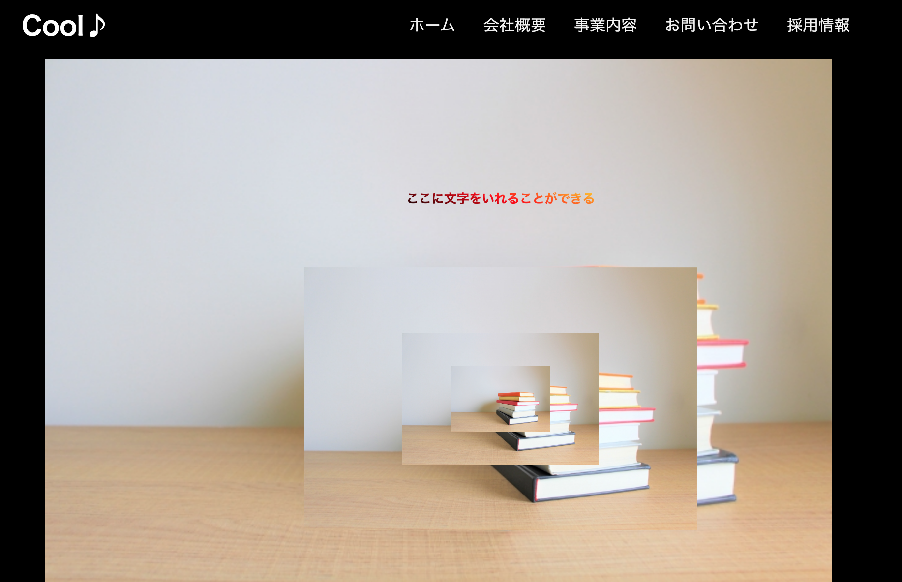
・画像を4枚重ねる
・画像はフリーサイトから拾ってきました(PhotoACさん)
・1枚目の画像にテキストを重ねる
・せっかくなので(文字以外)真ん中に重ねていく
・合計5つ重ねたことになる
・ナビゲーションバーやロゴのアニメーションは過去に実装したコードをもってきた
【ナビゲーションバー」
https://qiita.com/pontarou194/items/321305d55049022f06ed
「ロゴのアニメーション」
https://qiita.com/pontarou194/items/321305d55049022f06ed
完成したWEBサイトがこちら

画像版
コードがこちら
HTML
<!DOCTYPE html>
<html lang="ja">
  <head>
    <link rel="stylesheet" href="rensyu1.css">
    <script src="https://kit.fontawesome.com/a076d05399.js"></script>
    <link rel="stylesheet" href="https://cdnjs.cloudflare.com/ajax/libs/animate.css/4.0.0/animate.min.css"/>
  </head>
  <body>
    <nav>
      <input type="checkbox" id="check">
      <label for="check" class="checkbtn">
        <i class="fas fa-bars"></i>
      </label>
      <label class="logo"><a href="#" class="logo animate_bounce">Cool♪</a> </label>
      <ul>
        <li><a class="active" href="#">ホーム</a></li>
        <li><a href="#">会社概要</a></li>
        <li><a href="#">事業内容</a></li>
        <li><a href="#">お問い合わせ</a></li>
        <li><a href="#">採用情報</a></li>
      </ul>
    </nav>

    <div class="image-l">
      <div class="text1">ここに文字をいれることができる</div>
      <img src="3355688_s.jpg" width="1000px">
      <div class="image-m">
        <img src="3355688_s.jpg" width="500px">
      <div class="image-s">
        <img src="3355688_s.jpg" width="250px">
      </div>
      <div class="image-ss">
        <img src="3355688_s.jpg" width="125px">
      </div>
    </div>
    <div class="center">
      <div class="outer button">
        <button>ログイン</button>
      </div>
      <div class="outer circle">
        <button>新規登録</button>
      </div>
    </div>
  </body>
</html>
CSS
.image-l{
  position: relative;
  width: 100%;
  margin: 0 60px;

}
.text1{
  position: absolute;
  background: linear-gradient(15deg, black, #ff0000 , #ffd800);
  -webkit-background-clip: text;
  -webkit-text-fill-color: rgba(255,255,255,0.0);
  font-weight: 600;
  top: 20%;
  left: 50%;
  transform: translate(-50%, -30%);
  -webkit-transform: translate(-50%, -30%);
  -moz-transform: translate(-50%, -30%);
  -ms-transform: translate(-50%, -30%);
}

.image-m{
  position: absolute;
  top: 50%;
  left: 50%;
  transform: translate(-50%, -50%);
  -webkit-transform: translate(-50%, -50%);
  -moz-transform: translate(-50%, -50%);
  -ms-transform: translate(-50%, -50%);
}
.image-s{
  position: absolute;
  top: 50%;
  left: 50%;
  transform: translate(-50%, -50%);
  -webkit-transform: translate(-50%, -50%);
  -moz-transform: translate(-50%, -50%);
  -ms-transform: translate(-50%, -50%);
}
.image-ss{
  position: absolute;
  top: 50%;
  left: 50%;
  transform: translate(-50%, -50%);
  -webkit-transform: translate(-50%, -50%);
  -moz-transform: translate(-50%, -50%);
  -ms-transform: translate(-50%, -50%);
}
/*画像を重ねる処理ここまで*/

*{
  margin: 0;
  padding: 0;
  box-sizing: border-box;
  list-style: none;
  text-decoration: none;
}

html{
  background-color: black;
}

nav{
  background: black;
  height: 80px;
  width: 100%;
}
label.logo a{
  color: white;
  font-size: 33px;
  line-height: 80px;
  font-weight: 600;
}
nav ul{
  float: right;
  margin-right: 60px;
}
nav ul li{
  display: inline-block;
  line-height: 80px;
  margin: 0 2px;
}
nav ul li a{
  color: #f2f2f2;
  font-weight: 500;
  font-size: 20px;
  padding: 7px 13px;
  border-radius: 3px;
  text-transform: uppercase;
  font-family: 'Poppins', sans-serif;
}
a.active,a:hover{
  background: black;
  transition: .5s;
}
.checkbtn{
  font-size: 30px;
  color: white;
  float: right;
  line-height: 80px;
  margin-right: 40px;
  cursor: pointer;
  display: none;
}
# check{
  display: none;
}
@media (max-width: 952px){
  label.logo{
    font-size: 27px;
    padding-left: 25px;
  }
  nav ul li a{
    font-size: 16px;
  }
}
@media (max-width: 858px){
  .checkbtn{
    display: block;
    margin-right: 40px;
  }
  ul{
    position: fixed;
    width: 100%;
    height: 100vh;
    background: black;
    top: 80px;
    left: -100%;
    text-align: center;
    transition: all .5s;
    z-index: 1;
  }
  nav ul li{
    display: block;
    margin: 50px 0;
    line-height: 30px;
  }
  nav ul li a{
    font-size: 20px;
  }
  a:hover,a.active{
    background: none;
    color: black;
  }
  #check:checked ~ ul{
    left: 0;
  }
}

.center{
  display: flex;
  text-align: center;
  align-items: center;
  justify-content: center;
}
.outer{
  position: relative;
  margin: 0 50px;
  background: black;
}
.button{
  height: 70px;
  width: 220px;
  border-radius: 50px;
}
.circle{
  height: 200px;
  width: 200px;
  border-radius: 50%;
}
.outer button, .outer span{
  position: absolute;
  top: 50%;
  left: 50%;
  transform: translate(-50%, -50%);
}
.outer button{
  background: black;
  color: #f2f2f2;
  outline: none;
  border: none;
  font-size: 20px;
  z-index: 9;
  letter-spacing: 1px;
  text-transform: uppercase;
  cursor: pointer;
}
.button button{
  height: 60px;
  width: 210px;
  border-radius: 50px;
}
.circle button{
  height: 180px;
  width: 180px;
  border-radius: 50%;
}
.outer span{
  height: 100%;
  width: 100%;
  background: inherit;
}
.button span{
  border-radius: 50px;
}
.circle span{
  border-radius: 50%;
}
.outer:hover span:nth-child(1){
  filter: blur(7px);
}
.outer:hover span:nth-child(2){
  filter: blur(14px);
}
.outer:hover{
  background: linear-gradient(#14ffe9, #ffeb3b, #ff00e0);
  animation: rotate 2.5s linear infinite;
}
@keyframes rotate {
  0%{
    filter: hue-rotate(0deg);
  }
  100%{
    filter: hue-rotate(360deg);
  }
}
@media (max-width: 640px){
  .center{
    flex-wrap: wrap;
    flex-direction: column;
  }
  .outer{
    margin: 50px 0;
  }
}
.logo{
  display: inline-flex;
  width: 180px;
  height: 55px;
  margin: 0 15px;
  perspective: 1000px;
}
.animate_bounce:hover {
  animation-name: bounce;
  animation-duration: 1.0s;
  animation-iteration-count: infinite;
}
簡単な解説
・基本的には親要素をの大きさを決めて、親要素にposition:relative;をつけて、子要素にabsolute;をつける。
・子要素にはしっかりとどの場所にするかを明記すること
・真ん中に表重ねるため、
  top: 50%;
  left: 50%;
  transform: translate(-50%, -50%);
  -webkit-transform: translate(-50%, -50%);
  -moz-transform: translate(-50%, -50%);
  -ms-transform: translate(-50%, -50%);
をそれぞれの子要素に記述、これだけですね。
そして
-webkit-transform: translate(-50%, -30%);
  -moz-transform: translate(-50%, -30%);
  -ms-transform: translate(-50%, -30%);
この部分は各ブラウザ(chromeやfirefox,IE等への配慮で念の為記述しています)
以上となります。
ここは違う、ここはこうしたほうが良いかも〜等々ございましたらご指摘いただけますと幸いです。
最後までみていただき、ありがとうございます。