CSSだけでアニメーションを作る(trasition及び@keyframeを使用)
・hoverした際に動くアニメーションとしました
・アニメーション以外は前回作ったシャーロックホームズのテンプレを一部利用しています
・画像はフリーのものを使用しました
お世話になったサイト様
@7968様 @keyframeとanimation
@7968様 trasition関連
完成物
コード
<!DOCTYPE html>
<html>
<head>
<title>CSS 3D Ratating Image Gallery</title>
<link rel="stylesheet" type="text/css" href="30_10.css">
</head>
<body>
<nav id="nav-drawer">
<input type="checkbox" id="check" id="nav-input">
<label for="check" class="checkbtn open"></label>
<label for="check" class="checkbtn close"></label>
<label class="logo"><a href="#" class="logo">Sherlock</a></label>
<ul>
<li><a class="active" href="#">ホーム</a></li>
<li><a href="#">会社概要</a></li>
<li><a href="#">事業内容</a></li>
<li><a href="#">お問い合わせ</a></li>
<li><a href="#">採用情報</a></li>
</ul>
</nav>
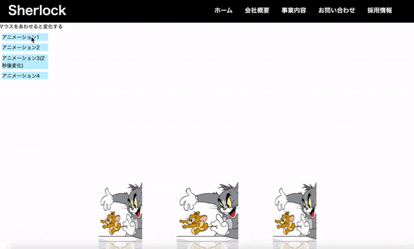
<div class="description">マウスをあわせると変化する</div>
<div class="animate1"><a href="#">アニメーション1</a></div>
<div class="animate2"><a href="#">アニメーション2</a></div>
<div class="animate3"><a href="#">アニメーション3(2秒後変化)</a></div>
<div class="animate4"><a href="#">アニメーション4</a></div>
<div class="container">
<div class="box">boxを中心にくるくるアニメーション
<span style="--i:1;"><img src="トムとジェリー.png"width="300px" height="300px"></span>
<span style="--i:2;"><img src="トムとジェリー.png"width="300px" height="300px"></span>
<span style="--i:3;"><img src="トムとジェリー.png"width="300px" height="300px"></span>
<span style="--i:4;"><img src="トムとジェリー.png"width="300px" height="300px"></span>
<span style="--i:5;"><img src="トムとジェリー.png"width="300px" height="300px"></span>
<span style="--i:6;"><img src="トムとジェリー.png"width="300px" height="300px"></span>
<span style="--i:7;"><img src="トムとジェリー.png"width="300px" height="300px"></span>
<span style="--i:8;"><img src="トムとジェリー.png"width="300px" height="300px"></span>
</div>
</div>
</body>
</html>
*
{
	margin: 0;
	padding: 0;
	box-sizing: border-box;
}
.description{
  top:0;
  color: black;
}
a{
  text-decoration: none;
  color: black;
}
.container
{
	display: flex;
	justify-content: center;
	align-items: center;
	min-height: 100vh;
}
/* 一個目 */
.animate1{
  background-color: rgb(192, 240, 255);
  width: 150px;
  top: 0;
  margin: 10px;
  text-decoration: none;
}
.animate1:hover{
  animation-name: none;
  background-color:blue;
  color: black;
  width: 300px;
  transition-duration: 5s;
}
/* 二個目 widthが5秒で変化、bgcがすぐに変化*/
.animate2{
  background-color: rgb(192, 240, 255);
  width: 150px;
  top: 0;
  margin: 10px;
  text-decoration: none;
  transition-property:width;
}
.animate2:hover{
  animation-name: none;
  background-color:blue;
  color: black;
  width: 300px;
  transition-duration: 5s;
}
/* 3個目 2秒まってスタート*/
.animate3{
  background-color: rgb(192, 240, 255);
  width: 150px;
  top: 0;
  margin: 10px;
  text-decoration: none;
}
.animate3:hover{
  animation-name: none;
  background-color:blue;
  color: black;
  width: 300px;
  transition-delay:2s;
  transition-duration: 3s;
}
.animate4{
  background-color: rgb(192, 240, 255);
  width: 150px;
  top: 0;
  margin: 10px;
  text-decoration: none;
}
.animate4:hover {
  animation-name: fadeIn;
  animation-duration:5s;
}
@keyframes fadeIn {
  0% {
      opacity:0;
  }
  100% {
      opacity:1;
  }
}
.box{
  position: relative;
  width: 200px;
  height: 200px;
  transform-style: preserve-3d;

}
.box:hover
{
	position: relative;
	width: 200px;
	height: 200px;
	transform-style: preserve-3d;
  animation: animate 22s linear infinite;
}
.box span
{
	position: absolute;
	top: 0;
	left: 0;
	width: 100%;
	height: 100%;
	transform-origin: center;
	transform-style: preserve-3d;
	transform: rotateY(calc(var(--i) * 45deg)) translateZ(400px);
	-webkit-box-reflect: below 0px linear-gradient(transparent,transparent,#0004);
}
.box span img
{
	position: absolute;
	top: 0;
	left: 0;
	width: 100%;
	height: 100%;
	object-fit: cover;
}
@keyframes animate
{
	0%
	{
		transform: perspective(1000px) rotateY(0deg);
	}
	100%
	{
		transform: perspective(1000px) rotateY(360deg);
	}
}
/* ↓ナビゲーションバー */
nav{
  background-color: black;
  width: 100%;
  top:0;
}
# check,
# nav-input{
  display: none;
}
.checkbtn{
  font-size: 30px;
  color: white;
  float: right;
  line-height: 80px;
  margin-right: 40px;
  cursor: pointer;
  display: none;
}
label.logo a{
  color: white;
  font-size: 40px;
  line-height: 80px;
  font-weight: 600;
  text-decoration: none;
  margin-left:30px;
}
nav ul{
  float: right;
  margin-right: 60px;
}
nav ul li{
  display: inline-block;
  line-height: 80px;
  margin: 0 2px;
}
nav ul li a{
  color: #f2f2f2;
  text-decoration: none;
  font-weight: 600;
  font-size: 20px;
  padding: 7px 15px;
  text-transform: uppercase;
  text-decoration: none;
}
学べたこと
・trasitionの動きと記述の流れ
・@keyframeとanimationの関係及び応用
感想
いままであまり気にしていなかった、trasitionやkeyframeの理解が進み、レパートリーが増えました。
今回作成したものは簡単なものですが画像等を用いると、企業向けの面白いサイトができそうです。
くるくる実装は建築系や、面白い雑貨屋さん等のオシャレなサイトにありそうですね!
今回は以上となります。
ここは違う、ここはこうしたほうが良いかも?等々ございましたらご指摘いただけますと幸いです。
最後までみていただき、ありがとうございました。