この記事は ミライトデザイン Advent Calendar 2022 の10日目の記事です。
https://twitter.com/suzuki_hoge/status/1597176731437187072?s=20&t=R1VgCu30z7dvsQ6MUPX--A

なぜか今年もアドベントカレンダーに参加することになりましたw
ほんとなぜだろう🤔
今年はCSSめっちゃ書いた1年でした。苦手意識が強かったCSSとも少しは仲良く慣れた気がします。
ということで、CSS in JSとStitchesについて書きたいと思います。
CSS in JSとはなにか?
CSS in JSとは、JavaScript(TypeScript)でCSSのスタイルを定義する方法です。
これにより、JavaScriptの中でスタイルを書くことができ、スタイルを動的に変更したり、JavaScript(TypeScript)の構文を使用したりすることができます。また、スタイルをJavaScriptのコンポーネント内に組み込むことで、スタイルのスコープを限定したり、再利用性を高めることができます。
結構批判も多かったり嫌いな人も多いイメージですが、個人的には動的なスタイリングがしやすいので好きです。
CSS in JSも実装は複数ありますが、お仕事ではstyled-componentsを使っていました。
おじさんなので、最近の流行りがよくわからないんですがStitchesがおすすめというのを優秀な若いエンジニアから教わりました。
Stitches ってやつもおすすめです。https://t.co/iCkQUbhdPp
— ほた (@hota1024) June 22, 2022
他にも Linaria だったり、 vanilla-extract、Compiledだったりといろいろあるわけですが、今回は「Stitches + nextjs」でCSS in JSがどういうものなんのかを触ってみみたいと思います。
Stitches is 何?
数あるCSS in JSの実装の中の一つです。
ほぼゼロのランタイム、SSR対応などReact(Nextjs)と組み合わせて使いやすいかなと個人的には思っています。
NextjsとStitchesでなにか作ってみる
ということで触りながら覚えるためにも、Next+Stitchesの組み合わせで遊んでみます。
まずはnextとstitchesのセットアップ
$ yarn create next-app --typescript next-stitches-example
次にstitchesを入れます
$ yarn add @stitches/react
これだけです。
試しにコンポーネントを作ってみる
試しにボタンコンポーネントを作ってみることにします。
// components/ui/button.ts

import { styled } from '@stitches/react';

export const Button = styled('button', {
  backgroundColor: 'Green',
  borderRadius: '20px',
  border: '1px solid #fff',
  fontSize: '24px',
  padding: '15px',
  '&:hover': {
    backgroundColor: 'DarkGreen',
    cursor: 'pointer'
  },
});
上記のような形でコンポーネントを作成し、page/index.tsx でボタンを使ってみたいと思います。
import Head from 'next/head'
import { Button } from '../components/ui/button'

export default function Home() {
  return (
    <div>
      <Head>
        <title>Next+Stitches</title>
        <meta name="description" content="Generated by create next app" />
        <link rel="icon" href="/favicon.ico" />
      </Head>

      <main>
        <Button>Hello, World</Button>
      </main>
    </div>
  )
}
ブラウザで見ると以下のように表示されているかと思います。
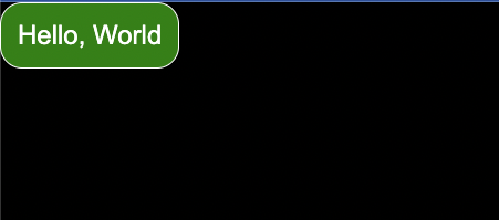
たったこれだでStitchesが使えます。
グローバルなスタイルを適用する
フォントだったり、マージンだったりGlobalに対応したいCSSもありますよね。
そういう場合は globalCss を使うことで解決出来ます。
// styles/global.ts
import { globalCss } from '@stitches/react';

export const globalStyles = globalCss({
  '*': {
    margin: 0,
    padding: 0,
    fontFamily: 'Noto Sans JP'
  },
  '@font-face': [{
    fontFamily: 'Noto Sans JP',
    src: "url('https://fonts.googleapis.com/css2?family=Noto+Sans+JP:wght@300;400;500;700;900&display=swa')"
  }]
})
// pages/_app.ts
import type { AppProps } from 'next/app'
import { useEffect } from 'react'
import { globalStyles } from '../styles/global'

export default function App({ Component, pageProps }: AppProps) {
  useEffect(() => {
    globalStyles()
  }, [])

  return <Component {...pageProps} />
}
バリアントを定義する
Stitchesは、第一級のバリアント APIをサポートしています。
variants プロパティのなかに定義するだけで簡単にバリアントを定義できます。
ということで先程のボタンに color というバリアントを追加してみましょう。
// components/ui/button.ts

import { styled } from '@stitches/react';

const greenStyle = {
  backgroundColor: 'Green',
  border: '1px solid #fff',
  '&:hover': {
    backgroundColor: 'DarkGreen',
  },
}

const grayStyle = {
  backgroundColor: '#ccc',
  border: '1px solid #333',
  '&:hover': {
    backgroundColor: '#222',
  },
}

export const Button = styled('button', {
  borderRadius: '20px',
  fontSize: '24px',
  padding: '15px',
  '&:hover': {
    cursor: 'pointer'
  },
  variants: {
    color: {
      green: { ...greenStyle },
      gray: { ...grayStyle },
    }
  }
});
// pages/index.tsx

import Head from 'next/head'
import { Button } from '../components/ui/button'

export default function Home() {
  return (
    <div>
      <Head>
        <title>Next+Stitches</title>
        <meta name="description" content="Generated by create next app" />
        <link rel="icon" href="/favicon.ico" />
      </Head>

      <main>
        <Button color="green">Hello, World</Button>
        <Button color="gray">Hello, World</Button>
      </main>
    </div>
  )
}
このような形でボタンcolorプロパティよって色を変えることができます。
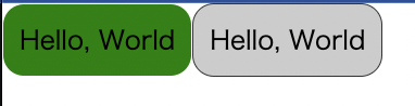
styled-componentsでバリアントを定義すると結構めんどくさいで、普通に感動しました。
デフォルトのバリアントを設定するには?
defaultVariants のプロパティで指定するだけです。
  defaultVariants: {
    color: 'green'
  }
とすればバリアントの指定が無い場合は <Button color='green' /> と同じ状態になります。
レスポンシブスタイルについて
createStitchesでブレークポイントを定義するだけで簡単にレスポンシブなスタイルを設定できます。
// components/ui/container.ts

import { createStitches } from '@stitches/react';

const { styled } = createStitches({
  media: {
    mobile: '(max-width: 640px)',
    pc: '(min-width: 768px)',
 },
});

export const BaseContainer = styled('div', {
  padding: 0,
  margin: 0,
  background: '#cefcef',
  '@mobile': {
    width: '100%',
    height: '100vh'
  },
  '@pc': {
    width: '1024px',
    margin: '0 auto',
  }
})
# テーマトークン
stitchesではトークンを定義でき、再利用性を高められます。
トークンは全部で14種類あります。
- colors
- space
- fontSizes
- fonts
- fontWeights
- lineHeights
- letterSpacings
- sizes
- borderWidths
- borderStyles
- radii
- shadows
- zIndices
- transitions
// stitches.config.ts
import { createStitches } from '@stitches/react';

export const { styled, css } = createStitches({
  theme: {
    colors: {
      gray100: '#888',
      gray200: '#444'
    }
  }
})
// components/ui/button.ts

import { styled } from '../../stitches.config';

...

const grayStyle = {
  backgroundColor: '$gray100',
  border: '1px solid #333',
  '&:hover': {
    backgroundColor: '$gray200',
  },
}
上記のような形で gray100, gray200 の定義を $gray100, $gray200 として利用する事が可能です。
さらにテーマを拡張することも出来ます。
// stitches.config.ts
import { createStitches } from '@stitches/react';

export const { styled, css, createTheme } = createStitches({
  theme: {
    colors: {
      gray100: '#444',
      gray200: '#888'
    }
  }
})

export const darkTheme = createTheme({
  colors: {
    gray100: '#ccc',
    gray200: '#ddd'
  }
})
Nextjs + Stitchesでダークモードに対応してみる
next-themesを使うことで簡単にダークモード対応ができます。
$ yarn add next-themes
あとは_app.tsxでThemeProviderを使うことで簡単にダークモードの対応ができます。
// pages/_app.tsx

import type { AppProps } from 'next/app'
import { useEffect } from 'react'
import { globalStyles } from '../styles/global'
import { ThemeProvider } from 'next-themes'
import { darkTheme } from "../stitches.config";

export default function App({ Component, pageProps }: AppProps) {
  useEffect(() => {
    globalStyles()
  }, [])

  return (
    <ThemeProvider
      attribute="class"
      defaultTheme="system"
      value={{
        light: "light",
        dark: darkTheme.className
      }}
    >
      <Component {...pageProps} />
    </ThemeProvider>
  )
}
参考: Adding a Dark Theme to Next.js with Stitches
サーバサイドレンダリング
getCssTextを使うことでSSRに最適化できるようです。(ぶっちゃけちゃんと理解できてない)
// stitches.config.ts
import { createStitches } from '@stitches/react';

export const { styled, css, createTheme, getCssText } = createStitches({
  theme: {
    colors: {
      gray100: '#444',
      gray200: '#888'
    }
  }
})

export const darkTheme = createTheme({
  colors: {
    gray100: '#ccc',
    gray200: '#ddd'
  }
})
// pages/_document.tsx
import NextDocument, { Html, Head, Main, NextScript } from 'next/document';
import { getCssText } from '../stitches.config';

export default class Document extends NextDocument {
  render() {
    return (
      <Html lang="ja">
        <Head>
          <style id="stitches" dangerouslySetInnerHTML={{ __html: getCssText() }} />
        </Head>
        <body>
          <Main />
          <NextScript />
        </body>
      </Html>
    );
  }
}
styleタグでgetCssText()でCSSを吐き出しているので微妙じゃないと思ったけどどうでもないのかな?
(そのへん気になるならCSS extractionに対応しているvanilla-extractとか使ったほうがいいのかな?)
今回のサンプルコード
今回試したサンプルコードはこちらに公開しています。
polidog/next-stitches-example
最後に
今からCSS in JSを導入するならstitchesを検討してみる価値は大いにありえるかと思います。
Stitchesはプログラマとの親和性も高いし、結構おすすめです。
明日はスーパープログラマのhogeさんがDBに関する記事を書いてくれるらしいのです!!!!超期待してます!!!