改訂
Dashのバージョン1.0が発表されたため、本記事の内容を大幅に改訂しました。
はじめに
Dashとは、Flask/Plotly.js/React.jsをベースに作成されたPython製のWebアプリケーションフレームワークであり、可視化ツールのPlotlyに従う描画を行うことができます。
この記事は、Dashのチュートリアルを翻訳したものです。
なおDashでの描画にはPlotlyの知識がある程度必要なため、コチラの記事などで復習しておくと理解しやすいです。
1. インストール
ではDashのインストールを行います。
なおPython2系とPython3系の両方をサポートしています。
pip install dash==1.11.0
Dashのバージョンv0.37.0からは自動的に
dash-rendererやdash-core-components、dash-html-components、dash-tableなどのパッケージも自動的にインストールされます。
2. Dashを使って描画を行う
2.1 DashでHTMLを生成する
Dashアプリの構成は以下の2つになります。
- layout: HTMLの外観を決める
- callbasks: アプリとデータ操作の連携をとる
Dashでは描画に必要とされる要素はPythonのクラスとして提供されます。
では実際に棒グラフを描画するHTMLを生成してみましょう。
# -*- coding: utf-8 -*-

# 必要なライブラリをインポート。
import dash
# 描画に必要なグラフやボタン、ドロップダウンなどのUIを提供するパッケージ。
import dash_core_components as dcc
# `dash_html_components`は、DivタグやH1タグなどのHTMLタグを提供するパッケージ。
import dash_html_components as html


# カスタムCSSのパスをリスト形式で指定。詳細は以下のDocs参照
# https://dash.plotly.com/external-resources
external_stylesheets = ['https://codepen.io/chriddyp/pen/bWLwgP.css']

# ファイル名をアプリ名として起動。その際に外部CSSを指定できる。
app = dash.Dash(__name__, external_stylesheets=external_stylesheets)

# この`layout`にアプリの外観部分を指定していく。
# `dash_html_components`がHTMLタグを提供し、React.jsライブラリを使って実際の要素が生成される。
# HTMLの開発と同じ感覚で外観を決めることが可能
app.layout = html.Div(children=[
    # `dash_html_components`が提供するクラスは`childlen`属性を有している。
    # `childlen`属性を慣例的に最初の属性にしている。
    html.H1(children='Hello Dash'),

    html.Div(children='Dash: A web application framework for Python.'),

    # `dash_core_components`が`plotly`に従う機能を提供する。
    # HTMLではSVG要素として表現される。
    dcc.Graph(
        id='example-graph',
        figure={
            'data': [
                {'x': [1, 2, 3], 'y': [4, 1, 2], 'type': 'bar', 'name': 'SF'},
                {'x': [1, 2, 3], 'y': [2, 4, 5], 'type': 'bar', 'name': u'Montréal'},
            ],
            'layout': {
                'title': 'Dash Data Visualization'
            }
        }
    )
])


if __name__ == '__main__':
    # `debug=True`でhot-reloadingモードを有効にし、コード上の変更を画面に反映する。
    app.run_server(debug=True)
ではアプリを起動してみます。
>> python part2_1.py
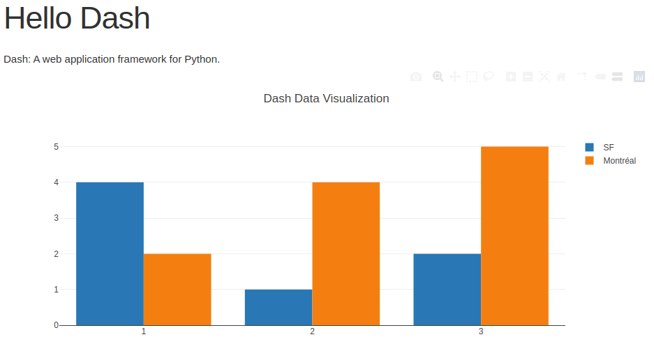
以上のコードを実行すると以下のような図がブラウザーに表示されます。
実際の生成されるHTMLは以下になります。
<div id="_dash-app-content" class>
    <div>
        <h1>Hello Dash</h1>
        <div>Dash: A web application framework for Python.</div>
        <div id="exampl-graph" class="dash-graph">
            <!-- 描画内容 -->
        </div>
    </div>
</div>
生成されるHTMLのイメージを付けておけばカスタムCSSを作成する際の手がかりになるでしょう。
2.2 HTML:応用
dash_html_componentsライブラリでは、HTMLタグに属性を指定することができる。
では実際にHTMLタグ内で直接CSSを指定して、アプリの外観を変更してみましょう。
なおソースコード上に実際に生成されるHTMLタグも一緒に記述しておきます。
# -*- coding: utf-8 -*-
import dash
import dash_core_components as dcc
import dash_html_components as html


external_stylesheets = ['https://codepen.io/chriddyp/pen/bWLwgP.css']

app = dash.Dash(__name__, external_stylesheets=external_stylesheets)

# 背景色と文字色を事前に設定しておく。
colors = {
    'background': '#111111',
    'text': '#7FDBFF'
}

# `style`を使用すればHTMLタグの`style`と同じようにCSS要素を適用できます。
# 注意点としては`style`内では属性名をキャメルケースで指定します。
# <div style="background-color: rgb(17, 17, 17)"></div>
app.layout = html.Div(style={'backgroundColor': colors['background']}, children=[

    # <h1 style="text-align: center; color: rgb(127, 219, 255);">Hello Dash</h1>
    html.H1(
        children='Hello Dash',
        style={
            'textAlign': 'center',
            'color': colors['text']
        }
    ),

    # <div style="text-align: center; color: rgb(127, 219, 255);">
    #    Dash: A web application framework for Python.</div>
    html.Div(children='Dash: A web application framework for Python.', style={
        'textAlign': 'center',
        'color': colors['text']
    }),

    dcc.Graph(
        id='example-graph-2',
        figure={
            'data': [
                {'x': [1, 2, 3], 'y': [4, 1, 2], 'type': 'bar', 'name': 'SF'},
                {'x': [1, 2, 3], 'y': [2, 4, 5], 'type': 'bar', 'name': u'Montréal'},
            ],
            # SVG要素内の属性`style`に適用されます。
            'layout': {
                'plot_bgcolor': colors['background'],
                'paper_bgcolor': colors['background'],
                'font': {
                    'color': colors['text']
                }
            }
        }
    )
])


if __name__ == '__main__':
    app.run_server(debug=True)
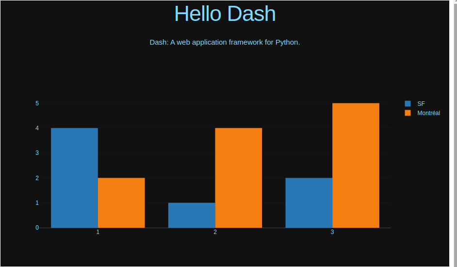
以上を実行すると以下の図が得られます。
2.3 表を作成する
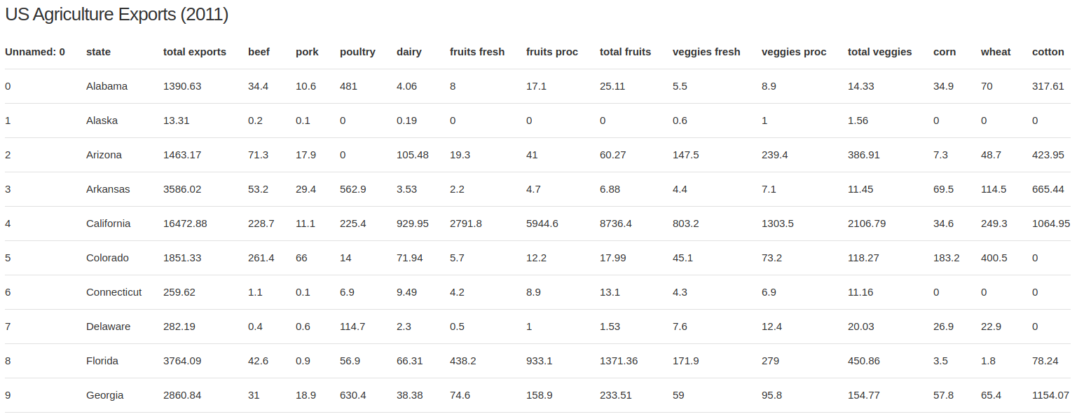
Pandasのデータフレームから表を生成することも可能です。
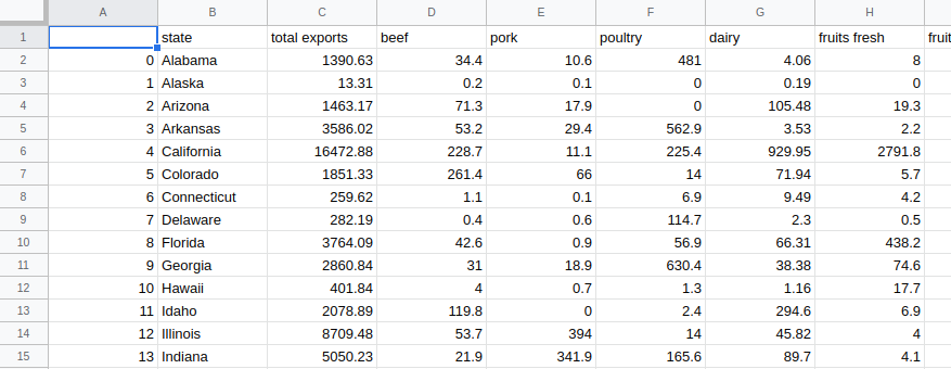
なお使用するデータセットは、アメリカの各州の農産物の輸出量です。
import dash
import dash_core_components as dcc
import dash_html_components as html
import pandas as pd


# pandasでcsvデータを読み込む
df = pd.read_csv('https://gist.githubusercontent.com/chriddyp/c78bf172206ce24f77d6363a2d754b59/raw/c353e8ef842413cae56ae3920b8fd78468aa4cb2/usa-agricultural-exports-2011.csv')


# pandasのデータフレームからHTMLタグを指定する。
def generate_table(dataframe, max_rows=10):
    # 以下でHTMLの`table@タグを生成する
    # <table class></table>
    return html.Table([
        # テーブルヘッダーを指定する。
        # <thead class></thead>
        html.Thead(
            # `html.Tr` => <tr class></tr>
            # `html.Th` => <th class></th>
            html.Tr([html.Th(col) for col in dataframe.columns])
        ),
        # テーブルの中身を指定する。
        # <tbody class></tbody>
        html.Tbody([
            # `html.Tr` => <tr class></tr>
            html.Tr([
                # `html.Td` => <td class></td>
                # 各行のデータの、各列のデータを順に出力
                html.Td(dataframe.iloc[i][col]) for col in dataframe.columns
            # 以下でDataFrameの中身を最大10行分生成する。
            ]) for i in range(min(len(dataframe), max_rows))
        ])
    ])


external_stylesheets = ['https://codepen.io/chriddyp/pen/bWLwgP.css']

app = dash.Dash(__name__, external_stylesheets=external_stylesheets)

app.layout = html.Div(children=[
    html.H4(children='US Agriculture Exports (2011)'),
    generate_table(df)
])


if __name__ == '__main__':
    app.run_server(debug=True)
以上を実行すると以下の図が得られます。
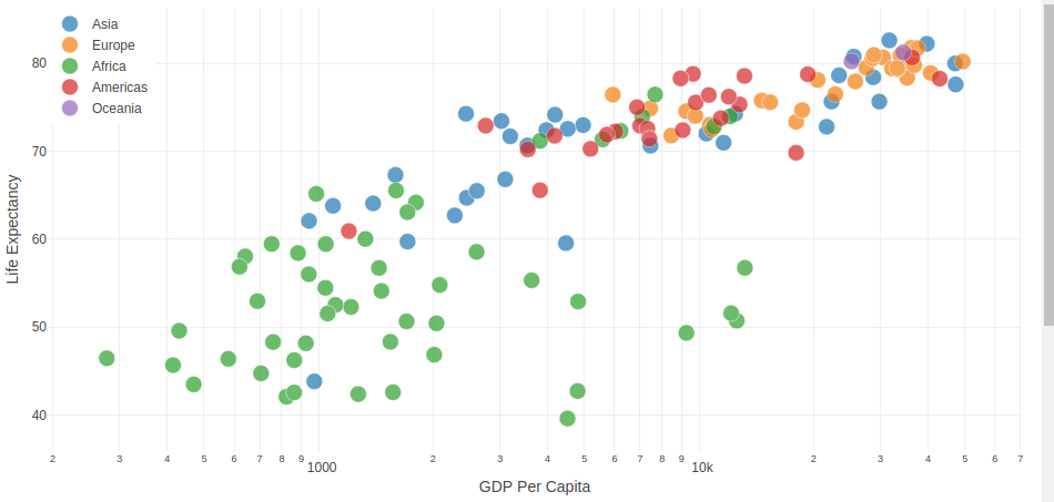
2.4 複雑な可視化を行う
Plotlyで使用可能なグラフ描画機能を提供するdash_core_componentsにはGraphと呼ばれるコンポーネントが存在し、Ploylyの35種類以上の図に対応しています。(Plotlyの公式HP)
ではこの機能を使用して複雑なグラフを生成してみましょう。
なおここらへんの勘所を身に付けたい場合はDashではなくPlotlyのチュートリアルなどを参考にしてください。
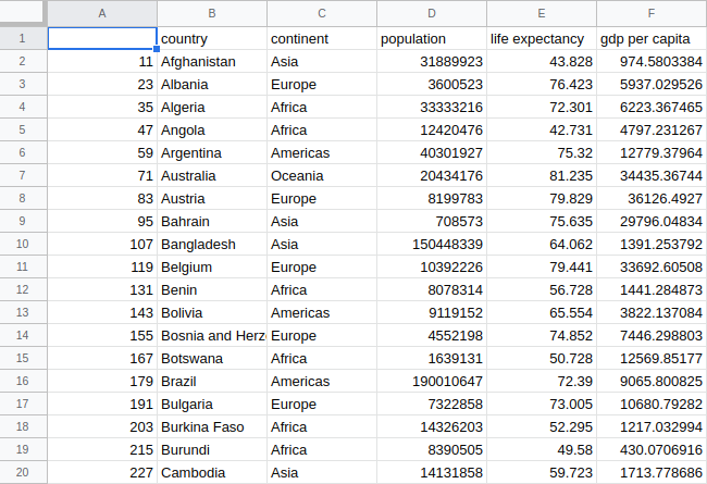
使用するデータは各国の1人あたりのGDPの値です。
import dash
import dash_core_components as dcc
import dash_html_components as html
import pandas as pd

external_stylesheets = ['https://codepen.io/chriddyp/pen/bWLwgP.css']

app = dash.Dash(__name__, external_stylesheets=external_stylesheets)

df = pd.read_csv('https://gist.githubusercontent.com/chriddyp/5d1ea79569ed194d432e56108a04d188/raw/a9f9e8076b837d541398e999dcbac2b2826a81f8/gdp-life-exp-2007.csv')


app.layout = html.Div([
    # `Graph`は`plotly.js`を使ってレンダリングを行う。
    # SVGとWebGLを使用しており35種類以上のグラフに対応している。
    dcc.Graph(
        id='life-exp-vs-gdp',
        # この`figure`属性は`plotly.py`と同じ挙動を示す。
        # https://plotly.com/python
        figure={
            # plotlyでは出力したいデータをリストで指定する。
            # 複数のデータを使用する場合には辞書のリストを指定する。
            'data': [
                # 大陸毎のデータを1かたまりにして出力する。
                dict(
                    x=df[df['continent'] == i]['gdp per capita'],
                    y=df[df['continent'] == i]['life expectancy'],
                    text=df[df['continent'] == i]['country'],
                    mode='markers',
                    opacity=0.7,
                    marker={
                        'size': 15,
                        'line': {'width': 0.5, 'color': 'white'}
                    },
                    name=i
                ) for i in df.continent.unique()
            ],
            'layout': dict(
                xaxis={'type': 'log', 'title': 'GDP Per Capita'},
                yaxis={'title': 'Life Expectancy'},
                margin={'l': 40, 'b': 40, 't': 10, 'r': 10},
                legend={'x': 0, 'y': 1},
                # カーソルを当てた際に最も近いデータ点の情報を出力する。
                hovermode='closest'
            )
        }
    )
])


if __name__ == '__main__':
    app.run_server(debug=True)
以上を実行すると以下の図が得られます。
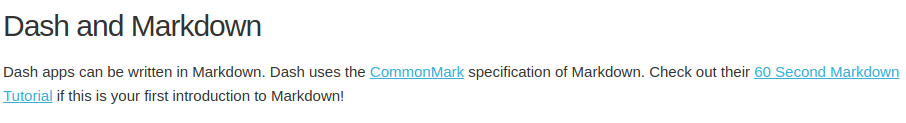
2.5 Markdownを使用する
dcc.Markdownを使用すれば直接Markdownのテキストを出力させることが可能です。
import dash
import dash_core_components as dcc
import dash_html_components as html


external_stylesheets = ['https://codepen.io/chriddyp/pen/bWLwgP.css']

app = dash.Dash(__name__, external_stylesheets=external_stylesheets)

# 出力させたいMarkdownでの文章を変数に格納しておく。
markdown_text = '''
### Dash and Markdown

Dash apps can be written in Markdown.
Dash uses the [CommonMark](http://commonmark.org/)
specification of Markdown.
Check out their [60 Second Markdown Tutorial](http://commonmark.org/help/)
if this is your first introduction to Markdown!
'''

app.layout = html.Div([
    dcc.Markdown(children=markdown_text)
])


if __name__ == '__main__':
    app.run_server(debug=True)
以上を実行すると以下の図が得られます。
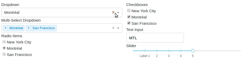
2.6 他のdash_core_componentsを試す
dash_core_componentsには、Graph以外にもドロップダウンやマークダウン、テキストボックスなど様々なオプションが存在します。
詳細は公式サイト: Dash Core Components Galleryを参考にしましょう。
# -*- coding: utf-8 -*-
import dash
import dash_core_components as dcc
import dash_html_components as html

external_stylesheets = ['https://codepen.io/chriddyp/pen/bWLwgP.css']

app = dash.Dash(__name__, external_stylesheets=external_stylesheets)

app.layout = html.Div([
    # <label>Dropdown</label>
    html.Label('Dropdown'),
    dcc.Dropdown(
        options=[
            {'label': 'New York City', 'value': 'NYC'},
            {'label': u'Montréal', 'value': 'MTL'},
            {'label': 'San Francisco', 'value': 'SF'}
        ],
        # `value`で初期値を設定できる。
        value='MTL'
    ),
    # <label>Multi-Select Dropdown</label>
    html.Label('Multi-Select Dropdown'),
    dcc.Dropdown(
        options=[
            {'label': 'New York City', 'value': 'NYC'},
            {'label': u'Montréal', 'value': 'MTL'},
            {'label': 'San Francisco', 'value': 'SF'}
        ],
        value=['MTL', 'SF'],
        # `multi`で複数選択も可能にする。
        multi=True
    ),
    # <label>Radio Items</label>
    html.Label('Radio Items'),
    dcc.RadioItems(
        options=[
            {'label': 'New York City', 'value': 'NYC'},
            {'label': u'Montréal', 'value': 'MTL'},
            {'label': 'San Francisco', 'value': 'SF'}
        ],
        value='MTL'
    ),
    # <label>Checkboxes</label>
    html.Label('Checkboxes'),
    dcc.Checklist(
        options=[
            {'label': 'New York City', 'value': 'NYC'},
            {'label': u'Montréal', 'value': 'MTL'},
            {'label': 'San Francisco', 'value': 'SF'}
        ],
        value=['MTL', 'SF']
    ),
    # <label>Text Input</label>
    html.Label('Text Input'),
    # <input type="text" step="any" persisted_props="value" persistence_type="local" value="sample">
    dcc.Input(value='MTL', type='text'),

    # <label>Slider</label>
    html.Label('Slider'),
    dcc.Slider(
        min=0,
        max=9,
        marks={i: 'Label {}'.format(i) if i == 1 else str(i) for i in range(1, 6)},
        value=5,
    ),

# 基本的にDashでは属性の最後にCSSスタイルを指定します。
# <div style="column-count: 2;"><\div>
], style={'columnCount': 2})


if __name__ == '__main__':
    app.run_server(debug=True)
困ったときは
それぞれの引数など何かわからないことがあった場合は、help関数を使いましょう。
>> help(dcc.Dropdown)
終わりに
以上がDashを使用してグラフをHTMLで描画する方法です。
どんな図を出力するにしても
layout
の設定することが基本です。