プログラムについて
ChatGPTを使って,2つのCSVファイルから対数スケールの散布図を作るプログラムを作りました.
環境
- MacBook Air(M1, 2020)
- Python 3.8.8
プログラム
ScatterPlot.py
import pandas as pd
import matplotlib.pyplot as plt
import sys
import numpy as np

# コマンドライン引数からファイル名を取得する
file1_name = sys.argv[1]
file2_name = sys.argv[2]

# CSVファイルを読み込む
df1 = pd.read_csv(file1_name)
df2 = pd.read_csv(file2_name)

# 軸名をCSVファイルから取得する
x_label = df1.columns[0]
y_label = df1.columns[1]

# 散布図を作成する
plt.scatter(df1[x_label], np.log10(df1[y_label]), label='1', s=6)
plt.scatter(df2[x_label], np.log10(df2[y_label]), label='2', s=6)

# グラフのタイトルと軸ラベルを設定する
plt.xlabel("x")
plt.ylabel("$log_{10}(r)$")

# 凡例を表示する
plt.legend()

# PNG形式で保存する
plt.savefig('test.png')
実行結果
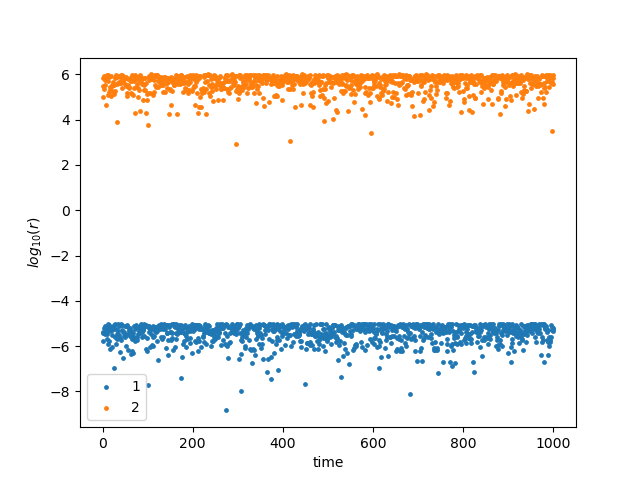
今回はテストとして,大きさの異なる2つのデータ(test1.csv, test2.csv)を用意しました.
そのため,対数表示にしています.必要なければ,np.log10()を削除してください.
実行例
$python3 ScatterPlot.py test1.csv test2.csv
作成された図は以下のようになっています.