プログラムについて
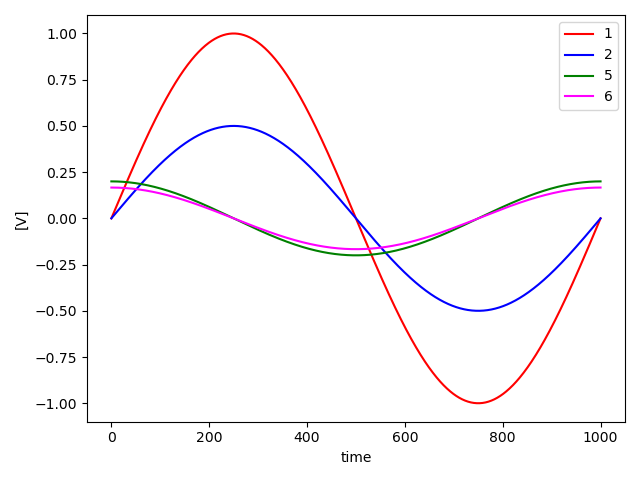
2つのCSVファイルの指定したデータをグラフにして,1枚の図で表示するプログラムを作りました.
凡例はCSVファイルから取得するようにしています.
環境
- MacBook Air(M1, 2020)
- Python 3.8.8
プログラム
graph.py
import sys
import pandas as pd
import matplotlib.pyplot as plt

# コマンドライン引数からファイル名を取得する
if len(sys.argv) != 7:
    print("Usage: python graph.py file1.csv y_col1 y_col2 file2.csv y_col1 y_col2")
    sys.exit(1)

file = sys.argv[1]
y_col1 = sys.argv[2]
y_col2 = sys.argv[3]

file2 = sys.argv[4]
y_col21 = sys.argv[5]
y_col22 = sys.argv[6]

#CSVファイルを読み取る
df = pd.read_csv(file)
cols = df.columns.tolist()
x_col = cols[0]  # 1つ目の列をxとする
y_col_1 = cols[int(y_col1)]  # 初めに指定した列をy1とする
y_col_2 = cols[int(y_col2)]  # 次に指定した列をy2とする
x = df[x_col]
y_1 = df[y_col_1]
y_2 = df[y_col_2]

#CSVファイルを読み取る
df2 = pd.read_csv(file2)
cols2 = df2.columns.tolist()
x_col2 = cols2[0]  # 1つ目の列をxとする
y_col_21 = cols2[int(y_col21)]  # 初めに指定した列をy21とする
y_col_22 = cols2[int(y_col22)]  # 次に指定した列をy22とする
x2 = df2[x_col2]
y_21 = df2[y_col_21]
y_22 = df2[y_col_22]

# グラフを作成する
fig, ax1 = plt.subplots()
ax1.set_xlabel('time', color='black')
ax1.set_ylabel('[V]', color='black')

# データをプロットする
ax1.plot(x, y_1, color='red', label=y_col_1)
ax1.plot(x, y_2, color='blue', label=y_col_2)

# データをプロットする
ax1.plot(x2, y_21, color='green', label=y_col_21)
ax1.plot(x2, y_22, color='magenta', label=y_col_22)

# グラフの凡例を表示する
ax1.legend(loc='best')

# グラフの設定を調整する
fig.tight_layout()

# PNG形式で保存する
plt.savefig('graph.png')
実行結果
今回はテストとして,sin関数のデータ(test1.csv), cos関数のデータ(test2.csv)の合計2つのデータを表示するようにしています.
実行例
python3 graph.py test1.csv 1 2 test2.csv 5 6
作成された図は以下のようになっています.