背景
Doczとは
- 公式サイト
- コンポーネントガイドを作ることができるライブラリ
- Storybookのようなもの
Doczの特徴
- mdxで書くことができる
- markdown + jsx
- 基本はmarkdownで書くことができる
- markdownの中にjsxタグを埋め込むことができる
- 設定ファイルなしで作ることができる
使い方
HelloWorldまで
- ライブラリのインストール
yarn add -D docz
# or
npm i -D docz
- mdxファイルを作る
- プロジェクト内ならどこでもOK
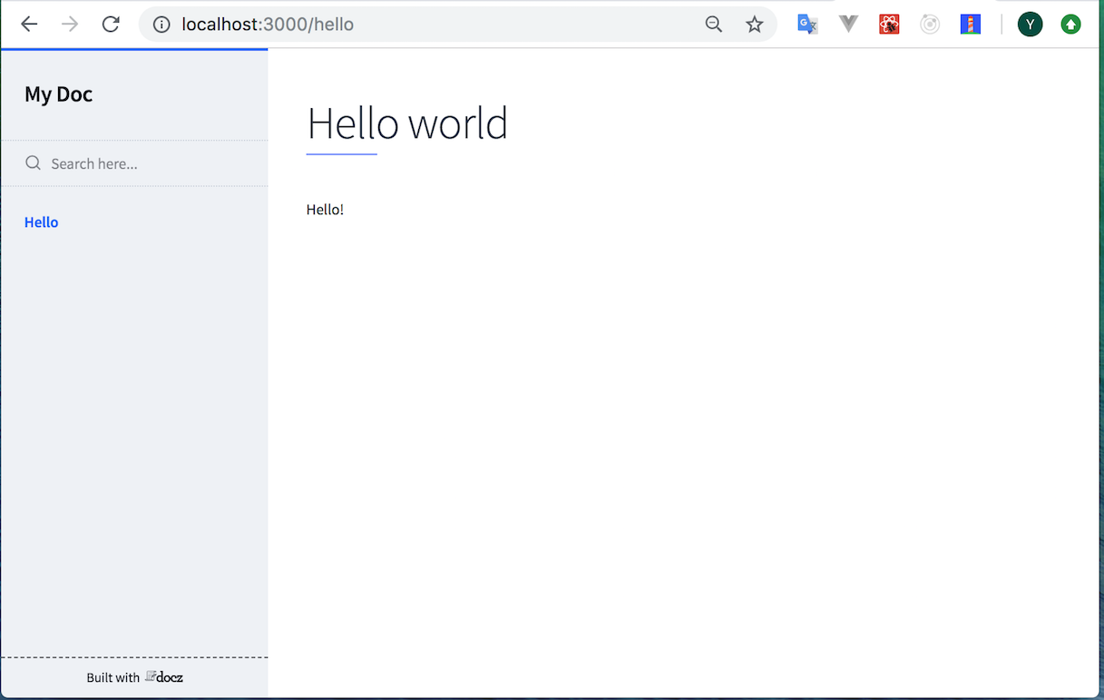
hello.mdx
---
name: Hello
---

# Hello world

Hello!
- 起動
yarn docz dev
# or
npx docz dev
- ページにアクセス
- http://localhost:3000/ で起動するのでアクセスするとHello Worldを確認できる
Reactコンポーネントを埋め込む
- 単純なボタンコンポーネントのサンプル
---
name: Button
---

import { Playground, PropsTable } from 'docz'
import Button from './Button'

# Button

- ボタンコンポーネント

## Usage

<Playground>
  <Button onClick={() => alert('hello!')}>ボタン</Button>
</Playground>

<Playground>
  <Button wide onClick={() => alert('hello!')}>ボタン</Button>
</Playground>

## Props

<PropsTable of={Button} />
- 上記のmdxを作ると以下のような画面になる
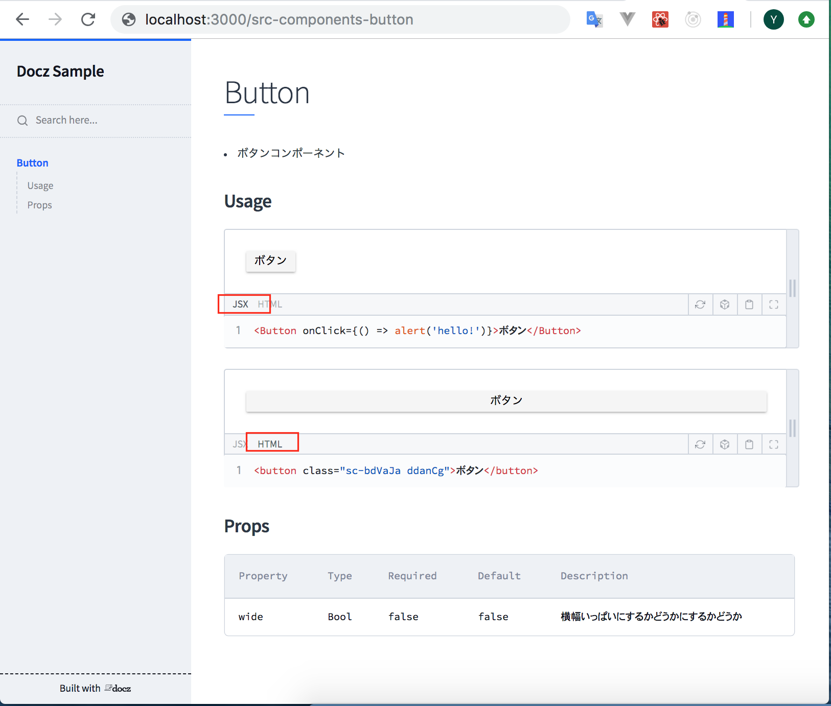
特徴1
- 表示したいコンポーネントを
<Playground>で囲うと、描画内容とjsxタグが自動で表示される - 図中で赤枠で囲っているようにjsxだけでなく変換後のhtmlも確認できる
特徴2
-
<PropsTable of={Button} />とすることでPropsの情報を自動的にテーブルにしてくれる - FlowでもPropTypesでもちゃんと拾ってくれる
- サンプルの例だと以下のような感じで定義している
Button.js
// ...省略

// flowの場合
type Props = {
  /** 横幅いっぱいにするかどうか */
  wide?: boolean,
};

// PropTypesの場合
Button.propTypes = {
   /** 横幅いっぱいにするかどうかにするかどうか */
   wide: PropTypes.bool,
 };

// DefaultPropsはFlowでもPropTypesでも共通
Button.defaultProps = {
  wide: false,
};
(参考)Storybookと比較
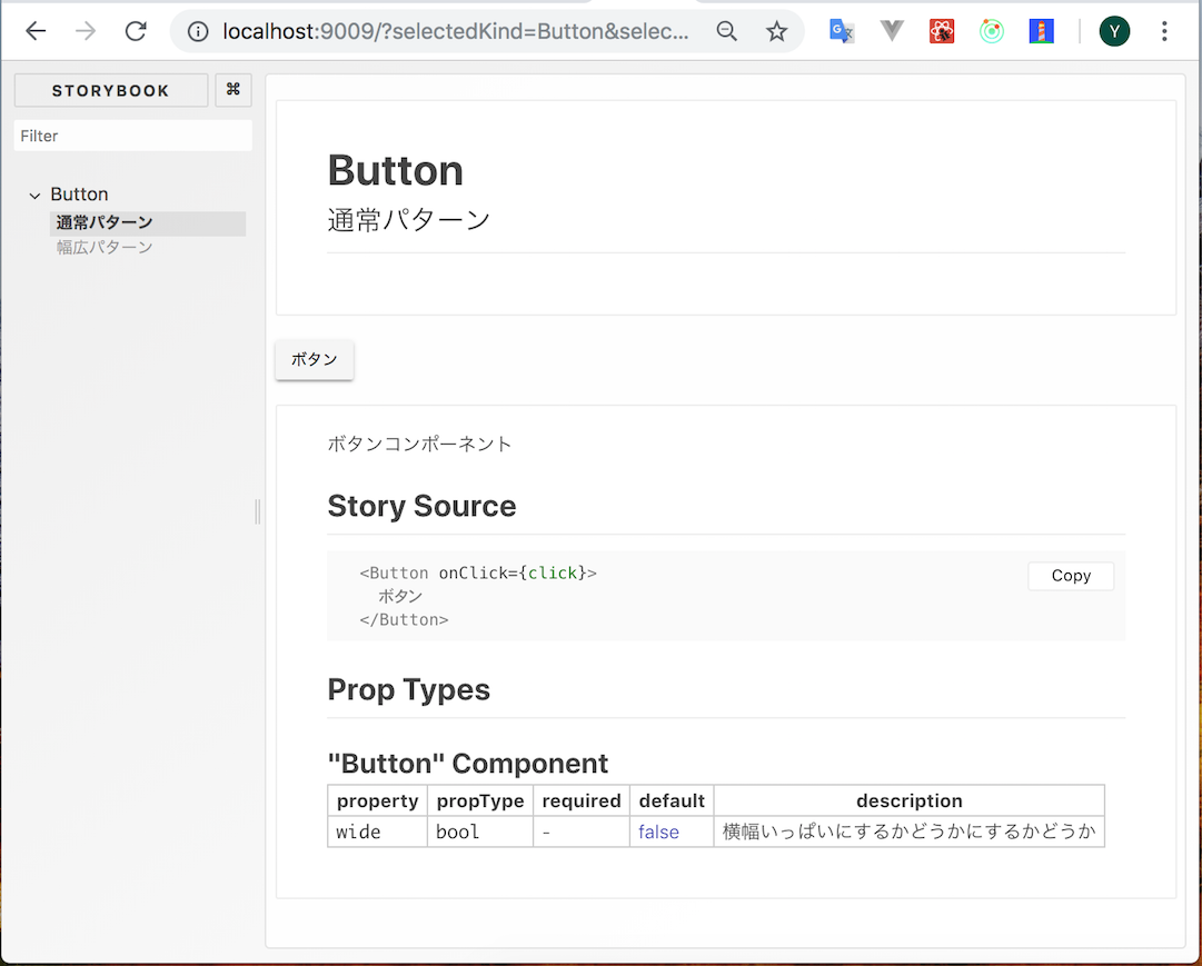
- 上の例で示したボタンコンポーネントのガイドと同じものをStorybookで作ってみる
- セットアップは割愛
- Docz版と同じものを再現するには
@storybook/addon-infoが必須- それ以外はなくても再現できる
stories.js
import React from 'react';
import { storiesOf } from '@storybook/react';
import { text } from '@storybook/addon-knobs';
import { action } from '@storybook/addon-actions';
import { withInfo } from '@storybook/addon-info';

import Button from './Button';

storiesOf('Button', module)
  .addDecorator(withInfo)
  .addParameters({
    info: {
      text: 'ボタンコンポーネント',
      inline: true,
    },
  })
  .add('通常パターン', () => (
    <Button onClick={action('click!!')}>
      {text('label', 'ボタン')}
    </Button>
  ))
  .add('幅広パターン', () => (
    <Button onClick={action('click')} wide>
      {text('label', 'ボタン')}
    </Button>
  ));
まとめ
- できることはStorybookと同じか少ないけど、これだけの内容を設定ファイルなしでできるのはお手軽だと思う!