日頃、何のために可視化を教えているのか!!!!
それはこの為だ
OP関数を進化させたい!!
前回作成したOP関数はこちら
Python言語のmatplotlibで綺麗な曲線OPを描く関数を作成して
可視化を行います。
なお、単なる静止画だと面白くないので
ipywidgetsの機能を付けています。
数値tを変えるとビヨンビヨン動きます。
import numpy as np
import matplotlib.pyplot as plt
from ipywidgets import interact, FloatSlider, IntSlider
import warnings
warnings.simplefilter('ignore')
%matplotlib inline

def oppai(y,t):
    x_1 = (1.5 * np.exp((0.12*np.sin(t)-0.5) * (y + 0.16 *np.sin(t)) ** 2)) / (1 + np.exp(-20 * (5 * y + np.sin(t))))
    x_2 = ((1.5 + 0.8 * (y + 0.2*np.sin(t)) ** 3) * (1 + np.exp(20 * (5 * y +np.sin(t)))) ** -1)
    x_3 = (1+np.exp(-(100*(y+1)+16*np.sin(t))))
    x_4 = (0.2 * (np.exp(-(y + 1) ** 2) + 1)) / (1 + np.exp(100 * (y + 1) + 16*np.sin(t)))
    x_5 = (0.1 / np.exp(2 * (10 * y + 1.2*(2+np.sin(t))*np.sin(t)) ** 4))
    x = x_1 + (x_2 / x_3) + x_4 + x_5
    return x

t = FloatSlider(min=0.1, max=5.0, step=0.1, value=0)
y = np.arange(-3, 3.01, 0.01)

@interact(t=t)
def plot_oppai(t):
    x = oppai(y,t)
    plt.figure(figsize=(10,9))
    plt.axes().set_aspect('equal', 'datalim')
    plt.grid()
    plt.plot(x, y, 'black')
    plt.show()
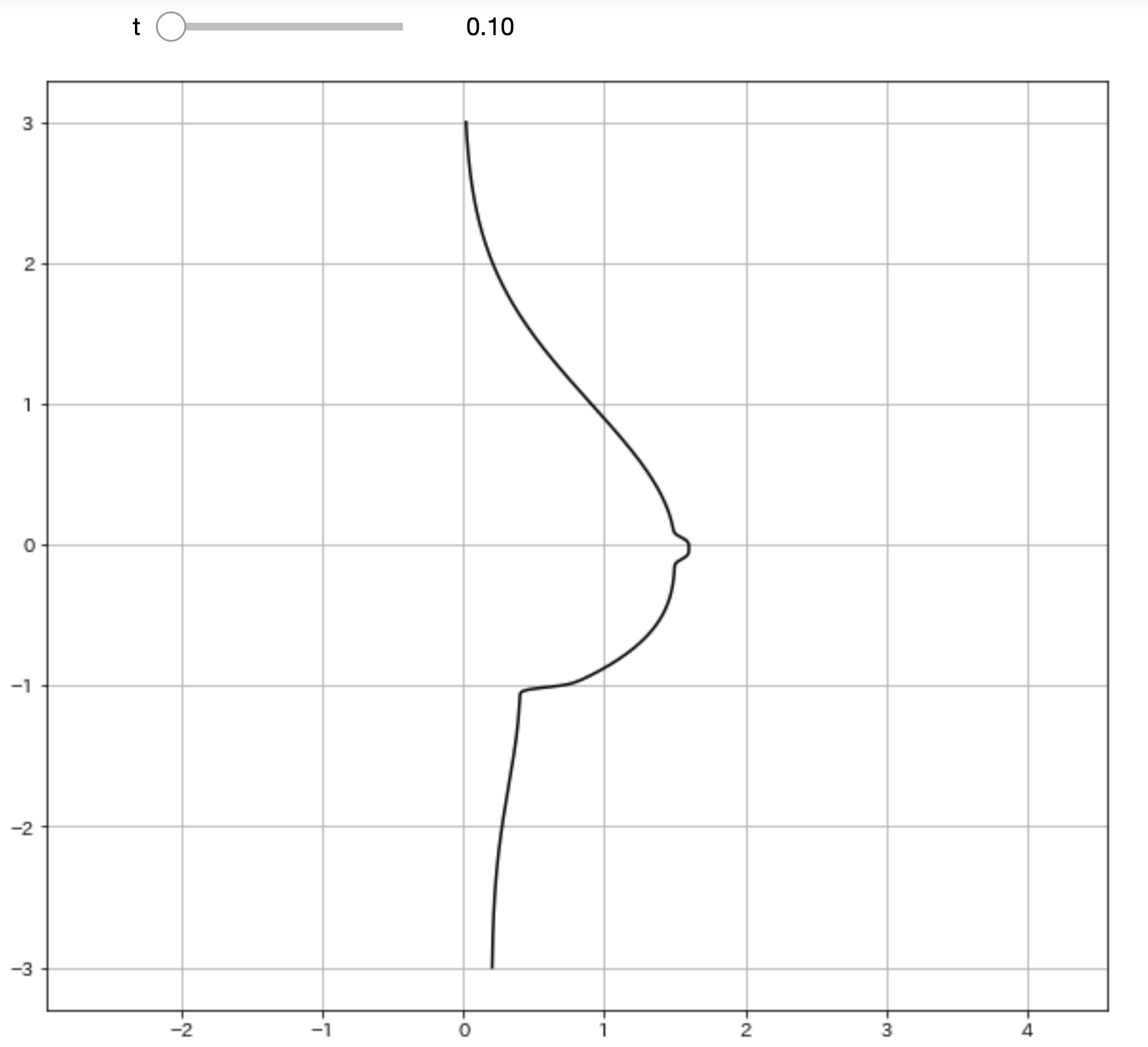
ふっ
これだと味気ない黒い曲線で描かれるだけで
芸術の域には達していませんね。
理想に近づけるために関数に色を付けていきましょう。
改良したOP関数はこちら
import numpy as np
import matplotlib.pyplot as plt
import matplotlib.patches as patches
from ipywidgets import interact, FloatSlider, IntSlider
import warnings
warnings.simplefilter('ignore')
%matplotlib inline

def oppai(y,t):
    x_1 = (1.5 * np.exp((0.12*np.sin(t)-0.5) * (y + 0.16 *np.sin(t)) ** 2)) / (1 + np.exp(-20 * (5 * y + np.sin(t))))
    x_2 = ((1.5 + 0.8 * (y + 0.2*np.sin(t)) ** 3) * (1 + np.exp(20 * (5 * y +np.sin(t)))) ** -1)
    x_3 = (1+np.exp(-(100*(y+1)+16*np.sin(t))))
    x_4 = (0.2 * (np.exp(-(y + 1) ** 2) + 1)) / (1 + np.exp(100 * (y + 1) + 16*np.sin(t)))
    x_5 = (0.1 / np.exp(2 * (10 * y + 1.2*(2+np.sin(t))*np.sin(t)) ** 4))
    x = x_1 + (x_2 / x_3) + x_4 + x_5
    return x

t = FloatSlider(min=0.1, max=5.0, step=0.1, value=0)
y = np.arange(-3, 3.01, 0.01)

@interact(t=t)
def plot_oppai(t):
    x = oppai(y,t)
    plt.figure(figsize=(10,9))
    plt.axes().set_aspect('equal', 'datalim')
    plt.grid()

    # 改良ポイント
    b_chiku = (0.1 / np.exp(2 * (10 * y + 1.2*(2+np.sin(t))*np.sin(t)) ** 4))
    b_index = [i for i ,n in enumerate(b_chiku>3.08361524e-003) if n]
    x_2,y_2 = x[b_index],y[b_index]
    plt.axes().set_aspect('equal', 'datalim')
    plt.plot(x, y, '#F5D1B7')
    plt.fill_between(x, y, facecolor='#F5D1B7', alpha=1)
    plt.plot(x_2, y_2, '#F8ABA6')
    plt.fill_between(x_2, y_2, facecolor='#F8ABA6', alpha=1)
    plt.show()
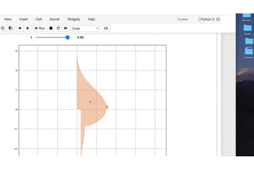
素晴らしい色艶ですね!!!
可視化の仕組み
matplotlibの仕組み上では
まずどこにプロットするかを決めないといけません。
散布図では二つの数値が必要になります。
縦軸の数値と横軸の数値です。
全体の描画に用いている縦軸方向の数値は固定です。
y = np.arange(-3, 3.01, 0.01)
yは-3から3までの0.01刻みの数値群です。
これに対して横軸方向の値を計算で求めてあげます。
関数oppai(y,t)では数値群yに対して1つ1つ計算して
数値群xを作成します。
引数tは微調整するための数値で
これも0.1から5までの0.1刻みの数値で計算しています。
xとyの数値群を用いて散布図にプロットします。
plt.plot(x, y)
これでこの滑らかな曲線OPが描かれています。
次にplt.fill_betweenです
これは色で塗りつぶしを行います。
そして最大のポイントが曲線のB地区
個人的に一番好きなポイントです。
これも塗りつぶしポイントの範囲を計算しないといけません。
    b_chiku = (0.1 / np.exp(2 * (10 * y + 1.2*(2+np.sin(t))*np.sin(t)) ** 4))
    b_index = [i for i ,n in enumerate(b_chiku>3.08361524e-003) if n]
    x_2,y_2 = x[b_index],y[b_index]
ここで縦横方向でちょうど良い範囲に収まるような
数値計算をしています。
enumerate(b_chiku>3.08361524e-003)では
その数値よりも大きいかがTrue or Falseで返ります。
それがB地区のインデックス値となるのでB地区の数値を
全体の曲線OPの数値群からインデックスで数値を取得します。
これでB地区の計算ができたので良い感じの色で塗ってあげて
Finishです。
最後に
いやーー
動かすと数値計算大変
けれども
静止画では味わえない醍醐味が得られるはずです。
Pythonやmatplotlibを使う意義はここにあります。
データサイエンスは詳しくなくても、可視化は勉強する価値があります。
ちなみに色合いは#F8ABA6
この色が好みでした。
色は好きな色に変えてくださいね。
それでは
作者の情報
乙pyのHP:
http://www.otupy.net/
Youtube:
https://www.youtube.com/channel/UCaT7xpeq8n1G_HcJKKSOXMw
Twitter:
https://twitter.com/otupython