概要
Vue Datepicker を使い 2022/1/1 〜 2022/6/1 のような期間を選択できる UI を作成してみました。

Vue Datepicker とは?
公式サイト: https://vue3datepicker.com/
Vue3 用の最も完全な datepicker の解決策
強力、軽量、再利用可能な datepicker コンポーネントで、あらゆるプロジェクトに適合します。
- 年、月、日、秒まで指定可能
- 日本語対応可能
- デザイン & 操作性

更に、オプションが100個近くあるので、どのようなユースケースにも対応できそうです。
 使用方法
使用方法
公式の手順: https://vue3datepicker.com/installation/
 インストール
yarn add @vuepic/vue-datepicker
 設置
設置
MyComp.vue
<script setup>
import { ref } from 'vue'
import Datepicker from '@vuepic/vue-datepicker'
import '@vuepic/vue-datepicker/dist/main.css'

const date = ref(new Date())
</script>

<template>
  <Datepicker v-model="date"></Datepicker>
</template>
こんな感じになる 

 注意事項
注意事項
以下のような CSS を定義していると、年と月の選択が正常に出来なくなるためご注意ください。
* {
  position: relative;
}
※厳密には .dp__month_year_row クラスに position: relative が当たっている場合に発生します。
(本題) 期間選択 UI を作る
Vue Datepicker の range プロパティを使えば 9/1 〜 9/5 のような期間指定ができますが、
- 操作性が微妙 (個人的に)
- 月や年を跨ぐような広範囲だと更に使いづらい (個人的に)
という理由で Datepicker を開始日と終了日で2つ配置することにしました。
しかし、

こんな感じの UI にすると必要な操作が増えたりと微妙なので、テキストフィールド & テキストフィールドクリック時に表示するメニューを自前で用意し、メニューの中に inline オプションでカレンダーのみにした Datepicker を2つ配置する形にしたいと思います。
-
inlineオプション: https://vue3datepicker.com/api/props/#inline- 入力フィールドを削除し、カレンダーを親コンポーネントに配置する
使用ライブラリとバージョン
- vue
v3.2.38 - @vuepic/vue-datepicker
v3.4.8 - date-fns
v2.29.2- 日付の計算のために使用。他ライブラリで代用可
- vuetify
v3.0.0-beta.10- テキストフィールド、モーダル、ボタンなどの UI 設置のために使用。他ライブラリで代用可
ソースコード
長いので折りたたみ
<script setup lang="ts">
import { ref, computed } from 'vue'
import Datepicker from '@vuepic/vue-datepicker'
import '@vuepic/vue-datepicker/dist/main.css'
import { format, differenceInDays } from 'date-fns'
// 期間
const startDate = ref(new Date())
const endDate = ref(new Date())
// 入力したがまだ反映はされていない、仮状態の期間
const tmpStartDate = ref(startDate.value)
const tmpEndDate = ref(endDate.value)
// 仮状態の期間を変更した/していないのフラグ
const isTmpStartDateChanged = ref(false)
const isTmpEndDateChanged = ref(false)
// メニューが表示されているなら true
const isMenuOpened = ref(false)
// メニューを閉じる。合わせて各状態を初期値に戻す
const closeMenu = () => {
isMenuOpened.value = false
// メニューが閉じられてから (ユーザの目に見えないときに) 初期値に戻す
setTimeout(() => {
tmpStartDate.value = startDate.value
tmpEndDate.value = endDate.value
isTmpStartDateChanged.value = false
isTmpEndDateChanged.value = false
}, 300)
}
// 仮状態の期間を反映する
const updatePeriods = () => {
startDate.value = tmpStartDate.value
endDate.value = tmpEndDate.value
closeMenu()
}
// 仮状態の期間を反映可能な状態なら true
const isUpdatable = computed<boolean>(() => {
// 期間が変更されていないなら false
if (!isTmpStartDateChanged.value && !isTmpEndDateChanged.value) {
return false
}
// end が start より過去の値になっているなら false (同日は可)
const diffDays = differenceInDays(tmpEndDate.value, tmpStartDate.value)
if (diffDays < 0) {
return false
}
// 上記以外は true
return true
})
const formatDate = (date: Date): string => {
return format(date, 'yyyy年M月d日')
}
// Vue Datepicker に渡すオプション
const datepickerOptions = {
inline: true, // 入力フィールドを削除し、カレンダーを親コンポーネントに配置する
format: formatDate,
locale: 'jp',
monthChangeOnScroll: false, // マウスホイールで月を切り替えない
autoApply: true, // 日付をクリックした際、自動的にその値を選択する
noToday: true, // カレンダーから今日のマークを隠す
hideOffsetDates: true, // カレンダーの前月/翌月の日付を非表示にする
preventMinMaxNavigation: true, // minDate または maxDate の後または前のナビゲーションを防止する
enableTimePicker: false // タイムピッカーを無効化
}
const startDatepickerOptions = {
...datepickerOptions
}
const endDatepickerOptions = computed(() => ({
...datepickerOptions,
minDate: tmpStartDate.value // 選択できる最小の日付は start と同日まで
}))
const handleUpdateStartDatepicker = () => {
// 仮状態の期間を変更した/していないのフラグを更新
isTmpStartDateChanged.value = true
isTmpEndDateChanged.value = false
}
const handleUpdateEndDatepicker = () => {
// 仮状態の期間を変更した/していないのフラグを更新
isTmpEndDateChanged.value = true
isTmpStartDateChanged.value = false
}
</script>
<template>
<div>
<v-menu
v-model="isMenuOpened"
transition="slide-y-transition"
:close-on-content-click="false"
@update:modelValue="(opened) => opened || closeMenu()"
>
<template v-slot:activator="{ props }">
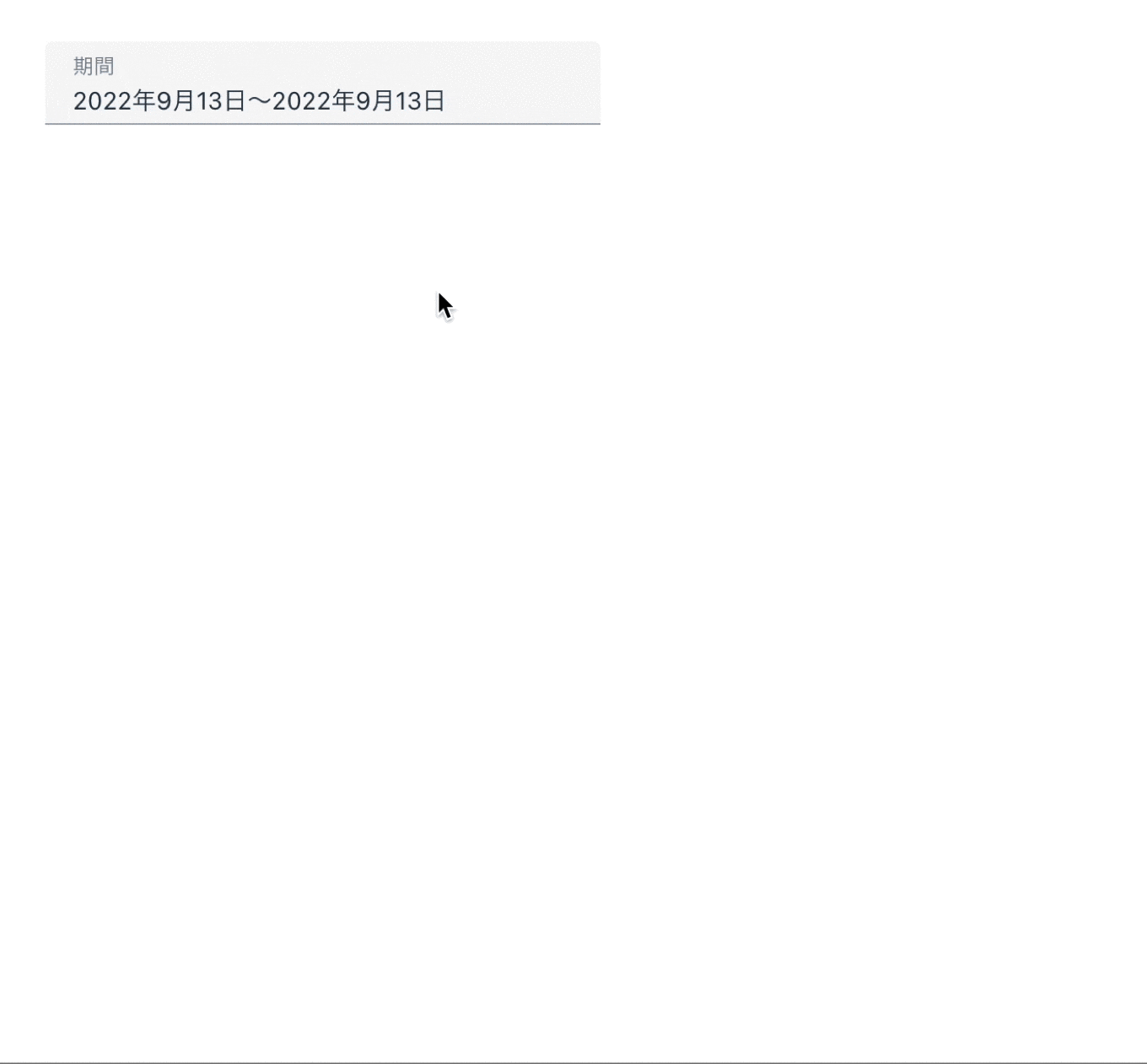
<v-text-field
:model-value="`${formatDate(startDate)}〜${formatDate(endDate)}`"
v-bind="props"
label="期間"
density="comfortable"
hide-details
/>
</template>
<v-card class="pa-3">
<v-card-title class="mb-3">
<v-icon icon="mdi-calendar-check" class="mt-n1 mr-2" size="md" />期間
</v-card-title>
<v-card-text>
<p class="tmpDate mb-3">
<span class="tmpDate__item" :class="{'is-active': isTmpStartDateChanged}">
{{ formatDate(tmpStartDate) }}
</span>
<span> - </span>
<span class="tmpDate__item" :class="{'is-active': isTmpEndDateChanged}">
{{ formatDate(tmpEndDate) }}
</span>
</p>
<v-row class="mb-5">
<v-col cols="auto">
<p class="text-overline font-weight-bold">FROM</p>
<Datepicker
v-model="tmpStartDate"
v-bind="startDatepickerOptions"
@update:modelValue="handleUpdateStartDatepicker"
/>
</v-col>
<v-col cols="auto">
<p class="text-overline font-weight-bold">TO</p>
<Datepicker
v-model="tmpEndDate"
v-bind="endDatepickerOptions"
@update:modelValue="handleUpdateEndDatepicker"
/>
</v-col>
</v-row>
<v-btn
color="primary"
prepend-icon="mdi-update"
:disabled="!isUpdatable"
class="px-8 mr-4"
@click="updatePeriods"
>
更新
</v-btn>
<v-btn
prepend-icon="mdi-cancel"
@click="closeMenu"
>
キャンセル
</v-btn>
</v-card-text>
</v-card>
</v-menu>
</div>
</template>
<style scoped lang="scss">
::v-deep(.v-field__input) {
font-size: 14px;
}
.tmpDate {
margin: -6px -8px;
&__item {
transition: 0.3s;
padding: 6px 8px;
border-radius: 4px;
&.is-active {
background-color: rgba(var(--v-theme-primary), 0.15)
}
}
}
</style>
出来たもの