文字の回り込みを制御できるCSS Shapesについて参考サイトを元に自分なりに勉強したことを書いていきます
間違ってたら指摘お願いします
参考
- 矩形レイアウトを超えた !? – CSS Shapes で Web のレイアウトはもっと自由になる – PSYENCE:MEDIA
- Art Direction For The Web Using CSS Shapes — Smashing Magazine
私の記事はブラウザバックしてもらえればいいのですが、↑のページは読む価値あると思います!
ブラウザ対応

IE、Edge以外は動くようです (2019/05/18現在)
CSS Shapesとは
CSSで図形を設定して、その形にテキストを流し込むことができます。 shape-outside、 shape-margin、shape-image-thresholdのプロパティで定義します
基本的な例
<img src="ball.png" alt="バスケットボール">
<p>
    おはようございます。おはようございます。おはようございます。おはようございます。おはようございます。おはようございます。おはようございます。おはようございます。おはようございます。おはようございます。
    おはようございます。おはようございます。おはようございます。おはようございます。おはようございます。おはようございます。おはようございます。おはようございます。おはようございます。おはようございます。
    おはようございます。おはようございます。おはようございます。おはようございます。おはようございます。おはようございます。おはようございます。おはようございます。おはようございます。おはようございます。
</p>
img {
    float: left;
    shape-outside: circle(50%);
}
See the Pen css shapes example1 by 奥村健吾 (@okumurakengo) on CodePen.
cssでcircle(50%)と設定したので、それに合わせて文字が円形に回り込んでくれました
shape-outside
隣接する文字の回り込み方法を指定できます
※参考リンク引用
/* Keyword values */
shape-outside: none;
shape-outside: margin-box;
shape-outside: content-box;
shape-outside: border-box;
shape-outside: padding-box;

/* Function values */
shape-outside: circle();
shape-outside: ellipse();
shape-outside: inset(10px 10px 10px 10px);
shape-outside: polygon(10px 10px, 20px 20px, 30px 30px);

/* <url> value */
shape-outside: url(image.png);

/* <gradient> value */
shape-outside: linear-gradient(45deg, rgba(255, 255, 255, 0) 150px, red 150px);

/* Global values */
shape-outside: initial;
shape-outside: inherit;
shape-outside: unset;
shape-box
- margin-box
- border-box
- padding-box
- content-box
margin-box
文字をmarginに合わせて回り込むようにする
.hoge {
    float: left;
    shape-outside: margin-box;
}
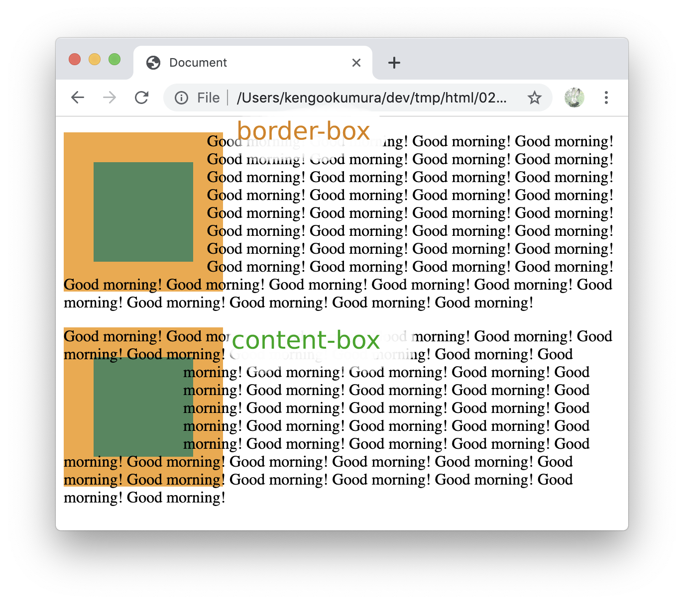
border-box
文字をborderに合わせて回り込むようにする
.hoge {
    float: left;
    shape-outside: border-box;
}
padding-box
文字をpaddingに合わせて回り込むようにする
.hoge {
    float: left;
    shape-outside: padding-box;
}
content-box
文字をpaddingより内側の部分に合わせて回り込むようにする
.hoge {
    float: left;
    shape-outside: content-box;
}
See the Pen css shapes example2 by 奥村健吾 (@okumurakengo) on CodePen.
basic-shape
inset()
四角形が内側にあるように文字の回り込みを指定できます
<div></div>
<p>
    Good morning! Good morning! Good morning! Good morning! Good morning! Good morning!
    Good morning! Good morning! Good morning! Good morning! Good morning! Good morning!
    Good morning! Good morning! Good morning! Good morning! Good morning! Good morning!
    Good morning! Good morning! Good morning! Good morning! Good morning! Good morning!
    Good morning! Good morning! Good morning! Good morning! Good morning! Good morning!
    Good morning! Good morning! Good morning! Good morning! Good morning! Good morning!
    Good morning! Good morning! Good morning! Good morning! Good morning! Good morning!
</p>
div {
    background: seagreen;
    float: left;
    height: 200px;
    width: 200px;
    float: left;
    shape-outside: inset(50px 30px 70px 30px);
}
上、右、下、左で指定していますので、以下のような感じで文字が回り込んでくれます

div {
    float: left;
    shape-outside: inset(50px); /* 上右下左を50pxで指定 */
}
div {
    float: left;
    shape-outside: inset(50px round 30px); /* 上右下左を50px、角丸を30pxで指定 */
}
div {
    float: left;
    shape-outside: inset(50px 25px) /* 上下、右左で指定 */
}
div {
    float: left;
    shape-outside: inset(15% 25px 30% round 20% 70%) /* 上、右左、下、角丸を左上右下70%、右上左下20%で指定 */
}

↓もう少し動きがわかりやすいサンプルです
See the Pen css shapes example3 by 奥村健吾 (@okumurakengo) on CodePen.
inset() だけではないですが、先ほどのmargin-box、border-box、padding-box、content-boxと一緒に使えます
div {
    background: seagreen;
    border: 30px solid orange;
    float: left;
    height: 100px;
    width: 100px;
    float: left;
}

div.box1 {
    shape-outside: inset(10%) border-box;
}

div.box2 {
    shape-outside: inset(10%) content-box;
}
circle()
円の形で指定できます
div {
    background: seagreen;
    height: 200px;
    width: 200px;
    float: left;
    shape-outside: circle(50%);
}
円の半径を50% = boxいっぱいを指定


div {
    background: seagreen;
    height: 200px;
    width: 200px;
    float: left;
    shape-outside: circle(50% at 35% 65%);
}
atでpositionのx、yを指定


See the Pen css shapes example4 by 奥村健吾 (@okumurakengo) on CodePen.
ellipse()
楕円形で指定できます
div {
    background: seagreen;
    height: 200px;
    width: 200px;
    float: left;
    shape-outside: ellipse(50% 25% at 50% 50%);
}
ellipse(半径横 半径縦 at 横位置 縦位置); で楕円形を指定します


See the Pen css shapes example5 by 奥村健吾 (@okumurakengo) on CodePen.
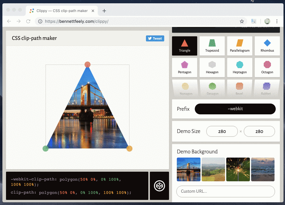
polygon()
座標指定で複雑な図形を指定することができます
div {
    float: left;
    shape-outside: polygon(50% 0%, 66% 33%, 100% 34%, 75% 63%, 84% 100%, 51% 77%, 15% 99%, 27% 62%, 0 35%, 36% 33%);
}
See the Pen css shapes example6 by 奥村健吾 (@okumurakengo) on CodePen.
- こちらのサイトを使うと簡単にpathが作成できました
shape-margin
余白を設定
div {
    background: seagreen;
    height: 200px;
    width: 200px;
    float: left;
    clip-path: polygon(0 0, 150px 150px, 0 150px);
    shape-outside: polygon(0 0, 150px 150px, 0 150px);
    shape-margin: 20px;
}

shape-image-threshold
画像の透明度を指定して、そこに合わせて文字を回り込ませてくれます
例えばこちらの画像を使うと、
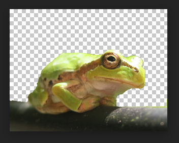
img {
    float: left;
    shape-outside: url('./amagaeru.png');
    shape-image-threshold: 0;
}
このように、透過部分に合わせてくれます
See the Pen css shapes example7 by 奥村健吾 (@okumurakengo) on CodePen.
linear-gradientで調整することもできるようです
div {
    background: linear-gradient(50deg, rgb(77, 26, 103), transparent 60%, transparent);
    height: 200px;
    width: 200px;
    float: left;
    shape-outside: linear-gradient(50deg, rgb(77, 26, 103), transparent 60%, transparent);
    shape-image-threshold: .2;
}

See the Pen css shapes example8 by 奥村健吾 (@okumurakengo) on CodePen.
最後まで読んでくれてありがとうございましたm(_ _)m