Plotlyで3DのSurfaceを描こうとすると、既定の設定では色々と余計なものが付いてきます。それらの消し方をまとめます。ついでに、メッシュの追加方法などについても簡単にまとめます。
1. 特に何も指定しない場合
まずは最小限のコードを書いてみます。出力されたhtmlファイルをブラウザで開くと図が表示されます。あるいは、Jupyter Notebookを使う場合は最後の行をコメントアウトすると直接図が表示されます。
# 必要なパッケージをインポート
import numpy as np
import plotly.graph_objects as go

# 適当なデータを生成
x_arr = np.linspace(-3, 3, 100)
y_arr = np.linspace(-3, 3, 100)
xx_arr, yy_arr = np.meshgrid(x_arr, y_arr)
zz_arr = np.exp(-(xx_arr**2 + yy_arr**2))

# Plotlyで描画、その1
fig = go.Figure()
fig.add_trace(go.Surface(x=x_arr, y=y_arr, z=zz_arr))

# 出力
fig.write_html('tmp.html')
#fig.show() # Jupyter Notebookの場合はコメントアウト
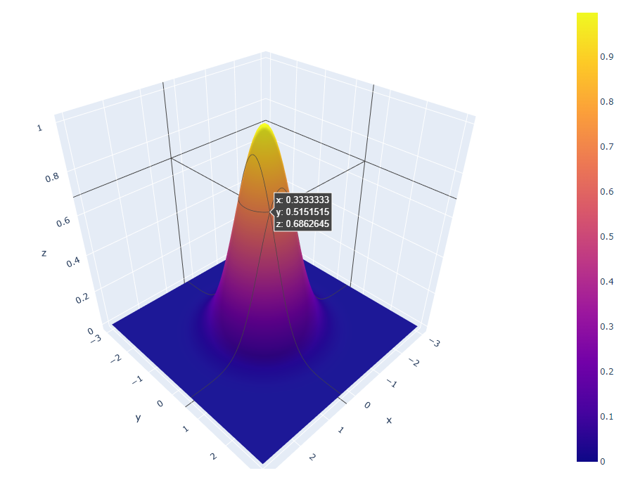
上のような図が出てきました。ごちゃごちゃして見づらいです。
2. マウス位置のxyz座標を消す
hoverinfo='skip' とするとマウス位置のxyz座標の表示が消せます。
# Plotlyで描画、その2
fig = go.Figure()
fig.add_trace(go.Surface(x=x_arr, y=y_arr, z=zz_arr,
                         hoverinfo='skip'))

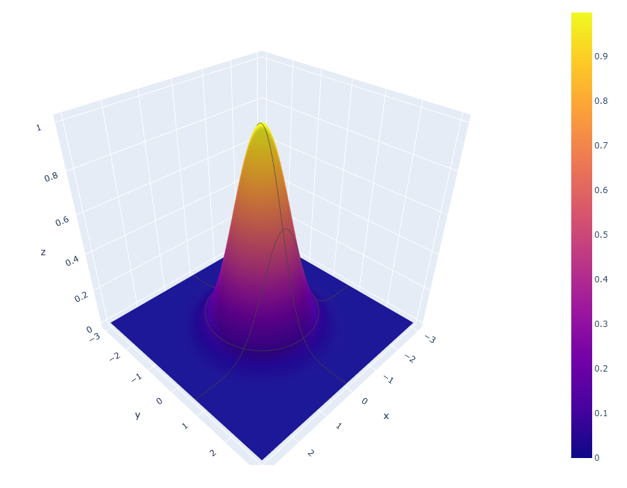
3. マウス位置に対応した各軸の線を消す
すぐ上の図で黒い縦線が2本見えると思います。このような線を消すには、update_scenes を追加し、その中で各軸 (xaxis, yaxis, zaxis) に対して showspikes=False とすると消せます。
# Plotlyで描画、その3
fig = go.Figure()
fig.add_trace(go.Surface(x=x_arr, y=y_arr, z=zz_arr,
                         hoverinfo='skip'))
axis = dict(showspikes=False)
fig.update_scenes(xaxis=axis, yaxis=axis, zaxis=axis)
4. 軸自体を消す
軸自体を消してしまうことも可能です。showspikes の代わりに visible=False とすれば良いです。
# Plotlyで描画、その4
fig = go.Figure()
fig.add_trace(go.Surface(x=x_arr, y=y_arr, z=zz_arr,
                         hoverinfo='skip'))
axis = dict(visible=False)
fig.update_scenes(xaxis=axis, yaxis=axis, zaxis=axis)

5. マウス位置を通る曲線を消す
この方法を見つけるのに物凄く苦労しました。ほとんどのページに書いてありません。結論としては、contours オプションで各軸 (x, y, z) に対し highlight=False を指定すると消せます。
# Plotlyで描画、その5
fig = go.Figure()
contours = dict(x=dict(highlight=False),
                y=dict(highlight=False),
                z=dict(highlight=False))
fig.add_trace(go.Surface(x=x_arr, y=y_arr, z=zz_arr,
                         hoverinfo='skip',
                         contours=contours))
axis = dict(visible=False)
fig.update_scenes(xaxis=axis, yaxis=axis, zaxis=axis)

6. カラーバーを消す
カラーバーは showscale=False で消せます。
# Plotlyで描画、その6
fig = go.Figure()
contours = dict(x=dict(highlight=False),
                y=dict(highlight=False),
                z=dict(highlight=False))
fig.add_trace(go.Surface(x=x_arr, y=y_arr, z=zz_arr,
                         hoverinfo='skip',
                         contours=contours,
                         showscale=False))
axis = dict(visible=False)
fig.update_scenes(xaxis=axis, yaxis=axis, zaxis=axis)

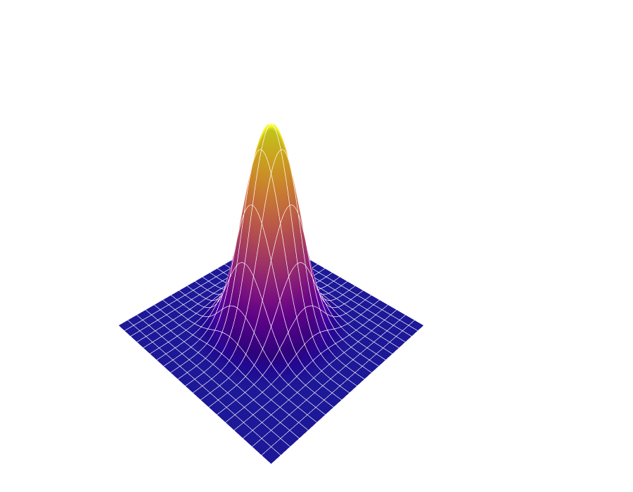
7. メッシュを追加する
余計なものが大体消えたので、今度は必要なものを足してみます。全体的に立体感が足りないのでメッシュを足してみましょう。先ほど無効化した contoursですが、マウスの動きと連動した highlight だけでなく、等間隔に線を引く機能もあります。これだけを有効化します。show=True で、色は color='white' などとします。z軸は分かりづらいのでここではFalseにしておきます。
# Plotlyで描画、その7
fig = go.Figure()
contours = dict(x=dict(highlight=False, show=True, color='white'),
                y=dict(highlight=False, show=True, color='white'),
                z=dict(highlight=False, show=False))
fig.add_trace(go.Surface(x=x_arr, y=y_arr, z=zz_arr,
                         hoverinfo='skip',
                         contours=contours,
                         showscale=False))
axis = dict(visible=False)
fig.update_scenes(xaxis=axis, yaxis=axis, zaxis=axis)

まあまあ良いのですが、初期設定のままだと間隔が広過ぎます。
8. メッシュの間隔を調節する
メッシュの間隔を調節するには、各軸について最小値と最大値を start と end で明示した上で、間隔を size=0.3 などと指定します。startとendが書いていないと効かないので注意して下さい。あと、本数でなく間隔でしか指定できないようなので、間隔は欲しい本数から逆算して下さい。
# Plotlyで描画、その8
fig = go.Figure()
contours = dict(x=dict(highlight=False, show=True, color='white',
                       start=-3, end=3, size=0.3),
                y=dict(highlight=False, show=True, color='white',
                       start=-3, end=3, size=0.3),
                z=dict(highlight=False, show=False))
fig.add_trace(go.Surface(x=x_arr, y=y_arr, z=zz_arr,
                         hoverinfo='skip',
                         contours=contours,
                         showscale=False))
axis = dict(visible=False)
fig.update_scenes(xaxis=axis, yaxis=axis, zaxis=axis)
9. Z方向を縮める
既定の設定だとZ方向が高過ぎてバランスが悪いです。解決法は update_scenes に aspectratio を指定することです。以下の例のようにdictでx, y, zの割合を適宜指定して下さい。取り合えずzを20%に縮めてみます。
# Plotlyで描画、その9
fig = go.Figure()
contours = dict(x=dict(highlight=False, show=True, color='white',
                       start=-3, end=3, size=0.3),
                y=dict(highlight=False, show=True, color='white',
                       start=-3, end=3, size=0.3),
                z=dict(highlight=False, show=False))
fig.add_trace(go.Surface(x=x_arr, y=y_arr, z=zz_arr,
                         hoverinfo='skip',
                         contours=contours,
                         showscale=False))
axis = dict(visible=False)
fig.update_scenes(xaxis=axis, yaxis=axis, zaxis=axis,
                  aspectratio=dict(x=1,y=1,z=0.2))

10. 初期表示を拡大する
実は、aspectratio というオプションはxyzの相対的な比率を表すものではありません。例えばそれぞれを2倍にすると初期表示が2倍に拡大されます。もちろんPlotlyはインタラクティブなので出力後に拡大縮小は可能です。
# Plotlyで描画、その10
fig = go.Figure()
contours = dict(x=dict(highlight=False, show=True, color='white',
                       start=-3, end=3, size=0.3),
                y=dict(highlight=False, show=True, color='white',
                       start=-3, end=3, size=0.3),
                z=dict(highlight=False, show=False))
fig.add_trace(go.Surface(x=x_arr, y=y_arr, z=zz_arr,
                         hoverinfo='skip',
                         contours=contours,
                         showscale=False))
axis = dict(visible=False)
fig.update_scenes(xaxis=axis, yaxis=axis, zaxis=axis,
                  aspectratio=dict(x=2,y=2,z=0.4))

11. 半透明にする
山の裏側が見えないのが気になります。半透明にしてみましょう。Plotlyの場合は opacity=0.8 などとします。
# Plotlyで描画、その11
fig = go.Figure()
contours = dict(x=dict(highlight=False, show=True, color='white',
                       start=-3, end=3, size=0.3),
                y=dict(highlight=False, show=True, color='white',
                       start=-3, end=3, size=0.3),
                z=dict(highlight=False, show=False))
fig.add_trace(go.Surface(x=x_arr, y=y_arr, z=zz_arr,
                         hoverinfo='skip',
                         contours=contours,
                         showscale=False,
                         opacity=0.8))
axis = dict(visible=False)
fig.update_scenes(xaxis=axis, yaxis=axis, zaxis=axis,
                  aspectratio=dict(x=2,y=2,z=0.4))

個人的にはちょっと分かりづらい気がします。他の方法を試してみます。
12. ワイヤーフレームにする
いっそのことSurfaceを消してメッシュだけ残すという手もあります。matplotlibのwireframeに相当します。Surfaceを消すには hidesurface=True とします。メッシュの色は青に変えてみました。
# Plotlyで描画、その12
fig = go.Figure()
contours = dict(x=dict(highlight=False, show=True, color='blue',
                       start=-3, end=3, size=0.3),
                y=dict(highlight=False, show=True, color='blue',
                       start=-3, end=3, size=0.3),
                z=dict(highlight=False, show=False))
fig.add_trace(go.Surface(x=x_arr, y=y_arr, z=zz_arr,
                         hoverinfo='skip',
                         contours=contours,
                         showscale=False,
                         hidesurface=True))
axis = dict(visible=False)
fig.update_scenes(xaxis=axis, yaxis=axis, zaxis=axis,
                  aspectratio=dict(x=2,y=2,z=0.4))

これはこれで使いどころがありそうです。
13. 初期表示の視点を変える
山の裏側が見えないことが問題でした。視点の位置を変え、もっと高い座標点から全体を見下ろす感じにすることでも解決可能です。これは update_scenes の camera_eye オプションで指定できます。初期設定は (x=1.25, y=1.25, z=1.25) です。値は各座標の実際の値でなく、おそらく各軸に関してデータ範囲の最小値を-1、最大値を1に正規化した時の値のようです。
# Plotlyで描画、その13
fig = go.Figure()
contours = dict(x=dict(highlight=False, show=True, color='white',
                       start=-3, end=3, size=0.3),
                y=dict(highlight=False, show=True, color='white',
                       start=-3, end=3, size=0.3),
                z=dict(highlight=False, show=False))
fig.add_trace(go.Surface(x=x_arr, y=y_arr, z=zz_arr,
                         hoverinfo='skip',
                         contours=contours,
                         showscale=False))
axis = dict(visible=False)
fig.update_scenes(xaxis=axis, yaxis=axis, zaxis=axis,
                  aspectratio=dict(x=2,y=2,z=0.4),
                  camera_eye=dict(x=0, y=1.25, z=1.5))

14. カラースケールを変える
Plotlyではmatplotlibで使えるカラースケールのほとんどが使えます。Plotlyで使用可能なカラースケール一覧は こちら にあります。指定方法は colorscale='Earth' などとします。反転させたい場合は reversescale=True を追加します。
# Plotlyで描画、その14
fig = go.Figure()
contours = dict(x=dict(highlight=False, show=True, color='white',
                       start=-3, end=3, size=0.3),
                y=dict(highlight=False, show=True, color='white',
                       start=-3, end=3, size=0.3),
                z=dict(highlight=False, show=False))
fig.add_trace(go.Surface(x=x_arr, y=y_arr, z=zz_arr,
                         hoverinfo='skip',
                         contours=contours,
                         showscale=False,
                         colorscale='Earth',
                         reversescale=True))
axis = dict(visible=False)
fig.update_scenes(xaxis=axis, yaxis=axis, zaxis=axis,
                  aspectratio=dict(x=2,y=2,z=0.4),
                  camera_eye=dict(x=0, y=1.25, z=1.5))

余談ですが、この例では中間ぐらいの高さに輪のようなものが現れています。これは既定のカラースケールの Plasma では見えませんでした。このように、本当は連続的に値が変化しているにも関わらず、カラースケールによっては偽の不連続変化があるように見えてしまう場合があります。これはこれで注意が必要です。
15. 単色にする
表面を単色にしたい場合は、colorscale=[[0, 'green'], [1, 'green']] などとします。つまり、両端に同じ色を指定した自作のカラースケールを作って渡すことで、zの値によらず同じ色にすることが出来ます。
# Plotlyで描画、その15
fig = go.Figure()
contours = dict(x=dict(highlight=False, show=True, color='white',
                       start=-3, end=3, size=0.3),
                y=dict(highlight=False, show=True, color='white',
                       start=-3, end=3, size=0.3),
                z=dict(highlight=False, show=False))
fig.add_trace(go.Surface(x=x_arr, y=y_arr, z=zz_arr,
                         hoverinfo='skip',
                         contours=contours,
                         showscale=False,
                         colorscale=[[0, 'green'], [1, 'green']]))
axis = dict(visible=False)
fig.update_scenes(xaxis=axis, yaxis=axis, zaxis=axis,
                  aspectratio=dict(x=2,y=2,z=0.4),
                  camera_eye=dict(x=0, y=1.25, z=1.5))

15. 影を左または右に付ける
PlotlyのSurfaceでは光源位置 lightposition を指定可能ですが、様々なバグが報告されていて、修正される気配もありません。なので細かい調整はできません。
x, y, zはそれぞれ-10^5から10^5の範囲を指定可能ですが、xは-1000以下または1000以上、yは1000以上の範囲で調節し、zは0に固定するのが良いと私は思います。特にzは極めて意味不明な挙動をするので下手にいじらない方が良いです。
lightpositionのxは、データのx軸ではなく、画面上の左右方向に対応します。右がプラス、左がマイナスです。同様に、lightpositionのyは、データのy軸ではなく、画面上の上下方向に対応します。上がプラス、下がマイナスです。ではzは画面に対して垂直な奥行き方向かというと全然そうではないので、時間を無駄にしたくない人は調べない方が良いです。
lightposition=dict(x=10**5, y=10**4, z=0) とすると、光源は右遠方のやや上にくるため、左側に影が付きます。逆に、lightposition=dict(x=-10**5, y=10**4, z=0) とすると、光源が左遠方のやや上になり、右側に影が付きます。
# Plotlyで描画、その16
fig = go.Figure()
contours = dict(x=dict(highlight=False, show=True, color='white',
                       start=-3, end=3, size=0.3),
                y=dict(highlight=False, show=True, color='white',
                       start=-3, end=3, size=0.3),
                z=dict(highlight=False, show=False))
fig.add_trace(go.Surface(x=x_arr, y=y_arr, z=zz_arr,
                         hoverinfo='skip',
                         contours=contours,
                         showscale=False,
                         lightposition=dict(x=10**5, y=10**4, z=0)))
axis = dict(visible=False)
fig.update_scenes(xaxis=axis, yaxis=axis, zaxis=axis,
                  aspectratio=dict(x=2,y=2,z=0.4),
                  camera_eye=dict(x=0, y=1.25, z=1.5))
fig.write_html('tmp.html')
x=10**5 の場合

x=-10**5 の場合
