WPF でおしゃれっぽい画面を作るときに多くの人がお世話になる MahApps.Metro と Material Design In XAML Toolkit の導入方法をメモっておきます。
プロジェクト作成
普通に WPF アプリのプロジェクトを作ります。私は、.NET 5 で作ってますが .NET Core 3.1 でもほぼ同じ手順だと思います。
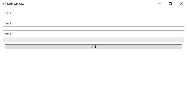
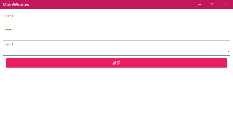
白いウィンドウだけだと何が変わったのかわかりづらいと思うので、MainWindow.xaml をちょっと書き換えてコントロールを置いておきます。
<Window
    x:Class="WpfApp1.MainWindow"
    xmlns="http://schemas.microsoft.com/winfx/2006/xaml/presentation"
    xmlns:x="http://schemas.microsoft.com/winfx/2006/xaml"
    xmlns:d="http://schemas.microsoft.com/expression/blend/2008"
    xmlns:local="clr-namespace:WpfApp1"
    xmlns:mc="http://schemas.openxmlformats.org/markup-compatibility/2006"
    Title="MainWindow"
    Width="800"
    Height="450"
    mc:Ignorable="d">
    <StackPanel Margin="10">
        <Label Content="Item1" />
        <TextBox />
        <Label Content="Item2" />
        <TextBox />
        <Label Content="Item1" />
        <ComboBox />
        <Button Margin="10" Content="送信" />
    </StackPanel>
</Window>
実行するとこんな見た目です。
適用してみよう
ということで見た目変えていきます。
MaterialDesignThemes.MahApps を追加します。自動で MahApps.Metro も依存先にあるので入るのですが、2.0.0 が追加されたので、手動で MahApps.Metro の最新版を追加しました。私がやった時点での最新版は 2.3.3 でした。
App.xaml に MahApps.Metro と MaterialDesignThemes 用のリソースを追加します。
この Issue にある App.xaml の例からまるっと拝借してきます。
https://github.com/MaterialDesignInXAML/MaterialDesignInXamlToolkit/issues/1896
<Application
    x:Class="WpfApp1.App"
    xmlns="http://schemas.microsoft.com/winfx/2006/xaml/presentation"
    xmlns:x="http://schemas.microsoft.com/winfx/2006/xaml"
    xmlns:local="clr-namespace:WpfApp1"
    StartupUri="MainWindow.xaml">
    <Application.Resources>
        <ResourceDictionary>

            <ResourceDictionary.MergedDictionaries>

                <!--  MahApps  -->
                <ResourceDictionary Source="pack://application:,,,/MahApps.Metro;component/Styles/Controls.xaml" />
                <ResourceDictionary Source="pack://application:,,,/MahApps.Metro;component/Styles/Fonts.xaml" />
                <ResourceDictionary Source="pack://application:,,,/MahApps.Metro;component/Styles/Themes/Light.Violet.xaml" />

                <!--  Material Design  -->
                <ResourceDictionary Source="pack://application:,,,/MaterialDesignThemes.Wpf;component/Themes/MaterialDesignTheme.Light.xaml" />
                <ResourceDictionary Source="pack://application:,,,/MaterialDesignThemes.Wpf;component/Themes/MaterialDesignTheme.Defaults.xaml" />
                <ResourceDictionary Source="pack://application:,,,/MaterialDesignColors;component/Themes/Recommended/Primary/MaterialDesignColor.DeepPurple.xaml" />
                <ResourceDictionary Source="pack://application:,,,/MaterialDesignColors;component/Themes/Recommended/Accent/MaterialDesignColor.Lime.xaml" />

                <!--  Material Design: MahApps Compatibility  -->
                <ResourceDictionary Source="pack://application:,,,/MaterialDesignThemes.MahApps;component/Themes/MaterialDesignTheme.MahApps.Fonts.xaml" />
                <ResourceDictionary Source="pack://application:,,,/MaterialDesignThemes.MahApps;component/Themes/MaterialDesignTheme.MahApps.Flyout.xaml" />

            </ResourceDictionary.MergedDictionaries>

            <!--  MahApps Brushes  -->
            <SolidColorBrush x:Key="MahApps.Brushes.Highlight" Color="{DynamicResource Primary700}" />
            <SolidColorBrush x:Key="MahApps.Brushes.AccentBase" Color="{DynamicResource Primary600}" />
            <SolidColorBrush x:Key="MahApps.Brushes.Accent" Color="{DynamicResource Primary500}" />
            <SolidColorBrush x:Key="MahApps.Brushes.Accent2" Color="{DynamicResource Primary400}" />
            <SolidColorBrush x:Key="MahApps.Brushes.Accent3" Color="{DynamicResource Primary300}" />
            <SolidColorBrush x:Key="MahApps.Brushes.Accent4" Color="{DynamicResource Primary200}" />
            <SolidColorBrush x:Key="MahApps.Brushes.WindowTitle" Color="{DynamicResource Primary700}" />
            <SolidColorBrush x:Key="MahApps.Brushes.Selected.Foreground" Color="{DynamicResource Primary500Foreground}" />
            <LinearGradientBrush x:Key="MahApps.Brushes.Progress" StartPoint="1.002,0.5" EndPoint="0.001,0.5">
                <GradientStop Offset="0" Color="{DynamicResource Primary700}" />
                <GradientStop Offset="1" Color="{DynamicResource Primary300}" />
            </LinearGradientBrush>
            <SolidColorBrush x:Key="MahApps.Brushes.CheckmarkFill" Color="{DynamicResource Primary500}" />
            <SolidColorBrush x:Key="MahApps.Brushes.RightArrowFill" Color="{DynamicResource Primary500}" />
            <SolidColorBrush x:Key="MahApps.Brushes.IdealForeground" Color="{DynamicResource Primary500Foreground}" />
            <SolidColorBrush
                x:Key="MahApps.Brushes.IdealForegroundDisabled"
                Opacity="0.4"
                Color="{DynamicResource Primary500}" />

        </ResourceDictionary>
    </Application.Resources>
</Application>
MainWindow.xaml も MetroWindow を継承するようにするのと GlowBrush と BorderThickness を設定するように変更します。
<mah:MetroWindow
    x:Class="WpfApp1.MainWindow"
    xmlns="http://schemas.microsoft.com/winfx/2006/xaml/presentation"
    xmlns:x="http://schemas.microsoft.com/winfx/2006/xaml"
    xmlns:d="http://schemas.microsoft.com/expression/blend/2008"
    xmlns:local="clr-namespace:WpfApp1"
    xmlns:mah="clr-namespace:MahApps.Metro.Controls;assembly=MahApps.Metro"
    xmlns:mc="http://schemas.openxmlformats.org/markup-compatibility/2006"
    Title="MainWindow"
    GlowBrush="{DynamicResource AccentColorBrush}"
    BorderThickness="1"
    Width="800"
    Height="450"
    mc:Ignorable="d">
    <StackPanel Margin="10">
        <Label Content="Item1" />
        <TextBox />
        <Label Content="Item2" />
        <TextBox />
        <Label Content="Item1" />
        <ComboBox />
        <Button Margin="10" Content="送信" />
    </StackPanel>
</mah:MetroWindow>
MainWindow.xaml.cs の方も基本クラスを Window から MetroWindow に変更します。
using MahApps.Metro.Controls;

namespace WpfApp1
{
    /// <summary>
    /// Interaction logic for MainWindow.xaml
    /// </summary>
    public partial class MainWindow : MetroWindow
    {
        public MainWindow()
        {
            InitializeComponent();
        }
    }
}
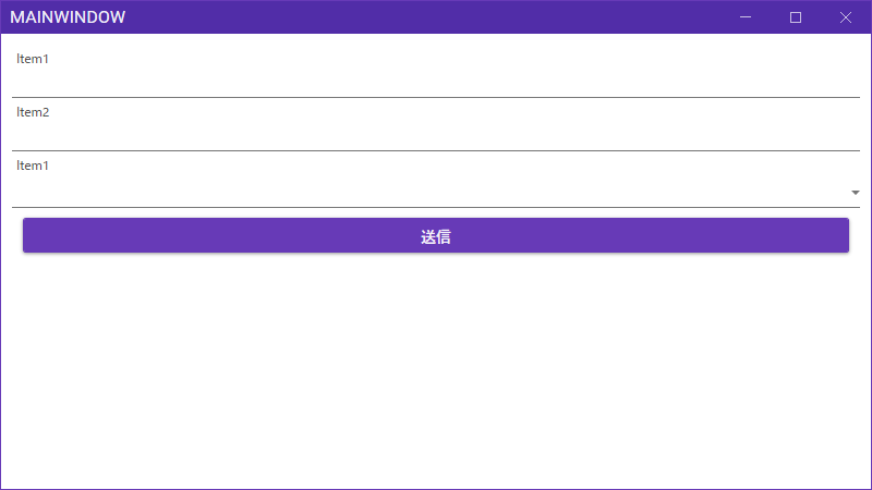
これで実行するといい感じの見た目になっているはずです。
微調整
テーマカラーを変えたい
とりあえず App.xaml にある以下の定義の部分で DeepPurple を指定しているので、そこを変更すると全体的に色が変わります。
<ResourceDictionary Source="pack://application:,,,/MaterialDesignColors;component/Themes/Recommended/Primary/MaterialDesignColor.DeepPurple.xaml" />
指定できる XAML は以下のリポジトリで確認できます。
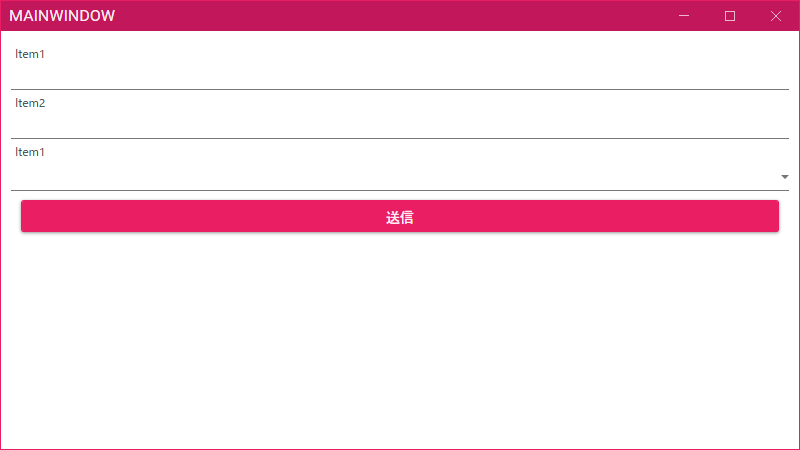
例えば Pink を指定すると以下のような感じになります。
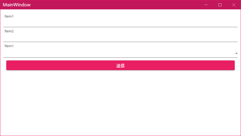
Window タイトルが大文字になるのを辞めたい
MetroWindow に TitleCharacterCasing というプロパティがあるので、ここに Nromal を設定しましょう。MainWindow.xaml で以下のように指定します。
<mah:MetroWindow
    x:Class="WpfApp1.MainWindow"
    xmlns="http://schemas.microsoft.com/winfx/2006/xaml/presentation"
    xmlns:x="http://schemas.microsoft.com/winfx/2006/xaml"
    xmlns:d="http://schemas.microsoft.com/expression/blend/2008"
    xmlns:local="clr-namespace:WpfApp1"
    xmlns:mah="clr-namespace:MahApps.Metro.Controls;assembly=MahApps.Metro"
    xmlns:mc="http://schemas.openxmlformats.org/markup-compatibility/2006"
    Title="MainWindow"
    Width="800"
    Height="450"
    BorderThickness="1"
    GlowBrush="{DynamicResource AccentColorBrush}"
    TitleCharacterCasing="Normal"
    mc:Ignorable="d">
    <StackPanel Margin="10">
        <Label Content="Item1" />
        <TextBox />
        <Label Content="Item2" />
        <TextBox />
        <Label Content="Item1" />
        <ComboBox />
        <Button Margin="10" Content="送信" />
    </StackPanel>
</mah:MetroWindow>
これで大文字にならなくなりました。
ボタンのフォントがちょっと太い…
ボタンがボールド体とまではいかないのですが、ちょっと太くなってしまっています。
MaterialDesignThemes のソースを見てみると Button に既定であたるスタイルは MaterialDesignRaisedButton というキーで定義されていることがわかります。
<!-- https://github.com/MaterialDesignInXAML/MaterialDesignInXamlToolkit/blob/cde5d53823a05d2ad2695dc7d0735878256d690b/MaterialDesignThemes.Wpf/Themes/MaterialDesignTheme.Defaults.xaml -->
<Style TargetType="{x:Type Button}" BasedOn="{StaticResource MaterialDesignRaisedButton}" />
そして、その定義を見てみると…、あっ、ハードコードしてますね。
    <Style x:Key="MaterialDesignRaisedButton" TargetType="{x:Type ButtonBase}">
        <Setter Property="FocusVisualStyle" Value="{StaticResource FocusVisual}"/>
        <Setter Property="Background" Value="{DynamicResource PrimaryHueMidBrush}"/>
        <Setter Property="BorderBrush" Value="{DynamicResource PrimaryHueMidBrush}"/>
        <Setter Property="Foreground" Value="{DynamicResource PrimaryHueMidForegroundBrush}"/>
        <Setter Property="wpf:ButtonProgressAssist.IndicatorForeground" Value="{DynamicResource PrimaryHueMidForegroundBrush}" />
        <Setter Property="wpf:ButtonProgressAssist.IndicatorBackground" Value="{DynamicResource PrimaryHueMidBrush}" />
        <Setter Property="wpf:RippleAssist.Feedback" Value="White" />
        <Setter Property="Cursor" Value="Hand"/>
        <Setter Property="wpf:ShadowAssist.ShadowDepth" Value="Depth1" />
        <Setter Property="TextBlock.FontWeight" Value="Medium"/> <!-- まじか!? -->
        <Setter Property="TextBlock.FontSize" Value="14"/>
なので、気に入らない場合は App.xaml でデフォルトのボタンにあたるスタイルを上書きしてやればいいです。こんな感じになります。
<Application
    x:Class="WpfApp1.App"
    xmlns="http://schemas.microsoft.com/winfx/2006/xaml/presentation"
    xmlns:x="http://schemas.microsoft.com/winfx/2006/xaml"
    xmlns:local="clr-namespace:WpfApp1"
    StartupUri="MainWindow.xaml">
    <Application.Resources>
        <ResourceDictionary>

            <ResourceDictionary.MergedDictionaries>

                <!--  MahApps  -->
                <ResourceDictionary Source="pack://application:,,,/MahApps.Metro;component/Styles/Controls.xaml" />
                <ResourceDictionary Source="pack://application:,,,/MahApps.Metro;component/Styles/Fonts.xaml" />
                <ResourceDictionary Source="pack://application:,,,/MahApps.Metro;component/Styles/Themes/Light.Violet.xaml" />

                <!--  Material Design  -->
                <ResourceDictionary Source="pack://application:,,,/MaterialDesignThemes.Wpf;component/Themes/MaterialDesignTheme.Light.xaml" />
                <ResourceDictionary Source="pack://application:,,,/MaterialDesignThemes.Wpf;component/Themes/MaterialDesignTheme.Defaults.xaml" />
                <ResourceDictionary Source="pack://application:,,,/MaterialDesignColors;component/Themes/Recommended/Primary/MaterialDesignColor.Pink.xaml" />
                <ResourceDictionary Source="pack://application:,,,/MaterialDesignColors;component/Themes/Recommended/Accent/MaterialDesignColor.Green.xaml" />

                <!--  Material Design: MahApps Compatibility  -->
                <ResourceDictionary Source="pack://application:,,,/MaterialDesignThemes.MahApps;component/Themes/MaterialDesignTheme.MahApps.Fonts.xaml" />
                <ResourceDictionary Source="pack://application:,,,/MaterialDesignThemes.MahApps;component/Themes/MaterialDesignTheme.MahApps.Flyout.xaml" />

            </ResourceDictionary.MergedDictionaries>

            <!--  MahApps Brushes  -->
            <SolidColorBrush x:Key="MahApps.Brushes.Highlight" Color="{DynamicResource Primary700}" />
            <SolidColorBrush x:Key="MahApps.Brushes.AccentBase" Color="{DynamicResource Primary600}" />
            <SolidColorBrush x:Key="MahApps.Brushes.Accent" Color="{DynamicResource Primary500}" />
            <SolidColorBrush x:Key="MahApps.Brushes.Accent2" Color="{DynamicResource Primary400}" />
            <SolidColorBrush x:Key="MahApps.Brushes.Accent3" Color="{DynamicResource Primary300}" />
            <SolidColorBrush x:Key="MahApps.Brushes.Accent4" Color="{DynamicResource Primary200}" />
            <SolidColorBrush x:Key="MahApps.Brushes.WindowTitle" Color="{DynamicResource Primary700}" />
            <SolidColorBrush x:Key="MahApps.Brushes.Selected.Foreground" Color="{DynamicResource Primary500Foreground}" />
            <LinearGradientBrush x:Key="MahApps.Brushes.Progress" StartPoint="1.002,0.5" EndPoint="0.001,0.5">
                <GradientStop Offset="0" Color="{DynamicResource Primary700}" />
                <GradientStop Offset="1" Color="{DynamicResource Primary300}" />
            </LinearGradientBrush>
            <SolidColorBrush x:Key="MahApps.Brushes.CheckmarkFill" Color="{DynamicResource Primary500}" />
            <SolidColorBrush x:Key="MahApps.Brushes.RightArrowFill" Color="{DynamicResource Primary500}" />
            <SolidColorBrush x:Key="MahApps.Brushes.IdealForeground" Color="{DynamicResource Primary500Foreground}" />
            <SolidColorBrush
                x:Key="MahApps.Brushes.IdealForegroundDisabled"
                Opacity="0.4"
                Color="{DynamicResource Primary500}" />

            <!-- ボタンのテキストは普通の太さのフォントにしたい -->
            <Style BasedOn="{StaticResource MaterialDesignRaisedButton}" TargetType="{x:Type Button}">
                <Setter Property="FontWeight" Value="Normal" />
            </Style>
        </ResourceDictionary>
    </Application.Resources>
</Application>
これで実行すると、以下のようにフォントが普通の太さになります。全部のボタンがこうなるのが嫌な場合は x:Key を Style に指定して自分で太字にしたくないボタンに対してだけスタイルを指定してやりましょう。
他のコントロールで見た目が気に入らない場合も、この方法と同じ手順でカスタマイズが出来ます。
まとめ
Wiki の内容が古くてちょっと大変だった。