環境
使用する OS は MacOSX です。私の環境は以下の通り
% sw_vers
ProductName:    Mac OS X
ProductVersion: 10.12.6
BuildVersion:   16G29
使用するコマンドは以下のとおり
% create-react-app --version
1.4.0
% getstorybook --version
3.2.9
これらのコマンドを最新の状態にするには npm i -g create-react-app @storybook/cli を実行します。
練習用のプロジェクトディレクトリを準備
プロジェクトを生成し、storybook を導入する。ついでに react-icons をあらかじめ install しておく
create-react-app tutorial-atomic-design && cd $_
getstorybook -f
yarn add  react-icons --save
components 用のディクレトリと作成予定のファイルを生成
mkdir src/components
touch src/components/{Buttons.js,Ratings.js,Cards.js}
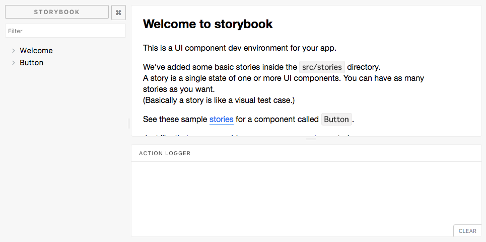
yarn run storybook を実行して http://localhost:9009/ を開きます。以下の画面が表示される事を確認します。
本記事で扱う Atomic design について
Atomic design は5つのパートに分かれていますが、本記事では以下のパートを採用します。小さなパーツを積み上げて大きなパーツが出来上がっている過程を真似ているだけなのでこの記事の説明は厳密でないかもしれませんが Atomic design と react-storybook がやろうとしていることが非常に似ているので本記事で紹介している react-storybook の tutorial を通じて Atomic design の概念に触れることができると思います。本記事では小さなパーツから大きなパーツへ組み立てていくのですが、小さなパーツと大きなパーツを以下のように分類しています。
ATOMS = 原子
MOLECULES = 分子
ORGANISMS = 有機体
また CSS の記述方法は src/index.css に追記するものとします。今回の記事では CSS in JS は採用しません.
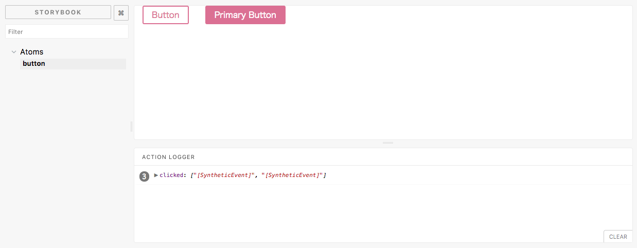
原子: button を作成
create src/components/Buttons.js
import React from "react";
import "../index.css";

export const Button = ({ primary, children, onClick }) => {

  const className = primary ? "btn btn-primary" : "btn";

  return(
    <div className={className} onClick={onClick}>
      {children}
    </div>
  )
};
edit src/stories/index.js
import React from 'react';

import { storiesOf } from '@storybook/react';
import { action } from '@storybook/addon-actions';
import { linkTo } from '@storybook/addon-links';

import { Button } from '../components/Buttons';

storiesOf('Atoms', module)
  .add('button', () =>
    <div style={{display: "flex"}}>
      <Button onClick={action('clicked')}>btn</Button>
      <Button primary onClick={action('clicked')}>btn-primary</Button>
    </div>
  )
edit src/index.css
body {
  margin: 0;
  padding: 0;
  font-family: sans-serif;
  font-size: 14px;
}

.btn {
  display: flex;
  align-items: center;
  border-radius: 3px;
  padding: 0.25em 1em;
  margin: 0 1em;  // 本当は親component が padding で制御したほうがよい
  background: transparent;
  color: palevioletred;
  border: 2px solid palevioletred;
}

.btn-primary {
  background: palevioletred;
  color: white;
}
動作確認
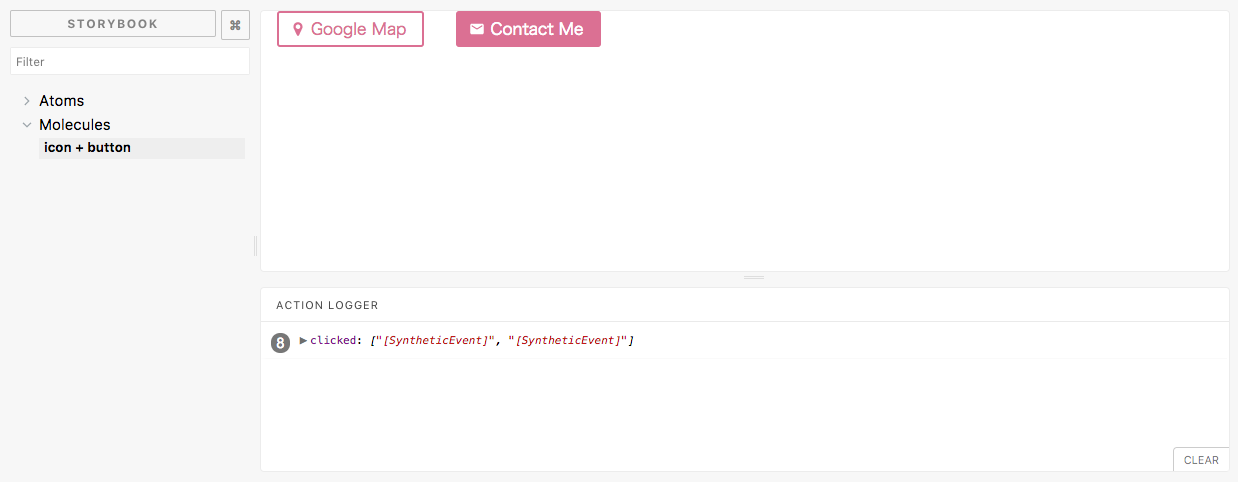
分子: iconButton を作成
次に react-icons を使用してアイコン付きのボタンを作成します。
edit src/components/Buttons.js
import React from "react";
import "../index.css";

import FaMapMarker from 'react-icons/lib/fa/map-marker';
import MdEmail from 'react-icons/lib/md/email';

export const Button = ({ primary, icon, children, onClick }) => {

  const className = primary ? "btn btn-primary" : "btn";

  let IconComponent;
  switch (icon) {
  case "map":
      IconComponent = () => <span className="btn-icon"><FaMapMarker /></span>
      break
  case "contact":
      IconComponent = () => <span className="btn-icon"><MdEmail /></span>
      break
  default:
      IconComponent = () => null
  }

  return(
    <div className={className} onClick={onClick}>
      {icon && <IconComponent />}
      {children}
    </div>
  )
};
edit src/index.css
   background: palevioletred;
   color: white;
 }
+
+.btn-icon {
+  display: flex;
+  padding: 0 5px 0 0;
+  margin-left: -5px;
+}
ecit src/stories/index.js
+
+storiesOf('Molecules', module)
+  .add('icon + button', () =>
+    <div style={{display: "flex"}}>
+      <Button icon="map" onClick={action('clicked')}>Google Map</Button>
+      <Button icon="contact" primary onClick={action('clicked')}>Contact Me</Button>
+    </div>
+  )
動作確認
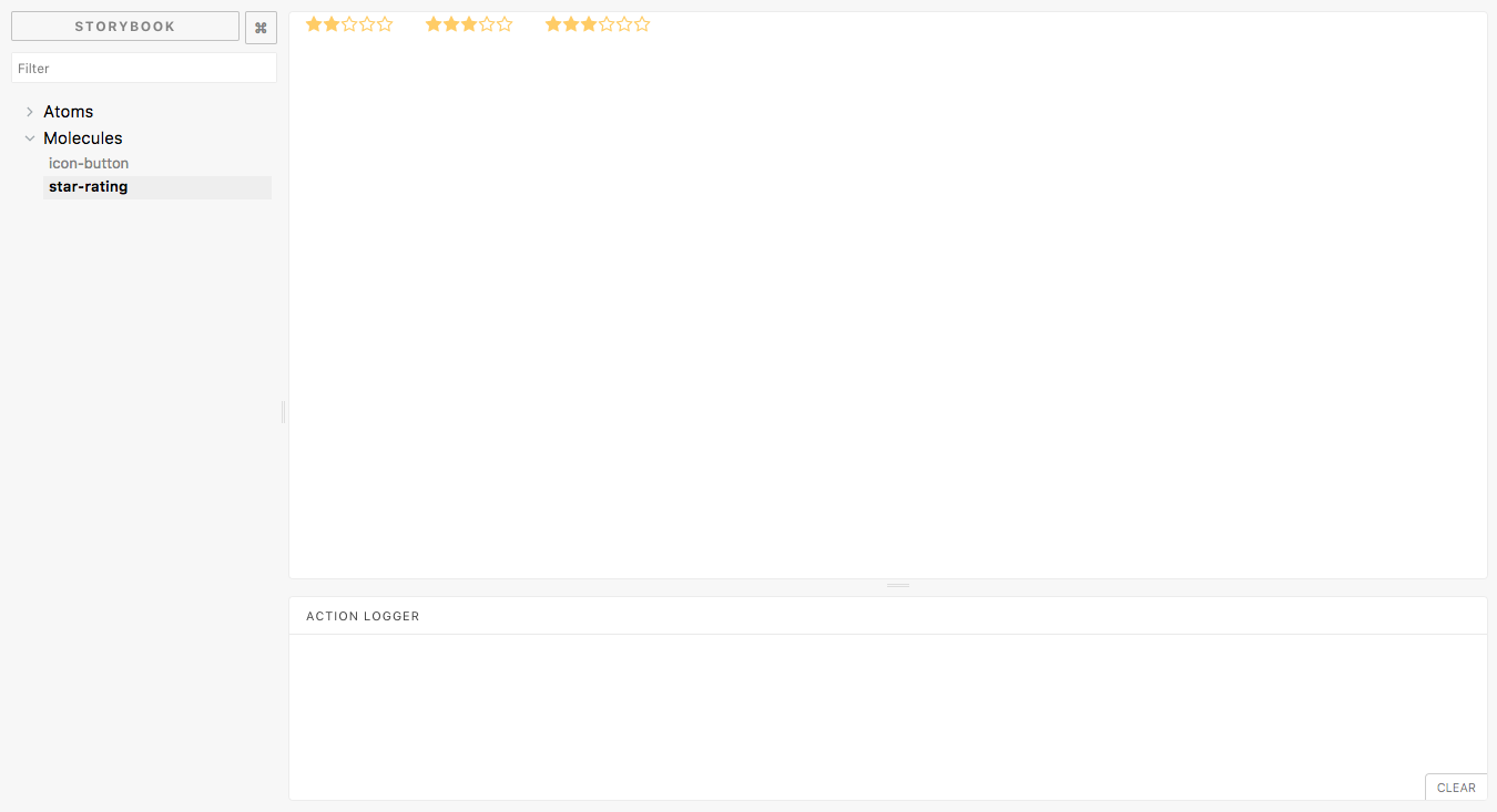
分子: star-rating を作成
create src/components/Ratings.js
import React from "react";
import "../index.css";

import FaStarO from "react-icons/lib/fa/star-o";
import FaStar from "react-icons/lib/fa/star";

const StarIcon = ({color, size, empty}) => {
  return (empty ? <FaStarO size={size} color={color} /> : <FaStar size={size} color={color} />)
}

export const StarRating = (props) => {

  const rating = props.rating || 3;
  const total = props.total || 5;

  const iconProps = []
  for (let i = 0; i < total; i++) {
    iconProps.push({empty: i >= rating})
  }

  return (
    <div className="star-rating">
      {iconProps.map((prop, index) => (
        <StarIcon key={index} color="#ffcc66" size={16} empty={prop.empty} />
      ))}
    </div>
  )
}
edit src/index.css
   padding: 0 5px 0 0;
   margin-left: -5px;
 }
+
+.star-rating {
+  margin: 0 1em;
+  padding-bottom: 5px;
+}
edit src/stories/index.js
 import { linkTo } from '@storybook/addon-links';

 import { Button } from '../components/Buttons';
+import { StarRating } from '../components/Ratings';

 storiesOf('Atoms', module)
   .add('button', () =>
@@ -21,3 +23,10 @@ storiesOf('Molecules', module)
       <Button icon="contact" primary onClick={action('clicked')}>Contact Me</Button>
     </div>
   )
+  .add('star-rating', () =>
+    <div style={{display: "flex", flexDirection: "columns"}}>
+      <StarRating rating={2} total={5} />
+      <StarRating rating={3} total={5} />
+      <StarRating rating={3} total={6} />
+    </div>
+  )
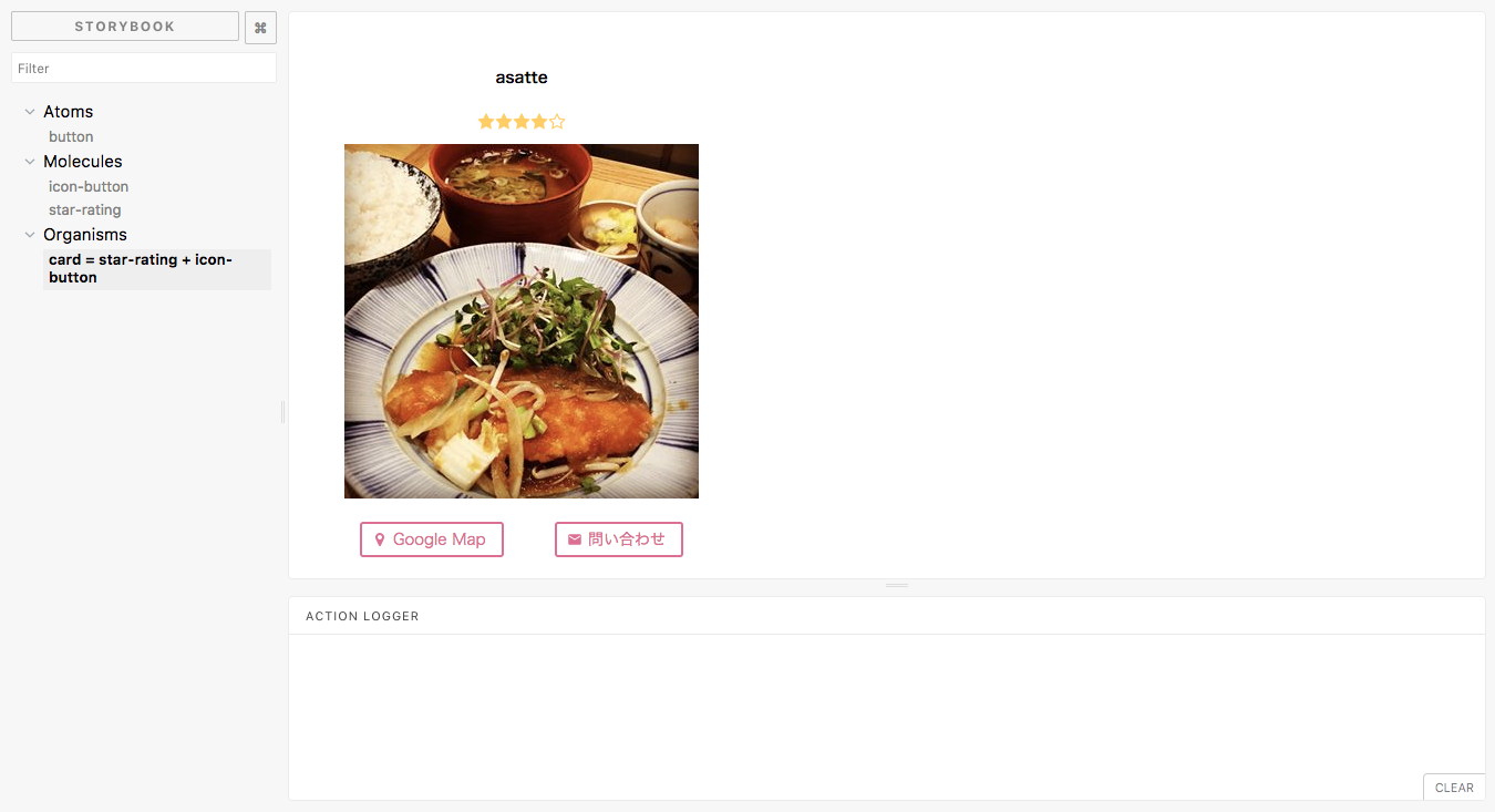
有機体: Card layout + star-rating + iconButton を作成
create src/components/Cards.js
import React from "react";
import "../index.css";

import { Button } from './Buttons';
import { StarRating } from './Ratings';

export const Card = ({title, rating, onClick }) => {

  return(
    <div className="card">
      <h4>{title}</h4>
      <div className="star-rating"><StarRating rating={rating} total={5} /></div>
      <div className="thumbnail">
        <img src="https://scontent-nrt1-1.cdninstagram.com/t51.2885-15/s320x320/e35/21689115_104174550297726_4853457458460360704_n.jpg" />
      </div>
      <div className="buttons">
        <Button icon="map" onClick={onClick}>Google Map</Button>
        <Button icon="contact" onClick={onClick}>問い合わせ</Button>
      </div>
    </div>
  )
};
edit src/index.css
   padding-bottom: 5px;
 }

+.card {
+  display: flex;
+  text-align: center;
+  flex-direction: column;
+  width: 360px;
+}
+
+.card .thumbnail {
+  width: 100%;
+}
+
+.card .buttons {
+  padding: 15px 20px;
+  display: flex;
+  justify-content: space-between;
+}
edit src/stories/index.js
+
+storiesOf('Organisms', module)
+  .add('card = star-rating + icon-button', () =>
+    <div style={{display: "flex", padding: "30px"}}>
+      <Card title="asatte" rating={4} onClick={action('clicked')} />
+    </div>
+  )
動作確認
まとめ
というわけで 原子である button component と icon compnent(react-icons) を組み合わせて、分子となる icon-button component を作成しました。また、原子である icon component(react-icons) を組み合わせて分子となる rating component を作成しました。
最後に分子である icon-button component と rating component を組み合わせて有機体となる card component を作成しました。
このように細かいパーツから component 化をしていくと再利用しやすいですし、動きのあるデザインも作りやすくなると思うのでフロントエンドエンジニアだけでなくデザイナーやコーダーのみなさんも是非お試しください。