Python の描画ライブラリ「matplotlib」を扱う上で,忘れがちなことメモです.
- 更新履歴
2016-11-11 「ax.annotate 文字と矢印」を追加,見出しを微調整
2016-11-11 「Locator 目盛り位置」を追加
2016-12-16 「Locator 目盛り位置」をアップデート
2017-02-11  凡例を「枠外に出す」方法を追加
- 環境
- Anaconda 4.0.0 (Python 2.7.13)
- CentOS 6.5
- 今後の追加予定(2016-11-11)
- cmap
- plt.xlim() = ax.set_xlim()
忘れがちプロット
plt.fill_between 塗りつぶし
範囲指定の塗りつぶしプロット
plt.fill_between(time, value1, value2)
plt.fill_betweenx(depth, profile1, profile2) # 鉛直分布を書くとき
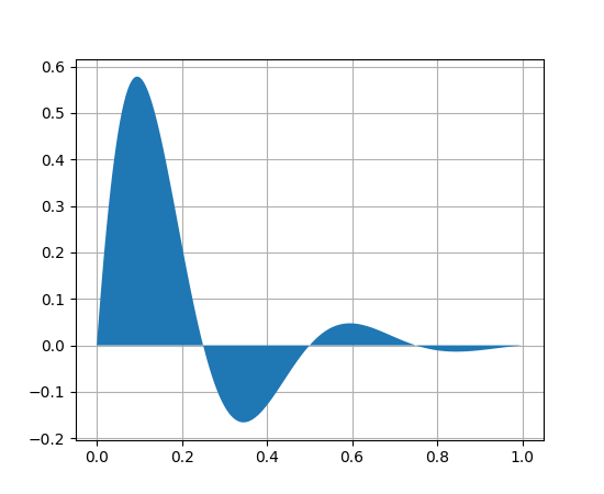
http://matplotlib.org/api/pyplot_api.html#matplotlib.pyplot.fill_between
plt.errorbar エラーバー
エラーバー付きプロット
plt.errorbar(time, value, yerr=value_std)
plt.errorbar(profile, depth, xerr=profile_std) # 鉛直分布なら
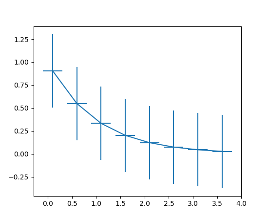
http://matplotlib.org/api/pyplot_api.html#matplotlib.pyplot.errorbar
df.plot pandas用プロット
pandas.DataFrame のプロット
df.plot(x='time', y='value1', ls='-', marker='o', color='k')
df.plot(x='time', y=['value1','value2']) # 複数ラインを1つのグラフに描写.
df.plot(x='time', y=['value1','value2'], subplots=True, layout=(1,2)) # ax[0], ax[1]にそれぞれ描写
- x はデフォルトで
indexなので省略可能だが,y として指定する方法がわからない.(y='index'はエラーになる) - y 省略は全 column をプロット
plt.semilogy 対数軸プロット
plt.semilogy(x, y) # y軸が対数
plt.semilogx(x, y) # x軸が対数
plt.loglog(x, y) # 両対数
ax.plot(x, y)
ax.set_xscale("log") # あとからでも設定可能
ax.set_yscale("log", nonposy='clip') # 負になる場合の対処.'mask'もある
http://matplotlib.org/examples/pylab_examples/log_demo.html
http://matplotlib.org/api/pyplot_api.html#matplotlib.pyplot.semilogy
ax.annotate 文字と矢印
ax.annotate('arrowstyle',
            xy=(0, 1), xycoords='data',      # 矢印の先(xy)を軸の値(data)で指定
            xytext=(-50, 30),
            textcoords='offset points',      # 文字の位置(xytext)を矢印の先からの相対距離(offset points)で指定
            arrowprops=dict(arrowstyle="->")
            )
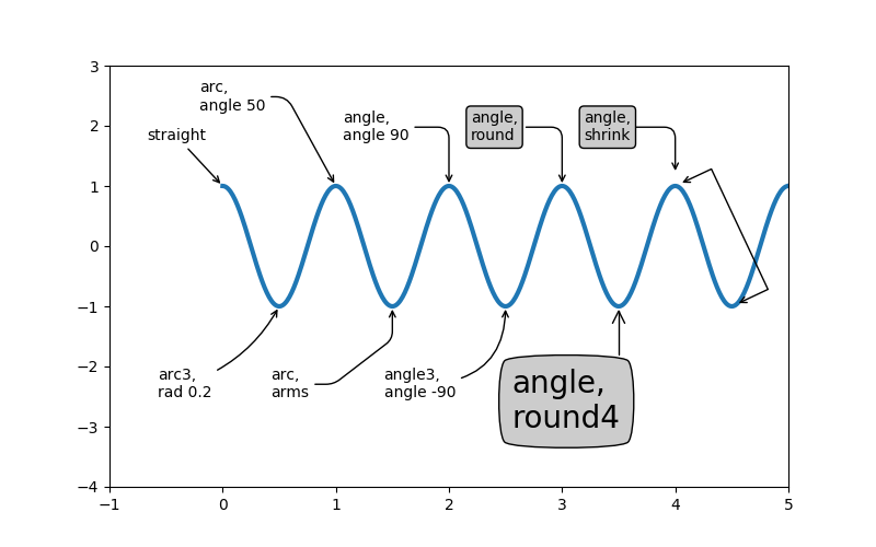
http://matplotlib.org/examples/pylab_examples/annotation_demo2.html
忘れがち軸設定
ax.set_xticklabels([]) ラベルを消す
軸のラベル(数字や日付部分)を消す
fig, ax = plt.subplots(1,2)

ax[0].set_xticklabels([]) # 上の図のx軸を消す
DateFormatter 日付の書式変更
時刻軸のフォーマットを変更する
from matplotlib.dates import DateFormatter

ax.xaxis.set_major_formatter(DateFormatter('%m/%d\n%H:%M'))
Locator 目盛り位置
数値軸
from matplotlib import ticker

ax.xaxis.set_major_locator(ticker.MultipleLocator(20))           # 20ごと
ax.xaxis.set_major_locator(ticker.MaxNLocator(5))                # 最大5個
時刻軸
from matplotlib import dates as mdates

ax.xaxis.set_major_locator(mdates.AutoDateLocator(maxticks=8))   # 最大8個
ax.xaxis.set_major_locator(mdates.HourLocator(12))               # 12時
ax.xaxis.set_major_locator(mdates.HourLocator(interval=24))      # 24時間ごと
ax.xaxis.set_major_locator(mdates.DayLocator(np.arange(1,31,7))) # 1週間ごと
忘れがちオプション
plt.savefig 保存
背景透過
plt.savefig(filename, transparent=True) # default: False
余白を小さく
plt.savefig(filename, bbox_inches='tight')
plt.legend 凡例
並べ方の変更
plt.legend(ncol=2) # 各凡例が横に並ぶ数(default: 1)
マーカの数
plt.legend(numpoints=1) # marker の数をひとつにする(default: なぜか 2)
枠外に出す
plt.legend(bbox_to_anchor=(1.01,1), loc=2, borderaxespad=0)
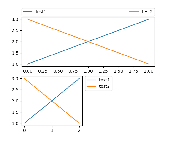
http://matplotlib.org/users/legend_guide.html#legend-location
その他
plt.rcParams[] 設定
描画前にフォント等の設定をしておけばてっとりばやい
plt.rcParams["font.size"] = 12 # フォントサイズを変更(default: 10?)
matplotlibrc デフォルト設定
それよかデフォルト設定を変更しておくとさらに楽なので,matplotlibrc を編集する
matplotlibrc
legend.numpoints = 1
plt.style.use スタイル
全体的なデサインの変更
plt.style.use('ggplot')