はじめに
1)ChatGPTにグラフを作ってもらうとデザイン性があまり良くないので思った通りのグラフにならないことが多いです
2)今回は一度Claudeにデザインを作ってもらいロジック部分をChatGPTで仕上げて汎用化したテンプレートを作りました。
3)初めに手の込んだグラフのサンプルを作っておけばアレンジはしやすい。という発想で追加指示をするといいです(後述)
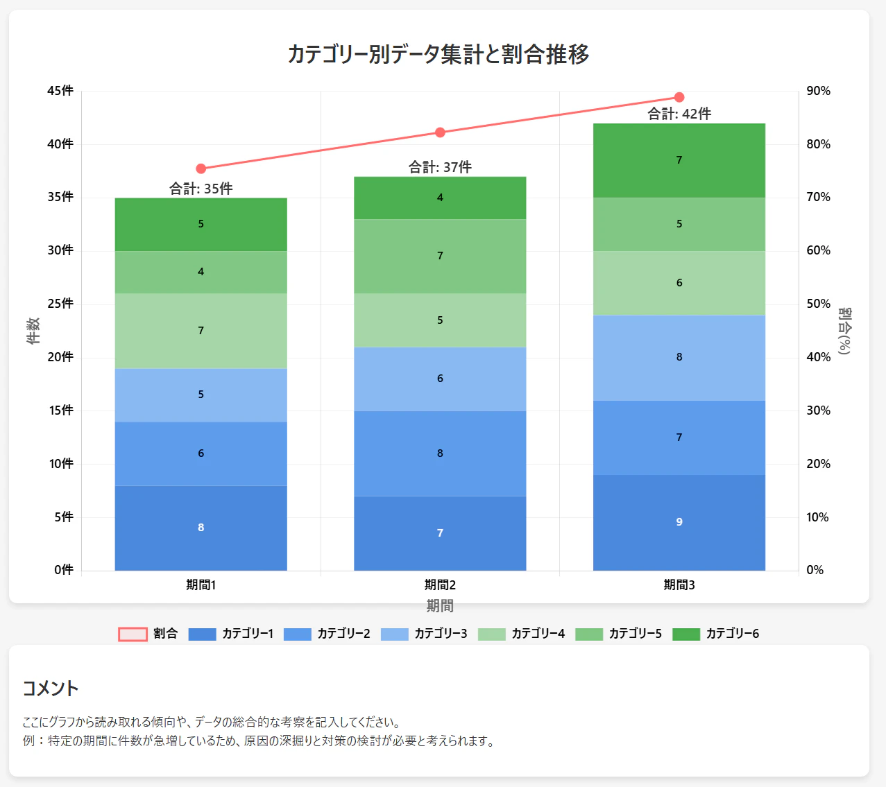
テンプレートの出力図(空っぽ)
これがベースになります。なかなかきれいなグラフです。
プロンプト文
そのまま生成AIに貼り付けてください。(o1かo3-miniがおすすめです)
あなたはプレゼン書類作成のプロフェッショナルです。
以下の要件を理解して、新しいグラフを作成してください。

・提供されたデータを理解して、適切なグラフを提供してください。
・グラフはデータに合わせて形を変えても問題ないです。
・提供されたデータからユーザーがどのような情報を知りたいかを想像して適切なグラフを提供してください
・グラフの色に意味を持たせてください。


【1. 基本情報】
タイトル:{タイトルを記入}

【2. 軸設定】
■左軸(積み上げ棒)
・範囲:0-450
・目盛:50単位
・単位:なし
・ラベル:「件数」

■右軸(折れ線)
・範囲:0-10%
・目盛:1%単位
・単位:%表示
・ラベル:「変化率」

【3. データ構成】
■入力データ(月別)
{YYYY年MM月}
グループ1:A+B={数値}, C={数値}, D={数値}
グループ2:A+B={数値}, C={数値}, D={数値}
変化率:{数値}%

※以下、月別データを同形式で記載

【4. デザイン仕様】
■フォント
・書体:Yu Gothic UI
・サイズ:
  - タイトル:20px
  - 軸ラベル:14px
  - 数値:12px
  - 凡例:12px

■配色
・積み上げ棒(青系統)
  - A+B:#4B89DC
  - C:#5D9CEC
  - D:#89B9F2
・折れ線:#FF6B6B

■グリッド
・横線のみ表示
・色:rgba(0,0,0,0.1)

【5. 表示要素】
■数値表示
・各セグメント:セグメント内に値を表示
・合計値:棒グラフ上部に「計: {数値}」形式
・変化率:小数点2位まで表示

■凡例
・位置:グラフ下部
・表示項目:A+B, C, D, 変化率
・グループ2は非表示

【6. インタラクション】
■ホバー時
・ツールチップ表示
・背景:白(透明度95%)
・枠線:#ddd

■クリック時
・詳細ポップアップ表示
・3秒後に自動非表示

【7. レスポンシブ対応】
・画面幅768px未満:
  - フォントサイズ20%縮小
  - グラフ幅95%に調整

【8. 印刷設定】
・背景色:白
・影効果:非表示
・グリッド線:維持

【9. アクセシビリティ】
・コントラスト比:4.5:1以上
・フォントの可読性確保
・代替テキスト対応

【10. 特記事項】
・データ欠損時は null 使用
・千桁区切りカンマ表示
・軽量化のためアニメーション省略可
・ブラウザ互換性:モダンブラウザ対応
・下段にコメント欄を掲載し、グラフから読み取れる情報を500文字程度で分かりやすく具体的に記載する。


参考コード:
<!DOCTYPE html>
<html lang="ja">
<head>
  <meta charset="UTF-8" />
  <meta name="viewport" content="width=device-width, initial-scale=1.0" />
  <title>データ集計グラフ</title>
  <script src="https://cdn.jsdelivr.net/npm/chart.js"></script>
  <style>
    body {
      background: #f5f5f5;
      margin: 0;
      padding: 0;
    }
    .chart-container {
      width: 90%;
      max-width: 1200px;
      height: 70vh;
      min-height: 500px;
      margin: 40px auto 60px; /* 下部マージンを確保 */
      padding: 20px;
      background: #fff;
      border-radius: 12px;
      box-shadow: 0 4px 8px rgba(0, 0, 0, 0.1);
    }
    .chart-title {
      text-align: center;
      font-family: 'Yu Gothic UI', sans-serif;
      font-size: 32px;
      font-weight: bold;
      margin-bottom: 20px;
      color: #333;
    }
    /* コメント欄のスタイル */
    .chart-summary-container {
      width: 90%;
      max-width: 1200px;
      margin: 60px auto 40px;  /* 上部マージンを確保 */
      padding: 20px;
      background: #fff;
      border-radius: 12px;
      box-shadow: 0 4px 8px rgba(0, 0, 0, 0.1);
    }
    .chart-summary-title {
      font-family: 'Yu Gothic UI', sans-serif;
      font-size: 28px;
      font-weight: bold;
      color: #333;
      margin-bottom: 10px;
      text-align: left; /* 左寄せ */
    }
    .chart-summary-text {
      font-family: 'Yu Gothic UI', sans-serif;
      font-size: 18px;
      color: #333;
      line-height: 1.5;
      text-align: left;
    }
    @media (max-width: 768px) {
      .chart-container,
      .chart-summary-container {
        width: 95%;
        height: auto;
      }
    }
  </style>
</head>
<body>
  <div class="chart-container">
    <h1 class="chart-title">カテゴリー別データ集計と割合推移</h1>
    <!-- roleとaria-labelでアクセシビリティ対応 -->
    <canvas id="myChart" role="img" aria-label="カテゴリー別データ集計と割合推移のグラフ"></canvas>
  </div>

  <!-- コメント欄 -->
  <div class="chart-summary-container">
    <h2 class="chart-summary-title">コメント</h2>
    <p class="chart-summary-text">
      ここにグラフから読み取れる傾向や、データの総合的な考察を記入してください。<br>
      例:特定の期間に件数が急増しているため、原因の深掘りと対策の検討が必要と考えられます。
    </p>
  </div>

  <script>
    // ─────────────────────────────
    // 補助関数:背景色に合わせたコントラストの良い文字色を取得
    // ─────────────────────────────
    function getContrastColor(hexcolor) {
      if (hexcolor[0] === '#') hexcolor = hexcolor.slice(1);
      if (hexcolor.length === 3) {
        hexcolor = hexcolor[0] + hexcolor[0] +
                   hexcolor[1] + hexcolor[1] +
                   hexcolor[2] + hexcolor[2];
      }
      const r = parseInt(hexcolor.substr(0, 2), 16);
      const g = parseInt(hexcolor.substr(2, 2), 16);
      const b = parseInt(hexcolor.substr(4, 2), 16);
      const brightness = (r * 299 + g * 587 + b * 114) / 1000;
      return brightness > 128 ? '#000000' : '#ffffff';
    }

    // ─────────────────────────────
    // サンプルデータ(今後、ここを変更するだけでグラフ生成可能)
    // ─────────────────────────────
    const chartData = {
      labels: ['期間1', '期間2', '期間3'],
      categories: [
        { label: 'カテゴリー1', color: '#4B89DC', data: [8, 7, 9] },
        { label: 'カテゴリー2', color: '#5D9CEC', data: [6, 8, 7] },
        { label: 'カテゴリー3', color: '#89B9F2', data: [5, 6, 8] },
        { label: 'カテゴリー4', color: '#A5D6A7', data: [7, 5, 6] },
        { label: 'カテゴリー5', color: '#81C784', data: [4, 7, 5] },
        { label: 'カテゴリー6', color: '#4CAF50', data: [5, 4, 7] }
      ],
      ratio: [75.5, 82.3, 88.9]
    };

    // ─────────────────────────────
    // データからdatasetsを自動生成する関数
    // ─────────────────────────────
    function createChartDatasets(data) {
      const datasets = [];
      // バーチャート用:各カテゴリーのデータ
      data.categories.forEach((item) => {
        datasets.push({
          type: 'bar',
          label: item.label,
          backgroundColor: item.color,
          data: item.data,
          stack: 'dataStack',
          order: 2,
          borderWidth: 0
        });
      });
      // 折れ線グラフ用:割合
      datasets.push({
        type: 'line',
        label: '割合',
        data: data.ratio,
        borderColor: '#FF6B6B',
        backgroundColor: 'rgba(255,107,107,0.1)',
        borderWidth: 3,
        yAxisID: 'y1',
        tension: 0.4,
        order: 1,
        pointRadius: 6,
        pointHoverRadius: 8,
        pointBackgroundColor: '#FF6B6B'
      });
      return datasets;
    }

    // ─────────────────────────────
    // プラグイン:バーの上に各積み上げ合計値を表示
    // ─────────────────────────────
    const totalLabelPlugin = {
      id: 'totalLabelPlugin',
      afterDatasetsDraw(chart, args, options) {
        const { ctx, data, scales: { x, y } } = chart;
        ctx.save();
        ctx.font = 'bold 20px "Yu Gothic UI", sans-serif';
        ctx.fillStyle = options.textColor || '#333';
        ctx.textAlign = 'center';

        data.labels.forEach((label, index) => {
          let total = 0;
          data.datasets.forEach((dataset) => {
            if (dataset.type === 'bar') {
              total += dataset.data[index] || 0;
            }
          });
          const xPos = x.getPixelForValue(index);
          const yPos = y.getPixelForValue(total) - 12;
          ctx.fillText(`合計: ${total}件`, xPos, yPos);
        });
        ctx.restore();
      }
    };

    // ─────────────────────────────
    // プラグイン:各積み上げバー部分に数値を表示
    // ─────────────────────────────
    const dataSegmentLabelPlugin = {
      id: 'dataSegmentLabelPlugin',
      afterDatasetsDraw(chart, args, options) {
        const { ctx } = chart;
        ctx.save();
        // 各bar datasetごとに処理
        chart.data.datasets.forEach((dataset, datasetIndex) => {
          if (dataset.type === 'bar') {
            const meta = chart.getDatasetMeta(datasetIndex);
            meta.data.forEach((element, index) => {
              const value = dataset.data[index];
              if (value === 0) return;
              const x = element.x;
              const y = (element.y + element.base) / 2;
              let bgColor = dataset.backgroundColor;
              if (Array.isArray(bgColor)) {
                bgColor = bgColor[index] || '#000000';
              }
              const textColor = getContrastColor(bgColor);
              ctx.fillStyle = textColor;
              ctx.font = 'bold 16px "Yu Gothic UI", sans-serif';
              ctx.textAlign = 'center';
              ctx.textBaseline = 'middle';
              ctx.fillText(value, x, y);
            });
          }
        });
        ctx.restore();
      }
    };

    // ─────────────────────────────
    // チャートの設定を作成する関数
    // ─────────────────────────────
    function buildChartConfig(data) {
      return {
        type: 'bar',
        data: {
          labels: data.labels,
          datasets: createChartDatasets(data)
        },
        plugins: [totalLabelPlugin, dataSegmentLabelPlugin],
        options: {
          responsive: true,
          maintainAspectRatio: false,
          interaction: {
            intersect: false,
            mode: 'index'
          },
          animation: {
            duration: 1000,
            easing: 'easeInOutQuart'
          },
          plugins: {
            legend: {
              position: 'bottom',
              labels: {
                font: {
                  family: 'Yu Gothic UI, sans-serif',
                  size: 18,
                  weight: 'bold'
                },
                padding: 15
              }
            },
            tooltip: {
              backgroundColor: 'rgba(255, 255, 255, 0.95)',
              titleColor: '#333',
              bodyColor: '#666',
              borderColor: 'rgba(0, 0, 0, 0.1)',
              borderWidth: 1,
              padding: 12,
              titleFont: {
                family: 'Yu Gothic UI, sans-serif',
                size: 18,
                weight: 'bold'
              },
              bodyFont: {
                family: 'Yu Gothic UI, sans-serif',
                size: 16
              },
              callbacks: {
                label: function (context) {
                  const label = context.dataset.label || '';
                  if (context.dataset.type === 'line') {
                    return `${label}: ${context.parsed.y.toFixed(1)}%`;
                  }
                  return `${label}: ${context.parsed.y}件`;
                }
              }
            }
          },
          scales: {
            x: {
              title: {
                display: true,
                text: '期間',
                font: {
                  family: 'Yu Gothic UI, sans-serif',
                  size: 20,
                  weight: 'bold'
                }
              },
              ticks: {
                font: {
                  family: 'Yu Gothic UI, sans-serif',
                  size: 18,
                  weight: 'bold'
                }
              }
            },
            y: {
              stacked: true,
              beginAtZero: true,
              title: {
                display: true,
                text: '件数',
                font: {
                  family: 'Yu Gothic UI, sans-serif',
                  size: 20,
                  weight: 'bold'
                }
              },
              grid: {
                color: 'rgba(128, 128, 128, 0.1)'
              },
              ticks: {
                font: {
                  family: 'Yu Gothic UI, sans-serif',
                  size: 18,
                  weight: 'bold'
                },
                callback: function (value) {
                  return value + '件';
                }
              }
            },
            y1: {
              position: 'right',
              beginAtZero: true,
              title: {
                display: true,
                text: '割合(%)',
                font: {
                  family: 'Yu Gothic UI, sans-serif',
                  size: 20,
                  weight: 'bold'
                }
              },
              grid: {
                display: false
              },
              ticks: {
                font: {
                  family: 'Yu Gothic UI, sans-serif',
                  size: 18,
                  weight: 'bold'
                },
                callback: function (value) {
                  return value + '%';
                }
              }
            }
          }
        }
      };
    }

    // ─────────────────────────────
    // チャートの初期化
    // ─────────────────────────────
    const ctx = document.getElementById('myChart').getContext('2d');
    const chartConfig = buildChartConfig(chartData);
    const myChart = new Chart(ctx, chartConfig);

    // ※ Chart.js のレスポンシブ対応(resizeイベントは通常不要ですが…)
    window.addEventListener('resize', () => {
      myChart.resize();
    });

    // ─────────────────────────────
    // ダークモードの自動調整
    // ─────────────────────────────
    function applyDarkMode(isDark) {
      const container = document.querySelector('.chart-container');
      const title = document.querySelector('.chart-title');
      if (isDark) {
        container.style.backgroundColor = '#2d2d2d';
        title.style.color = '#ffffff';
        myChart.options.scales.x.ticks.color = '#ffffff';
        myChart.options.scales.y.ticks.color = '#ffffff';
        myChart.options.scales.y1.ticks.color = '#ffffff';
        myChart.options.plugins.legend.labels.color = '#ffffff';
      } else {
        container.style.backgroundColor = '#fff';
        title.style.color = '#333';
        myChart.options.scales.x.ticks.color = '#000';
        myChart.options.scales.y.ticks.color = '#000';
        myChart.options.scales.y1.ticks.color = '#000';
        myChart.options.plugins.legend.labels.color = '#000';
      }
      myChart.update();
    }

    // 初回チェック&システムテーマ変更への対応
    const darkModeMediaQuery = window.matchMedia('(prefers-color-scheme: dark)');
    applyDarkMode(darkModeMediaQuery.matches);
    darkModeMediaQuery.addEventListener('change', (e) => {
      applyDarkMode(e.matches);
    });
  </script>
</body>
</html>


■今回のインプット
(次のチャットで指示をします。待機してください)
指示用プロンプト文
サンプルを出す場合はざっくりとした指示をしてください。
実際に値がある場合は、Excelをコピーして貼り付けるなどしてください。
IT保守運用サービスの過去3か月のインシデント報告件数を作成してください
出力した後の追加指示例:
円グラフにしてみてください
デザインを変更する場合の例:
グラフの色を赤系にしてください
作成例
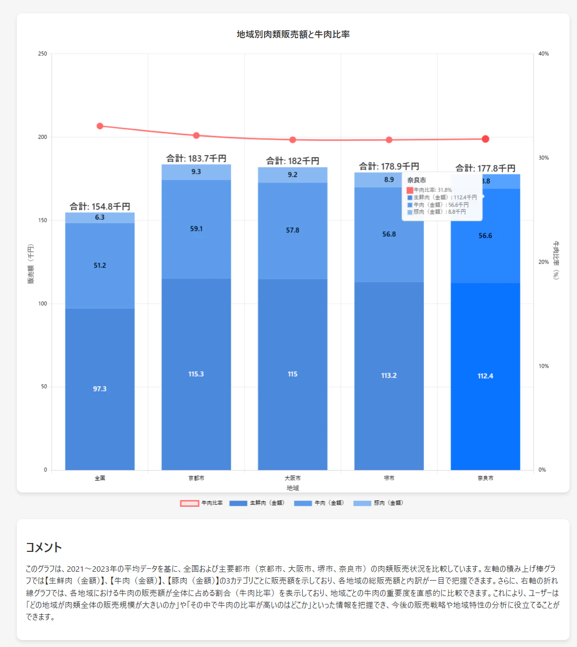
統計局から取得した家計調査のExcelを無邪気に貼り付けたグラフです。
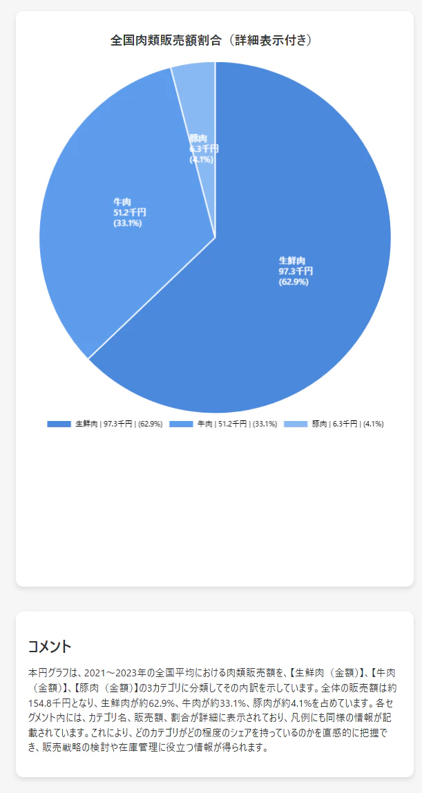
円グラフにしてみた図です
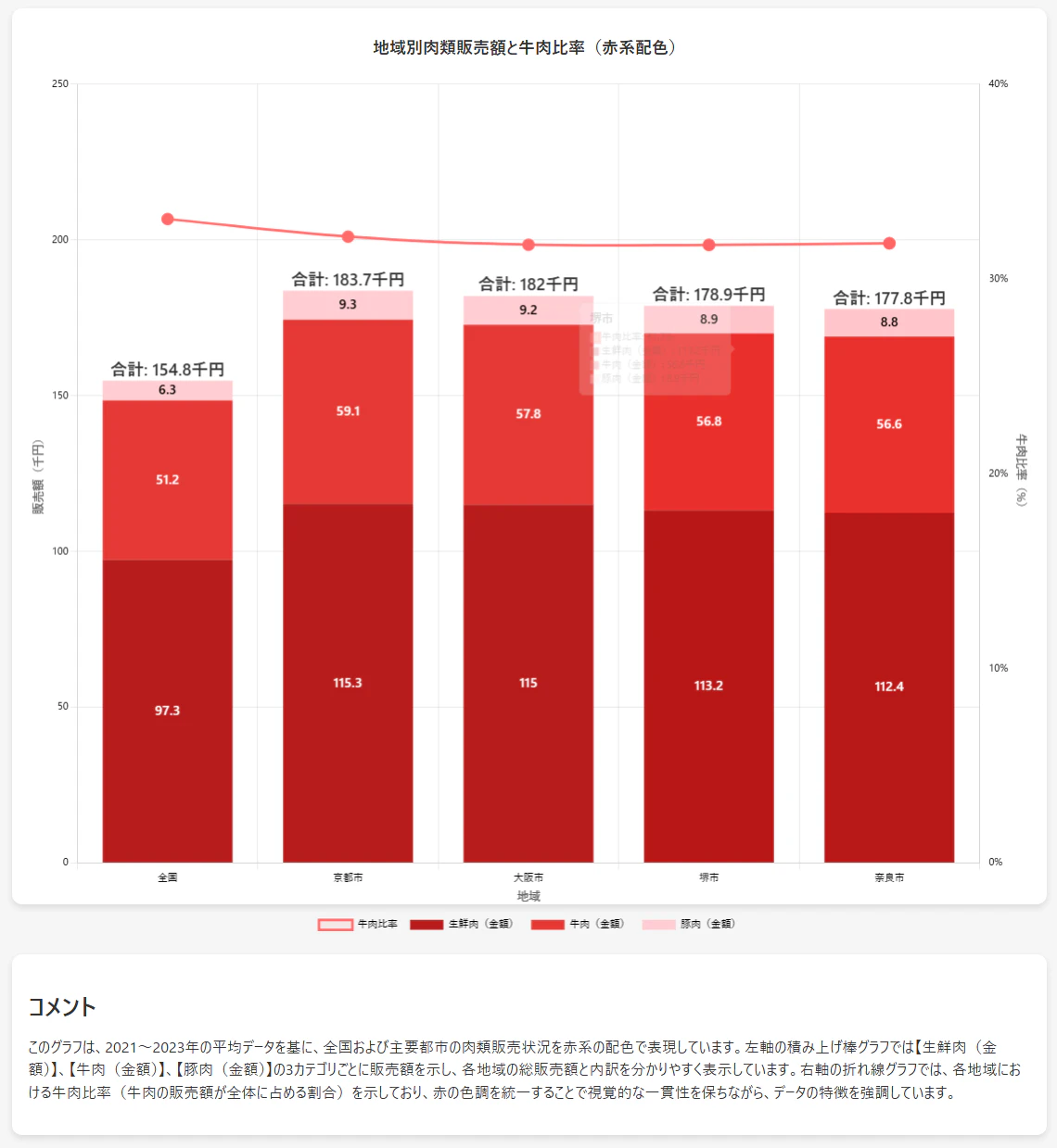
赤系にしてみた図です
以上です。
一度出たグラフのHTMLに、「もっとこうしてください」という指示を出すとさらに望む形になると思います。o1やo3-miniといった長文を扱えるモデルを使うと成功しやすいです。
皆さまの生産性が少しでも向上することを心からお祈りしております。
気に言って頂けましたら「❤いいね」を押して頂けると嬉しいです。
▼ プロンプト集を用意しています。ぜひご覧ください▼