はじめに
あまり知られていないかもしれませんが、Svelteを使ってWeb Componentsを開発することができます。
本記事ではSvelteを使ってWeb Componentsを開発するやり方を紹介したいと思います。
Web Componentsとは
Web Componentsは、WebプラットフォームAPIのセットで、WebページやWebアプリケーションで使用する、新しいカスタム、再利用可能な、カプセル化されたHTMLタグを作成することを可能にします。カスタムコンポーネントとウィジェットはWeb Componentsの標準に基づいて構築され、モダンブラウザで動作し、HTMLで動作するあらゆるJavaScriptライブラリやフレームワークで使用することができます。
Web Componentsは、既存のWeb標準をベースにしています。Web Componentsをサポートする機能は現在 HTML と DOM の仕様に追加されており、ウェブ開発者はカプセル化されたスタイルとカスタム動作を持つ新しい要素で HTML を簡単に拡張することができます。
準備
Svelteの新規プロジェクトをviteを使って作成します。
今回はsvelte-tsを指定してTypeScriptが動く状態にしています。
※ ちなみにsvelteを指定するとJavaScriptプロジェクトが作成されます。
npm create vite@latest my-web-components -- --template svelte-ts
開発
今回はアプリケーションの作成はしません。src/App.svelteは不要なので削除します。
src/main.tsを以下のように変更することでsrc/lib/Counter.svelteのコンポーネントをエクスポートできるようになります。
- import App from './App.svelte'

- const app = new App({
-  target: document.getElementById('app')
- })

- export default app

+ export * from './lib/Counter.svelte'
次に、SvelteコンポーネントをWeb Componentsとしてビルドするために<svelte:options>タグをコンポーネントに追加します。
割り当てられたタグは、後で通常のHTML要素として使用されるタグです。
今回の例の場合は<my-counter></my-counter>で呼び出せます。
+ <svelte:options tag="my-counter" />

<script lang="ts">
  let count: number = 0
  const increment = () => {
    count += 1
  }
</script>

<button on:click={increment}>
  Clicks: {count}
</button>

<style>
  button {
    font-family: inherit;
    font-size: inherit;
    padding: 1em 2em;
    color: #ff3e00;
    background-color: rgba(255, 62, 0, 0.1);
    border-radius: 2em;
    border: 2px solid rgba(255, 62, 0, 0);
    outline: none;
    width: 200px;
    font-variant-numeric: tabular-nums;
    cursor: pointer;
  }

  button:focus {
    border: 2px solid #ff3e00;
  }

  button:active {
    background-color: rgba(255, 62, 0, 0.2);
  }
</style>
次に、生成されるWeb Componentsを試せるようにindex.htmlを変更します。
<div id="app"></div>は不要なので削除し、<my-counter></my-counter>を追加します。
<!DOCTYPE html>
<html lang="en">
  <head>
    <meta charset="UTF-8" />
    <link rel="icon" href="/favicon.ico" />
    <meta name="viewport" content="width=device-width, initial-scale=1.0" />
    <title>Svelte + TS + Vite App</title>
  </head>
  <body>
-   <div id="app"></div>
+   <my-counter></my-counter>
    <script type="module" src="/src/main.ts"></script>
  </body>
</html>
最後に、SvelteコンポーネントをWeb Componentsとしてコンパイルすることをコンパイラに設定します。
import { defineConfig } from 'vite'
import { svelte } from '@sveltejs/vite-plugin-svelte'

// https://vitejs.dev/config/
export default defineConfig({
+  plugins: [svelte({
+    compilerOptions: {
+      customElement: true,
+    },
+  }),]
})
これでSvelteコンポーネントがWeb Componentsとして動作するはずです。npm run devで動かしてみましょう。
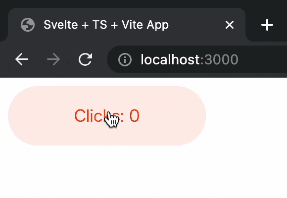
動きました
もう1つコンポーネントを作ってみます。
QiitaのAPIを使って記事をfetchして表示するだけのコンポーネントを作りました。
<svelte:options tag="my-articles" />

<script>
  import { onMount } from 'svelte';

  let articles = [];

  onMount(async () => {
    const res = await fetch('https://qiita.com/api/v2/items?page=1&per_page=20');
    articles = await res.json();
  });
</script>

{#each articles as article}
  <p>
    <a href={article.url}>{article.title}</a>
  </p>
{:else}
  <p>loading...</p>
{/each}

<style>
  a {
    color: red;
    text-decoration: none;
  }

  a:hover {
    text-decoration: underline;
  }
</style>
次にsrc/main.tsへexportを追加します。
export * from './lib/Counter.svelte'
+ export * from './lib/Articles.svelte'
最後にindex.htmlに<my-articles></my-articles>を追加します。
<!DOCTYPE html>
<html lang="en">
  <head>
    <meta charset="UTF-8" />
    <link rel="icon" href="/favicon.ico" />
    <meta name="viewport" content="width=device-width, initial-scale=1.0" />
    <title>Svelte + TS + Vite App</title>
  </head>
  <body>
    <my-counter></my-counter>
+   <my-articles></my-articles>
    <script type="module" src="/src/main.ts"></script>
  </body>
</html>
npm run devで動かしてみましょう。
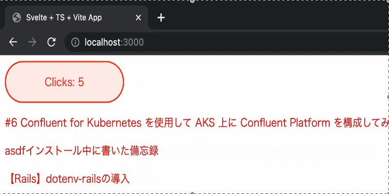
動きました
ビルド
ライブラリとしてビルドして使うことが多いと思いますのでその設定をしていきます。
単一のファイルとしてビルドしたい場合
単一のファイルとしてビルドしたい場合はviteのlibオプションを設定します。
import { defineConfig } from 'vite'
import { svelte } from '@sveltejs/vite-plugin-svelte'

// https://vitejs.dev/config/
export default defineConfig({
+  build:{
+    lib:{
+      entry: './src/main.ts',
+      name: 'svelte-web-components',
+    }
+  },
 plugins: [svelte({
    compilerOptions: {
      customElement: true,
    },
  }),]
})
これでnpm run buildを実行し、下記のような表示が出ればビルド成功です!
vite v2.9.13 building for production...
✓ 3 modules transformed.
dist/my-web-components.es.js   8.40 KiB / gzip: 2.61 KiB
dist/my-web-components.umd.js   4.01 KiB / gzip: 1.88 KiB
TIPS
デフォルトでは、esとumdの2つのフォーマットでライブラリをバンドルします。libの設定にformatsプロパティを追加することでフォーマットを変更することができます。利用可能なオプションは'es' | 'cjs' | 'umd' | 'iife' です。
分割して独立したファイルとしてビルドしたい場合
分割して独立したファイルとしてビルドしたい場合は以下のようにrollupOptions.inputを指定します。
import { defineConfig } from 'vite'
import { svelte } from '@sveltejs/vite-plugin-svelte'

// https://vitejs.dev/config/
export default defineConfig({
+  build:{
+    rollupOptions: {
+      input: ['./src/lib/Counter.svelte', './src/lib/Articles.svelte'],
+    }
+  },
  plugins: [svelte({
    compilerOptions: {
      customElement: true,
    },
  }),]
})
これでnpm run buildを実行し、下記のような表示が出ればビルド成功です!
vite v2.9.13 building for production...
✓ 4 modules transformed.
dist/assets/Counter.955a26c5.js    0.94 KiB / gzip: 0.59 KiB
dist/assets/Articles.50f11d60.js   1.54 KiB / gzip: 0.84 KiB
dist/assets/index.65416970.js      3.55 KiB / gzip: 1.62 KiB
最後に
Svelteを使ってWeb Componentsを作ることで他のフレームワークをまたいで使うこともできますし、そのままSvelteコンポーネントとして使うことも可能です。1行<svelte:option>タグを追加するだけでできるので、最初はWeb Componentsとして部分的に使って、将来的にはSvelteKitを使って独立したSvelteアプリケーションを作りたい場合にでもすぐ変更することができそうです!