#はじめに
今年(2018)は台風24号の影響で、山手線が早めに運転見合わせをするなど、台風が例年より目立った印象があります。
そこで気象庁の台風の統計資料をスクレイピングしてみました。
#環境
Google Colaboratory を使いました。
また、統計資料は以下です。
#2018年の台風の発生数
まず今年の台風の発生数を取得してみました。
typhoon.py
import urllib.request
from bs4 import BeautifulSoup
import pandas as pd

url = "https://www.data.jma.go.jp/fcd/yoho/typhoon/statistics/generation/generation.html"
html = urllib.request.urlopen(url)
soup = BeautifulSoup(html, "html.parser")

rows2018 = soup.find_all("table")[0].findAll("tr")
table2017u = soup.find_all("table")[1]

labels = []
values = []
for row in rows2018:
    for cell in row.findAll(['th']):
        labels.append(cell.get_text())
    for cell in row.findAll(['td']):
        values.append(cell.get_text())

labels.pop(-1)
labels.pop(0)
values.pop(0)

values[3] = values[4] = values[11] = 0
values.pop()

df = pd.DataFrame(list(map(int,values)), index=labels)
df.columns = ['発生数']
df

棒グラフにしてみましょう
typhoon.py
%matplotlib inline
import matplotlib.pyplot as plt

plt.rcParams['font.family'] = 'IPAPGothic' #全体のフォントを設定

plt.rcParams["figure.figsize"] = [12, 10]
plt.rcParams['font.size'] = 20
plt.rcParams['xtick.labelsize'] = 15
plt.rcParams['ytick.labelsize'] = 15

df.plot(kind='bar', y='発生数').set(xlabel='月', ylabel='発生数')
plt.title('2018年')
 今年は7月と8月が多かったのですね。
#1951年から2018年の発生数
1951年から2018年の発生数を取ってみました。
typhoon.py
table2017u_tr = table2017u.findAll("tr")
total = []

for trs in table2017u_tr:
        year_v = []
        td_f = trs.find(['td'])
        td_all = trs.findAll(['td'])
        try:
            text = td_f.get_text()
            for td in td_all:
                if td.get_text().strip() == '':
                    year_v.append(0)
                else:
                    year_v.append(int(td.get_text()))

            total.append(year_v)

        except AttributeError:
             pass

index = []
year_num = []
for t in total:
    index.append(t[0])
    year_num.append(t[-1])

index.reverse()
index.append(2018)
year_num.reverse()
year_num.append(29)

df2 = pd.DataFrame(year_num, index=index)
df2.columns = ['発生数']

df2.plot(kind='bar', y='発生数').set(xlabel='年', ylabel='発生数')
plt.rcParams["figure.figsize"] = [15, 20]
plt.title('1951年から2018年')
棒グラフでこんな感じです。
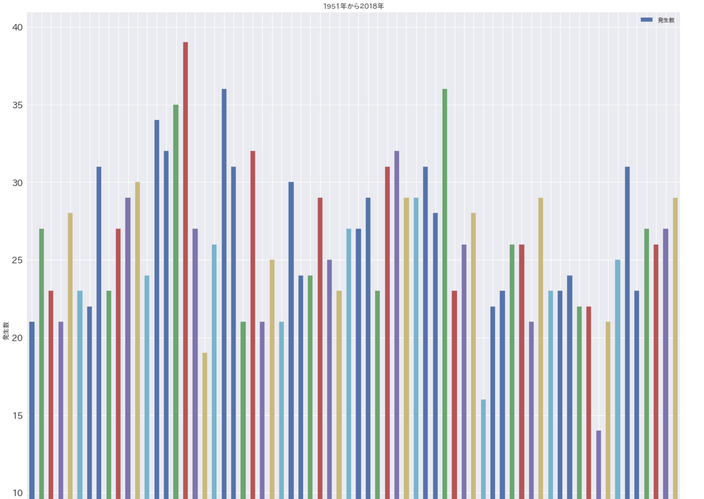
左から順に、1951年から2018年までの発生数です。(ディスプレイの関係でグラフ全体を撮れませんでした。)
今年より多い年を選択してみました。
# 今年の発生数は29
df2[df2.発生数 > 29]

発生数の平均は
df2.mean()
発生数 26.205882
dtype: float64
発生数で見ると、今年は台風が例年よりは多かったですが、特別ではないようです。
台風の発生数の順位 2018年はランク外
台風の上陸数 2018年は5つ
台風の上陸数の順位 2018年は5位
これらも見てみましたが、数だけで考えると、今年が特別だったのではないようです。
ありがとうございました。